

How to Use Screen Printing on Packaging
February 02,2026
Your beauty product might be magic in a bottle—but if the packaging for cosmetics doesn’t pop, it’s just another face in the crowd. Screen printing on packaging gives your brand that red-carpet entrance: bold colors, crisp lines, and finishes so sleek they practically wink at shoppers.
You’ve probably seen it—some rival’s lipstick tube with a metallic logo so sharp it could slice through silence. That’s no accident. According to Smithers’ Global Print Market Report, screen-printed packaging continues to lead in durability and high-impact visual appeal for cosmetics, growing steadily at 3.6% each year.
Mass production doesn’t mean mass compromise. Screen printing flexes across materials—glass bottles, acrylic jars, aluminum shells—with color precision that keeps every unit looking runway-ready.
If you’re wrangling messy inconsistencies or fading designs after shipping? It might be time to swap the sticker for something stickier: ink baked into your brand story.
5 Benefits of Using Screen Printing on Packaging
Screen printing on packaging isn’t just old-school cool—it’s still one of the smartest moves in modern product design. Here’s why it keeps winning across industries.

Durable and Long-lasting: The Strength of Screen Printed Designs
- Ink adhesion is no joke here—screen printing bonds directly to surfaces like glass, metal, and acrylic.
- You get scratch resistance that laughs in the face of rough handling during transit.
- Even after months on a shelf, designs stay bold thanks to serious fade resistance.
Screen printing on packaging doesn’t flake or peel like some digital prints do. It forms a tough, long-lasting design that resists daily wear. Whether you’re working with lip gloss tubes or fragrance bottles, this method ensures your branding stays intact from warehouse to vanity.
Eye-Catching Finishes: How Screen Printing Enhances Visual Appeal
• Custom color blends? Yep. Think ombré effects and metallic sheens that pop off the shelf.
• Bold graphics with insane color saturation give your product instant shelf appeal.
• You can even layer up for rich pigments, adding depth and dimension to your logo.
Packaging isn’t just about function—it’s about flexing style too. With screen printing on packaging, you can create high-impact visuals using vivid colors, slick gradients, and even tactile finishes that scream premium without saying a word.
Cost-Effective and Efficient: Reducing Waste with Screen Printing
- Bulk orders = lower cost per unit—ideal for brands scaling fast.
- Less setup waste means fewer trashed materials during production runs.
- It’s perfect for repeat jobs where consistency matters but budgets are tight.
Here’s what makes this technique shine financially:
| Production Volume | Avg Waste Reduction (%) | Cost Saving (%) | Setup Time (min) |
|---|---|---|---|
| Low (1k–5k units) | 10% | 8% | 45 |
| Mid (5k–20k units) | 18% | 15% | 30 |
| High (20k+ units) | 24% | 22% | 20 |
By cutting down on material loss while boosting speed, screen printing becomes a go-to for brands chasing both quality and efficiency.
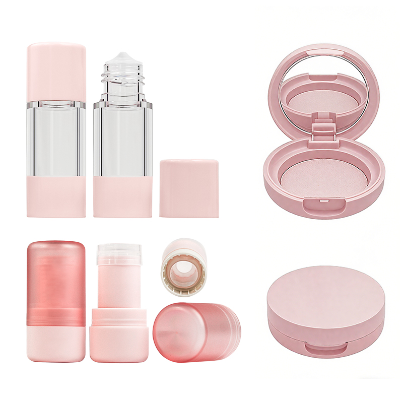
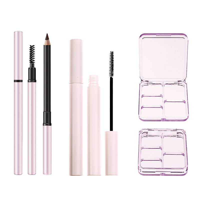
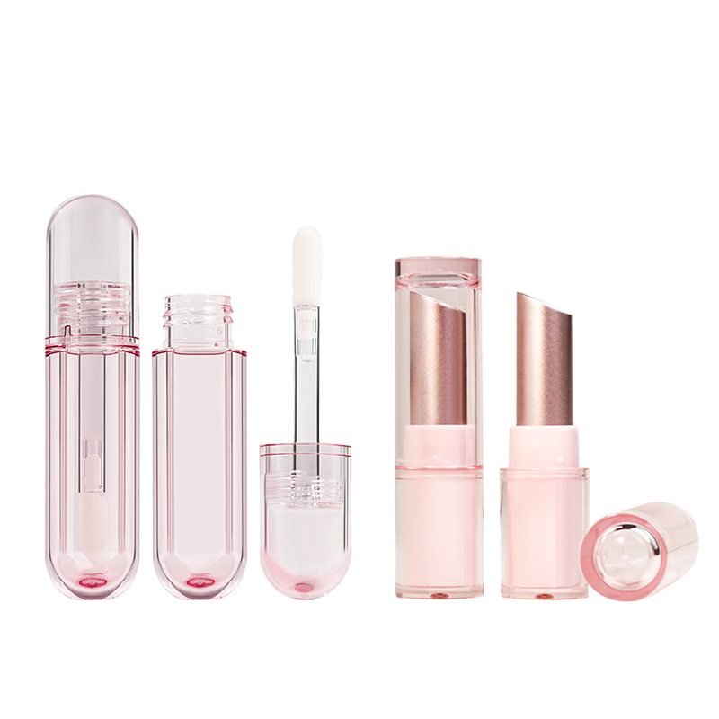
Versatile Applications: Ideal for Various Cosmetic Product Packaging
You’d be surprised how many surfaces this method works with:
- Glass pump bottle for perfumes
- Plastic foundation jars
- Aluminum lipstick tube
- Irregularly shaped mascara tube
What ties all these together? Compatibility with diverse substrates like glass, plastic, and metal, making screen printing on packaging incredibly flexible. Whether you’re going minimalist or full glam, its adaptability helps maintain visual consistency across an entire product line without sacrificing quality—or creativity.
How to Choose Colors for Effective Screen Printing on Packaging
Nailing your color game can make or break how people vibe with your packaging. Here’s how to do it right.

Color Psychology: Choosing Hues for Maximum Impact
• Warm tones like reds and oranges spark energy, while blues and greens calm things down. That’s basic color psychology, but it works.
- Red = urgency and passion
- Blue = trust and relaxation
- Yellow = optimism and youthfulness
Pairing high-saturation hues with muted backgrounds boosts emotional contrast.
A recent NielsenIQ study (2024) found that 69% of consumers associate green packaging with “natural” or “eco-conscious” products—even when it’s just a hue trick.
Use this knowledge wisely in screen printing on packaging—it isn’t just about looking good; it’s about sparking the right feeling fast.
Pantone Matched Colors: Ensuring Consistency Across Product Lines
| Product Line | Pantone Code | Finish Type | Visual Consistency Score |
|---|---|---|---|
| Lipstick Box | PMS 186 C | Glossy | 9.5/10 |
| Serum Tube | PMS 186 C | Matte | 9.3/10 |
| Powder compact case | PMS 186 C | Satin | 9.7/10 |
Using the Pantone Matching System ensures your coral pink looks identical across every product—no weird shifts even if the substrate changes.
Stick to brand-approved codes, run a spectrophotometer check during proofing, and always test against different packaging materials before mass production kicks off.
With consistent color, your lineup screams brand unity—even if each item has a different shape or texture.
Custom Color Blends: Creating Unique Shades for Your Brand
Group A – Why go custom?
• You stand out in a sea of sameness
• You own a shade no one else can copy easily
Group B – What you need:
• A solid understanding of hue, saturation, and finish interaction
• A screen printer who knows their way around custom inks
Group C – Watch out for:
• Over-saturating on textured substrates (can cause blotching)
• Poor adhesion on glossy finishes without proper treatment
Creating unique blends during screen printing on packaging means experimenting—but smartly. Topfeel’s innovation lab cracked their signature mauve by combining complementary tones with subtle metallic overlays, giving them an edge without shouting too loud.
When done right, your custom shade becomes part of your identity—and that’s branding magic right there.
Step-by-Step Guide to Screen Printing on Packaging
Mastering the art of screen printing on packaging means understanding each layer—from prepping bottles to applying final finishes. Let’s unpack it all.

Preparing the Surface: Best Practices for Acrylic Plastic and Glass Bottles
• Wipe down every bottle with isopropyl alcohol—no shortcuts here. Dust, grease, and oils are enemies of clean prints.
• Use flame treatment on acrylic plastic surfaces; it’s not overkill—it’s essential for ink bonding.
• For glass bottles, silane-based primers work wonders by chemically enhancing ink grip.
Surface prep isn’t just about cleanliness—it’s about chemistry. The smoother your base, the cleaner your print. And when you’re aiming for crisp results with screen printing, don’t skip these steps.
Selecting the Right Ink: Water Based vs. Solvent Based Inks
- Water-based inks dry slower but are eco-friendlier and great for soft-touch finishes.
- Solvent-based inks cure faster and stick better to slick surfaces like glass or coated plastic.
- If you’re working with food-grade packaging, always double-check ink compliance.
According to Smithers’ 2024 Packaging Print Report, “solvent-based inks still dominate high-speed production lines due to their superior adhesion properties.” But sustainability trends are pushing water-based formulations into more mainstream use.
Quality Control: Achieving Consistency in Color and Finish
Short tip #1: Always run a control sample before starting large batches—your eye can catch what machines sometimes miss.
Short tip #2: Use a densitometer to measure color density if you’re chasing Pantone precision across runs.
Short tip #3: Don’t forget humidity—printing in humid air can mess with how ink lays down on different packaging substrates.
You’ll never regret being picky here—consistency is king when it comes to brand recognition through color fidelity.
Final Touches: Applying Glossy Varnish or Matte Lamination
Grouped Finishing Options:
✔️ Glossy varnish: Ideal for vibrant branding that pops under store lighting; enhances bold colors and sharp edges.
✔️ Matte lamination: Adds sophistication; reduces glare and fingerprints—perfect for luxury brands or minimalist designs.
Both finishes add durability, but they also shape perception. Whether you want shiny shelf appeal or muted elegance, your choice impacts how consumers feel about your product at first glance.
Troubleshooting Common Issues: Ensuring Flawless Results in Screen Printing
Common Fixes Grouped by Problem Type:
🛠 Ink Bleeding:
- Check emulsion thickness; too thin? You’ll get fuzzy edges.
- Dial back squeegee pressure—it might be forcing excess ink through the mesh.
🛠 Misalignment:
- Recalibrate registration marks before every run.
- Lock down jig fixtures tighter so nothing shifts during printing cycles.
🛠 Poor Adhesion:
- Recheck surface prep—especially important on curved or treated materials.
- Switch up your ink type based on material compatibility; not all inks love all surfaces.
Topfeel has built its reputation by obsessing over these kinds of details—and it shows in every flawless print they deliver across industries using advanced techniques in high-end screen printing on packaging solutions.
FAQs
What makes screen printing ideal for luxury cosmetic packaging?
Screen printing clings beautifully to Acrylic Plastic, Glass Bottles, and Aluminum Shells—keeping Pantone Matched Colors alive through every touch.
- Powder compact case dazzles under Metallic Finishes that never peel.
- Lipstick tube and Foundation Jars hold intricate lines even after countless uses.
- Wholesale mascara tube glides through production with precision alignment.
⟡ This method turns ordinary surfaces into wearable artistry—built to endure as long as the makeup inside them.
How do color choices enhance emotional response in design?
A hint of warmth or a flash of cool metallic shapes how a product is felt before it’s opened:
- Pearlized Pigments echo sophistication on Eyeshadow Cases and Blush Compacts.
- Gradient Color Schemes create subtle rhythm across Highlighter Palettes lined together on store shelves.
- Custom Color Blends bring personality beyond standard Pantone tones, giving each brand voice its own temperature of desire.
Which surface finishes best elevate printed designs?
Each finish whispers something different beneath fingertips:
| Surface Finish | Effect Description | Ideal Match |
|---|---|---|
| Glossy Varnish | Deep shine & reflection depth | Metallic Finishes on Lipstick tube |
| Matte Lamination | Soft calm look with reduced glare | Foundation Jars & Concealer stick |
| Soft Touch Coating | Velvet-like grip & premium feel | Premium Compact Cases |
| Textured Embossing | Added dimension enhancing logo texture | Luxury Eyeliner Pens |
Small decisions in finish can turn visual impact into tactile memory.
Why does screen printed packaging outperform other decoration techniques in durability?
Short bullet summary + human arc:
• Compared with Hot Stamping or Pad Printing, its ink layer fuses tighter using UV Curable Inks or Scratch Resistant Inks for extreme wear protection.
• UV Coating adds another wall against friction common during mass shipping of recycled PET shells or satin-finish aluminum pieces.
• Even Eco-Friendly Paperboard retains crisp graphics when layered correctly with Water Based Inks tuned by experienced hands.
This marriage between craftsmanship and chemistry ensures the story printed stays clear from factory floor to vanity mirror worldwide.
Ready to create packaging that leaves a lasting impression? Contact Topfeel Makeup today to discover how our expert screen printing solutions can elevate your brand.
References
[1] Global Print Market Report – Smithers. https://www.smithers.com/services/market-reports/printing
[2] Consumer Sustainability Trends – NielsenIQ. https://nielseniq.com/global/en/insights/infographic/2023/consumer-sustainability-trends-40-claims-driving-sustainable-consumers-to-buy/
[3] Color Psychology – Verywell Mind. https://www.verywellmind.com/color-psychology-2795824
[4] Pantone Matching System – Pantone. https://www.pantone.com/
[5] UV Adhesion Promoter for Glass – Boston Industrial Solutions. https://bostonindustrialsolutions.com/uv-adhesion-promoter-for-glass-tiles-ceramics/