

Why Everyone Is Obsessed With This Viral Cute Blush Packaging
April 21,2026
Beauty shoppers today buy with their hearts first. If the compact feels like a keepsake, it earns a spot on the vanity—and the feed. Miss that moment, and your blush blends in before it even hits the shelf.
This obsession isn’t fluff. It’s strategy wrapped in pink.
Melodic Insights: Cute Blush Packaging Guide
➔ Emotional Color: Pastel hues and custom shades create instant nostalgia and brand affinity.
➔ Tactile Branding: Embossed logos, soft-touch coatings, and satisfying closures forge memorable sensory bonds.
➔ Functional Delight: Integrated mirrors, refillable systems, and clear windows offer both practicality and charm.
➔ Sustainable Appeal: Recyclable materials, compostable options, and bamboo accents underscore eco-responsibility.
How A Tiny Blush Case Creates Huge Brand Love

A tiny blush case can spark big feelings. When cute blush packaging blends smart design with soft vibes, it turns a daily makeup move into a small joy. From pastel tones to a snappy click, every detail shapes how blush packaging feels in your hand and in your heart.
Pastel Shades in a Compact: Emotional Connection Through Color
In cute blush packaging, pastel shades inside a compact do more than look sweet.
- Soft color builds instant emotional warmth.
- A gentle aesthetic signals safe, skin-loving beauty.
- Soft finishes reduce visual stress on crowded shelves.
-
Color choice
- Baby pink → comfort
- Peach beige → daily wear ease
-
Compact finish
- Matte shell → calm mood
- Satin gloss → playful glow
According to Mintel’s 2025 beauty packaging review, consumers are “increasingly drawn to soft-tone palettes that communicate care and emotional reassurance in uncertain times.” That trend fuels demand for cute makeup packaging that feels personal, not loud.
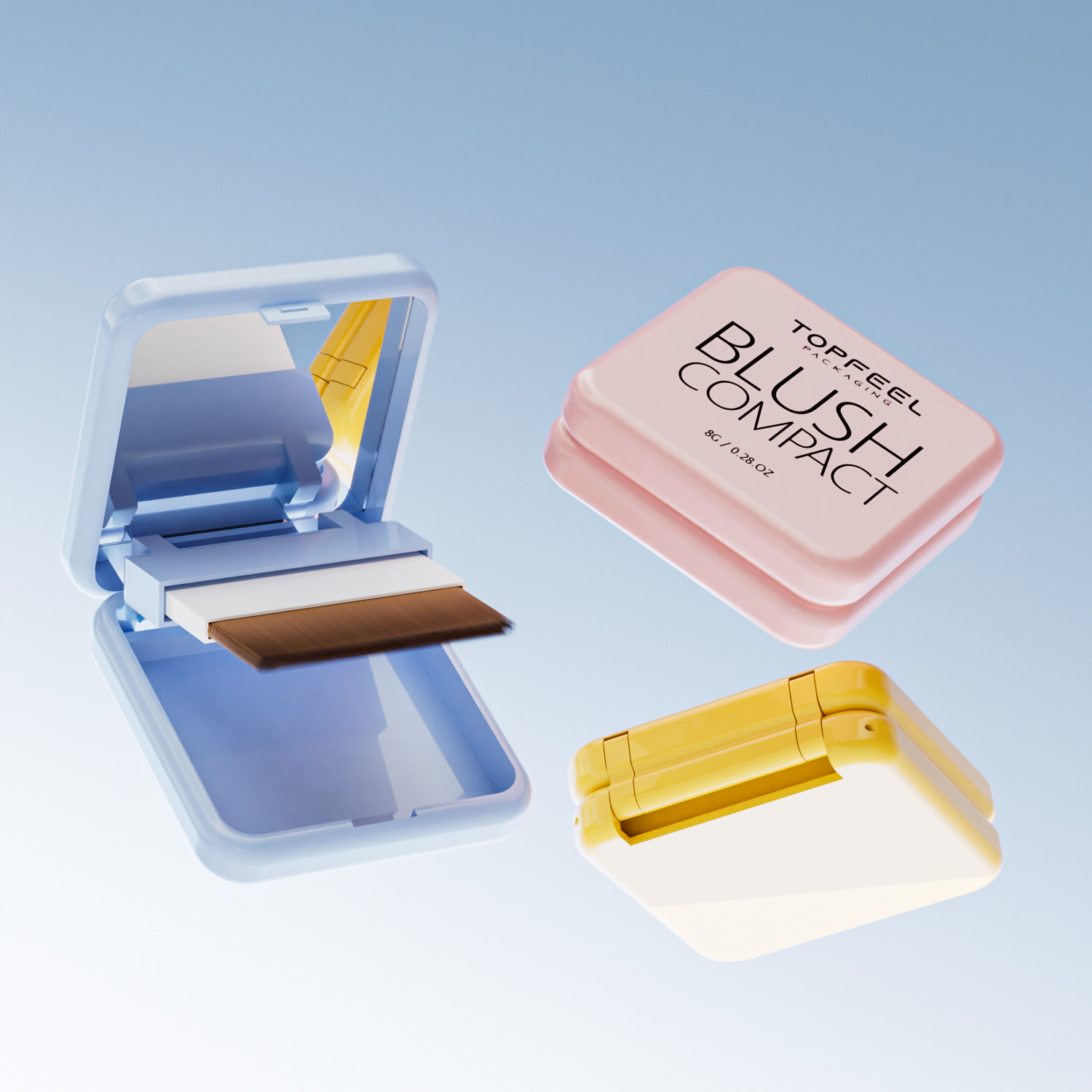
Acrylic Mini Jar with Integrated Mirror: Function Meets Affection
A clear acrylic mini jar with an integrated mirror keeps cute blush packaging practical and lovable.
| Feature | User Benefit | Portability Score (1–10) | Repurchase Impact (%) |
|---|---|---|---|
| Transparent wall | Visible product level | 9 | 18 |
| Built-in mirror | Quick touch-up | 8 | 22 |
| Lightweight design | Easy carry | 9 | 15 |
| Secure lid | Clean storage | 8 | 17 |
- Functional yet stylish
- Portable and convenient
- Thoughtful design that sparks affection
That’s why brands like Topfeel focus on blush compact packaging that feels cute but never flimsy.
Embossed Logo on Bioplastic Pot: Memorable Tactile Branding
Great cute blush packaging speaks through touch.
-
Material choice
- Bioplastic reduces fossil use
- Matte finish feels premium
-
Surface detail
- Embossed logo creates raised texture
- Fingers trace the brand name naturally
- Tactile cues build memory
- Sustainable pot supports eco values
- Branding becomes quietly memorable
Topfeel pairs sustainable material with blush packaging cute enough for social feeds, yet serious about impact.
Snap Closure Tube: Delight in Every Click
The magic sometimes hides in sound.
A snap closure tube adds a secure, satisfying click that upgrades user experience instantly.
★ Click = confirmation
★ Tight seal = product safety
★ Smart innovative packaging = trust
Short moment. Big effect. That tiny click turns ordinary blush packaging into cute blush packaging people want to show off, carry daily, and buy again.
3 Reasons Brands Choose Cute Blush Packaging
Cute blush packaging is more than a sweet outer shell. It shapes brand vibe, buyer trust, and price perception. When blush, cute, and packaging work together, even a small compact can spark big attention both online and in-store.

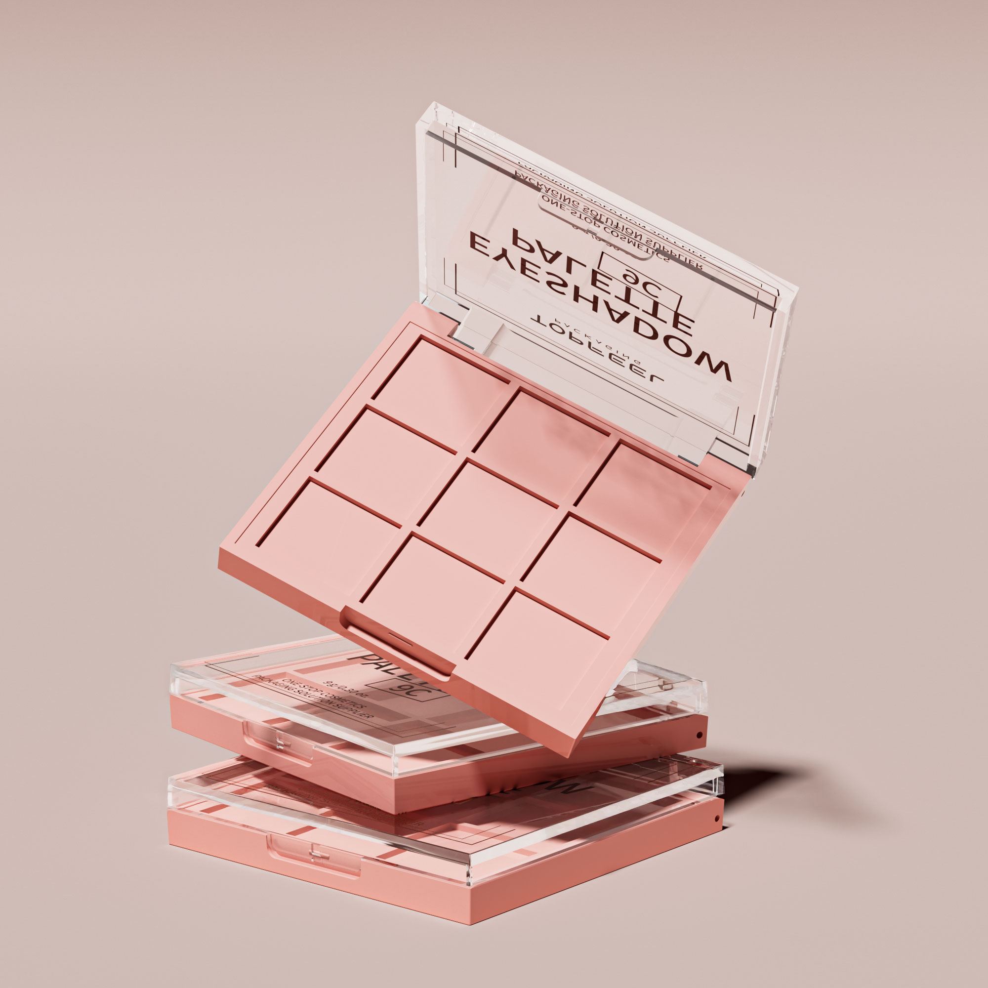
Novelty Shape Palette for Social Buzz
Brands chasing scroll-stopping cute blush packaging often start with shape. A novelty palette built around a Unique design turns basic blush packaging into a mini collectible.
-
Visual Impact
-
Custom silhouettes
- Heart, fruit, or dessert-inspired molds
- Strong shelf contrast
-
Surface styling
- Glossy coatings for Eye-catching shine
- Soft-touch finishes for a Playful aesthetic
-
-
Social Trigger
-
Camera readiness
- Made to be Instagrammable
- Compact enough for flat-lay shots
-
Share factor
- Limited drops build Collectible buzz
- Youth-driven looks create Viral appeal
-
-
Brand Energy
-
Youth focus
- Expresses a Trendsetting attitude
-
Memory hook
- Distinct shapes increase recall
-
This kind of cute blush packaging doesn’t just hold blush; it builds conversation. Topfeel designs often lean into these playful forms, helping brands turn cute packaging for blush into a social magnet without overcomplicating production.
Clear Window Pouch for Instant Product Trust
Clear windows feel honest. In cute blush packaging, a pouch with Product visibility lowers doubt fast.
Consumers like to see:
- Real Shade display
- Texture clarity for Quality assurance
- Clean labeling that hints at Ingredient transparency
- A See-through design shows color directly.
- That visibility signals Authenticity.
- Shoppers gain Consumer confidence before opening.
According to McKinsey’s 2024 global beauty insights, transparency in product presentation is strongly linked to higher purchase intent among Gen Z shoppers.
When cute packaging meets visible blush, trust rises. The soft pouch shape keeps the cute blush packaging vibe, while the window says, “What you see is what you get.” It’s simple, but it works.
Magnetic Closure Compact for Premium Perception
Not all cute blush packaging aims for playful. Some blends cute blush tones with a luxe feel.
-
Exterior Craft
-
Metallic or pearlescent shell
- Creates a Sophisticated design
- Adds an Elegant glow
-
Weighted base
- Feels Durable in hand
-
-
Closure Experience
-
Built-in magnet
- Smooth snap for a Secure closure
- Subtle click that suggests precision
-
Opening motion
- Enhances the Tactile experience
-
-
Value Signal
-
Finish quality
- Delivers a Luxurious feel
- Communicates High-end intent
-
Overall impression
- Leaves a Refined packaging memory
-
For brands upgrading from basic blush packaging to premium cute blush packaging, this compact style shifts perception instantly. Topfeel supports this transition with engineered magnetic systems that keep the cute factor while elevating perceived value.
Which Cute Blush Packaging Trends Dominate TikTok?
Cute blush packaging is blowing up on TikTok, and it’s not just about color anymore. From shimmer to refill systems, every detail of cute, blush, and packaging design matters on camera. If your cute blush packaging pops in a 10-second clip, you win attention. Let’s break down what’s actually trending.

Glitter Effect Paperboard Refill Pan for Unboxing ASMR
When it comes to cute blush packaging, sparkle equals clicks. The mix of glitter, paperboard, and refill systems feels fun but still mindful.
-
Visual Layer
-
Surface:
- Fine glitter dust embedded into paperboard coating
- Soft reflective effect under ring light
-
Core:
- Magnetic refill pan for easy swap
- Slim packaging profile for stackable storage
-
-
Sound Layer
- Light tap on textured paperboard
- Subtle click when refill pan locks in
- Crisp snap during unboxing
-
Emotional Trigger
- ✦ That slow peel sound in ASMR clips
- ✦ The shimmer flash during reveal
For brands like Topfeel, pairing eco-friendly refill ideas with playful blush packaging keeps cute packaging relevant and repeat-worthy. Cute blush moments aren’t random; they’re engineered for replay.
Matte Finish Metal Compact in Custom Color Hues
Minimal glare. Maximum vibe. That’s why matte, finish, and metal rule short-form beauty videos.
Design Breakdown
-
Outer Shell
-
Material
- Brushed metal
- Anti-fingerprint matte finish
-
Color Strategy
- Pastel custom color hues
- Limited-edition design drops
-
-
Performance on Camera
- No harsh reflection
- Smooth open-close motion
- Clean silhouette for flat lays
Consumer Preference Snapshot (2025 Beauty Packaging Study)
| Feature Tested | Preference Rate (%) | TikTok Engagement Lift (%) |
|---|---|---|
| Matte metal compact | 68 | 42 |
| Gloss plastic case | 21 | 18 |
| Paperboard fold case | 11 | 9 |
The numbers show it clearly: matte blush packaging wins on screen. Cute blush packaging doesn’t always mean glitter; sometimes soft-touch metal in custom color tells a cooler story. Topfeel taps into this with tailored color runs that make cute blush feel grown-up but still scroll-stopping.
UV Printing on Glass Jar for Viral Visuals
Bold graphics are trending hard. UV printing on a glass jar brings serious contrast to cute blush packaging.
-
Print Technology
-
Direct UV printing
- High-definition visuals
- Scratch-resistant finish
-
Layered ink build
- 3D raised design
- Gloss-matte contrast
-
-
Aesthetic Impact
- Clear glass base shows product tone
- Bright art boosts viral replay
- Strong shelf appeal
Short. Sharp. Shareable.
Cute blush packaging built with UV-printed glass doesn’t fade under studio lights. It feels premium, a little extra, and totally TikTok-ready. When blush packaging looks this crisp, cute packaging turns into content fuel—and that’s the real win.
Recyclable Vs. Non-Recyclable Blush Design
Cute blush packaging is not just about pastel hearts and glossy lids anymore. Buyers now scan labels, flip compacts over, and ask what happens after the last swipe. From blush packaging materials to refill systems, design choices shape both vibe and impact.

Recyclable Blush Packaging
When cute blush packaging meets sustainable design, it gets interesting. The charm stays, but the waste drops.
- Outer shells made from paperboard or lightweight aluminum
- Clear windows crafted in recyclable glass
- Inserts using PCR plastic instead of virgin resin
- Swap-in pans that are fully refillable
For brands building cute packaging with a conscience, structure matters:
-
Material Layer
-
Primary case
- ♻ aluminum casing for durability
- Molded PCR plastic base for reduced carbon use
-
Decorative wrap
- Soy-ink print on paperboard sleeves
-
-
Refill System
- Magnetic-free click pans
- Easy pop-out metal trays
-
End-of-Life Path
- Consumer separation guide
- Clear recycling codes
The result? Cute blush compact designs that feel light in your hand and lighter on the planet. Topfeel pushes this approach by pairing eco-conscious aesthetics with modular refills, keeping cute blush packaging trendy without creating landfill drama.
“Sustainability is now a core purchase driver in beauty, with packaging transparency shaping brand trust,” noted McKinsey & Company in its 2024 Global Beauty Insights update.
That insight hits home. Consumers love blush. They just don’t love guilt.
Non-Recyclable Blush Packaging
Not all blush packaging plays nice with recycling bins.
Common issues include:
- Heavy virgin plastic shells
- Fused mixed materials that can’t be separated
- Glitter coatings and metallic films that block recycling
Inside a typical non-recyclable cute blush packaging design:
-
Outer Case
- Thick non-biodegradable plastic
- Decorative metal plates glued in place
-
Functional Add-ons
- Mirrors bonded with resin
- Magnets creating complex design barriers
-
After Disposal
- Ends as landfill waste
- Gradual breakdown into microplastic
- Contribution to long-term environmental pollution
It may look luxe. It may scream viral cute packaging. Still, single-use formats stack up fast.
Topfeel avoids this trap by reducing layered plastics and cutting unnecessary metallic finishes, proving cute blush packaging can stay adorable without turning into tomorrow’s trash.
Struggling Shelf-Appeal? Cute Blush Packaging Helps
Retail shelves are packed tight, and standing out is no joke. Smart cute blush packaging can shift a product from “just okay” to “must try.” When blush packaging blends charm with structure, shoppers slow down. That pause often turns into a pickup—and that’s where sales begin.

Stackable Design with Soft-Touch Coating for Visual Order
Great cute blush packaging does more than look sweet; it creates clean visual rhythm on crowded displays.
-
Stackable
- Aligns units vertically
- Builds tidy order across limited shelf space
- Supports a compact retail layout
-
Design
- Balanced proportions
- Rounded edges for softer aesthetic appeal
- Easy front-facing alignment
-
Soft-touch
- Velvet-like feel
- Subtle coating that reduces glare
- Boosts tactile memory during product testing
Retail performance comparison:
| Feature Type | Shelf Space Use (%) | Shopper Touch Rate (%) | Reorder Frequency (Monthly) |
|---|---|---|---|
| Standard Case | 100 | 42 | 1.8 |
| Stackable Soft-Touch | 78 | 67 | 2.6 |
| Gloss Plastic | 95 | 51 | 2.0 |
Topfeel applies this design logic to create cute packaging that feels calm, neat, and totally shop-ready.
Debossed Pattern on Bamboo Tube for Natural Luxury
A bamboo tube already whispers sustainability. Add a debossed pattern, and that whisper turns confident.
- Deep texture gives grip.
- Visible grain signals natural sourcing.
- Clean carving detail adds quiet luxury.
For brands aiming at eco-friendly beauty lovers, this type of blush packaging hits home. It feels warm in hand, not cold or overly glossy. Cute blush details—like floral lines or soft curves—bring personality without losing that earthy tone.
Topfeel blends bamboo with precise tooling, so the pattern stays sharp while the surface remains smooth. Cute blush packaging built this way speaks to buyers who want pretty, but also planet-aware.
Double-Wall Construction Jar: Sturdy Presence on Crowded Shelves
On a packed shelf, weight matters.
-
Double-wall
-
Inner layer:
- Shields formula
- Adds protection from impact
-
Outer layer:
- Thick visual frame
- Strong presence
-
-
Construction
- Reinforced base
- Balanced lid alignment
- Long-term durability
-
Jar
- Solid feel in hand
- Stable on display
- Confident sturdy stance
This kind of cute blush packaging doesn’t wobble or fade into the background. It stands firm, looks premium, and protects the product inside. With thoughtful construction, Topfeel turns blush packaging into something shoppers trust at a glance—and that trust often seals the deal.
In-Store Displays: Cute Blush Packaging Steals Spotlight
In busy retail aisles, cute blush packaging does more than sit on a shelf—it grabs attention fast. When blush cute packaging meets smart display design, shoppers slow down, take a look, and often reach out. That’s the sweet spot brands want.

Hot Stamping on Metal Compacts for Eye-Catching Shine
When cute blush packaging features hot stamping on metal compacts, the impact starts at a distance and builds up close.
-
Visual attraction at shelf level
-
Reflective lighting interaction
- The metallic finish reacts to overhead retail lights.
- Reflective surfaces create tiny flashes as shoppers walk by.
-
Elevated shelf contrast
- Matte cartons fade back.
- Shiny blush packaging steps forward with instant visual appeal.
-
-
Tactile and emotional response
-
Surface detail
- Fine decorative elements pressed through hot stamping feel slightly raised.
- Fingers trace the logo, reinforcing packaging aesthetics.
-
Perceived value
- The cool weight of metal compacts plus a bright foil stamp signals a premium look.
- Cute packaging for blush suddenly feels gift-worthy.
-
-
Brand storytelling through finish
- Soft pink base + silver foil = playful chic.
- Peach tones + rose-gold stamp = trendy, selfie-ready.
In-store, this kind of cute blush packaging doesn’t whisper. It shines, reflects, and quietly says, “pick me.” That shimmer turns casual browsers into curious buyers.
Compostable Options with Reduced Material Usage for Eco-Friendly Impact
Not all cute blush packaging needs sparkle. Some wins hearts through smart restraint and sustainable packaging choices.
-
Material strategy
-
Core structure
- Use compostable materials for outer cartons.
- Shift inserts to molded pulp for real waste minimization.
-
Compact redesign
- Slimmer pans support material reduction.
- Fewer layers, less plastic, lower environmental impact.
-
-
Eco-friendly design details
-
Surface finish
- Soy-based inks on blush packaging keep color soft yet responsible.
-
End-of-life planning
- Clear disposal icons encourage use of biodegradable options.
- Messaging highlights commitment to green packaging.
-
-
Shopper perception in-store
- Shelf tags call out “compostable” in plain language.
- The lightweight feel reinforces eco-friendly design choices.
- Cute blush packaging with a natural texture feels honest, not flashy.
This softer side of cute blush packaging proves something simple: blush packaging can be adorable and thoughtful at the same time. When brands trim excess and focus on smart materials, cute packaging for blush becomes part of a bigger story—one that shoppers actually respect.
FAQs about Cute Blush Packaging
Why is cute blush packaging capturing so much attention?
Cute blush packaging turns a simple compact or palette into a small emotional ritual.
- Visual pull
- Pastel shades + custom color shells soften the mood instantly.
- A novelty shape compact or heart-shaped pot sparks collectable desire.
- Touch memory
- Soft-touch coating over plastic or acrylic feels warm in hand.
- An embossed logo pressed into metal builds quiet confidence.
- Share factor
- Glitter effect + metallic finish reflect light on camera.
- UV printing and hot stamping flash under store lights and social feeds.
It’s not just makeup—it’s the click of a magnetic closure, the glow of a clear window, the small thrill before the brush even touches skin.
Which materials and forms balance beauty with durability?
The charm fades fast if the case cracks, so material choice matters.
| Material | Common Form | Emotional & Practical Edge |
|---|---|---|
| Acrylic | Compact / Jar | Clear body + integrated mirror elegance |
| Metal | Compact | Weighty feel + hinged lid strength |
| Paperboard | Palette | Lightweight + recyclable material appeal |
| Bamboo | Jar / Tube | Sustainable sourcing + warm texture |
| Bioplastic | Pot / Refill pan | PCR content + reduced guilt |
Add a double-wall construction for security, a snap closure for everyday ease, or a slim pouch for travel. Durability should feel natural, never bulky.
How do closure and functional features elevate user experience?
The smallest motion can define the brand.
- ✦ Magnetic closure: smooth, quiet authority.
- ✦ Click lock: sharp, satisfying snap.
- ✦ Screw cap on a jar: dependable and airtight.
- ✦ Flip-top on a tube: quick touch-ups on the go.
Layer in function:
- Airtight seal protects delicate blush texture.
- Applicator compartment keeps tools clean.
- Refillable system extends product life.
- Stackable design keeps vanities tidy.
Each detail whispers care—consumers notice.
What sustainable options work for bulk buyers seeking cute blush packaging?
Eco choices now shape purchase decisions as strongly as color.
- Recyclable paperboard palettes with matte finish and silk screening for low-impact beauty.
- Glass jars or metal compacts designed for long-term refill use.
- Biodegradable packaging and compostable options that cut waste.
- PCR plastic compacts with eco-friendly dyes and debossed pattern branding.
- Designs focused on reduced material usage without sacrificing charm.
Sustainability no longer sits in the background; it lives in the texture, the weight, and the conscience behind every cute blush compact.
References
- Recyclable materials – Value of Beauty
- eco-responsibility – Delfin Technologies
- Mintel’s 2025 beauty packaging review – Mintel
- Viral appeal – Blanka Brand
- Consumer confidence – SkyQuestt
- McKinsey’s 2024 global beauty insights – Berlin Packaging
- Tactile experience – Technavio
- TikTok – NellyRodi
- unboxing – Hello Magazine
- matte finish – Beauty Packaging
- sustainable design – Sustainable Packaging Coalition
- premium look – Cosmopolitan
- visual appeal – Future Market Insights
- compostable materials – Business Wire

