

New Insights into Cute Packaging for Cosmetics
September 29,2025
Ever noticed how cute packaging cosmetics practically fly off the shelves before anyone even reads what’s inside? It’s not magic—it’s marketing psychology in a tutu. Consumers aren’t just buying blush anymore; they’re falling hard for heart-shaped compacts and pastel droppers that look like they belong in a dollhouse. When the product feels like a keepsake, it doesn’t just get used—it gets posted, shared, remembered.
But here’s the rub: pretty won’t cut it if it cracks under pressure—literally or figuratively. Today’s buyers expect more than eye candy. Think refillable jars with satisfying clicks, eco-friendly inks that don’t smell like regret, and tubes that survive handbags of chaos without leaking their soul all over your receipts.
In short? Cute is serious business now—and brands not getting on board are missing out on shelf appeal and sustainability cred.
Key Points in the Charm Game: A Quick Look at Cute Packaging Cosmetics
➔ Material Matters: Eco-friendly cardboard and recycled PET inserts ensure strength without sacrificing sustainability.
➔ Design is Identity: Custom molds—like round jars or square compacts—help brands stand out on crowded shelves.
➔ Decor Speaks Volumes: Hot stamping, screen printing, and embossing elevate visual appeal while reinforcing brand recognition.
➔ Color Consistency Wins: Pantone-matched hues, gradient effects, and metallic finishes keep packaging both vibrant and on-brand.
➔ Sustainability Sells: Refillable designs, biodegradable materials, PCR content, and water-based inks show commitment to planet-friendly beauty.
5 Steps to Evaluate Cosmetic Box Quality
Wanna make sure your beauty packaging isn’t just cute but also top-tier? Here’s how to check if that cosmetic box is worth the shelf space.
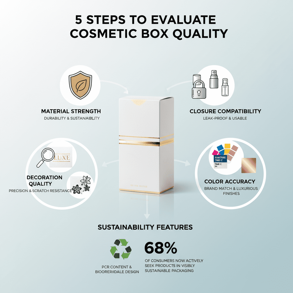
Step 1: Assess Material Strength with Eco-Friendly Cardboard
-
Eco-conscious durability
Look for boxes made with sturdy, high-grade recycled paperboard. It should resist dents and maintain shape even under light pressure. -
Structural integrity
A quality cosmetic box won’t collapse when stacked. Test it—if it caves easily, it’s not up to par. -
Moisture resistance
Some eco-friendly materials offer coatings that help repel water. This matters if your products sit in humid bathrooms. -
Weight-bearing capacity
Thicker GSM cardboard supports heavier items like glass jars or serums without bowing out. -
Sustainability certification
FSC-certified paperboard ensures responsible sourcing—important for brands pushing green values.
Even when you’re going for that cute packaging cosmetics vibe, don’t skip strength—it’s what keeps the pretty stuff protected.
Step 2: Inspect Closure Compatibility from Screw Caps to Pump Dispensers
• Start by twisting and locking every closure—screw caps, flip-tops, sprayers—across samples. If anything feels loose or misaligned, toss it from consideration.
• Next, test usability. Can you open it one-handed? Does the pump jam halfway through? These little things matter more than you’d think for daily users.
• Watch out for leakage during transport simulations; shake vigorously and store upside down overnight. If there’s seepage, the seal’s not secure enough for real-world use.
• Finally, ensure closures match product viscosity—creams need tight seals while mists require smooth-spraying nozzles. Match function with form every time.
When choosing between sleek pumps or classic caps, always prioritize practical sealing over just looking good on a vanity shelf.
Step 3: Evaluate Decoration Quality in Hot Stamping and Screen Printing
-
Hot stamping precision
Crisp edges and consistent foil adhesion are key signs of high-quality hot stamping on your cosmetic box. Blurry lines = bad news. -
Screen printing clarity
Fonts should be sharp—even small text—and colors shouldn’t bleed into each other. -
Scratch resistance
Rub gently with a coin; if print peels off easily, durability’s lacking big time. -
Gloss vs matte finishes
Glossy ink pops under light but may show fingerprints; matte gives an upscale feel but needs higher ink density to stand out.
A little shimmer can go far—but only if it’s applied cleanly and stays put after shipping mishandling or bathroom humidity kicks in.
Step 4: Analyze Color Accuracy Using Pantone Colors and Metallic Finishes
Pantone-matched tones are everything when branding is involved. One shade off can totally mess up brand recognition—and don’t get us started on metallics that look dull instead of luxe:
Color matching isn’t just about aesthetics—it’s about trust. Customers expect consistency between what they see online and what shows up at their door. If your rose gold ends up looking bronze under different lighting? That’s a problem no amount of influencer hype can fix.
Metallic finishes should shine evenly without patchy spots or smudges—and reflect light cleanly without distorting color underneath them. When done right, these details elevate even basic cosmetics packaging into something special enough to display proudly on any dresser top.
Step 5: Confirm Sustainability Features—PCR Content & Biodegradable Design
According to Mintel’s Global Packaging Trends Report released early this year, over “68% of consumers now actively seek products housed in visibly sustainable packaging.” That means recycled content isn’t optional anymore—it’s expected:
• Check the percentage of post-consumer resin (PCR content) used; anything above 30% is solid progress toward circularity goals.
• Look for biodegradable coatings or compostable inner trays—they reduce landfill impact dramatically compared to traditional plastic inserts.
• Certifications matter here too—labels like OK Compost Industrial or BPI Certified tell buyers this stuff actually breaks down as promised—not just marketing fluff disguised as greenwashing.
Your packaging doesn’t need to scream “eco-warrior,” but subtle cues like kraft textures or embossed recycling icons go a long way toward winning eco-conscious shoppers hunting both style and substance in their cosmetic boxes.
Carton vs. Plastic Packaging Options
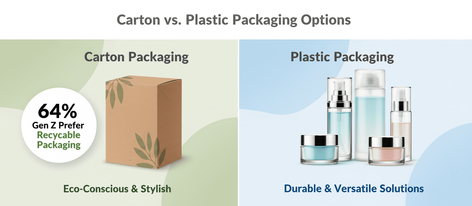
Choosing between carton and plastic packaging isn’t just about looks—it’s about purpose, sustainability, and brand vibe.
Carton Packaging Options
Eco-conscious brands are leaning into paperboard and folding cartons, not just because they’re green, but because they scream style when done right. According to Euromonitor’s Q1 2024 report, over 64% of Gen Z consumers say they prefer products in recyclable or biodegradable packaging—even for their “cutest” makeup buys.
• Lightweight yet protective, sustainable materials like kraft paper offer a rustic charm that stands out on shelves.
• Custom die-cuts and embossing add flair without extra waste.
• Brands are using eco-friendly inks to keep it clean while still getting bold colors.
Want something easy to print on? These cartons are a dream for detailed branding thanks to advanced printing techniques, especially when you’re aiming for that premium-but-playful look often seen in boutique beauty lines.
Short-run cosmetic launches—especially those targeting the “cute” aesthetic—benefit from the flexibility of carton customization. And yes, these options are more than just pretty faces; they’re built with recyclability in mind so your brand feels as good as it looks.
Plastic Packaging Options
When durability meets transparency, you get plastic solutions that don’t mess around. From glossy PET bottles to sleek airless pumps, plastics bring both form and function—especially important when you’re showcasing those pastel creams or glittery serums designed for the fun-loving crowd.
| Material Type | Clarity Level | Recyclable | Common Use |
|---|---|---|---|
| PET | High | Yes | Bottles & jars |
| HDPE | Medium | Yes | Tubes & closures |
| Acrylic | Very High | No | Premium displays |
| Recycled Plastic | Varies | Yes | Eco-focused lines |
① Need something leak-proof? Go with double-seal closures made of high-grade HDPE.
② Want shelf appeal? Acrylic gives off luxe vibes perfect for limited-edition drops.
✦ Pro tip: Combining clear PET with colored labels helps products pop without overcomplicating design.
For brands like Topfeel exploring playful formats targeting younger buyers who adore visually appealing skincare items, plastic offers unmatched versatility—from squeezable tubes to transparent jars that highlight textures inside.
Don’t sleep on recycled content either—it’s becoming the norm rather than the exception as more indie brands align packaging with their values while chasing that viral-worthy aesthetic tied closely to cutesy cosmetic lines.
Fragile Boxes? Reinforce with Eco-Friendly Materials
Smart packaging doesn’t have to be weak. Here’s how to keep things sturdy, sustainable, and stylish—especially when it comes to those adorable beauty box designs.

Reinforced Corners with Recycled PET Inserts
- Reinforced Corners are a lifesaver when your packaging takes a hit in transit. These toughened edges absorb shock and help boxes maintain shape.
- Using Recycled PET is not just about being green—it brings real strength without adding bulk or weight.
- The transparent nature of PET lets designers play around with window cut-outs while keeping structural integrity intact.
- Perfect for delicate items like glass serum bottles or compact mirrors, these Inserts offer both protection and polish.
- Ideal for brands pushing the eco angle without compromising on durability—especially in the world of petite, charming beauty kits.
Embossing Techniques Strengthen Eco-Friendly Cardboard
You’d be surprised how much power is packed into texture. Embossing isn’t just there for looks—it actually reinforces your Eco-Friendly Cardboard, giving it extra resistance against bending and wear.
• Start by selecting FSC-certified cardboard that can handle pressure without splitting.
• Add subtle patterns or ridges through Embossing Techniques, which naturally stiffen the surface layer.
• Bonus? It elevates design appeal, making even minimalist boxes feel luxe.
• This approach works wonders on small-format packages where every millimeter matters—hello compact-sized lip glosses and travel kits!
By combining function and flair, embossing transforms simple packaging into something tactile, strong, and surprisingly long-lasting—perfectly suited for playful yet protective cosmetic presentations.
UV Coating & Water-Based Inks for Added Surface Durability
- A pop of shine from UV Coating does more than catch the eye—it adds a hard shell that resists scratches, smudges, and moisture.
- When paired with Water-Based Inks, you get vibrant prints minus the toxic footprint—great news if you’re aiming to stay clean-label inside and out.
- These finishes work double-duty on small-batch runs of cutesy designs where every detail counts—from pastel blush palettes to mini perfume samplers.
- Plus, they hold up better under handling in stores or during shipping—a win-win for both shelf appeal and product safety.
- The combo keeps your packaging as fresh as what’s inside while staying true to eco-conscious goals.
From soft-touch textures to glossy shields, these upgrades make sure even the most delicate items arrive looking flawless—and fabulous.
Poor Brand Recognition? Unique Cute Packaging Helps Cosmetics Stand Out
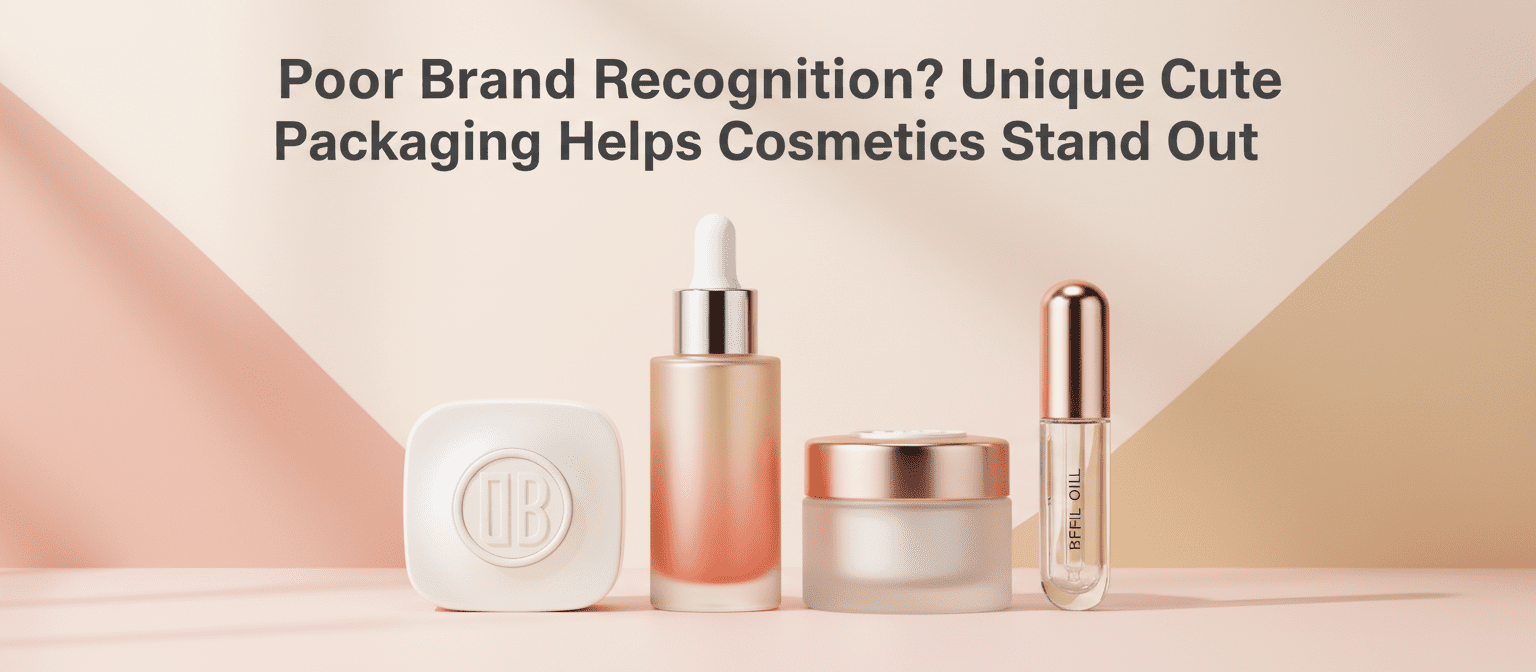
In a world full of lookalike products, standout packaging isn’t optional—it’s survival. Let’s talk cute, clever, and totally unforgettable.
Custom Tints & Gradient Effects for Signature Appeal
- Soft blush tones evoke warmth and trust—perfect for skincare lines aimed at teens or young adults.
- Cool gradients like lilac-to-mint suggest freshness and innovation—great for serums or lip gloss collections.
- Warm ombrés such as coral-to-gold scream luxury without being over-the-top.
Want your product shelf-ready and selfie-worthy? Use custom tints that play off your brand story while adding visual interest under store lighting. Subtle gradient effects can make even minimalist designs pop, giving your packaging that unmistakable air of signature appeal.
Embossed Logos on Aluminum Containers and Glass Bottles
• Adds texture customers literally feel—tactile branding works wonders in crowded cosmetic aisles
• Enhances perceived value instantly; embossed details scream quality without saying a word
• Works across materials—from sleek aluminum containers to luxe frosted glass bottles
An embossed logo isn’t just a design detail—it’s a mood-setter that makes your product feel more premium from the first touch.
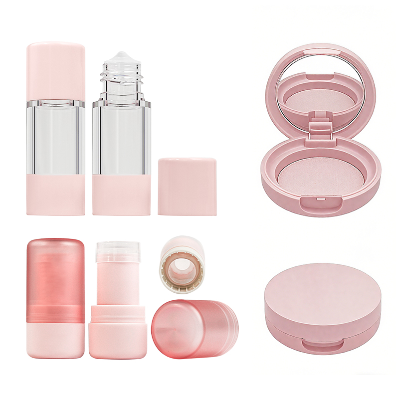
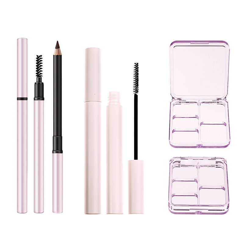
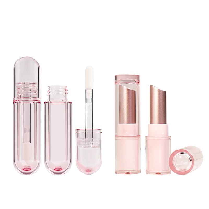
Unique Molds: Round Jars, Square Compacts & Oval Tubes
Group A – Shape Variety That Pops Off the Shelf:
- Round jars: Great for creams, masks, balms—friendly shapes that invite interaction
- Square compacts: Offer symmetry lovers something classy yet modern
- Oval tubes: Sleek silhouettes perfect for lip oils or eye serums
Group B – Function Meets Aesthetic:
- Stackable designs help retailers showcase more SKUs
- Ergonomic molds fit better in hands—and handbags
- Custom die-cuts allow endless creativity while staying practical
Thinking outside the mold with these distinct shapes helps smaller brands punch above their weight in the crowded world of beauty shelves filled with cookie-cutter formats.
Refillable Designs with Dropper Assemblies for Lasting Engagement
Short Segments Approach:
Eco is no longer niche—it’s expected. With smartly designed refillable containers, customers stick around longer because they’re buying into more than just a formula—they’re joining a movement.
Dropper assemblies aren’t just trendy—they offer precision dosing and mess-free use, which users love especially when dealing with potent formulas like retinol or vitamin C serums.
And let’s be real: people notice when packaging is both cute and conscious. Bonus points if you make it Instagrammable too.
Grouped Bullets:
✓ Boosts sustainability cred through reusable components like glass droppers and PET sleeves
✓ Encourages repeat purchases via refill pouches or magnetic cartridge systems
✓ Keeps cost-per-use low without sacrificing aesthetics
One refill-friendly bottle can turn casual buyers into loyalists—and that’s where Topfeel shines by balancing form, function, and eco-smarts in every unit they produce.
FAQs
It’s not just the look—it’s how it feels in your hand, how it opens with a soft click, and how the colors echo a brand’s personality. A lipstick tube shaped like a heart or an eyeshadow palette that glows under light—these details linger in memory. Embossed logos on frosted glass bottles don’t just say “luxury,” they whisper it. When packaging becomes part of the experience, people remember.
- Reinforced cardboard made from recycled fibers keeps things sturdy
- PET corner inserts protect delicate edges during bumpy rides
- UV coating shields printed designs from scuffs and moisture
All this strength wrapped up in eco-friendly materials means your products arrive safe—and still adorable.
Absolutely! Sustainability doesn’t mean plain or boring anymore:
- Refillable compacts with pastel finishes feel both smart and stylish
- Mono-material tubes reduce waste while keeping their glossy appeal
- PCR plastics molded into soft curves add character without harming Earth
Cute meets conscious when design serves both beauty and purpose.
Because one shade off can break trust. That perfect blush pink you chose to represent your lip balm line? It needs to stay consistent across every batch of tubes, jars, cartons—even website banners. Using Pantone-matched inks ensures harmony across all touchpoints. Metallic foils used sparingly (but precisely) bring life to logos without overwhelming them. Color isn’t decoration—it’s identity expressed visually.