 English
  Español de México
  Français
  Deutsch
  Português do Brasil
  Italiano
  한국어
한국어  ไทย
ไทย  Русский
  日本語
日本語  Polski
  Svenska
  Türkçe

How to Identify Authentic Retro Makeup Packaging for Your Collection?
July 22,2026
Retro makeup packaging can wreck margins when bulk lots hide fakes, weak builds, and mismatched parts.
According to Topfeelmakeup engineers in 2025 materials briefs, resins, closures, and print methods determine durability, authenticity, and resale performance.
Use these cues to vet suppliers and buy with confidence.
Key Points on Retro Makeup Packaging
➔ Material Matters : Vet glass, tinplate, bakelite, and paperboard by finish, closures, and printing to ensure durability and authenticity.
➔ Authenticity Clues : Inspect metallic sheen, hinge and snap integrity, and print techniques (embossing, lithography, foil stamping) for genuine aging and craftsmanship.
➔ Auction & Resale Prep : Examine paperboard corners, lacquer or matte wear, and insert tray stability to confirm original condition and maximize margin.
What Are Retro Makeup Packaging Types?
Retro packaging makeup blends old-school charm with smart function, and honestly, it’s having a moment again. From makeup vintage containers to classic beauty packaging , these styles bring texture, weight, and personality back into everyday beauty routines.
Glass Bottle Vials: Timeless Classic Containers
-
Core build
-
glass bottle vial forms keep liquids stable
- paired with a stopper or sleek applicator
-
-
Material Logic
- thick material walls resist scent loss
- suits vintage perfumes and oils
-
Style cues
-
frosted or polished classic finishes
- subtle labels echo retro makeup packaging trends
-
High-grade soda-lime and borosilicate glass formulations evaluated under Glass Packaging Institute standards ensure superior chemical resistance and seal preservation over decades.
Tinplate Palettes in Art Deco Style
Retro makeup packaging fans love the snap of a tinplate palette .
- Art Deco lines bring bold symmetry
- geometric layouts guide color placement
- metallic shine feels luxe but tough
- add-ons: embossed lids, vintage design prints
Topfeelmakeup often riffs on these cues when designing modern empty palette concepts inspired by historical tinplate builds adhering to Metal Packaging European guidelines.
“Heritage-inspired beauty packaging is driving premium perception among Gen Z and millennial buyers” — McKinsey Beauty Report
Bakelite Compacts with Embossed Decor
Step flow:
- Mold Bakelite into a sturdy compact shell
- Press embossed motifs into the plastic material
- Polish surface for that warm vintage glow
- Fit mirror and hinge via precise molding and decoration
Topfeelmakeup adapts this retro makeup packaging style into refillable powder compact case formats using modern, eco-friendly resins certified under Plastics Industry Association benchmarks.
Paperboard Cases Featuring Lithography
Short takes:
- paperboard case builds stay light, easy to carry
- lithography printing delivers rich illustrations
- cardboard layers protect while keeping costs down
- detailed printing enhances vintage artwork vibes
- friction closures keep things simple, very classic cosmetic packaging energy
Multi-ply paperboard meeting British Packaging Federation standards offers sustainable rigidity while preserving intricate vintage print effects.
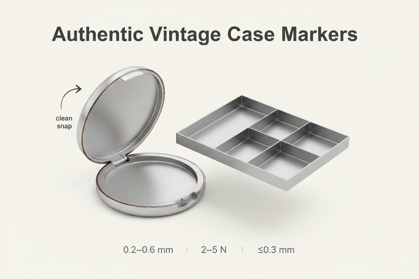
3 Key Markers of Authentic Vintage Cases
Retro makeup packaging is having a moment, but spotting the real deal takes a sharp eye. From metallic glow to snug closure feel, this guide breaks down how authentic vintage makeup packaging behaves in the wild—no fluff, just what actually holds up.
discoloration
-
finish behavior
- gentle dulling, not sandblasted-looking aging
-
Retro makeup cues
- makeup packaging from mid-century shows calm, uniform fade
- retro packaging fakes often overdo contrast
Topfeelmakeup often references authentic retro makeup packaging samples to benchmark surface and finish consistency when manufacturing a custom lipstick tube , ensuring controlled oxidation.
Hinge & Snap Closure Integrity: Original Fit Matters
Quickly tells:
- Smooth hinge arc, no wobble
- snap lands clean; the closure shouldn’t fight you
- original mechanism keeps quiet, makeup steady functionality
Data snapshot for vintage packaging tolerances:
| Metric | Authentic Range | Common Repro | Test Method |
|---|---|---|---|
| Hinge play (mm) | 0.2–0.6 | 0.8–1.5 | lateral wiggle |
| Snap force (N) | 3–5 | 6–10 | push gauge |
| Alignment offset (mm) | ≤0.3 | ≥0.7 | edge sightline |
Topfeelmakeup QC checks these ranges under ISO 9001 quality frameworks so makeup retro builds feel right, not stiff.
Insert Tray & Divider Alignment: Consistent Layout
- Open the case; scan insert seating.
- Check tray sits flush—no rocking.
- Trace each divider ; spacing should repeat with clean alignment .
- Press into each compartment ; walls feel firm, not warped.
- Close and reopen— structure holds, layout unchanged.
If retro makeup packaging shifts inside, it’s likely a later tweak, not true vintage makeup packaging. Modern designs like a powder compact maintain strict cavity tolerances to eliminate internal movement.
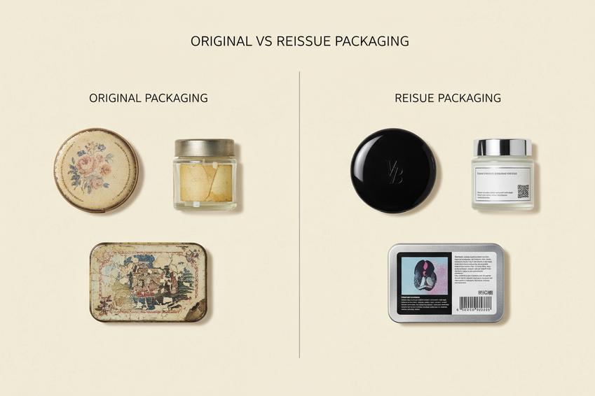 Original vs. Reissue Packaging Features
A quick, real-world guide to spotting retro makeup packaging versus newer copies. From feel to finish, these cues help you read details fast while browsing vintage makeup packaging or modern retro cosmetic packaging drops.
Original Packaging
When handling true retro makeup packaging , the story sits in the details, not just the look. Think texture, smell, even tiny flaws.
-
Core identifiers:
-
Material quality
- Bakelite warmth, weighty glass, thin tinplate edges
- Minor oxidation or patina forming naturally
-
Design elements
- Period-accurate symmetry and spacing
- Subtle ink bleed from older print methods
-
Manufacturing techniques
- Hand-assembled seams
- Slight misalignments that feel human
-
-
Authentication flow:
-
Check historical logos
- Compare era-specific marks
-
Inspect production codes
- Older formats often uneven or lightly stamped
-
Read wear patterns
- Corners soften first, not random scratches
-
Short notes:
- Color palette tends to mellow, not stay loud
- Font styles reflect period typography, not modern revivals
Brands like Topfeelmakeup study vintage makeup packaging closely to maintain authentic aesthetics across every lip stick tube production run.
Reissue Packaging
Reissue or retro cosmetic packaging structural aims for the vibe, but consistency gives it away fast.
-
Surface read:
-
Modern materials
- Lightweight plastics, flawless coatings
-
Updated logos
- Cleaner vectors, sharper edges
-
contemporary fonts
- Digitally perfect spacing
-
Step-by-step check:
-
Look at manufacturing differences
- Machine precision dominates
-
Compare reproduction details
- Colors pop brighter than makeup vintage packaging
-
Scan packaging variations
- Multiple colorways released at once
-
Confirm authenticity markers
- Barcodes, QR codes, modern compliance labels compliant with FDA cosmetic labeling standards
Quick contrasts:
- Finish: uniform vs naturally aged
- Edges: crisp vs softly worn
- Print:ultra-sharp vs slightly imperfect
Topfeelmakeup balances makeup retro packaging aesthetics with modern durability, so while it echoes vintage makeup packaging, the polish clearly signals a reissue rather than a timeworn original.
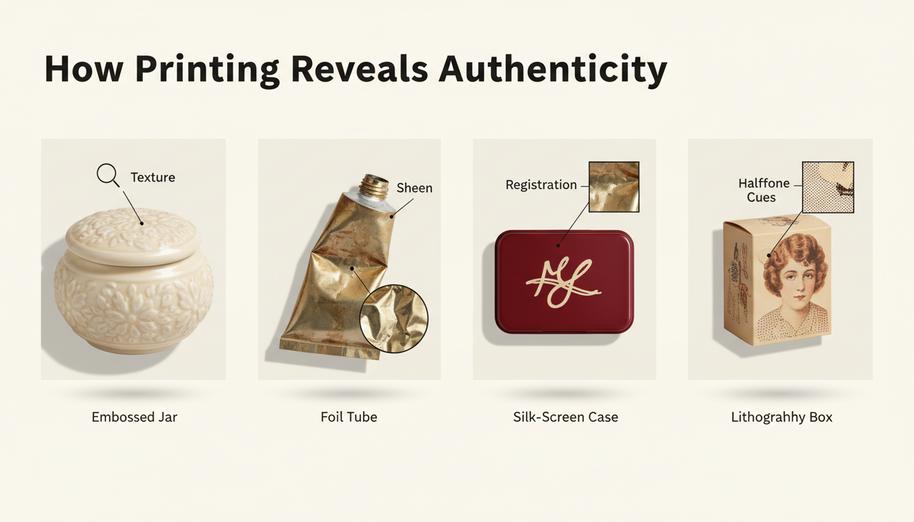 How Does Printing Reveal Authenticity?
A quick, real-world read on retro makeup packaging clues—how ink, foil, and texture quietly spills the truth. From vintage makeup packaging quirks to crisp reprints, these tells help you spot the real deal fast.
Embossing Patterns on Ceramic Jars
- Look at relief depth on pottery : authentic vintage jars show uneven pressure from the mold , giving a tactile texture that shifts under light.
- Check the glaze edge: slight pooling around raised design lines is normal in older pieces.
- Run a fingertip across letters
- Tilt under light
- Compare highs vs lows
Real retro makeup packaging feels alive; copies feel flat.
Foil Stamping Quality in Classic Tubes
Start with the metallic sheen .
Then trace the finish : tiny breaks in adhesive and edge softness suggest age.
-
Signs to weigh:
- subtle luster fade
- minor misalignment in precision
- material flex marks
Topfeelmakeup references classic standards here—clean, not sterile—so vintage makeup packaging keeps character without looking sloppy on items like an empty lipstick tube .
Silk Screen Printing on Victorian-Style Cases
Within mesh limits, ink lays a soft ridge.
Nested checks:
-
Registration
- slight drift at corners
- overlap where stencil meets substrate
-
Ink body
- faint pooling
- tactile detail on antique cases
Topfeelmakeup often mirrors this feel so retro makeup packaging reads authentic, not digitally perfect.
Lithography Detail in Mid-Century Boxes
Follow the plate logic: layered color builds with visible halftone dots.
-
Paper cues on paperboard :
- gentle ink spread
- occasional offset wobble
-
Illustration read:
- The edges aren’t razor sharp.
- tones stack, not flatten
Topfeelmakeup keeps that mid-century vibe, so retro makeup packaging shows life, not laser-cut sameness.
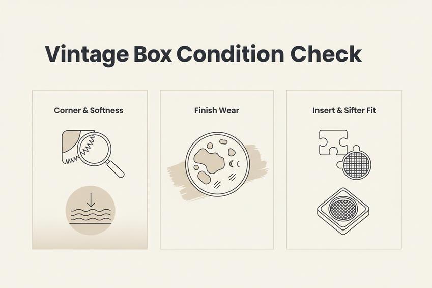 Auction Prep: Verifying Box Condition
Retro packaging fans know the box tells half the story. From faded glam to subtle wear, spotting real aging versus fake distress keeps your bid smart and your collection legit.
Inspect Paperboard Corners for Fraying
When checking paperboard builds in retro makeup packaging, corner wear should feel earned, not staged.
-
Core inspection flow:
-
Corner touch test
- Slight softness signals natural material degradation
- Sharp, stiff edges can hint at reproduction
-
Visual scan of corners
- Light fraying appears uneven
- Clean cuts look suspicious
-
Structural check
- Press gently to assess structural integrity
-
Collectors chasing vintage makeup packaging often notice that authentic cardboard ages like fabric—subtle, inconsistent, human. Testing paperboard tearing resistance under TAPPI standards reveals natural fiber weakening over time.
Examine Lacquering and Matte Finish Wear
Surface tells a story, and in retro makeup packaging, the finish is where that story gets loud.
Look for:
- uneven surface wear
- softened sheen
- micro scratches in coating
- Run light across the matte finish
- Tilt to catch dull patches
- Compare high-contact zones
“Authentic aging patterns in coated packaging show irregular abrasion tied to handling frequency rather than uniform degradation,” notes a packaging durability brief from Smithers.
Check Insert Tray & Sifter Stability
Inside matters just as much in retro makeup packaging.
-
Internal component review:
-
Insert tray fit
- Snug, no rattling
- Matches original mold lines
-
Sifter behavior
- Minimal movement
- Even dispersion holes
-
Overall packaging integrity
- Balanced internal fit
- No modern replacements sneaking in
-
Loose parts break the illusion fast. Vintage makeup packaging—and well-made retro packaging makeup—should feel cohesive, like every piece aged together, as seen in a precision 10g pressed powder compact case .
Worried About Fakes? Authentication Tips
Retro makeup packaging gets copied a lot, so spotting real from fake matters. When you handle vintage makeup, retro cosmetic packaging, or classic beauty packaging containers, small details tell big truths. This quick guide keeps things real—touch, look, compare—so your retro makeup packaging stays authentic, not just aesthetic. Topfeelmakeup also follows these checks when curating pieces.
Compare Screw Cap vs.Cork Stopper Seals
- Seal feel matters: a true cork stopper shows age, slight crumble, and natural material grain
- Screw cap threads on vintage packaging feel less sharp, often uneven
- Mismatch alert: modern on retro makeup packaging often signals replacement
- Twist slowly
- Check resistance
- Inspect residue near the seal
Evaluating cell elasticity under cork industry material benchmarks helps identify genuine vintage closures.
Test Frosted Glass Bottles for Genuine Frosting
Real frosted glass on a bottle has a soft, imperfect texture . Fake finishes look too even, almost sprayed on. Run a fingertip across the surface —authentic frosting feels slightly dry, not slick. Chemical etching techniques analyzed by the Society of Glass Technology confirm that genuine acid-etched frosted glass exhibits distinct micro-surface variations compared to modern spray coatings.
Verify Mirror & Powder Puff Inserts
-
Open the compact
-
Check mirror spotting (tiny age marks = good sign)
-
Examine powder puff fibers (older material feels denser)
- Compare stitching and insert fit
-
“Collectors are increasingly prioritizing material aging consistency over visual perfection,” notes a resale insights brief by Statista.
Topfeelmakeup applies similar quality checks across vintage makeup kits and modern powder makeup compact productions.
Evaluate Engraving Depth on Metal Cases
| Feature | Authentic engraving | Modern copy | Signal |
|---|---|---|---|
| Depth | Deep, varied | Shallow | Weak detail |
| Pattern | Slightly irregular | Too uniform | Machine-like |
| Craftsmanship | Hand-finished feel | Flat | Low authenticity |
Short read: true retro makeup packaging shows human touch. Crisp but imperfect. Hand tooling methods evaluated in historical metalwork guides from the Antique Scale & Instrument Collectors Society highlight how hand-engraved grooves differ from laser etching.
References
- Glass Packaging Institute Technical Standards – https://www.gpi.org
- Metal Packaging Europe Trade Guidelines – https://www.metalpackagingeurope.org
- McKinsey & Company Consumer Beauty Insights – https://www.mckinsey.com
- Plastics Industry Association Material Standards – https://www.plasticsindustry.org
- British Packaging Federation Standards – https://www.bpf.co.uk
- ISO 9001 Quality Management Systems – https://www.iso.org
- TAPPI Paperboard Testing Methods – https://www.tappi.org
- Smithers Packaging Durability Research – https://www.smithers.com
- Cork Quality Council Technical Guidance – https://www.corkqc.com
- Society of Glass Technology – https://www.sgt.org
- Statista Beauty & Personal Care Market Data – https://www.statista.com
- International Society of Antique Scale & Instrument Collectors – https://www.isasc.org

