

Why Lipstick Design Packaging Is the Secret to Brand Success in 2026
February 06,2026
You ever pick up a lipstick and, before even twisting the tube, know it’s worth the price tag? That snap of a magnetic cap… that weight in your hand… it’s no accident. In 2026, lipstick design packaging isn’t just pretty plastic—it’s pulling serious weight behind brand loyalty, shelf power, and eco street cred.
Here’s the kicker: Nearly 72% of beauty buyers say packaging influences whether they’ll buy again—more than color range or even product feel. (Source: McKinsey Beauty Consumer Report 2025). Your customer doesn’t have time for clunky caps or cheap-feeling tubes. She wants elegance with ethics—and she’ll switch brands in a heartbeat to get it.
Now toss in rising refillable systems, mono-material mandates from Europe to California, and Gen Z calling out greenwashing like it’s their side hustle… suddenly, packaging isn’t decoration anymore—it’s strategy.
So if you’re still treating lipstick tube options like afterthoughts on your bill of materials? Sit tight—we’re about to unpack why smart brands are putting packaging for cosmetics at center stage.
Key Points: lipstick design packaging
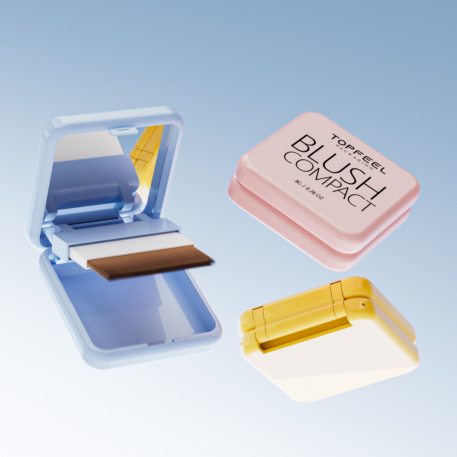
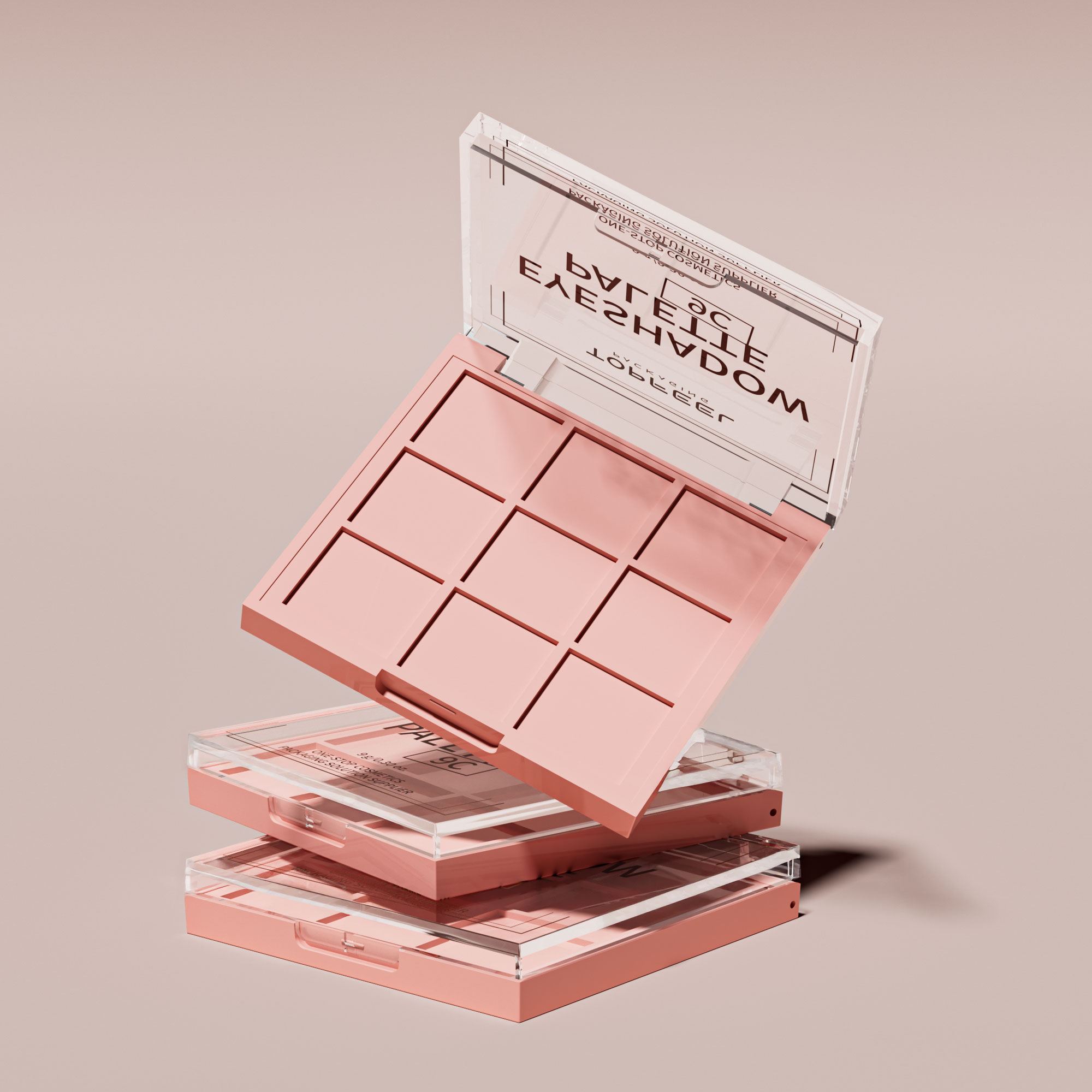
➔ Premium Touchpoints: Cap closure type, balanced weight, and ergonomic design instantly convey quality and influence repeat purchases.
➔ Material & Sustainability: Mono-material polypropylene, post-consumer recycled ABS/aluminum, and refillable mechanisms build eco-credibility in 2026 markets.
➔ Finish & Visual Impact: Matte, glossy, iridescent, soft-touch coatings, and UV finishes boost shelf presence and tactile appeal at scale.
➔ Structural Integrity: Tube diameter, base stability, precise twist mechanisms, and secure cap fit are essential for durability and user satisfaction.
➔ Decoration & Branding: Hot stamping, silk screening, pad printing, engraving, and clear labeling turn design features into recognizable brand signals.
Why Lipstick Design Packaging Defines Brand Success In 2026

Smart brands know that how a lipstick feels, looks, and opens matters just as much as the formula inside.
Brand signals buyers feel instantly: cap closure type, weight, and ergonomics
- A satisfying cap closure click isn’t just noise—it’s reassurance.
- Hefty in hand? That’s premium perception at play.
- Smooth curves and balanced ergonomic design? Comfort meets class.
- Magnetic closures are now the gold standard for luxury. They’re sleek, silent, and scream sophistication.
- Snap caps still work but often signal mass-market positioning—especially when paired with lightweight tubes.
- The weight of the tube influences expectations: heavier often implies quality—even if it’s not always true.
- Ergonomics matter more than ever in 2026—people want makeup that feels like it belongs in their hand, not just their bag.
A custom lipstick tube with poor balance or awkward shape can ruin even the most stunning shade. Shoppers notice these tactile details instantly—they’re subconscious cues about value and design intent.
Short impressions form fast:
• Heavy = luxe
• Light = cheap
• Smooth open = thoughtful
• Clunky snap = rushed
When someone holds your product for the first time, they’re already judging your brand before they swipe any color on their lips.
Premium vs. mass cues in aluminum and ABS tubes with metallic finishes
Let’s break it down visually:
| Material Type | Finish Style | Perceived Value | Common Use Case |
|---|---|---|---|
| Aluminum | Brushed Metallic | High | Prestige & luxury lines |
| ABS | Electroplated | Medium | Affordable premium |
| ABS | Gloss Molded | Low | Mass-market |
| Aluminum | Anodized Color | Very High | Designer collaborations |
ABS plastic is versatile—but without top-tier surface treatment, it rarely passes for premium. Still, when done right (like vacuum metallization), it can mimic real metal at a fraction of the cost.
Short segments:
- Aluminum tubes carry weight—literally and emotionally—they tell users this isn’t drugstore stuff.
- But smart brands use ABS tubes with high-gloss coatings to fake that upscale vibe without breaking budgets.
- Texture matters too: matte aluminum reads chic; shiny plastic sometimes reads cheap unless perfectly finished.
The trick lies in matching your material choice to your brand promise—cutting corners is obvious when consumers hold packaging up close under good lighting.
Refillable mechanisms and post-consumer recycled content as 2026 trust-builders
It’s no longer enough to look good—your packaging better do some good too.
- Start with a refillable core system using either recycled materials, like PCC-based ABS or reclaimed aluminum shells.
- Make swapping inserts easy—not fiddly—and keep aesthetics intact even after multiple uses.
- Communicate clearly on-pack about your sustainability choices; don’t make buyers dig through fine print to feel good about their purchase.
Nested grouping:
A) Refillable Mechanisms
- Twist-lock systems are popular due to ease of use.
- Magnetic refill cartridges add a layer of elegance but come at higher cost.
- Push-click cores are emerging as both functional and fun to use.
B) Materials That Build Trust
- Post-consumer resin (PCC content) gives plastic new life while cutting environmental guilt.
- Recycled aluminum reduces energy footprint by over 90% compared to virgin metal production.
- Compostable outer sleeves? Still niche but gaining traction among Gen Z shoppers looking for zero-waste options.
C) Emotional Impact
- Eco-friendly choices aren’t just logical—they’re emotional hooks that drive loyalty.
- Shoppers want brands that align with their values—and they’ll pay more if you prove you care too.
In short: sustainable doesn’t mean boring anymore—it means smart design wrapped around smarter ethics. If you’re not thinking green by now, you’ll be left behind by next season’s shelf resets.
The Future Trend Of Lipstick Design Packaging In Global Beauty Markets

The beauty world’s moving fast—and lipstick design packaging is racing right alongside it. Here’s how the new wave of materials, finishes, and sustainability goals are shaping what goes in your purse next.
Mono-material polypropylene tubes and caps are quietly taking over
- Mono-material designs make recycling way less complicated—no more prying off metal bits before tossing.
- Beauty brands are shifting to polypropylene for both tubes and caps, keeping things simple and sustainable.
- It’s all about reducing waste without cutting down on shelf appeal.
💡 A single-material package means fewer sorting steps at recycling plants, making it easier to close the loop in circular packaging systems.
Topfeel is already riding this wave, offering sleek lipstick formats made entirely from recyclable polypropylene, proving that eco-conscious doesn’t have to look boring.
Lightweighting through injection molding and smarter tooling strategies
- Brands want lighter packaging—because lighter equals cheaper shipping and a smaller carbon footprint.
- Using high-precision injection molding, manufacturers can cut down on material without sacrificing strength.
- Smarter tooling strategies mean lipstick tubes stay sturdy but weigh less in your hand or handbag.
This approach isn’t just about saving grams—it’s also about faster production cycles and lower energy use during manufacturing. That’s a win-win for both factories and the planet.
Iridescent and soft touch finishes meet UV coating for “premium at scale”
• Shiny but subtle? That’s where iridescent finishes come in—they catch light without screaming “glitter bomb.”
• Add a velvety layer with a silky-smooth soft touch finish, creating tactile luxury that feels expensive.
• Then seal it all with durable, glossy UV coating so colors pop under store lights—and resist scratches too.
This combo makes mass-produced lipstick feel boutique-level fancy. It also helps brands like Topfeel deliver upscale vibes across global markets without driving up costs per unit.
Biodegradable materials, recyclability claims, and carbon footprint proof points
Biodegradables are no longer fringe—they’re front row now. Compostable plastics made from corn starch or sugarcane are popping up as real contenders for cosmetic packaging. But flashy green labels aren’t enough anymore—consumers want receipts.
According to Mintel’s 2024 Global Packaging Trends Report: “72% of consumers say they trust sustainability claims only when backed by third-party verification or lifecycle data.”
That means brands need solid proof—like verified carbon emission stats or QR-code-enabled recyclability info—to win over eco-savvy buyers scanning shelves with their conscience turned on full blast. And lipstick design has become ground zero for this shift toward truly transparent green marketing.
Color, Texture, Structure: Lipstick Design Packaging Explained
From color finish to structural click, every part of lipstick design packaging tells a story. Let’s unpack how each element shapes consumer love at first swipe.

Color systems that sell: matte, glossy, satin, and metallic storytelling
Color isn’t just visual—it’s emotional. The right color palette can scream luxury or whisper minimalism.
- Matte finish = modern edge; think bold reds and deep berries for power looks.
- Glossy finish = youthful shine; perfect for pinks and peaches with playful vibes.
- Satin finish = versatile elegance; balances soft glow with rich pigment.
- Metallic finish = glam factor; often used in limited editions or festive collections.
“Over 72% of beauty buyers say packaging finish affects their perception of product quality,” according to Mintel’s 2024 Global Beauty Packaging Trends report.
The visual vibe of your lipstick starts long before the cap comes off—finish sets the tone.
Texture that lingers in memory: soft touch vs. engraved micro-patterns
What your fingers feel sticks longer than you’d expect. That first grip on a tube? It matters more than we realize.
- A soft touch coating offers a plush, velvety surface—think comfort meets class.
- Engraved patterns, like micro-ridges or subtle logos, boost tactile identity.
- Combining both can elevate sensory memory and encourage repeat use.
Textured packaging isn’t just fancy—it builds brand loyalty through subconscious sensory recall.
Structure essentials: tube, base, and cap roles in perceived quality
How solid is that snap? Does the base feel sturdy? These little things shape how premium your lipstick feels.
- The lipstick tube diameter influences grip comfort—too slim feels cheap, too wide feels clunky.
- A weighted base component adds stability when opened on a vanity or counter.
- The precision-fit of the cap design signals craftsmanship—and prevents purse disasters.
All these physical parts come together to define what consumers call “luxury.” It’s not just about looks—it’s about feel and function too.
Mechanism feel matters: smooth twist, secure click, zero wobble assembly
You twist it up—and if it wobbles? Instant turn-off. Mechanical precision is everything in good lipstick design packaging.
• A silky-smooth twist mechanism makes application effortless—not jerky or stiff.
• A satisfying click closure reassures users the product is sealed tight—no messes ahead.
• Zero-wobble means high-quality engineering—loose parts scream poor build even if the formula rocks.
That mechanical feedback loop between fingers and product builds trust—and keeps people coming back for more swipes.
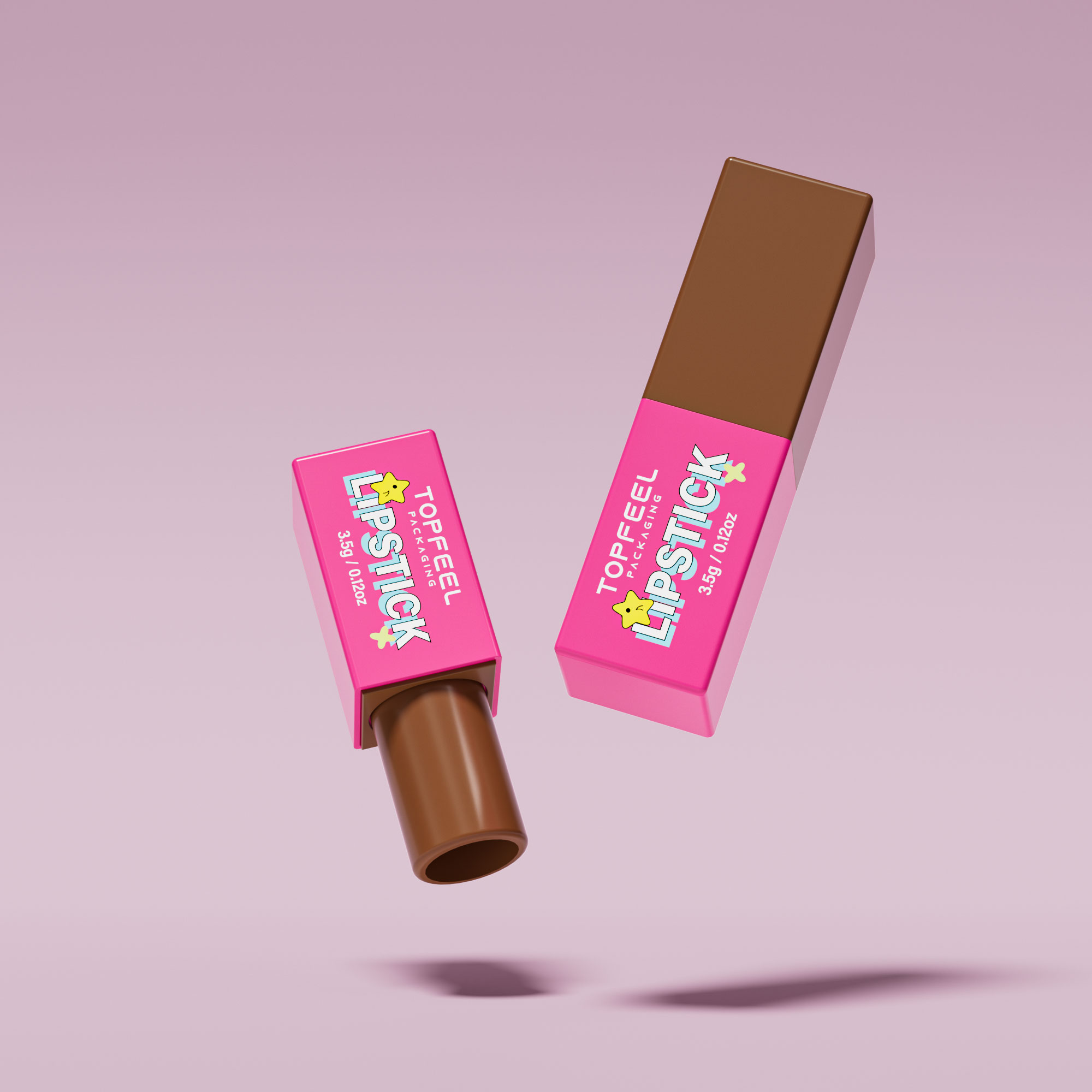
Decoration methods decoded: hot stamping, silk screening, pad printing, labeling
Surface decoration is where branding meets durability—and every method has its moment under the spotlight:
1️⃣ Hot stamping: Ideal for metallic effects—logos pop with foil finishes that won’t fade easily.
2️⃣ Silk screening: Great for multi-color designs across curved surfaces like tubes or caps.
3️⃣ Pad printing: Works well on irregular shapes—perfect for detailed logos on small areas.
4️⃣ Labeling techniques: Fast but less premium-feeling unless paired with textured materials or embossing tricks.
Each method leaves its own mark—not just visually but emotionally too—influencing how consumers remember your brand long after purchase.
Lipstick Packaging That Converts Shelf Attention Into Sales

Quick glances decide purchases. Smart lipstick design packaging catches eyes first—then seals the deal.
Shape that stops the scroll-in-aisle: bold silhouettes and balanced proportions
- A packaging silhouette that’s too generic? It disappears in seconds.
- But when you craft a tube with unique contours, it grabs attention even from the corner of your eye.
- Think hourglass curves, asymmetric caps, or squared-off edges—anything but boring cylinders.
- Start with a distinct geometric shape—triangular, oval, or even hexagonal.
- Balance it with an intuitive hand-feel using ergonomic design principles.
- Ensure every angle contributes to overall visual balance, not just novelty.
☑️ The goal isn’t shock value—it’s memorability paired with function.
A well-proportioned lipstick doesn’t just stand out; it invites touch. Shoppers scrolling past dozens of tubes online or scanning shelves in-store stop when they see something both familiar and fresh. That’s how smart lipstick design packaging wins.
Glossy vs. matte finishes for instant shelf contrast and brand recognition
Glossy dazzles under lights; matte whispers class. Both can be showstoppers—but only when matched to your brand’s vibe.
• Gloss = light bounce + high visibility = youthful energy
• Matte = soft diffusion + tactile elegance = premium feel
- Use high-gloss for energetic lines aimed at Gen Z—think playful colors and bold fonts.
- Go matte for minimalist branding where texture equals luxury.
- Combine both strategically—a matte base with glossy logo embossing ups both contrast and cachet.
“Visual texture plays as much of a role in product recall as color,” says Mintel’s 2024 Beauty Packaging Report.
The finish isn’t just about looks—it signals who you are before they ever twist the cap off your lipstick tube.
Hot stamping and UV coating that “pops” under retail lighting
Shoppers don’t squint—they scan fast under bright store lights. This is where clever use of foil stamping or UV gloss gives your packaging that extra snap.
Step 1: Choose reflective metallics for logos or accents using hot foil techniques—gold, rose gold, even holographic silver all scream premium without saying a word.
Step 2: Pair it with spot UV on strategic areas like embossed text or borders to boost tactile interaction under fingers and light beams alike.
Step 3: Test these effects under actual retail lighting conditions—not studio setups—to ensure maximum light reflection impact where it counts most: in-store aisles.
| Technique | Visibility Under Light | Tactile Impact | Cost Range ($/unit) |
|---|---|---|---|
| Hot Foil Stamping | High | Medium | 0.05–0.12 |
| Spot UV Coating | Medium | High | 0.03–0.10 |
| Embossed Foiling | Very High | Very High | 0.08–0.15 |
These little touches make your lipstick pop—and we’re not talking about just the shade inside the tube, but how shoppers remember your brand at first glance.
Smart inserts and applicators that upgrade unboxing without extra bulk
Unboxing is no longer just an afterthought—it’s part of the show now, especially in e-commerce beauty buys where physical contact is limited until delivery day.
Here’s how to nail it:
• Include compact yet functional tools like custom-shaped sponge tips or angled wands—these elevate experience without adding weight or waste.
• Add intuitive pull-tabs inside boxes so users don’t fumble during opening.
• Use low-profile trays made from recycled materials that fit snugly while still presenting the product like a gem in its case.
- Design starts by selecting an insert style:
- Flat-fit trays for minimalism
- Molded pulp forms for eco-conscious brands
- Fold-out flaps if storytelling matters more than simplicity
- Next comes applicator innovation:
- Curved brushes for lip contouring
- Click-to-dispense pens for precision
- Dual-ended tips if offering multiple finishes
- Then test usability:
- Does it feel natural?
- Can users open one-handed?
- Is there friction between ease-of-use and visual appeal?
When done right, these tiny tweaks help turn simple packaging into something people want to share—and reuse again too.
Smart choices around inserts aren’t fluff—they’re functional details that transform ordinary tubes into memorable experiences within modern-day lipstick design packaging strategies.
How Lipstick Packaging Design Influences First-Purchase Decisions

What makes someone grab one lipstick over another? It’s not the formula—at least not at first. It’s the packaging.
The first 3 seconds: color, closure type, and perceived hygiene of the cap
- A soft matte finish on a cap can scream “clean,” while a glossy surface might suggest fingerprints and smudges.
- Clicky snap closures often feel more secure than twist-offs, making users trust the product more.
- Color psychology kicks in fast—light pinks feel gentle and clean, while deep blacks hint at boldness or luxury.
- Customers subconsciously assess cap design, closure mechanism, and overall visual appeal within three seconds.
- If the tube looks sleek but feels flimsy, that disconnect creates doubt—even if it houses a killer formula.
- The combo of color + touch = instant judgment.
A lipstick with poor sealing or unclear materials can trigger hygiene concerns right away. That split-second reaction might be all it takes to put it back on the shelf.
Short shapes with smooth curves tend to feel more hygienic and modern. Sharp edges? Not so much.
Acrylic vs. aluminum tubes: what shoppers assume about formula and price
- Acrylic says “lightweight” and “everyday wear.” Think sheer tints or balmy textures.
- Aluminum shouts “premium.” Heavier in hand, often paired with richer colors or matte formulas.
- Durability matters too—scratched-up acrylic loses trust points fast.
-
Shoppers link material choice directly to formula quality:
- Clear acrylic = fresh, trendy
- Solid aluminum = rich pigments, long-wear
-
They also tie weight to value—heavier tubes are seen as worth more money.
“According to Mintel’s 2024 Beauty Packaging Report, 67% of consumers say heavier packaging makes a product feel more luxurious—even before testing it.”
The tactile experience matters just as much as visual cues when evaluating lipstick design packaging for that first buy.
Labeling and engraving that turn claims into confidence
• Labels printed in high-resolution fonts build instant trust—blurry text does the opposite.
• Engraved logos signal permanence; they’re not going anywhere (just like your lip color shouldn’t).
• Sustainability badges only work if they look legit—not like they were slapped on last-minute.
- Clear typography boosts belief in performance claims like “12-hour wear” or “smudge-proof.”
- Embossed elements add texture that translates into perceived authenticity.
- Consistent branding through label design reinforces brand memory after purchase.
A label isn’t just decoration—it’s proof of promise. When done right, it transforms marketing fluff into something tangible you can believe in—even before swatching on your wrist.
When shoppers evaluate lipstick design packaging during that crucial pre-purchase moment, every detail—from font clarity to material weight—can make or break their decision to commit.
Is Your Lipstick Design Packaging Hurting Repeat Purchases?

Every swipe starts with the packaging. If it fails, users don’t come back. Let’s unpack why smart lipstick design packaging keeps customers loyal.
Loose caps and weak closure types: the #1 purse-fail that breaks loyalty
• A cap that pops off in a purse? Instant dealbreaker.
• Closure types matter more than you think—clicks, snaps, or magnets all affect user trust.
• When cap retention fails, product leakage ruins not just the lipstick but the bag too.
“Over 72% of consumers cited poor packaging failure as a reason for switching brands,” according to a 2024 report from Mintel Beauty & Personal Care Insights.
A secure closure isn’t just about looks—it’s about protecting your formula and your customer’s day.
Mechanism burnout: how poor assembly tolerances ruin the twist experience
- Users twist. Mechanism jams. Mood killed.
- Poor assembly tolerances lead to wobbly tubes and early burnout.
- Without precise component fit, even premium formulas feel cheap.
Twist quality is tactile branding—every turn should feel smooth and intentional. Topfeel nails this by fine-tuning every part of its mechanism design, ensuring consistent performance over time.
Refillability vs. disposable tubes: what repeat buyers expect in 2026
♻️ Refillable formats are rising fast—especially among eco-conscious Gen Z buyers.
💄 But if it doesn’t feel luxe, forget it; nobody wants flimsy greenwashing.
Today’s buyers want sustainable choices without compromising style or function in their refillable packaging. Disposable options still have space—but only when they’re ultra-convenient or budget-friendly.
Multiple studies show refillables drive higher engagement and longer brand relationships when paired with thoughtful aesthetics and intuitive use.
Recycled content without durability loss: balancing ABS strength and sustainability
-
The challenge:
- Using recycled materials
- Maintaining strong mechanical properties
- Protecting long-term product integrity
-
The solution:
- Smart blends of post-consumer resins
- Reinforced mold structures
- Testing under real-world usage scenarios
When done right, recycled ABS can offer both eco appeal and real toughness in your lipstick design packaging strategy. It’s not just about checking a sustainability box—it’s about keeping your product beautiful through daily wear-and-tear without sacrificing on material strength or finish quality.
Topfeel has already begun using high-grade recycled blends that pass drop tests while still looking runway-ready in-hand—and that balance is exactly what modern beauty buyers expect now.
FAQs
What tells customers a lipstick package is premium the instant they hold it?
- Magnetic or snug closure types hint at trustworthy craftsmanship.
- Balanced weight and ergonomics deliver that quiet “click” moment of luxury.
- Smooth-turning mechanisms and bases—no shake, no hesitation—speak precision.
✨ Hints of brushed aluminum or metallic finishes suggest permanence despite daily use.
How do materials color a shopper’s sense of quality?
A brief glance reveals:
| Material | Emotional cue | Market effect |
|---|---|---|
| Aluminum | Prestige & endurance | Signals upper-tier pricing |
| Acrylic | Clarity & innovation | Appeals to modern buyers |
| Polypropylene (mono-material) | Responsibility & simplicity | Reinforces brand eco-values |
Each choice reshapes perception long before anyone tests the formula inside.
Why is mono-material polypropylene stealing attention in new orders?
Short story structure with bullet expansions:
- Because recyclability feels personal: one single material means less sorting guilt.
- Manufacturers smile too: fewer steps in assembly, lighter transport weight, smaller carbon footprint.
Light yet firm, this tube–cap duo proves sustainability doesn’t have to look plain.
Which decoration approach glows best under store lighting?
Combination style: numeral rhythm meets emotion line by line.
1️⃣ Hot stamping: metallic allure flashing like jewelry beneath LEDs.
2️⃣ Silk screening: crisp logos holding sharp contrast on matte grounds.
3️⃣ UV coating: glossy films amplifying depth over bright pigments while reducing label peel issues through careful curing during extrusion-based finishing.
The goal isn’t only brilliance—it’s memory retention from three feet away.
How can refillable mechanisms turn casual buyers into loyal fans?
Symbol-style blend + human curve storytelling: ♻️ Refillable empty lipstick tube options or aluminum shells, sturdy across thousands of twists; ♥ keep emotional touchpoints intact when refilling favorite shades.
• Encourages waste avoidance via durable inner inserts instead of full replacements.
• Adds ritual value—the small twist-and-swap becomes part of each morning routine.
That continuity turns packaging into companionship rather than disposable décor.
References

