

Why is the Retro Packaging Trend Dominating Design in 2026?
January 26,2026
In 2026, the retro packaging trend isn’t just playing dress-up—it’s stealing the show. Vintage lipstick tube bullets, frosted glass powder compact case designs, and old-school aluminum tubes are flying off shelves like limited-edition vinyl records. Brands are cashing in on nostalgia because it hits where it hurts (and sells where it counts): emotion.
“Aesthetic familiarity builds trust faster than function,” says consumer behavior analyst Dr. Renee Haskins of NielsenIQ, citing a 22% higher purchase intent for products with vintage-inspired designs compared to their modern counterparts.
And sourcing managers? You’re not chasing trends—you’re calculating ROI in grams and gloss levels. Retro doesn’t just look sharp; it ships well, photographs better, and holds its own under REACH scrutiny.

The Surprising Rise of Retro Packaging in Modern Design
The retro packaging trend is rewriting the rules of shelf appeal—where old-school charm meets next-gen branding.
Nostalgic Materials
- Eco-friendly cardboard boxes are making a comeback, not just because they’re biodegradable but because they remind people of simpler times.
- Brands are leaning into kraft paper, rough textures, and raw finishes—it’s all about that handmade vibe.
- Glass isn’t just glass anymore. Think amber glass, thick bases, and a weight that screams premium.
- Shoppers now associate recycled materials with authenticity. If it feels reused, it feels real.
- Even the smell of certain packaging—like earthy tones from uncoated cardboard—triggers memory cues.
- More than 60% of consumers say sustainable choices influence their buying habits.
- Biodegradable doesn’t mean boring; many brands are using textured embossing on cardboard for added flair.
- Glass bottles now come in uniquely vintage hues and shapes to match nostalgic themes.
♻️ Sustainable nostalgia is no longer niche—it’s the new normal.
By mixing sustainability with throwback vibes, brands tap into emotional triggers while staying future-forward. That’s why Topfeelpack champions these materials—they’re good for the planet and even better for brand storytelling.
Unique Shapes
• Round is back—but not just any round. Think squat cylindrical jars that look like something your grandmother used to keep jam in. • Custom mold development allow brands to create signature silhouettes that scream “you’ve never seen this before.” • Ergonomics matter too—those curves aren’t just cute; they fit snugly in your hand or bag.
Grouped by function: – Visual Appeal: Retro-style bottle necks, fluted edges, curved shoulders – Functionality: Easy-to-grip forms, stackable bases, pour-friendly tops – Brand Identity: Signature silhouettes matched with vintage fonts
Consumers don’t just want something pretty—they want something practical that still gives them those warm fuzzy feelings from the past.
Vintage Colors
| Color Group | Emotional Effect | Popular Pairings | Usage Frequency |
|---|---|---|---|
| Earth Tones | Grounded + Natural | Kraft paper + twine | High |
| Pastel Colors | Soft + Whimsical | Matte finishes + gold foil | Medium |
| Muted Hues | Calm + Sophisticated | Amber glass + black text | High |
| Metallic Gold | Luxe + Nostalgic | Navy blue + serif fonts | High |
Pantone-matched palettes are being used more strategically than ever before. A well-selected shade can transport someone straight back to their childhood kitchen—or an old apothecary shop downtown.
Muted greens with a touch of copper? That says “heritage.” And when paired with aged textures or gloss-free coatings, these colors make products feel like heirlooms instead of commodities.
Design Techniques
“Consumers don’t buy products anymore; they buy stories,” according to Mintel’s 2024 Global Packaging Trends report—and nothing tells a story better than texture you can feel and labels you want to keep peeling off (but won’t).
– Embossed logos create instant tactile recognition—your thumb knows luxury when it feels it. – Die-cut custom labels in irregular shapes break away from cookie-cutter design templates. – Foil stamping adds shine where it counts—especially over muted backgrounds or on top of kraft paper surfaces.
Step-by-step enhancements: 1) Start with thick material like uncoated board or textured stock. 2) Add layers using screen printing or selective varnish for contrast. 3) Finish with debossing or raised ink for a final sensory payoff.
When done right, these design techniques do more than decorate—they elevate perception and build trust at first touch.
Retro packaging trend elements aren’t just about looking cool—they’re about feeling familiar while standing out loud on shelves today.

Reasons Why Retro Packaging Is Making a Comeback
The retro packaging trend is more than just a throwback—it’s a smart mix of nostalgia, sustainability, and standout design.
Sustainable Sourcing Practices
- Sustainable materials like recycled paperboard and biodegradable plastics are now go-to choices for brands embracing the retro packaging trend, offering that old-school charm without trashing the planet.
- Many companies are shifting to recycled content, including post-consumer waste cardboard and glass bottles that bring vintage flair while cutting down on landfill overflow.
- An uptick in eco-friendly design isn’t just about looks—minimalist graphics on kraft paper or tin evoke the past while reducing ink use.
- The rise of biodegradable packaging means those charmingly rustic boxes don’t sit in landfills for decades.
- Brands are leaning into ethical sourcing, ensuring raw materials come from suppliers that treat workers fairly and minimize environmental harm.
- Tapping into vintage aesthetics helps brands stand out on cluttered shelves with hand-drawn fonts, muted colors, and nostalgic textures.
- This all feeds into the growing push toward a circular economy, where packaging lives multiple lives before returning to nature or industry.
Certification Standards
You can’t talk about responsible retro-inspired packaging without mentioning compliance. It’s not just about looking good—it’s about being safe and accountable.
• Products aligning with the retro vibe often undergo strict checks to meet REACH regulations, which limit harmful substances in materials.
• The classic look doesn’t mean outdated safety; adherence to the RoHS directive ensures electronics and components inside retro-styled packages remain free from toxic heavy metals.
• Trust is built through visible signs of quality—think seals showing full regulatory compliance stamped right onto labels.
• Modern consumers expect transparency; they want proof their favorite throwback brand follows top-tier environmental standards set by global watchdogs.
• Behind every package is a trail of documentation—full-on material certification processes confirm what goes into each box meets eco-conscious expectations.
• These certifications also enforce strict rules around chemical usage through detailed lists of approved substances under global frameworks for chemical restrictions.
The result? Retro looks with modern peace of mind baked right in.
Decorative Elements
Retro isn’t subtle—it pops off shelves like your grandma’s soda bottle label used to. Here’s how:
1️⃣ Start with bold color palettes reminiscent of mid-century signage—these hues grab attention fast.
2️⃣ Add some shine using hot stamping, which presses metallic foil onto logos or borders to create that luxe shimmer you remember from vintage chocolate tins.
3️⃣ Layer in a glossy finish via precise UV coating, giving surfaces a slick feel while protecting printed designs from fading or scratching over time.
4️⃣ Combine both embellishments strategically—not overdone—to elevate your brand’s perceived value without overwhelming minimalistic layouts common in nostalgic styles.
Together, these details deliver more than just looks—they offer an immersive tactile experience that makes unboxing feel like opening a keepsake rather than just another product.
By weaving together authentic visuals with premium finishes, today’s brands are proving that the old-school way can still be the best way—with polish.
Why Retro Packaging Trend Is the Future of Branding
The retro packaging trend is shaking up how brands connect with consumers, blending old-school cool with modern-day needs. Here’s how it’s shaping what’s next.
Volume Variations
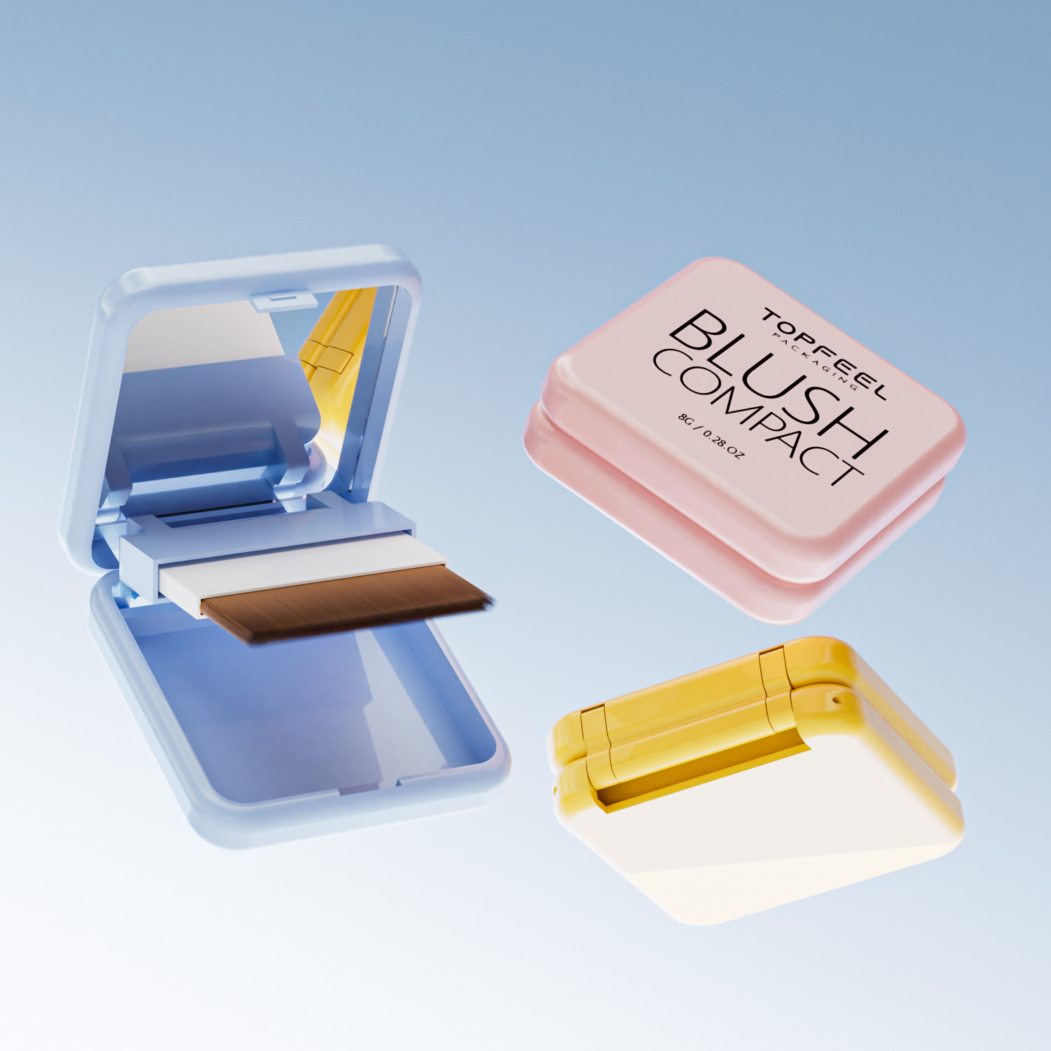
Smaller sizes are stealing the spotlight. Think compact, cute, and clever—here’s why brands are shrinking down:
- Miniature packaging like 10g pressed powder compact case fits seamlessly into purses or travel kits.
- 200ml cleansing oils hit the sweet spot between usability and portability.
- Consumers love options—smaller formats allow trial without full commitment.
- Influencers favor these sizes for flat lays and “what’s in my bag” posts.
- Smaller volumes reduce waste, aligning with growing eco-conscious values.
- Brands can offer more SKUs with limited shelf space.
- These formats scream exclusivity when paired with vintage-inspired labels.
This shift in product sizing isn’t just practical—it’s stylish. The retro vibe gives these tiny packages a big personality.
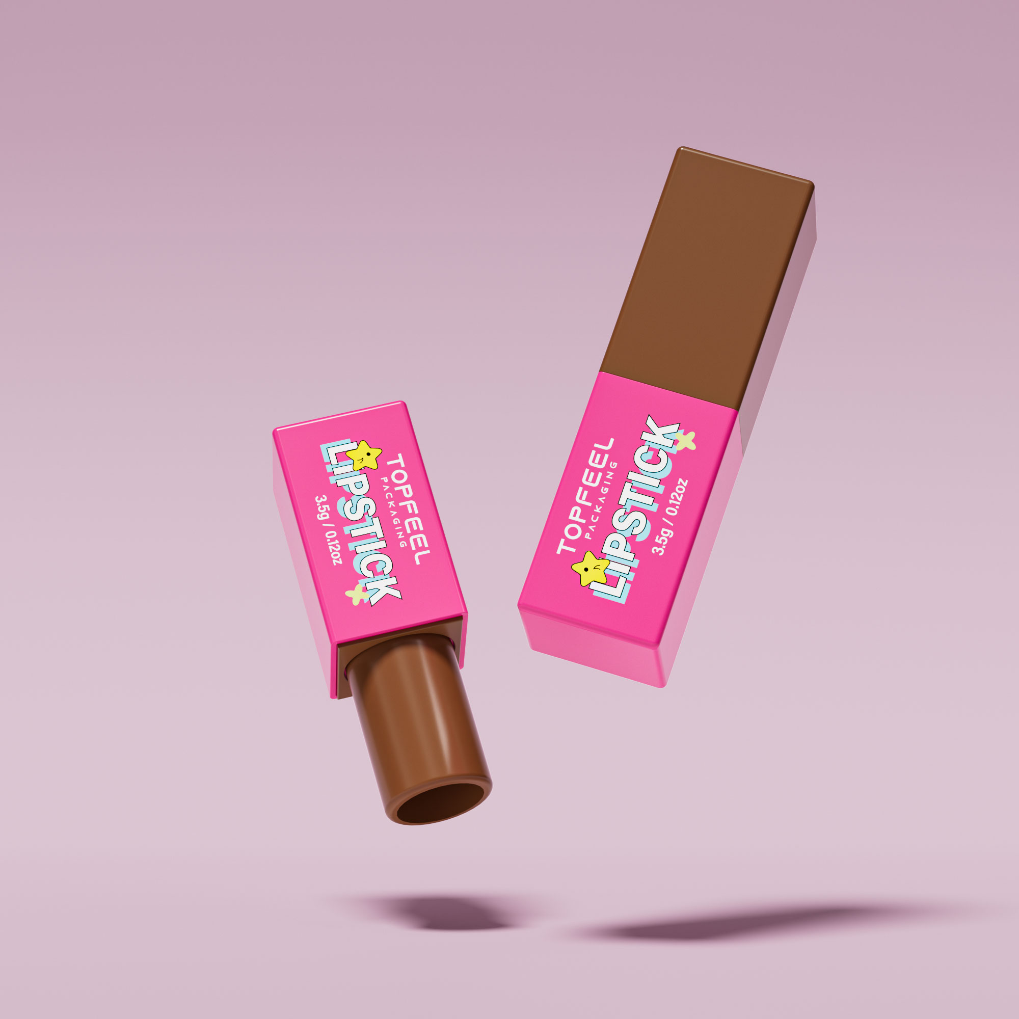
Mechanisms Matter
You know that satisfying click when twisting up a classic lipstick? That’s not just nostalgia—it’s smart design. The appeal of lipstick mechanisms in retro tubes comes down to:
- Functional ease that beats flimsy alternatives—no awkward twisting here.
- A sensory experience that taps into memory and emotion.
- Durable inner components built for repeated use without jamming.
• Modern consumers want more than looks; they want tactile feedback too.
• Classic tube functionality offers both flair and reliability.
Incorporating mechanical charm into today’s beauty tools means bringing back vintage class without sacrificing performance—a win-win for brands chasing the retro design wave.
Visual Identity
Color does more than catch your eye—it shapes perception. Check this out:
| Gradient Effect Type | Consumer Emotion | Perceived Value | Market Adoption (%) |
|---|---|---|---|
| Warm-to-cool blend | Calm & balanced | Premium | 38% |
| Monochrome fade | Minimalistic | Clean | 26% |
| Neon gradient | Edgy & bold | Trendy | 21% |
| Pastel transitions | Soft & nostalgic | Friendly | 15% |
These gradients aren’t just pretty—they’re strategic tools that elevate visual identity, boost shelf appeal, and signal brand personality at a glance.
So yeah, when you mix smart color psychology with retro cues, you get packaging that doesn’t just look good—it sells itself.
Future Trends
“Retro is no longer niche—it’s mainstream,” noted Mintel in its Q2 2024 Packaging Innovation Briefing. And nothing says future-meets-past like metal-infused design.
Here’s where it gets interesting:
• Using aluminum alloy adds durability without bulking things up. It feels luxe but stays light.
• Pairing this material with curved embossing or deco-style fonts nails that perfect balance between sleek and nostalgic.
• This combo also leans sustainable—aluminum is recyclable and increasingly favored by eco-conscious shoppers.
As consumer expectations evolve, materials matter more than ever. Brands like Topfeelpack are already fusing traditional forms with forward-thinking materials to stay ahead in the ever-growing world of the retro packaging trend.

Can Retro Packaging Enhance Brand Recognition?
Retro packaging isn’t just about nostalgia—it’s a smart tool that can boost visibility and deepen consumer connections.
Comparative Effectiveness
- Retro design often uses tactile materials like tin or textured paper, which contrast sharply with the sleek minimalism of modern design, making products feel more personal.
- Consumers tend to associate retro design with authenticity and trust, while modern design signals innovation and efficiency.
- A recent NielsenIQ study found that brands using nostalgic elements saw a 12% increase in impulse purchases compared to those with purely contemporary looks.
• Retro packaging taps into memory-based buying behavior, increasing emotional resonance. • Modern designs focus on shelf clarity but can blend into the crowd.
Brands aiming for standout shelf presence are increasingly turning to the retro packaging trend, especially when targeting Gen X and Millennial consumers who respond strongly to vintage cues.
The Psychology of Shape
Short, punchy insights:
• Round shapes = comfort & approachability. Think lip balm tube tins or compact mirrors—very tactile. • Square bottles = order & sophistication. They suggest high-end, structured branding.
Consumers subconsciously connect shape with function. A circular compact feels intimate and soft—ideal for personal care items where emotion matters. A square bottle feels solid and premium—perfect for perfumes or serums where luxury is key.
According to Mintel’s Q2 Beauty Packaging Report from April 2024, “Shape impacts perceived product value more than color alone.” That’s why brands experimenting with both round cases and square bottles are seeing better engagement across diverse age groups.
By blending clever use of shape psychology with the ongoing pull of the retro packaging trend, brands can stir up both recognition and desire without saying a word.
FAQs about Retro Packaging Trend
How does the retro packaging trend influence buyer decisions in beauty products?
- It stirs nostalgia with tactile materials like eco-friendly cardboard boxes or glass bottles.
- Rounded edges, such as a round compact case, invite familiarity.
- A shimmering metallic gold finish hints at past glamour while aligning with modern taste.
→ The mix of memory and modern styling turns casual interest into purchase intent.
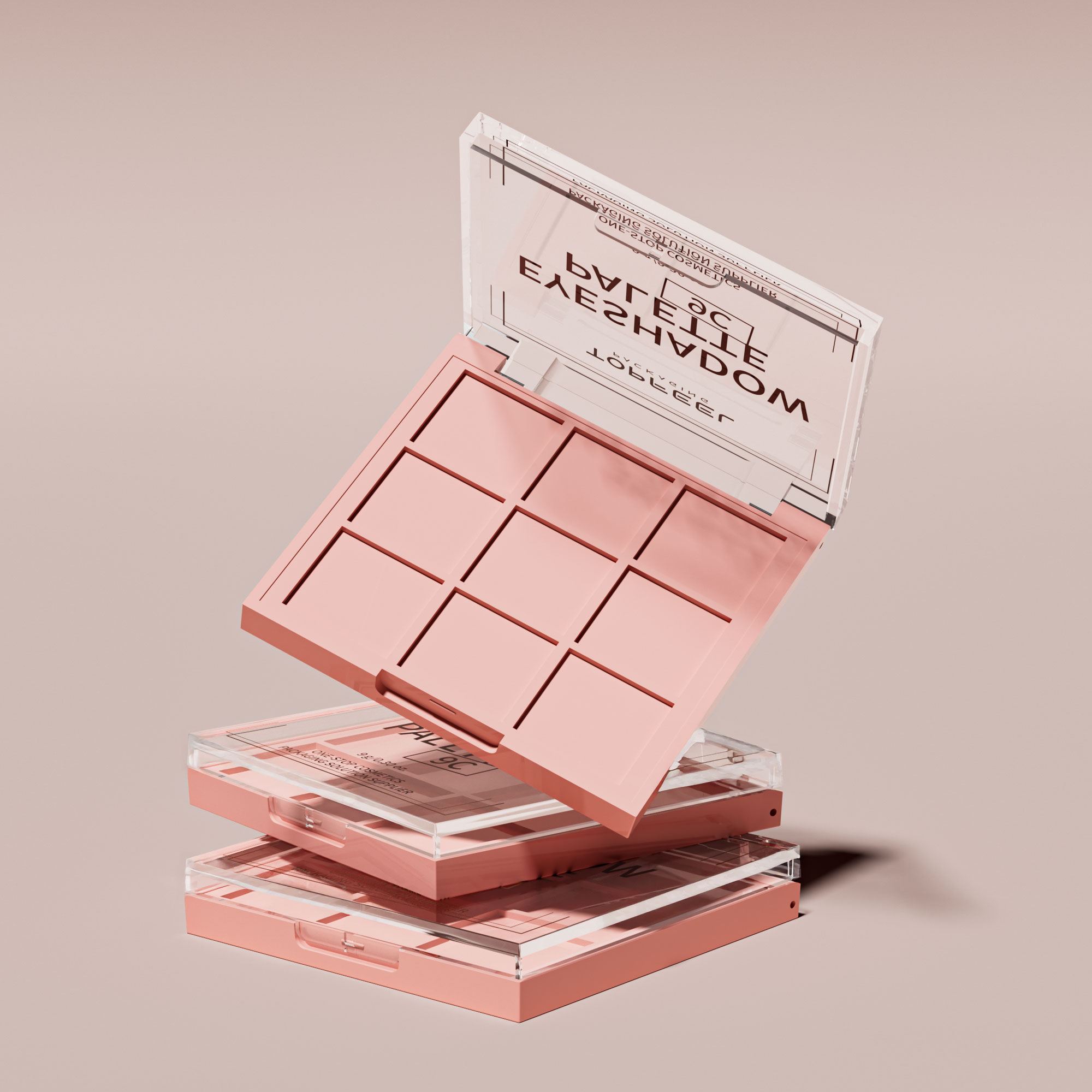
What are the best material and shape choices for large-scale makeup lines seeking vintage charm?
- PET plastic & Acrylic resin: Durable yet lightweight — ideal for travel-size items like a 5g lip balm container.
- Glass bottle: Luxurious feel for premium fills such as a 15ml serum bottle or 30ml foundation bottle.
- Shapes that tell stories: Cylindrical container shapes whisper elegance; square bottle designs project authority; oval shaped palettes add artistry to eyeshadows.
Why is certified sourcing critical when adopting retro-inspired cosmetics packaging?
△ ISO 9001 compliance guarantees production discipline you can trust.
△ REACH regulation adherence keeps chemical safety transparent across borders.
△ RoHS compliant materials protect global consumers from harmful substances while preserving heritage aesthetics through careful metal use (aluminum alloy lipstick tube mechanisms, for instance).
Which decoration techniques give traditional containers an exciting new presence?
— Hot stamping foil breathes gilded life into flat surfaces or curves alike, perfect on cylindrical perfume sprays using an atomizer spray pump.
— Silk screen printing locks Pantone matched colors deep within acrylic resin jars for vivid identity retention over years of display use.
— UV coating finish defends matte black coatings against fading, ensuring rectangular box packaging retains its bold silhouette under store lighting.
— Embossed texture design plus custom label application delivers both touch and recognition in boutique runs.
How is the retro spirit shaping bulk buyers’ investment strategies today?
A short branch line of thought: Nostalgic looks now meet performance needs — recycled PET married to durable mascara brush applicators under gradient color effects — creating product lines that stay stylish yet practical.
| Buyer Aim | Matching Element | Emotional Hook |
|---|---|---|
| Sustainability | Sustainable sourcing practices + FDA approved plastic | Care paired with conscience |
| Premium shelf impact | Glass bottles & aluminum alloy accents | Echoes of timeless prestige |
| Stand-out branding | Custom tinted options + embossed texture designs | Object feels uniquely theirs |
References
[Packaging That Wins – NIQ – https://nielseniq.com/global/en/insights/webinar/2026/webinar-packaging-design/]
[Cosmetic Packaging Trends 2026 – Somewang – https://somewang.com/blog/cosmetic-packaging-trends/]
[Global Packaging Predictions: 2026 & Beyond – Mintel – https://www.mintel.com/insights/packaging/global-packaging-trends/]
[Mintel announces Global Consumer Trends for 2024 – https://www.mintel.com/press-centre/mintel-announces-global-consumer-trends-for-2024/]
[Beauty Consumer and Packaging Trends 2025 – Bubble Paper – https://www.bubblepaper.com/blog/beauty-consumer-and-packaging-trends-2025]
[Guide for Makeup Manufacturers: Ensure Understanding of REACH Regulations – https://xirancosmetics.com/makeup-manufacturers-ensure-understanding-of-reach-regulation/]
[RoHS Directive – Environment – European Commission – https://environment.ec.europa.eu/topics/waste-and-recycling/rohs-directive_en]
[REACH Services for Cosmetics and Personal Care Products – Intertek – https://www.intertek.com/assuris/chemicals/regulatory/reach-cosmetics-and-personal-care-products/]
[RoHS Compliance FAQ – RoHS Guide – https://www.rohsguide.com/rohs-faq.htm]

