

How to Choose the Best Palette Red for Your Skin Tone and Style
January 20,2026
There’s a reason palette red keeps stealing the spotlight—it’s bold without begging, classic without trying too hard. But picking the right red for your product line isn’t just about what looks good in a catalog; it has to wear well on real skin and tell a story that shoppers feel in their bones. And if you’re selling to everyone from porcelain to deep espresso tones? You better believe not all reds are riding in the same lane.
Truth is, consumer behavior shows that shoppers are more likely to buy again from brands that “get” their specific needs—according to NielsenIQ’s beauty industry analysis. That means brand loyalty starts at shade-matching.
Some reds flirt. Others command respect like an old-school movie star walking into a room full of mirrors.
If you’re ordering custom cosmetic packaging by the tens of thousands, this isn’t about chance—it’s strategy with flair. Let me walk you through how skin tone meets finish meets the kind of palette red that actually moves units.
Palette Red Essentials: The Key Notes for Success
→ Understanding Undertones: Recognize warm, cool, and neutral undertones to determine which palette reds flatter different skin tones.
→ Choosing Finish Types: Consider the impact of glossy versus matte finishes on the overall appeal of your palette red products.
→ Custom Colors Matter: Tailor your palette red to meet consumer preferences through custom color options.
→ Material Selection: Select the right materials such as acrylic plastic or glass that enhance the quality perception of your palette red packaging.
Understanding Skin Undertones for Palette Red Selection
Picking the right red isn’t just about what catches your eye—it’s about syncing with your skin’s undertone. Let’s break it down.
The Warm vs. Cool Undertones Dilemma
• If your veins look greenish, you likely have a warm undertone; if they appear blue, it leans toward a cool undertone.
• Gold jewelry flatters warm tones, while silver pops on cool ones—classic clues from the old-school jewelry test.
• A quick swipe of different red shades can also reveal which direction your skin tilts when choosing a flattering tone.
Cool-toned folks should reach for blue-based reds like cranberry or cherry, while warm-toned beauties shine in orange-reds and tomato hues. Keep that in mind next time you’re scanning through a lipstick tube aisle or building out your go-to palette red options.
Finding the Right Red: Golden Undertones
🟊 Golden-skinned individuals have that sun-kissed glow year-round, thanks to their underlying yellow and peachy hues.
🟊 Think coral reds, brick reds, and even burnt orange—they vibe perfectly with the warmth radiating from golden tones.
According to makeup artistry standards, consumers with golden complexions are often advised to select coral-based reds when selecting products for their beauty kits. That’s no coincidence—these shades naturally amplify the brightness in those with a strong golden undertone, making them ideal candidates for warm-side picks in any curated red palette.
Neutral Undertones: The Best of Both Worlds
- Neutral skin is like that friend who gets along with everyone—versatile and balanced.
- You can pull off both cool and warm reds without clashing.
- Look great in universal shades like: • True red • Berry red • Blue-red • Orange-red
This flexibility means you can experiment freely across the entire spectrum of the red palette without worry. Whether you’re reaching for an everyday stain or crafting a full-glam moment, neutral tones are blessed with more freedom when navigating their personal version of the perfect palette red.
| Skin Tone Type | Recommended Reds | Jewelry Match | Vein Color |
|---|---|---|---|
| Warm | Coral, Brick | Gold | Green |
| Cool | Cranberry, Cherry | Silver | Blue |
| Neutral | True Red, Berry Red | Both | Mixed |
When you know where your skin tone stands—whether it’s leaning into peachy warmth or sitting comfortably at center—you’ll never again second guess which shade belongs in your custom-picked collection of rich crimson hues.
5 Key Factors to Choose Your Ideal Palette Red
Finding the right palette red is all about balancing style, function, and feel. Let’s break down what really counts.

Glossy Finish vs. Matte Finish: Which Do You Prefer?
• Glossy finishes reflect more light, giving a slick, wet-look vibe that pops under lighting—great for bold personalities who love shine.
• On the flip side, matte finishes absorb light and offer a flat texture that feels more muted and elegant—perfect if you’re into subtle sophistication.
• Some folks even mix both textures across products to match different moods or occasions.
Each finish affects how your chosen palette red shows up on skin or packaging—it’s not just about looks but also about how it wears over time.
The Impact of Material: Acrylic Plastic vs. Glass Bottles
Choosing the right bottle material can change everything—from portability to perception.
Grouped comparison below:
| Feature | Acrylic Plastic | Glass Bottles |
|---|---|---|
| Weight | Lightweight | Heavier |
| Durability | High impact resistance | Fragile under pressure |
| Feel | More utilitarian | Premium and sleek |
| Sustainability Score | Moderate | Higher due to recyclability |
If you’re after something tough and travel-friendly, go with clear cosmetic tube solutions. But if you’re into luxe vibes and don’t mind a bit of weight, glass pump bottles are your best bet for showcasing that perfect shade of palette red.
Custom Colors: Tailoring Your Palette Red
According to Mintel’s Global Beauty Trends, beauty consumers now expect personalized shades as standard. That says it all.
You don’t have to settle for off-the-shelf anymore:
- Want a deeper burgundy twist? Done.
- Need a warmer undertone for golden skin? Totally doable.
- Mixing pigments lets you create your signature version of palette red, whether it’s cherry-bright or brick-deep.
Customizing your color means aligning it with your identity—and that’s powerful stuff when every detail matters.
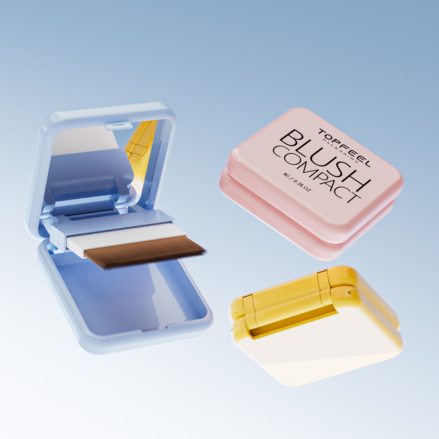
Closure Type: Magnetic vs. Screw Caps for Convenience
Step-by-step breakdown:
1️⃣ If speed is your thing—go empty magnetic palette. These closures snap shut instantly with minimal effort and feel satisfyingly secure with each click.
2️⃣ For those who prefer old-school reliability—screw caps are still king. They seal tighter and are less likely to pop open during travel or drops.
3️⃣ Consider where you’ll use it most often—at-home vanity setups love magnets; on-the-go users may lean toward screw tops for extra peace of mind.
Ultimately, both closure types work—it just depends on how you interact with your go-to bottle of palette red day-to-day.
How Different Palette Reds Suit Various Skin Tones
Picking the right red isn’t just about the color—it’s about how it vibes with your skin tone.

Light Skin Tones: What to Look for in a Shade
- Fair skin pairs beautifully with pinkish reds, which add warmth without overwhelming.
- Go for blue-based reds—they cool down redness and give your lips that crisp pop.
- People with a pale complexion often find that sheer finishes offer just enough color without looking too bold.
- If you’ve got cool undertones, steer toward shades like raspberry or cherry—they complement without clashing.
- Avoid anything too orange-heavy; it can wash you out fast.
- A swipe of bright red works great when paired with minimal makeup—let the lips do the talking.
- Try layering different tones to find what flatters best. Mixing gloss over matte can also balance intensity.
Whether you’re testing drugstore brands or high-end picks, always swatch under natural light. That way, you’ll see how each variation of segmented palette red plays off your undertones.
Mid-Tone Skin: The Power of Pearlescent Pigments
Sometimes it’s all about that subtle shimmer. If you’ve got medium skin, especially with those golden or slightly greenish hues known as olive undertones, then you’re in luck—your tone is super versatile.
• Start with pearlescent reds, which catch light and add dimension without looking flat.
• Opt for shades like berry reds or even muted corals; they harmonize well with both warm and neutral bases.
• Don’t shy away from shimmer-rich formulas—these work wonders on folks with both neutral and warm undertones.
- Apply a base balm to help reflective pigments glide smoothly across lips. 2) Use fingertip dabs instead of full swipes if you’re unsure—buildable color is your friend here.
According to Mintel’s analysis of color cosmetics, consumers are increasingly drawn to dimensional finishes that offer versatility.
So next time you’re browsing through palette red options at Sephora or Ulta, give those glowy finishes another glance—they’re not just pretty, they’re strategic.
Deep Skin Tones: Rich Reds and Their Appeal
Deep tones deserve deep drama—and that’s where the magic happens.
Bold hues like burgundy, intense crimsons, and moody maroons were practically made for people with a naturally rich complexion. These shades don’t just sit on top—they melt into the skin’s richness and bring out its depth.
• Try opaque formulas in wine-stained finishes—they amplify contrast while still feeling luxe.
• Jewel-toned reds like garnet or ruby? Absolute showstoppers on any night out.
• And if you’ve got deeper purple undertones, lean into it with some serious plum action—think sultry but sophisticated.
When shopping palette red colors tailored for deeper tones, don’t be afraid to go darker than you think—you’ll be surprised how flattering it gets once applied.
And hey, one swipe might turn into your signature look before you know it.
FAQs
1. How can I match *palette red* packaging to different skin undertones?
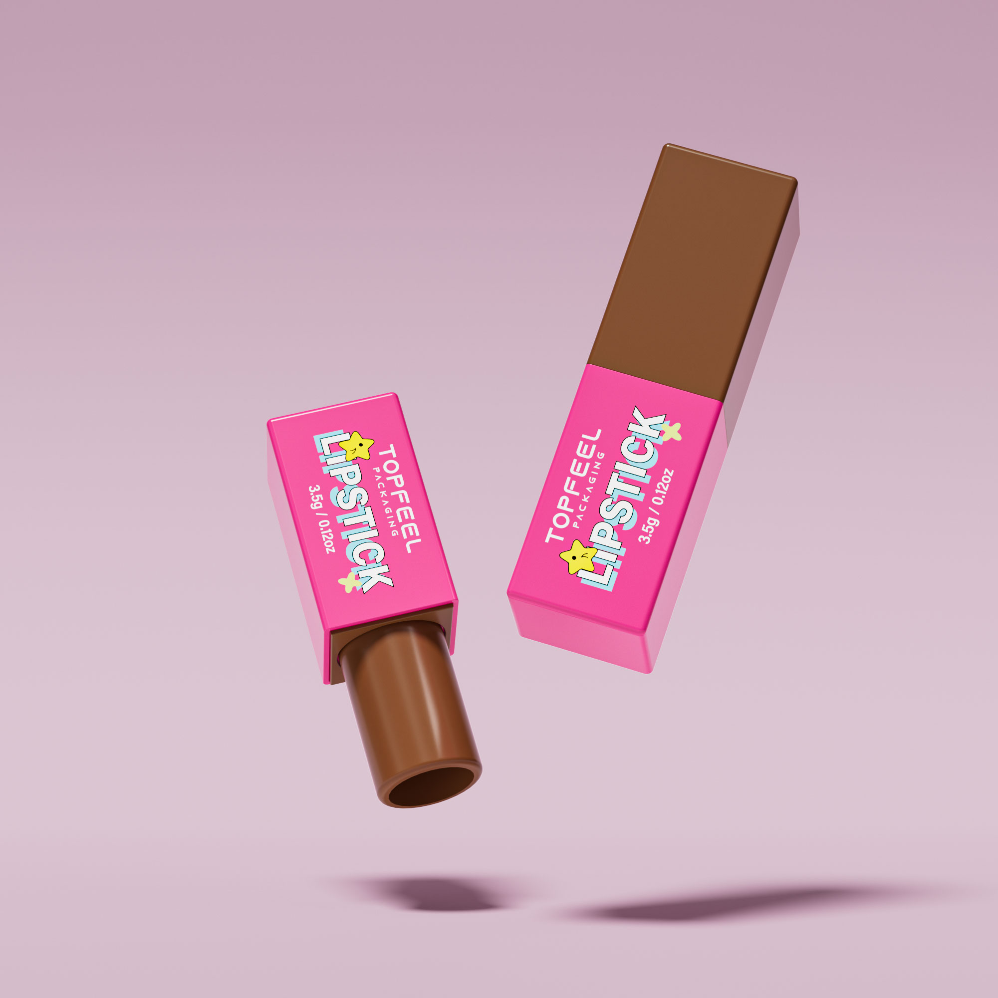
- Warm: coral or brick-red hues in glossy finish lip gloss tube with magnetic closures.
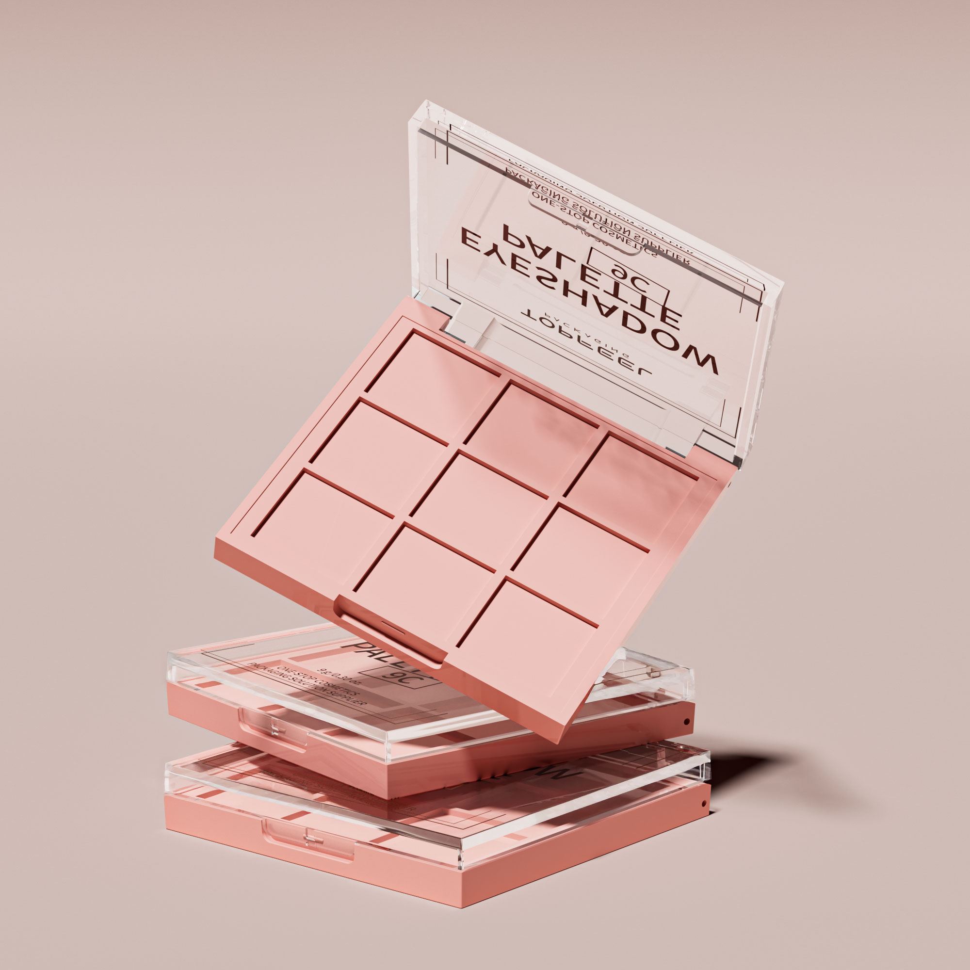
- Cool: blue-based reds in matte empty eyeshadow palette paired with soft-touch coating.
- Neutral: balanced reds, letting powder compact designs with satin finish whisper versatility.
2. Which materials keep palette red cosmetics looking fresh and premium?
Acrylic plastic protects mascara tubes during daily use; glass bottles for foundation offer elegance but add weight and fragility; aluminum cases cradle pearlized pigment lipsticks like a treasure chest that travels well.
3. Can we create custom or Pantone-matched palette reds for large orders?
Yes—custom shades bloom into brand signatures:
- Pantone matching keeps lipstick container components identical batch-to-batch.
- Metallic finishes on protective inserts bring luxury alive.
- Gradient effects over outer cartons catch store lighting in waves.
4. What surface finishes ignite attention for palette red products in retail displays?
Glossy finish brings light alive across compact edges—perfect for youthful energy; matte speaks of refined confidence on eco-friendly cardboard cartons; textured surfaces make applicator wands feel tactile, inviting touch before purchase.
5. Are decorative enhancements possible alongside bulk manufacturing of palette reds?
Hot stamping turns names into glints against bold color fields; silk screen printing etches logos onto mascara containers without losing vibrancy; metallization along inner trays makes limited-edition blush compact designs feel rare yet reachable.
References
- The state of the global beauty industry in 2023 – nielseniq.com
- What Color Lipstick Should You Wear? – byrdie.com
- How to Pick the Best Red Lipstick for Your Skin Tone – byrdie.com
- Mintel announces Global Beauty and Personal Care Trends for 2024 – mintel.com
- The Future of Colour Cosmetics 2024 – store.mintel.com

