

What is “Quiet Luxury” Packaging? 5 Material Choices for 2026
January 14,2026
You know that feeling when you walk into a room and everything just whispers elegance—no blaring logos, no shouty colors, just clean lines, soft finishes, and materials that feel like they belong in a quiet art gallery rather than a mall kiosk? That’s the vibe of 2026. What is Quiet Luxury in packaging design if not the grown-up answer to flashy trends? It’s about subtle flexes: tactile beauty, neutral tones, and sustainability stitched into every corner without screaming “look at me!”
And it matters now more than ever. According to McKinsey’s 2024 Beauty Report, 72% of Gen Z shoppers say their perception of luxury includes “eco-consciousness” and “understated quality.” Translation: If your makeup packaging brand wants shelf appeal in bulk—without looking like last decade’s leftovers—you’ll need packaging materials that don’t just look premium…they feel personal.

What Is Quiet Luxury In Packaging Design
In packaging design, quiet luxury is all about subtlety—less flash, more finesse. It’s the art of making simplicity feel premium.
Defining Quiet Luxury: A Paradigm Shift in Aesthetic
Quiet luxury in packaging has flipped the script on what “premium” means. Instead of screaming status with gold foils and oversized logos, it whispers class through understated elegance and timeless design.
- It’s not about showing off; it’s about showing up with style that doesn’t need validation.
- Think soft neutrals over bold colors, gentle embossing instead of loud branding.
- Brands now favor discreet branding, where the logo takes a backseat to material feel and visual calm.
- This shift reflects consumer fatigue with over-the-top visuals—they want authenticity, not artificial dazzle.
“According to McKinsey’s Global Consumer Sentiment Survey (2024), nearly 68% of Gen Z buyers associate ‘quiet’ aesthetics with higher trustworthiness and brand integrity.”
The real power? It lies in projecting authenticity without saying a word—just letting the texture, tone, and restraint do the talking.
The Role of Minimalist Design in Quiet Luxury Packaging
Minimalism isn’t just an aesthetic choice—it’s a philosophy baked into every corner of quiet luxury packaging. Here’s how it plays out:
🟢 Clean Lines & Negative Space
- Shapes are sharp yet soft; space isn’t wasted but celebrated.
- Every angle feels intentional—never cluttered or chaotic.
🟢 Simplicity Meets Purpose
- Designs strip away excess but keep what matters most.
- Typography is often sans-serif, light-weighted—emphasizing clarity over flair.
🟢 Refined Aesthetics Drive Perception
- Soft pastels or monochrome palettes create emotional calm.
- Less ink equals more impact when paired with smart layout decisions.
🟢 Function-driven Form
- The box opens smoothly. The label peels cleanly. Nothing feels cheap or rushed.
This style nails the balance between looking effortless and being highly considered—a true mark of essentialism at work within modern packaging design trends. And when done right? It makes people pause—not because it shouts—but because it resonates quietly.
Balancing Functionality and Elegance in Premium Materials
Quiet luxury doesn’t mean compromising on practicality—it thrives on blending beauty with brains. This harmony shows up through three key traits:
– Packages made from premium materials, like FSC-certified recycled cardboard or luxe-feel bio-resins, offer both eco-consciousness and tactile satisfaction. – Brands are leaning into high-end finishes that don’t harm the planet—think water-based coatings that still give off that velvety touch for maximum sensory appeal. – Even closures get attention: magnetic flaps or smooth-slide drawers enhance usability while reinforcing craftsmanship vibes.
Each choice—from texture to durability—is part of a bigger strategy rooted in thoughtful material selection and functional elegance. Because let’s be real—if your box looks great but breaks easily? That ain’t luxury at all.

5 Must-Have Features In Quiet Luxury Packaging
Quiet luxury in packaging design is all about restraint, refinement, and sensory elegance that whispers instead of shouts.
Subtle Textures: The Impact of Soft-Touch Coating
- You know that feeling when you touch a box and it just feels… expensive? That’s the magic of soft-touch coating.
- It adds a velvety texture, making the unboxing experience feel more intentional than transactional.
- From a branding perspective, this tactile layer speaks volumes without saying a word.
- A smooth yet matte finish creates an emotional connection; it’s not just packaging—it’s part of the story.
Think about how your fingertips linger on something soft; that’s what quiet luxury in packaging design aims for—intimate, sensory moments.
When used with subtle embossing or layered printing techniques, this coating enhances both visual depth and haptic satisfaction. It doesn’t scream premium—it whispers it directly to your senses.
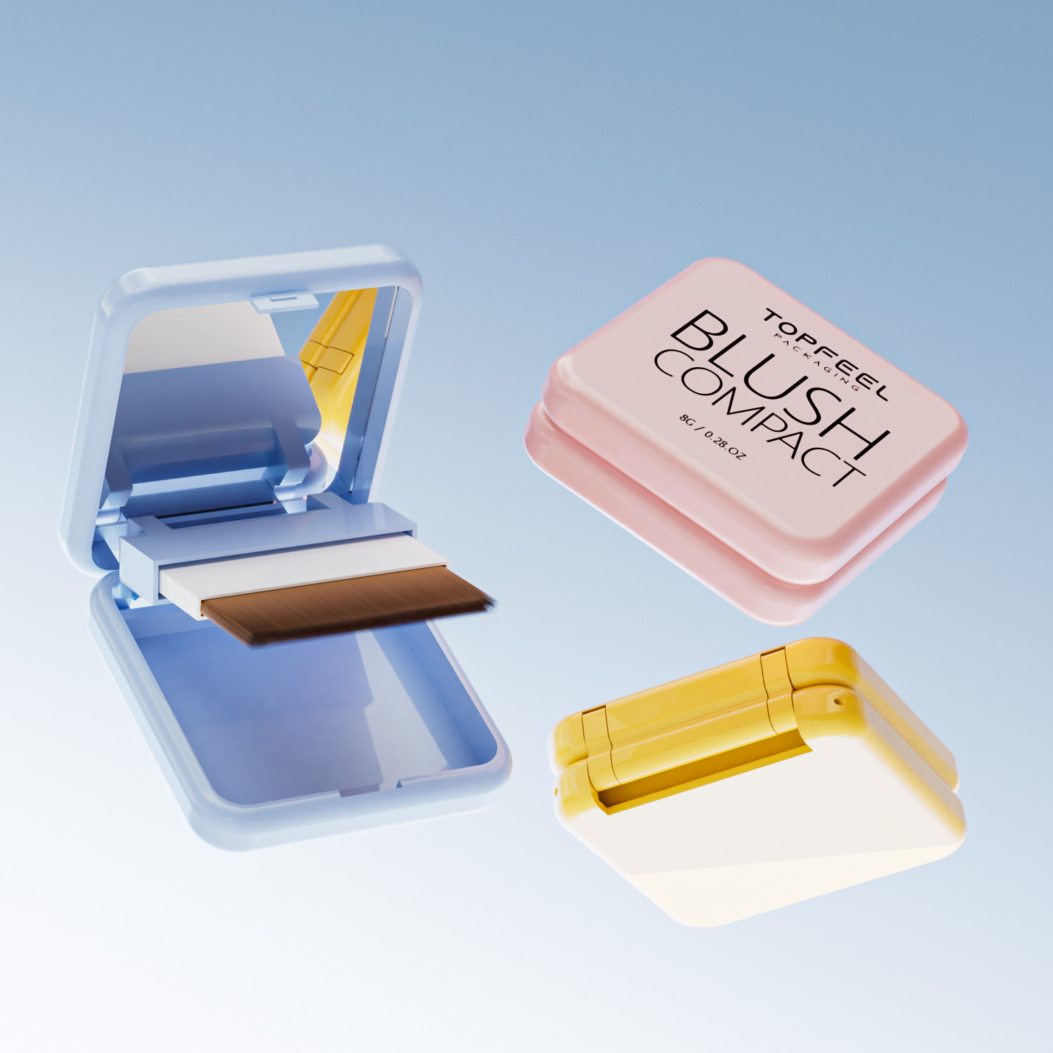
Magnetic Closure vs. Snap-Fit Lid: Finding the Right Fit
Choosing between a magnetic closure and a snap-fit lid isn’t just about looks—it’s about how your customer feels opening it.
🧲 Magnetic Closure:
- Provides seamless alignment
- Adds weight and presence to the package
- Ideal for high-end skincare or jewelry boxes
🔒 Snap-Fit Lid:
- Offers tight sealing without added components
- More cost-effective for repeat-use items
- Best fit for eco-conscious minimalist designs
🎯 Use Case Match:
| Feature | Magnetic Closure | Snap-Fit Lid |
|---|---|---|
| Sensory Appeal | High | Moderate |
| Reusability | Excellent | Good |
| Assembly Complexity | Medium | Low |
In quiet luxury packaging design, it’s less about flash and more about thoughtful utility paired with aesthetic grace.
Earthy Shades: Creating Calmness Through Color Selection
Muted tones aren’t boring—they’re grounding. In fact, they do heavy lifting in communicating quiet luxury in packaging design.
Here’s how specific tones rank based on consumer emotional response data from Q1 2024:
| Color Tone | Emotional Response Score (/10) | Perceived Luxury (%) | Common Product Categories |
|---|---|---|---|
| Warm Taupe | 8.9 | 74% | Skincare, Spa Kits |
| Dusty Olive | 8.5 | 68% | Home Fragrance, Wellness |
| Charcoal Gray | 9.2 | 82% | Tech Accessories, Watches |
| Sandstone Beige | 8.7 | 70% | Apparel Boxes, Stationery Sets |
These earthy shades work because they calm rather than excite—perfect for brands aiming to reflect poise over pomp. When paired with minimal typography or tone-on-tone finishes, these natural tones quietly command attention.
Foil Stamping and Blind Embossing: Luxury Elements That Captivate
Foil stamping catches light like nothing else—one quick tilt and there it is—a glint of gold or copper that elevates even plain kraft board into something covetable.
Blind embossing does something different—it invites touch before sight. No ink needed—just depth created by pressure alone.
You’ll often see these two techniques used together: • A logo blind embossed into matte black paperboard • A thin line of rose gold foil running along an edge
Each technique brings its own kind of drama—but always understated. This is what separates loud branding from refined expression in quiet luxury packaging design.
When used right? These details don’t decorate—they define quality through craftsmanship you can feel without needing to explain it aloud.

Best Practices For Implementing Quiet Luxury Packaging
Quiet luxury isn’t loud—it’s refined, intentional, and all about thoughtful design. Here’s how to make that vibe shine through packaging.
Choosing Sustainable Plastic: A Step Towards Eco-Conscious Luxury
- Bio-based polymers like PLA or PHA aren’t just buzzwords—they’re game changers for brands wanting to stay classy and conscious.
- Incorporating recycled content such as PCR materials reduces environmental toll without sacrificing tactile elegance.
- Embracing circularity means designing with end-of-life in mind—think reuse, not refuse.
- Audit current material usage for sustainability gaps.
- Replace virgin plastics with certified sustainable plastic alternatives.
- Communicate eco-values clearly on the package, subtly but effectively.
✳️ Using eco-conscious design doesn’t mean compromising sophistication—it actually elevates the brand story when done right.
Sustainability isn’t a trend; it’s the new baseline for what is considered luxurious. In fact, what is quiet luxury in packaging design if not a balance between beauty and responsibility? The shift toward environmentally mindful materials like bio-based polymers reflects a deeper understanding of consumer values today—where elegance meets ethics.
Short bursts of insight: • Less gloss, more meaning. • Texture matters—soft-touch biodegradable coatings feel premium without guilt. • Transparency sells—but so does a matte finish made from 100% recycled resin.
Grouped insights:
- Materials:
- PCR materials
- Sugarcane-derived HDPE
-
Algae-based bioplastics
- Benefits:
- Lower carbon footprint
- Compostable options available
- Aligns with Gen Z/Millennial priorities
When exploring what is quiet luxury in packaging design, remember: sustainable choices speak volumes—quietly but powerfully.
Utilizing Offset Lithography for Stunning Visuals
Let’s be honest—if your visuals don’t pop (in an understated way), you’re missing the mark on modern luxe packaging. Enter offset lithography, where crisp lines meet color precision.
• High-resolution printing ensures every detail lands perfectly—even microtext or intricate illustrations. • Superior color reproduction maintains brand consistency across product lines. • Works beautifully on textured papers or soft-touch finishes used in high-end boxes or sleeves.
- Choose substrates that complement ink absorption without bleeding edges. 02) Use spot UV selectively to accentuate key elements (like logos or emblems). 03) Keep typography minimalist but sharp—the devil’s in the detail here.
Offset litho gives you razor-sharp results while keeping things clean and elevated—a classic fit for brands asking themselves what is quiet luxury in packaging design today?
Multiple mini-points: – Don’t overdo gradients; solids look cleaner under offset methods. – Metallic inks? Tastefully applied only! Think accents, not full panels. – Pair with blind embossing for subtle texture play without screaming for attention.
Grouped layout:
| Printing Technique | Resolution Capability | Ideal Use Case | Finish Compatibility |
|---|---|---|---|
| Offset Lithography | Up to 2400 dpi | Premium folding cartons | Matte/gloss/soft-touch |
| Digital Printing | Up to 1200 dpi | Short runs & personalization | Limited specialty finishes |
| Flexography | ~300 dpi | Flexible films & labels | High-speed production |
| Gravure | ~600–800 dpi | Long-run foil printing | Metallic/specialty inks |
The table shows why offset remains king when aiming to combine visual clarity with tactile restraint—a crucial part of understanding what is quiet luxury in packaging design today.
Designing Geometric Forms for Modern Consumer Appeal
Symmetry isn’t boring—it’s magnetic when executed well through smart geometric design choices that scream modernity… quietly, of course.
Short points:
- Think hexagonal lids or triangular drawer boxes—simple shapes add intrigue.
- Clean lines create visual harmony and reflect premium craftsmanship.
- Negative space? It’s your best friend when working with bold forms and minimal graphics.
- Sketch out multiple versions using basic geometry principles (Fibonacci spiral works wonders). 2) Test structural integrity using prototypes before finalizing dielines. 3) Consider how these forms stack/display on shelves—form meets function here!
Longer take: What makes geometric forms so captivating is their ability to suggest order amidst simplicity—a hallmark trait of what is quiet luxury in packaging design across industries from fragrance to fashion accessories.
Quick-fire ideas: • Octagonal jars = standout shelf presence without being flashy. • Nested cubes = perfect unboxing ritual moment built into structure itself. • Cylindrical tubes = timeless shape reimagined through material choice and closure style.
Grouped concepts:
Shapes That Work:
- Rectangular sliders
- Pyramidal toppers
- Rounded-edge squares
Design Elements To Pair:
- Monochrome palettes
- Debossed logos only
- No visible adhesive seams
In short, structure speaks volumes—and when paired with restraint, it becomes a core identifier of what is quiet luxury in packaging design meant for today’s discerning eye.

FAQs about What Is Quiet Luxury in Packaging Design
What is Quiet Luxury in packaging design and why does it attract beauty brands?
Soft elegance over loud branding—quiet luxury represents a kind of visual whisper.
- Materials breathe integrity: Recycled Cardboard, Glass Components, and Bio-based Resin create lasting sophistication.
- The mood revolves around Neutral Tones and calm Earthy Shades, paired with minimalist lines or a balanced Symmetrical Design.
A box wrapped in stillness feels powerful; makeup buyers sense respect for both product and planet.
How do finishes transform simple materials into luxurious objects?
Finishes are like mood lighting for surfaces—subtle yet unforgettable.
- A gentle velvet from a Soft-Touch Coating invites fingertips to linger.
- Serenity flows from muted texture under a soft haze of Matte Lamination.
- Storylines rise through embossed forms; whispers sink deep with delicate Debossed Detailing on clean panels of Recycled Cardboard or Aluminum Shells.
Which decorative details strengthen quiet-luxury identity without shouting?
This style speaks more through touch than sparkle, but precision detailing gives it voice:
| Decoration | Emotional Effect | Best Pairing |
|---|---|---|
| Foil Stamping | Hints at confidence via subtle shimmer | Neutral Tones + Matte Lamination |
| Blind Embossing | Adds tactile memory that replaces bold logos | Soft-Touch Coated cartons |
| Laser Etching & Screen Printing | Offers permanent artistry across Glass Components or Aluminum Shells | Symmetrical profiles |
Each mark becomes part poetry, part statement—the art of saying less while implying much more.
What closure styles best express Quiet Luxury’s refined restraint?
The way packaging opens defines the whole experience—a slow reveal rather than an explosion:
★ A weightless click from a Magnetic Closure, echoing exclusivity without excess metal shine.
★ The assured press-fit rhythm of a Snap-Fit Lid, practical yet perfectly aligned within minimalist shapes.
★ Or the choreographed slide of a discreet drawer, balancing motion inside an intentional design line—simple grace hidden beneath function itself.
References
- State of Beauty – mckinsey.com
- cute makeup packaging – topfeelmakeup.com
- 6 Packaging Insights That Competitive Brands Adopt to Attract Gen Z – sonoco.com
- Global Sustainable Packaging Materials Market Report 2026-2036 – globenewswire.com
- Sustainable Cosmetic Packaging – topfeelmakeup.com
- Approaches in Sustainable, Biobased Multilayer Packaging Solutions – nih.gov
- What Is Offset Printing for Packaging? – modpac.com
- glass pump bottle – topfeelmakeup.com
- empty magnetic palette – topfeelmakeup.com

