

5 Sevimli Makyaj Ambalajı Tasarlama Stratejisi
25 Temmuz 2025
Güzellik reyonunda yürüdüğünüzde ne hissettiğinizi bilirsiniz; beyniniz daha nedenini söylemeden eliniz küçük pastel kavanoza uzanır. İşte bu sihirden bahsediyoruz 5 Sevimli Makyaj Ambalajı Tasarlama Stratejisi. Sevimli tasarım, siz daha gölgeyi kontrol etmeden havayı satan sessiz bir eküri haline geldi.

Tasarımcı Debbie Millman'ın bir keresinde dediği gibi, "Ambalaj bir markanın tiyatrosudur." Makyajda bu sahne kişilikle boyanır: bir renk patlaması, ilginç bir karakter veya cebinizde saklamak isteyeceğiniz bir sır gibi hissettirecek kadar küçük bir kompakt.
Bu kılavuz, "şirinliğin" neden bir güç hamlesi haline geldiğini; kültürel etkilerin, maskotların, mini formatların ve hatta renk psikolojisinin müşterileri nasıl durdurduğunu, şaklattığını ve kartlarını okuttuğunu inceliyor. Sonunda, dış görünüşün neden en az içindekiler kadar önemli olduğunu göreceksiniz.
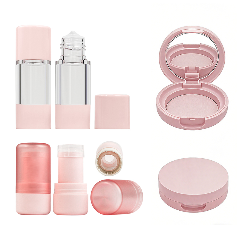
Makyaj Ambalajlarını "Sevimli" Yapan Nedir?
Ambalajlardaki sevimlilik sadece yüzeysel değildir; renk, şekil ve ilk bakışta gülümsemenizi sağlayan küçük tasarım detaylarına dayanan duygusal bir tetikleyicidir.

Oyunculuğu Ateşleyen Şekiller
Taraklı kapaklardan tatlı şeklindeki yeni ruj tüplerine kadar, eğlenceli ambalaj şekilleri anında zevk uyandırıyor. Bu formlar nostaljiye ve meraka hitap ediyor - asimetrik kavanozları veya araçlardan çok oyuncak gibi hissettiren katmanlı parfüm şişelerini düşünün.
-
Tuhaf silüetler (kalpler veya bulutlar gibi) eğlence ve yaratıcılığa işaret eder.
-
Geometrik veya organik kenarlar Raflardaki görsel monotonluğu kırın.
-
Asimetri veya benzersiz istifleme görsel ritim yaratır, gözü çeker.
💡 Eğlenceli bir gerçek: Araştırmalar, benzersiz şekilli ambalajların raf hatırlanabilirliğini 35%'ye kadar artırdığını göstermektedir.
Yumuşak Pasteller ve Neşeli Renkler
Renk duygusaldır ve sevimli kozmetik dünyasında oyun alanını pasteller yönetir. İster allık tonlu aydınlatıcılar ister lavanta rengi göz kremleri olsun, bu tonlar sakinleştirir, keyif verir ve öne çıkarır.
-
Allık, nane ve gök mavisi sakin ve masum bir his yaratır.
-
Limon sarısı ve mercan duyuları bastırmadan ambalajlara neşeli bir görünüm kazandırır.
-
Şeftali ve su geleneksel sevimliliğe modern bir dokunuş sağlıyor.
"Renk, duyguları iletmenin en hızlı yoludur - ve sevimli markalar bunu gizli bir dil gibi kullanır." - Yuna K., Güzellik Ambalajı Danışmanı, Tokyo
Anında Cazibe Yaratan Detaylar
Bir şeyi elinize alıp düşündüğünüz anı bilirsiniz, "Aww, bu çok sevimli." Bu şans değil, stratejik bir detay çalışmasıdır.
-
Fırfırlar ve danteller bir kompaktın kenarında? Anında romantizm.
-
Küçük nakış tarzı baskılar veya boncuklar etikette? Bu doğru yapılmış bir doku.
-
Şişe kapağında püskül veya saçak? Tuhaf ve beklenmedik.
Bu mikro detaylar bir kekin üzerindeki son şeker serpintisi gibidir - küçük ama tamamen unutulmaz.
Asyalı Güzellik Markaları Neden Şirin Tasarımlara Hakim?
Röportaj Konusu: Kore ve Japonya'dan gelen dayanılmaz derecede sevimli ambalajların yükselişini ne açıklıyor?
Bayan Ahn, Ambalaj Tasarımcısı: Asyalı markalar cazibelerini kawaii'nin kültürel köklerine dayandırıyor. Yumuşaklığa, oynaklığa ve nostaljiye yapılan vurgu anında duygusal rezonans yaratır 📦✨.

Temel Stratejiler:
-
Sınırlı sayıda üretilen ürünler ve canlı pop ikonları aracılığıyla genç demografik grupları hedefliyor.
-
Yumuşak dokunuşlu yüzeyler ve kabartmalı motifler gibi ambalaj malzemelerinde yenilik.
-
Anime işbirlikleri ve sokak tarzı sanat referansları aracılığıyla pop kültürünün etkisi.
-
Sosyal medya viralitesi, hiper-paylaşılabilir tasarımlarla kutu açma videolarını körüklüyor.
Uzman Görüşü: Tüketici psikolojisi profesörü Dr. Lee (Seul Ulusal Üniversitesi) "Ambalaj sessiz bir hikaye anlatıcısıdır" diyor. Araştırmalar, ambalaj uygun fiyat ve erişilebilirliği yansıttığında tüketicilerin marka hikayesi anlatımına ve ürün çeşitliliğine değer verdiğini göstermektedir (Journal of Cosmetic Science, 2022).
Satışları Artırmak için Karakterleri ve Maskotları Kullanma
Sevimli karakterler sadece çizgi filmler için değil, ciddi bir iş. Makyaj markaları maskotları ve lisansları sadakat oluşturmak, hikaye satmak ve erişimlerini ambalajın ötesine taşımak için kullanıyor.
-
Sadakat Yaratan Marka Maskotları
Maskotlar dekorasyondan çok daha fazlasıdır - güçlendirmeye yönelik stratejik araçlardır marka ki̇mli̇ği̇ ve teşvik etmek müşteri sadakati. Gibi markalar TonyMoly'nin Domatesi veya Etude House'un prenses temaları hafızada kalırlar çünkü bir duygusal bağ tüketici ile.
-
Karakter pazarlaması benzersiz bir form oluşturmaya yardımcı olur marka taninirliği.
-
Maskotlar kıvılcım tüketici güveni sıcaklık ve eğlence katarak.
-
Güçlü bir maskot ikonik sembol bütün bir ürün hattını tanımlar.
"Bir markayı maskot aracılığıyla insanileştirdiğinizde, müşterinin dilini sadece görsel olarak değil, duygusal olarak da konuşmuş olursunuz." - Kana Lee, ambalaj tasarımı stratejisti
-
Makyaj İşbirliklerinde Lisanslı Karakterler
Kimden Hello Kitty x ColourPop için Disney x MAC, karakter lisanslama makyaj markaları için bir altın madeni haline geldi. Bunlar güzelli̇k i̇şbi̇rli̇kleri̇ sık sık gelir sınırlı sayıda heyecan yaratan ve anında satış yapan setler.
-
Popüler kültür gücü marka hedefleriyle buluşuyor-hayranlar akın ediyor.
-
Kozmetik çizgiler çizgi film karakterleri ile hayran bağliliği.
-
Marka ortaklıkları güvenilirlik, eğlence ve perakende vızıltısı kazandırır.
| İşbirliği | Marka Ortağı | Satılan Birimler (Tahmini) |
|---|---|---|
| Sailor Moon x ColourPop | Toei Animasyon | 150,000+ |
| BT21 x VT Kozmetik | Hat Arkadaşları | 320,000+ |
| Barbie x NYX | Mattel | 200,000+ |

-
Maskot Tasarımıyla Hikaye Anlatımı
Bazı markaların maskotlarına nasıl bir arka plan hikayesi verdiğini hiç fark ettiniz mi? Bu bir tesadüf değil. anlatı geliştirme. Çok iyi. maskot tasarımı destekler marka anlatımı ve geliştirir görsel ki̇mli̇k.
-
Karakterler statik değildir - yansıtmak için evrimleşirler marka mesaji.
-
Hikaye odaklı maskotlar yaratın duygusal rezonans sadık kullanıcılarla.
-
İçinden tasarim i̇lkeleri̇Kızaran bir ayı bile özgüven ve öz bakım hakkında bir hikaye anlatabilir.
Bu yöntem sevimli bir yüzü bir anlamli marka elçi̇si̇.
-
Ambalajın Ötesinde Mağazacılık Fırsatları
Gerçekçi olalım - bu sevimli karakterler kutuda kalmıyor. Kupalar, keseler, peluşlar ve takvimler satılıyor. İşte bu marka uzantısı aracılığıyla ürün çeşi̇tlendi̇rmeve yeni bir geli̇r akişlari.
-
Markalar maskotları geliştirmek için kullanıyor tüketi̇ci̇ ürünleri̇ makyajın ötesinde.
-
Lisans anlaşmaları moda, kırtasiye ve oyuncak gibi perakende kategorilerine kapı açıyor.
-
Bu yakıtlar marka deneyi̇mi̇ ve inşa eder perakende stratejisi yaşam tarzı markasına dönüştü.
Maskotlar sadece süsleme yapmazlar hayali satmakrafta ve raf dışında.
Mini Boyutlar, Büyük Etki: Kompakt Tasarımın Gücü
Küçük, sevimli ambalajlar sadece yerden tasarruf sağlamakla kalmaz, aynı zamanda arzu uyandırır. Kompakt tasarımın makyaj ambalajlarında hem pratikliği hem de duygusal çekiciliği nasıl dönüştürdüğünü keşfedelim.
Bir Tasarım Avantajı Olarak Taşınabilirlik
Kompakt makyaj ürünleri hareket halindeki yaşam için bir rüya. Markalar günümüzün ihtiyaçlarını karşılamak için taşınabilirliği kullanıyor. kablosuz, el tipive hafif güzellik ihtiyaçları - hızlı rötuşlar veya seyahat çantaları için mükemmeldir.
-
Kompakt + Hafif: Tüketiciler, hacimsiz bir şekilde çantalarına atabilecekleri ürünleri severler.
-
Çok Yönlü Formatlar: Çift amaçlı mini stickler (dudak ve yanak renklendiricileri gibi) çoklu görev şampiyonlarıdır.
-
Hareket Halinde Satış Noktası: "Seyahate hazır" veya "taşıma dostu" etiketli ürünler internette 17% daha hızlı satılıyor.
-
"Mobilite etrafında tasarım yapmak kategori sadakatini yeniden tanımladı," diyor Lisa Kim, Ürün Geliştirme Direktörü Laneige.
Mini Ürünlerin Hediye Edilebilir Cazibesi
Dürüst olalım - küçük güzellik ürünleri farklıdır. İster bir seyahat boyu krem ya da YENİLİK dudak kremi, miniler mükemmel hatıralar ve düşünceli hediyelerdir.
-
Kendilerini özel hissederler - Anında bir şey var Büyüleyici mini makyaj hakkında; bir hediye vermek gibi dekoratif gece lambası-Gereksiz ama tamamen karşı konulmaz.
-
Paylaşmak için yaratılmışlar - Numuneler ve mini kitler düşünceli jestler daha az işlemsel ve daha kişisel hissettiren.
-
Anlık satın alımları artırırlar - Düşük fiyatları ve "aww" faktörü onları kasanın favorisi yapıyor.
Tablo: Mini Ürün Etkisi (Perakende Çalışması)
| Metrik | Mini Boyut (Evet) | Tam Boy (Hayır) |
|---|---|---|
| Ani Satın Alma Oranı | 42% | 23% |
| Hediye Tercih Puanı | 8.7/10 | 6.2/10 |
| Sosyal Paylaşım Sıklığı | 2,4 kat daha yüksek | Üs |

Sevimli Ambalajlarda Renk Psikolojisi
Renk sadece görsel değildir, duygusaldır da. Sevimli ambalajlar, ruh halleri, kültürler ve alışveriş dürtüleriyle şaşırtıcı derecede güçlü yollarla bağlantı kurmak için renk psikolojisinden yararlanır.
Dinginliğe İlham Veren Pastel Paletler
Yumuşak pastel boyalar özel bir şey yaparlar: bir sakinleştirici ortam alışveriş yapanların anında fark ettiği bir şey. Düşünmek sessiz tonlar, krem tonlarının hafifçe serpilmesi, keten tonları ve pastel kumaşlar yumuşak aydınlatma ile birlikte çalışıyor. Bu paletler hafif ve taze bir his veriyor ve ambalajın ulaşılabilir görünmesini sağlıyor. Markalar bu renkleri kullanıyor çünkü dinginliği ifade ediyorlar; böyle bir kutuyu elinize aldığınızda bile "ahh, ne güzel" diyorsunuz.
Eğlenceyi Düşündüren Parlak Renkler
-
Eğlenceli tasarımlar ve canlı tonlar Ambalajı öne çıkarın.
-
Neşeli aydınlatma cesur desenlerde heyecanı artırır.
-
İnsanlar ortak renkli kumaşlar ve akrilik gölgelikler ile enerji ve gençlik.
Bu kombinasyonlar "eğlenceli!" diye bağırıyor - canlılar ve maceracı ve cesur görünmeyi hedefleyen markalar için mükemmeller.

Güzellikte Kültürel Renk Tercihleri
Küresel güzellik ambalajları sembolik renkler ve geleneksel tasarimlar. itibaren etni̇k örüntüler Asya markalarında kültürel motifler bölgesel esteti̇kte i̇pek tonlari i̇le renk anlam taşiyabi̇li̇r. Örneğin, kırmızı şansı sembolize edebilirken, altın bazı pazarlarda prestije işaret eder. Ambalaj danışmanı Alana J. "Renk seçimi yaratıcı olduğu kadar kültüreldir de" diyor.
SSS
Cazibe yuvarlak kenarlardan, yumuşak pastel renklerden, minyatür şekillerden ve minik dekoratif detaylardan geliyor. Bu dokunuşlar, ürün daha açılmadan önce bir neşe duygusundan söz eder.
-
Pasteller sakinlik ve yumuşak bir ruh hali yaratır
-
Parlak tonlar eğlence ve heyecanı çağrıştırır
-
Doğal tonlar güvenlik ve denge hissi verir
Mevsimsel bir baskı veya özel bir sanat eseri içeren bir paket ortaya çıktığında, benzersiz hissettirir. İnsanlar, tasarımın bir daha asla geri gelmeyebileceğini bildiklerinden genellikle hemen alırlar.
Kesinlikle. Bitki bazlı plastikler, yeniden doldurulabilir kavanozlar ve yumuşak baskılı kağıt tüpler, ambalajın cazibesini veya kişiliğini kaybetmeden gezegene karşı nazik olmasını sağlamak için yeni yollar açmıştır.
-
Avuç içine mükemmel oturan bir şekil
-
Pürüzsüz veya kadifemsi yüzey dokuları
-
Küçük bir çantaya kolayca sığdırılabilir
Tasarım genellikle ürün test edilmeden çok önce dikkat çeker. Birçok mağazada, bir kutu veya şişenin görünümü merak uyandırır ve birinin onu eve getirmesine yol açar.