

Ruj Ambalajı Renk İpuçları: Markanızın Raflarda Öne Çıkmasını Sağlayın
30 Temmuz 2025
Günümüzün yoğun güzellik dünyasında, ruj ambalajı için doğru rengi seçmek sadece görünümle ilgili değildir. Marka tanınırlığını arttırmak, dikkat çekmek ve tüketicilerin satın almalarını sağlamak için stratejik bir yöntemdir. Raflarda ve internette tonlarca ürün varken, akıllı renk seçimleri ve iyi tasarım parlamanıza yardımcı olur. Bu makale, doğru ambalaj renklerinin ruj oyununuzu nasıl geliştirebileceğini ve alıcılarla nasıl bağlantı kurabileceğini açıklıyor.

Ruj Ambalajlarında Rengin Stratejik Rolü
Ambalaj Rengi Tüketici Davranışını Neden Etkiliyor?
Renk insanları ilk etkileyen şeydir. Daha ürünü ellerine almadan önce ürünün havası, kalitesi ve maliyeti hakkında ipuçları verir. Güzellik sektöründe, duygusal tepkiler satın alma kararlarını büyük ölçüde etkiler. Bu yüzden ambalaj rengi çok önemlidir. Koyu kırmızı, güven ve gücü ifade ederken, açık pastel renkler incelik ve sadeliği çağrıştırır.
Renkler Aracılığıyla Duygusal Tetikleyiciler ve İlk İzlenimler
Renkler, kökleri renk psikolojisine dayanan bir ilke olarak belirli duyguları çağrıştırır. Kırmızı, tutku ve heyecan gibi güçlü duyguları çağrıştırır. Mavi istikrarlı ve güvenli hissettirir. Bu hisler hızla yayılır ve saniyeler içinde fikirleri şekillendirir. Altın veya siyah ambalaj hemen ayrıcalık ve üstün kalite sinyali verir. Beyaz veya bej tonları saf ve temiz hissettirir.
Altın genellikle kozmetik ambalajlarında lüks ve ayrıcalığı simgelemek için kullanılır. Pek çok marka bu nedenle altın ruj tüplerini tercih ediyor.
Raf Etkisi: Kalabalık Bir Pazarda Öne Çıkmak
Perakende ortamlarında, ambalajın öne çıkması için hemen dikkat çekmesi gerekir. Ürününüz düzinelerce başka ürünle karşı karşıyadır. Parlak karışımlar veya göze çarpan renkler koridorun diğer ucundan gözleri çeker. Ayrıca, aynı renklere bağlı kalmak, insanların markanızı kalabalık bir teşhirde hızlıca fark etmesine yardımcı olur.
Renk Psikolojisini Ruj Ambalajlarına Uygulamak
Yaygın Renklerle Duygusal İlişkileri Anlamak
-
Kırmızı, Pembe ve Mercan: Tutku, Dişilik ve Enerji
Bu renkler genellikle içerideki rujla bağlantılıdır. Kırmızı güç ve arzu anlamına gelir. Pembe nazik ve kız gibi hissettirir. Mercan taze ve genç.
-
Siyah, Beyaz ve Gri: Sofistike ve Sade
Siyah, beyaz ve gri her şeyi şık tutar. Siyah şıktır. Beyaz nettir. Gri diğer tonlarla güzel uyum sağlar.
-
Altın ve Gümüş: Lüks ve Prestij
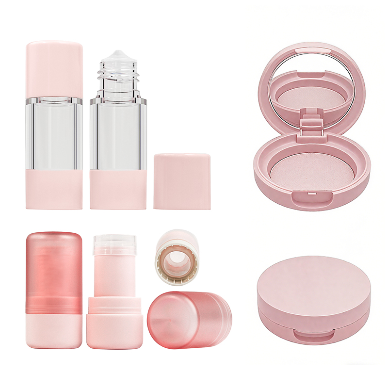
Altın, zenginlik ve prestij duygusu yayar. Gümüş ise havalı ve moderndir. Her ikisi de pahalı kozmetik ürünler için harikadır. Şunu alın *Topfeelpack MA-15 Lüks Ruj için Boş Ruj Tüpü Makyaj Kapları*-Altın rengi bir ruj tüpüdür ve iddialı ve dikkatleri hemen üzerine çeken havalı bir şekli vardır.

-
Yeşil ve Mavi: Sakinlik, Doğallık ve Güven
Yeşil genellikle çevre dostu olmayı veya doğal içerikleri temsil eder, bu da onu organik ürünler için ideal kılar. Mavi güven oluşturur, ekstra bakım faydaları olan rujlar için iyidir.
Ürün Ruh Halini veya Kullanımını Yansıtan Renkleri Seçme
Ambalaj rengi ürünün özelliklerine ve kullanım amacına uygun olmalıdır. Nemlendirici bir balm, hidrasyonu göstermek için soğuk mavilerle uyumlu olabilir. Sert bir mat ruj mu? Mat siyah, kalıcılık gücüne uygundur.
Ambalaj Renklerini Hedef Demografik Özelliklerle Uyumlaştırma
Küresel Güzellik Pazarlarında Kültürel Tercihler
-
Asya ve Batı Pazarlarındaki Tercihler
Japonya veya Kore gibi yerlerde, şeftali veya lavanta gibi yumuşak tonlar, ince ve genç estetiği tercih eden pazarlarda popülerdir. Bu hafif, genç görünümü seviyorlar. Batılılar ise koyu kırmızı veya parlak metalikler gibi büyük renklere yöneliyor; kalın renkler onların tarzına uyuyor.
-
Bölgesel Cilt Tonları Renk Algısını Nasıl Etkiliyor?
Cilt tonu renklerin nasıl ortaya çıkacağını değiştirir. Soluk tende parlak olan bir renk tonu daha koyu tonlarda soluklaşabilir. Markaların farklı bölgeler için bunu akılda tutması gerekir.
-
Yaş Grupları ve Renk Eğilimleri
Gençler ve genç yetişkinler vahşi renkleri seviyor; sıcak pembeleri veya ışıltılı yüzeyleri düşünün. Daha yaşlı alıcılar ise zengin kırmızılar veya altın süslemeli siyahlar gibi klasik renkleri seviyor. Bunlar zamansız hissettirir.
Tutarlı Renk Kullanımıyla Marka Kimliğini Yansıtmak
-
Marka Değerlerini Görsel Tasarım Unsurlarına Dönüştürme
Renkler markanızın hikayesini anlatır. Yeşil, gezegeni önemsediğinizi gösterebilir. Gümüş, son teknoloji fikirler anlamına gelebilir. Karışık renkler herkes için olduğunuzu söyleyebilir. Her seçim önemlidir. *Topfeelpack* müşterilerin isteklerine göre uyarlanmış birinci sınıf ambalajlara odaklanmaktadır.
-
Anahtar Renklerin Tekrarı Yoluyla Tanınırlık Oluşturma
Aynı renkleri tekrar tekrar kullanmak insanların aklına kazınır. Tiffany & Co.'nun meşhur mavisini düşünün; herkes bilir. Ruj yelpazenizdeki sabit renkler markanızın hatırlanmasını kolaylaştırır.
-
Özel Paletlerle İmza Niteliğinde Bir Görünüm Yaratmak
Özel renkler öne çıkmanızı sağlar. Topfeelpack, benzersiz tonlar da dahil olmak üzere tonlarca seçenek sunar. Bu, zorlu bir pazarda büyük bir artıdır.

Pazar Farklılaşması için Benzersiz Renk Kombinasyonlarının Kullanılması
-
Görsel İlgi İçin Kontrast ve Uyumun Dengelenmesi
Göze çarpmak için cesur kontrastları ve pürüzsüz tutmak için yumuşak eşleşmeleri karıştırın. Örneğin mat siyah ile parlak altın rengi dramatik görünür ama abartılı değildir.
-
Özgün Kalmak için Aşırı Kullanılan Sektör Renklerinden Kaçınmak
Pembe, güzellik endüstrisinde her yerde bulunan bir renk olsa da bazen aşırı kullanılabiliyor. Ama deniz mavisi ve bakır gibi garip kombinasyonlar? Sürüden ayrılırlar.
-
Beklenmedik Eşleştirmelerle Markanın Akılda Kalıcılığını Artırmak
Sürpriz renk karışımları dikkat çeker ve bunları reklamlarda kullanmaya devam ederseniz ikonik hale gelebilir.
Tüketici Rezonansı için Ambalaj Renklerinin Test Edilmesi
Renk Varyantları Üzerinde A/B Testi Yapma
A/B testleri ile renkleri çevrimiçi deneyin. Bir demet yapmadan önce hangisinin daha fazla tıklama çektiğini görün.
Odak Gruplarından veya Anketlerden Geri Bildirim Toplama
Hedef kitlenize ne düşündüklerini sorun. Onların görüşleri, renklerin markanızın havasına uyup uymadığını gösterir.
Gelecekteki Tasarımları Geliştirmek için Perakende Verilerini Kullanma
Ürüne göre satış rakamlarını kontrol edin. Bu size insanların zaman içinde gerçekten hangi renkleri satın aldığını gösterir.
Ambalaj Tasarımında Pazar Trendleri ile Güncel Kalmak
Mevsimsel ve Yıllık Trend Raporlarının İzlenmesi
Moda nedeniyle güzellikte renkler hızla değişir. Gözünüzü açık tutmak sizi oyunun içinde tutar.
Pantone'un Yılın Rengini Stratejik Olarak Kullanmak
Pantone her yıl bir renk seçer ve bu renk trendleri belirler. Fark edilmek için özel baskılarda akıllıca kullanın.
Tüketici Yaşam Tarzı Tercihlerindeki Değişimlere Uyum Sağlama
İnsanlar artık sağlık ve yeşil yaşama daha fazla önem veriyor. Killi kahverengi veya koyu yeşil gibi toprak renkleri, bugünlerde yüksek sesli neonlardan daha çok dikkat çekebilir.
Marka Bütünlüğünü Korurken Yenilikçilik
Tasarımları her sezon yenileyin, elbette. Ancak yazı tipleri veya düzen gibi markanızın özüyle oynamayın.
Seçtiğiniz Renkleri Güzelleştiren Malzemeler Seçmek
Malzeme Dokusu Algılanan Renk Kalitesini Nasıl Etkiler?
Kullandığınız malzeme renklerin ışıkta nasıl göründüğünü değiştirir.
-
Ruj Tüplerinde Mat ve Parlak Yüzeyler
Mat yüzeyler ışığı emerek zarif, abartısız bir görünüm verir. Parlak yüzeyler ışığı yansıtarak cesur, göz alıcı bir etki yaratır. Her biri farklı markalara uygundur. Private Label - Topfeelpack teklifleri *özel OEM seçenekleri*Renkleri ve mat ya da parlak yüzeyleri seçmek gibi.
-
Görsel Etki için Şeffaf ve Opak Bileşenler
Şeffaf tüpler ruj renginin görünmesini sağlar; kullanışlı ve basittir. Katı tüpler, kabartma veya folyo gibi hilelerle süslü olmanızı sağlar.
-
Estetikten Ödün Vermeden Dayanıklılık Sağlamak
PP (polipropilen) gibi sert malzemeler sonsuza kadar dayanır ve istediğiniz rengi alır. Geri dönüştürülebilir, hafif ve uzun süre dayanacak şekilde üretilmiştir.
Sonuç
Ruj ambalaj rengi, markanız ve tüketiciler arasında görsel bir diyalog görevi görür. Psikoloji, kültür, trendler, malzemeler ve yeni fikirleri harmanlar. Bunları baştan sona doğru bir şekilde uyguladığınızda markanız sadece iyi görünmekle kalmaz, insanlarla bağ kurar.
SSS
- Dikkati hızlı çekerÜrüne bağlı duyguları harekete geçirir
- Kaliteye dair ipuçları (lüks için altın gibi)
- Yoğun raflarda göze çarpmasını sağlar
Evet:
- Asya pazarları yumuşak şeftali veya lavantayı sever
- Batılılar kırmızı, siyah veya altın rengi tercih ediyor
- Cilt tonları renklerin öne çıkma şeklini değiştirir
Kesinlikle! Tedarikçiler size izin verir:
- Sertliğe göre PP, ABS veya AS seçin
- İstediğiniz görünüm için mat veya parlak tercih edin
- Damgalama, serigrafi veya etiket ekleme