

ทำไมแนวโน้มการบรรจุภัณฑ์ย้อนยุคถึงครองการออกแบบในปี 2026?
26 มกราคม 2569
ในปี 2026, the แนวโน้มบรรจุภัณฑ์สไตล์เรโทร ไม่ใช่แค่การแต่งตัว—มันคือการขโมยแสดง. วินเทจ แท่งลิปสติก กระสุน, แก้วขุ่น กล่องผงอัดรูป การออกแบบ และหลอดอลูมิเนียมสไตล์เก่ากำลังถูกซื้อขายออกจากชั้นวางอย่างรวดเร็วเหมือนแผ่นเสียงที่ผลิตจำนวนจำกัด. แบรนด์กำลังทำกำไรจากความคิดถึงเพราะมันตอบสนองอารมณ์ได้อย่างลึกซึ้ง (และขายได้ดี): อารมณ์.
“ความคุ้นเคยทางสุนทรียศาสตร์สร้างความเชื่อมั่นได้เร็วกว่าเชิงฟังก์ชัน” ดร. เรนี ฮาสกิ้นส์ นักวิเคราะห์พฤติกรรมผู้บริโภคของ NielsenIQ กล่าวถึงการอ้างอิง。 22% ความตั้งใจซื้อที่สูงขึ้น สำหรับผลิตภัณฑ์ที่มีการออกแบบที่ได้รับแรงบันดาลใจจากวินเทจเมื่อเปรียบเทียบกับผลิตภัณฑ์สมัยใหม่.
และผู้จัดการด้านจัดหาล่ะ? คุณไม่ได้ไล่ตามแนวโน้ม—คุณกำลังคำนวณ ROI เป็นกรัมและระดับความเงางาม. สไตล์เรโทรไม่เพียงแต่ดูเฉียบขาด; มันยังจัดส่งได้ดี, ถ่ายภาพได้ดีกว่า และมีคุณภาพเพียงพอภายใต้การตรวจสอบ REACH.

การกลับมาของบรรจุภัณฑ์สไตล์ย้อนยุคในออกแบบสมัยใหม่
เดอะ แนวโน้มบรรจุภัณฑ์สไตล์เรโทร กำลังเขียนกฎใหม่ของความดึงดูดบนชั้นวาง - ที่ซึ่งเสน่ห์แบบเก่าพบกับการสร้างแบรนด์ยุคหน้า.
วัสดุที่ทำให้รู้สึกถึงความคิดถึง
- วัสดุจากกระดาษที่เป็นมิตรกับสิ่งแวดล้อม กล่องกำลังกลับมาอีกครั้ง ไม่ใช่เพียงเพราะมันย่อยสลายได้ แต่เพราะมันทำให้ผู้คนระลึกถึงช่วงเวลาที่เรียบง่าย
- แบรนด์ต่างๆ กำลังโน้มเอียงไปที่ กระดาษคราฟท์พื้นผิวขรุขระ และการตกแต่งแบบดิบ ๆ ทั้งหมดนี้เกี่ยวกับบรรยากาศแบบทำมือ
- กระจกไม่ใช่เพียงแค่กระจกอีกต่อไป คิดว่า กระจกอำพันฐานหนา และน้ำหนักที่บ่งบอกถึงความพรีเมียม
- ผู้ซื้อในปัจจุบันเชื่อมโยง วัสดุรีไซเคิล ด้วยความสมจริง ถ้ามันรู้สึกถูกนำกลับมาใช้ใหม่ ก็รู้สึกจริง
- แม้แต่กลิ่นของบรรจุภัณฑ์บางชนิด—เช่น สีดินจากกระดาษแข็งที่ไม่เคลือบ—กระตุ้นการจดจำความทรงจำได้อย่างมีประสิทธิภาพ.
- มากกว่าผู้บริโภค 60% กล่าว การเลือกที่ยั่งยืน ส่งผลกระทบต่อพฤติกรรมการซื้อของพวกเขา
- วัสดุชีวภาพไม่ได้หมายความว่าน่าเบื่อ; หลายแบรนด์กำลังใช้การตกแต่งผิวสัมผัสที่มีลวดลายใน กระดาษลูกฟูก เพื่อความมีเอกลักษณ์เพิ่มเติม.
- ขวดแก้ว ตอนนี้มีสีและรูปทรงที่เป็นเอกลักษณ์ย้อนยุคเพื่อให้เข้ากับธีมที่สร้างความคิดถึง
♻️ ความคิดถึงที่ยั่งยืนไม่ใช่เรื่องเฉพาะอีกต่อไป—มันคือสิ่งปกติใหม่.
โดยการผสมผสานความยั่งยืนเข้ากับบรรยากาศย้อนยุค แบรนด์ต่างๆ จึงเข้าถึงความรู้สึกของผู้คนในขณะที่ยังมองไปยังอนาคต นั่นคือเหตุผลที่ ท็อปฟีลแพ็ค สนับสนุนวัสดุเหล่านี้—พวกเขาเป็นมิตรกับโลกและดียิ่งขึ้นสำหรับการเล่าเรื่องของแบรนด์.
รูปทรงที่ไม่ซ้ำกัน
• กลมกลับมาอีกครั้ง—แต่ไม่ใช่กลมทั่วไป คิดให้กว้างขึ้น ทรงกระบอก ขวดที่ดูเหมือนสิ่งของที่คุณย่าของคุณเคยใช้เก็บแยม การพัฒนาหมาตนที่กำหนดเอง อนุญาตให้แบรนด์สร้างซิลลูเอทที่มีเอกลักษณ์ซึ่งตะโกนว่า "คุณไม่เคยเห็นสิ่งนี้มาก่อน" • การออกแบบตามหลักสรีรศาสตร์ก็มีความสำคัญ—โค้งเหล่านั้นไม่ใช่แค่สวย แต่ยังพอดีในมือหรือกระเป๋าของคุณอย่างแน่นหนา
Grouped by function: – ความน่าสนใจทางสายตา: คอขวดสไตล์เรโทร, ขอบรีด, ไหล่โค้ง – ฟังก์ชันการใช้งาน: รูปทรงที่จับง่าย, ฐานซ้อนกันได้, ยอดที่เทสะดวก – อัตลักษณ์ของแบรนด์: รูปทรงที่โดดเด่นร่วมกับฟอนต์สไตล์ย้อนยุค
ผู้บริโภคไม่ต้องการแค่สิ่งที่สวยงาม—พวกเขาต้องการสิ่งที่ใช้งานได้จริงซึ่งยังคงให้ความรู้สึกอบอุ่นในอดีต。
สีวินเทจ
| กลุ่มสี | ผลกระทบทางอารมณ์ | การจัดคู่ที่นิยม | ความถี่ในการใช้งาน |
|---|---|---|---|
| สีธรรมชาติ | ธรรมชาติที่มีพื้นผิว เป็นธรรมชาติ | กระดาษคราฟท์ เชือก | สูง |
| สีพาสเทล | นุ่มนวล สร้างสรรค์ | การเคลือบด้าน ทองฟอยล์ | กลาง |
| เฉดสีที่เบาลง | สงบ ซับซ้อน | กระจกสีอำพัน ตัวอักษรสีดำ | สูง |
| สีทองเมทัลลิค | Luxe Nostalgic | สีน้ำเงินกรมท่า ฟอนต์เซริฟ | สูง |
พาเลตต์ที่ตรงกับ Pantone ถูกใช้อย่างมีกลยุทธ์มากขึ้นกว่าที่เคย ช่วงสีที่เลือกมาอย่างดีสามารถพาคนหนึ่งคนกลับไปสู่วัยเด็กในครัวของพวกเขาหรือร้านขายยาโบราณในตัวเมืองได้เลย
สีเขียวที่เงียบสงบพร้อมกับสัมผัสของทองแดง? นั้นหมายถึง “มรดก” และเมื่อจับคู่กับพื้นผิวที่มีอายุหรือการเคลือบที่ไม่ให้เงา สีเหล่านี้ทำให้ผลิตภัณฑ์รู้สึกเหมือนเป็นมรดกมากกว่าของใช้ทั่วไป.
เทคนิคการออกแบบ
“ผู้บริโภคไม่ซื้อผลิตภัณฑ์อีกต่อไป; พวกเขาซื้อเรื่องราว” ตามที่ รายงานแนวโน้มการบรรจุภัณฑ์ทั่วโลกของ Mintel ปี 2024—และไม่มีอะไรบอกเล่าเรื่องราวได้ดีไปกว่าความรู้สึกที่คุณสามารถสัมผัสได้และป้ายที่คุณอยากจะลอกออก (แต่จะไม่ทำ)
– โลโก้ที่มีลายนูนสร้างการรับรู้ที่สัมผัสได้ในทันที—นิ้วหัวแม่มือของคุณรู้สึกถึงความหรูหราขณะสัมผัสมัน. – แท็กที่ตัดแบบกำหนดเองในรูปร่างที่ไม่สม่ำเสมอทำให้แตกต่างจากแม่แบบการออกแบบที่ธรรมดา. – การใช้ฟอยล์เพิ่มความเงางามในจุดที่สำคัญ—โดยเฉพาะเมื่ออยู่บนพื้นหลังที่ไม่ฉูดฉาดหรือบนพื้นผิวกระดาษคราฟท์.
การปรับปรุงแบบทีละขั้นตอน: 1) เริ่มด้วยวัสดุหนาเช่นบอร์ดที่ไม่เคลือบหรือวัสดุที่มีพื้นผิว 2) เพิ่มชั้นโดยใช้การพิมพ์ผ้าหรือการเคลือบเลือกเพื่อสร้างความแตกต่าง 3) เสร็จสิ้นด้วย การพิมพ์ลวดลายแรงกระแทก หรือหมึกที่ยกขึ้นเพื่อการสัมผัสสัมผัสสุดท้าย
เมื่อทำได้อย่างถูกต้อง เทคนิคการออกแบบเหล่านี้ทำมากกว่าการตกแต่ง—มันยกระดับการรับรู้และสร้างความไว้วางใจตั้งแต่ครั้งแรกที่สัมผัส
องค์ประกอบแนวโน้มบรรจุภัณฑ์ย้อนยุคไม่ได้เกี่ยวกับการดูเท่ห์เพียงอย่างเดียว—มันเกี่ยวกับการรู้สึกคุ้นเคยในขณะที่โดดเด่นในชั้นวางสินค้าขณะนี้。

เหตุผลที่ทำให้บรรจุภัณฑ์แบบเรโทรกลับมาเป็นที่นิยมอีกครั้ง
เดอะ แนวโน้มบรรจุภัณฑ์สไตล์เรโทร มากกว่าการย้อนอดีต—มันเป็นการผสมผสานระหว่างความคิดถึง ความยั่งยืน และการออกแบบที่โดดเด่น.
แนวทางการจัดหาที่ยั่งยืน
- วัสดุที่ยั่งยืน กระดาษรีไซเคิลและพลาสติกย่อยสลายได้กลายเป็นทางเลือกที่นิยมสำหรับแบรนด์ที่ยอมรับแนวทางนี้. แนวโน้มบรรจุภัณฑ์สไตล์เรโทร, ให้เสน่ห์แบบเก่าโดยไม่ทำลายโลก.
- บริษัทหลายแห่งกำลังเปลี่ยนไปใช้ เนื้อหาที่นำกลับมาใช้ใหม่, รวมถึงกระดาษลังที่เกิดจากการใช้แล้วและ ขวดแก้ว ที่นำความเป็นวินเทจในขณะที่ลดขยะในหลุมฝังกลบ.
- การเพิ่มขึ้นใน การออกแบบที่เป็นมิตรกับสิ่งแวดล้อม กราฟิกที่เป็นมิตรกับสิ่งแวดล้อมไม่ได้แค่เรื่องความสวยงาม—กราฟิกที่เรียบง่ายบนกระดาษคราฟท์หรือกระป๋องกระตุ้นความทรงจำในขณะที่ลดการใช้หมึก.
- การเพิ่มขึ้นของ บรรจุภัณฑ์ย่อยสลายได้ หมายความว่ากล่องที่มีเสน่ห์และมีลักษณะดั้งเดิมเหล่านั้นจะไม่ถูกทิ้งอยู่ในหลุมฝังกลบเป็นเวลาหลายทศวรรษ
- แบรนด์ต่างๆ กำลังโน้มเอียงไปที่ การจัดหาที่มีความรับผิดชอบโดยมั่นใจว่าวัตถุดิบมาจากซัพพลายเออร์ที่ปฏิบัติต่อแรงงานอย่างเป็นธรรมและลดผลกระทบต่อสิ่งแวดล้อม.
- การติดต่อกับ ความงามย้อนยุค ช่วยให้แบรนด์โดดเด่นบนชั้นวางที่ยุ่งเหยิงด้วยฟอนต์ที่เขียนด้วยมือตัวสีอ่อนและพื้นผิวที่คิดถึงอดีต.
- ทั้งหมดนี้ส่งเสริมให้เกิดแรงผลักดันที่เพิ่มขึ้นสู่การ เศรษฐกิจหมุนเวียน, ที่ซึ่งบรรจุภัณฑ์มีชีวิตหลายชีวิตก่อนที่จะกลับคืนสู่ธรรมชาติหรืออุตสาหกรรม.
มาตรฐานการรับรอง
คุณไม่สามารถพูดคุยเรื่องบรรจุภัณฑ์ที่ได้รับแรงบันดาลใจจากอดีตอย่างรับผิดชอบได้โดยไม่พูดถึงการปฏิบัติตามข้อกำหนด มันไม่ใช่แค่การดูดี—มันเกี่ยวกับความปลอดภัยและการมีความรับผิดชอบ。
• ผลิตภัณฑ์ที่สอดคล้องกับบรรยากาศย้อนยุคมักจะต้องได้รับการตรวจสอบอย่างเข้มงวดเพื่อตอบสนอง ข้อบังคับ REACH, ซึ่งจำกัดสารอันตรายในวัสดุ.
• รูปลักษณ์คลาสสิกไม่ได้หมายความว่าความปลอดภัยล้าสมัย; การปฏิบัติตามการ ข้อกำหนด RoHS รับรองว่าอุปกรณ์อิเล็กทรอนิกส์และส่วนประกอบภายในบรรจุภัณฑ์สไตล์เรโทรปลอดจากโลหะหนักที่เป็นพิษ.
• ความเชื่อมั่นสร้างขึ้นจากสัญญาณแห่งคุณภาพที่เห็นได้ชัด—นึกถึงตราประทับที่แสดงคุณภาพเต็มรูปแบบ การปฏิบัติตามกฎระเบียบ ติดอยู่บนฉลากอย่างชัดเจน.
• ผู้บริโภคสมัยใหม่คาดหวังความโปร่งใส; พวกเขาต้องการหลักฐานว่าแบรนด์ที่พวกเขาชื่นชอบในอดีตนั้นตามมาตรฐานสูงสุด มาตรฐานด้านสิ่งแวดล้อม ที่กำหนดโดยหน่วยงานเฝ้าติดตามระดับโลก.
• เบื้องหลังทุกแพ็คเกจมีเอกสารที่ตามมา—แบบเต็ม. การรับรองวัสดุ กระบวนการยืนยันว่าสิ่งที่ใส่ในแต่ละกล่องเป็นไปตามความคาดหวังด้านสิ่งแวดล้อมอย่างมีจิตสำนึก.
• การรับรองเหล่านี้ยังบังคับใช้กฎที่เข้มงวดเกี่ยวกับการใช้สารเคมีผ่านรายการรายละเอียดของสารที่ได้รับการอนุมัติภายใต้กรอบงานระดับโลกสำหรับ ข้อจำกัดทางเคมี.
ผลลัพธ์คือ? ลุคย้อนยุคที่มาพร้อมกับความสบายใจสมัยใหม่ที่ถูกนำเข้าไปในตัว.
องค์ประกอบตกแต่ง
Retro ไม่ได้แฝงตัว—มันโดดเด่นเหมือนกับฉลากขวดโซดาของยายคุณเมื่อก่อน นี่คือวิธีการ:
1️⃣ เริ่มต้นด้วยโทนสีที่สดใสที่คล้ายคลึงกับป้ายโฆษณาจากกลางศตวรรษ—สีเหล่านี้ดึงดูดความสนใจได้อย่างรวดเร็ว.
เพิ่มความเงางามโดยใช้ 2️⃣ การประทับร้อนซึ่งกดแผ่นฟอยล์เมทัลลิกลงบนโลโก้หรือขอบเพื่อสร้างประกายความหรูหราที่คุณจำได้จากกล่องช็อกโกแลตโบราณ.
3️⃣ เคลือบให้มีความเงางามโดยใช้ความแม่นยำ เคลือบ UV, ทำให้พื้นผิวรู้สึกเรียบลื่นในขณะที่ปกป้องการออกแบบที่พิมพ์จากการซีดจางหรือขีดข่วนเมื่อเวลาผ่านไป.
4️⃣ รวมทั้งสองการตกแต่งอย่างมีกลยุทธ์—ไม่มากเกินไป—เพื่อยกระดับคุณค่าของแบรนด์ของคุณให้สูงขึ้นโดยไม่ทำให้การออกแบบที่เรียบง่ายซึ่งเป็นเรื่องปกติในสไตล์ที่มีความคิดถึงรู้สึกท่วมท้น.
รายละเอียดเหล่านี้มอบสิ่งที่มากกว่าความสวยงาม—พวกเขามอบประสบการณ์การสัมผัสที่ดื่มด่ำซึ่งทำให้การแกะกล่องรู้สึกเหมือนการเปิดของที่ระลึกมากกว่าการเปิดผลิตภัณฑ์อีกชิ้นหนึ่ง.
ด้วยการรวมเอาภาพจริงเข้ากับการตกแต่งระดับพรีเมียม แบรนด์ในปัจจุบันกำลังพิสูจน์ว่าวิธีการแบบเก่าสามารถยังคงเป็นวิธีที่ดีที่สุดได้—ด้วยความเงางาม.
ทำไมแนวโน้มการบรรจุภัณฑ์ย้อนยุคถึงเป็นอนาคตของการสร้างแบรนด์.
เดอะ แนวโน้มบรรจุภัณฑ์สไตล์เรโทร กำลังเปลี่ยนแปลงวิธีที่แบรนด์เชื่อมต่อกับผู้บริโภค โดยผสมผสานความเท่แบบดั้งเดิมกับความต้องการในยุคปัจจุบัน นี่คือวิธีที่มันกำลังสร้างสิ่งที่จะเกิดขึ้นต่อไป.
ความแปรปรวนของปริมาณ
ขนาดเล็กกำลังขโมยซีนอยู่ คิดถึงความกะทัดรัด น่ารัก และชาญฉลาด—นี่คือเหตุผลว่าทำไมแบรนด์ถึงลดขนาดลง:
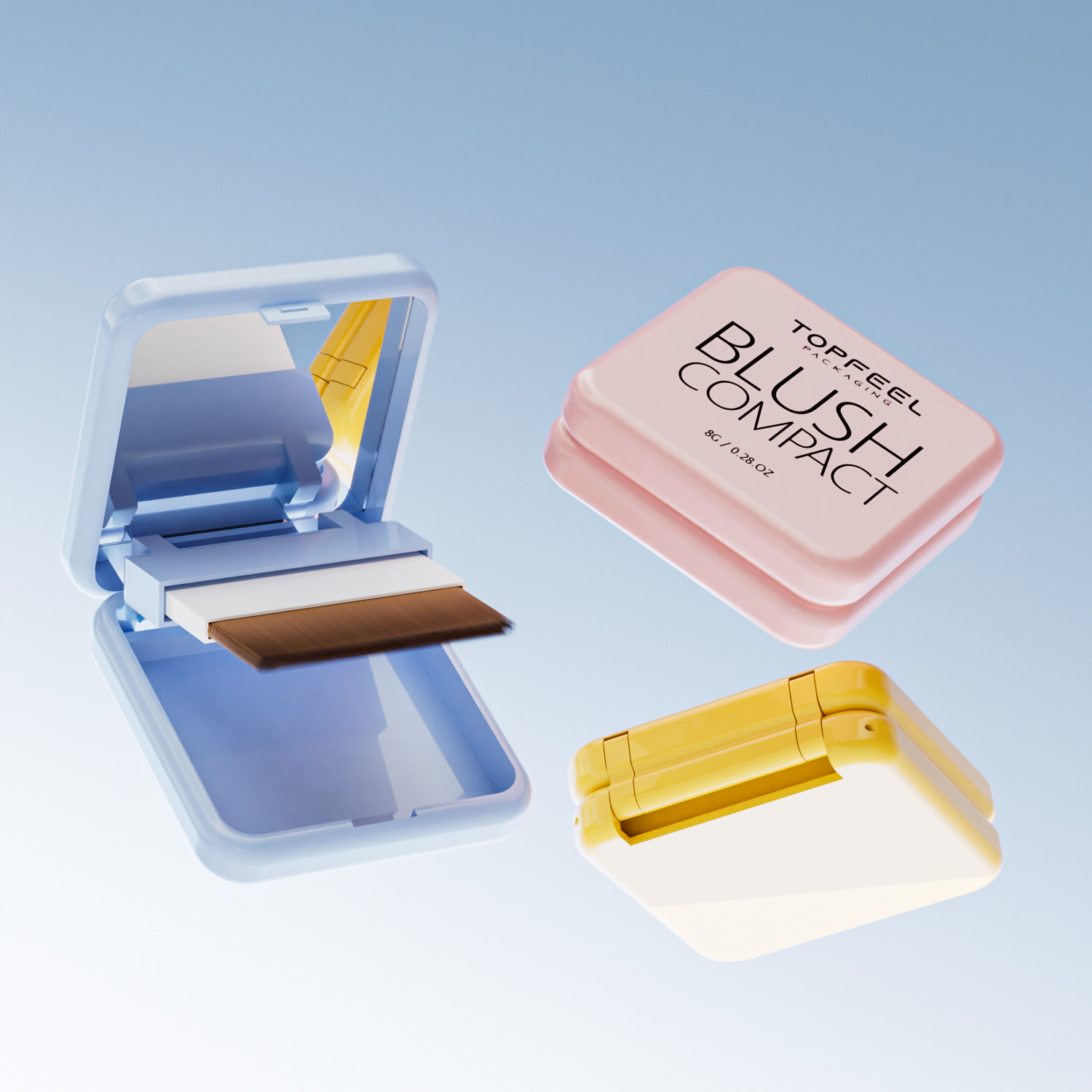
- บรรจุภัณฑ์ขนาดเล็ก เหมือน 10g เคสแป้งอัดแข็งแบบพกพา พอดีกับกระเป๋าหรือชุดอุปกรณ์เดินทางอย่างลงตัว.
- น้ำมันทำความสะอาด 200 มล. ทำให้ตรงจุดที่ลงตัวระหว่างการใช้งานและความสะดวกในการพกพา.
- ผู้บริโภคชอบตัวเลือก—รูปแบบขนาดเล็กช่วยให้ทดลองใช้งานโดยไม่ต้องมีการผูกพันทั้งหมด.
- ผู้มีอิทธิพลนิยมขนาดเหล่านี้สำหรับการจัดเรียงเรียบและโพสต์ “ในกระเป๋าของฉันมีอะไรบ้าง”.
- ปริมาณที่น้อยกว่าจะช่วยลดขยะ ซึ่งสอดคล้องกับค่านิยมด้านสิ่งแวดล้อมที่กำลังเติบโตอยู่.
- แบรนด์สามารถเสนอ SKU ได้มากขึ้นในพื้นที่จัดเก็บที่จำกัด.
- รูปแบบเหล่านี้ดูเหมือนความพิเศษเมื่อจับคู่กับฉลากที่มีแรงบันดาลใจจากวินเทจ.
การเปลี่ยนแปลงนี้ใน ขนาดสินค้า ไม่ได้มีแค่ความสะดวกสบาย—มันยังมีสไตล์ สไตล์ย้อนยุคทำให้บรรจุภัณฑ์ขนาดเล็กเหล่านี้มีบุคลิกที่ใหญ่โต.
กลไกมีความสำคัญ
คุณรู้สึกถึงการคลิกที่น่าพอใจเมื่อหมุนลิปสติกคลาสสิกขึ้นไหม? นั่นไม่ใช่แค่ความคิดถึง—มันคือการออกแบบที่ชาญฉลาด ความดึงดูดของ กลไกลลิปสติก ในท่อโทนย้อนยุคมักจะสรุปได้ว่า:
- ความสะดวกในการใช้งานที่เหนือกว่าทางเลือกที่หยาบกร้าน—ไม่มีการบิดที่น่าอึดอัดที่นี่.
- ประสบการณ์ทางประสาทสัมผัสที่เชื่อมโยงกับความทรงจำและอารมณ์.
- ส่วนประกอบภายในที่ทนทานสร้างขึ้นเพื่อการใช้งานซ้ำโดยไม่ติดขัด.
• ผู้บริโภคสมัยใหม่ต้องการมากกว่าความสวยงาม; พวกเขาต้องการความรู้สึกสัมผัสด้วย.
• คลาสสิก ฟังก์ชันการทำงานของท่อ ทั้งความเก๋และความเชื่อถือได้.
การนำเสน่ห์ทางกลเข้าไปในเครื่องมือความงามในปัจจุบันหมายถึงการนำกลับมาคลาสสิกแบบวินเทจโดยไม่ลดทอนประสิทธิภาพ—เป็นความชนะทั้งสองฝ่ายสำหรับแบรนด์ที่ไล่ตาม การออกแบบย้อนยุค คลื่น.
อัตลักษณ์ภาพ
สีสันทำมากกว่าการดึงดูดความสนใจของคุณ—มันสามารถสร้างการรับรู้ได้ ลองตรวจสอบสิ่งนี้ดูสิ:
| ประเภทผลกระทบแบบเกรเดียนต์ | อารมณ์ของผู้บริโภค | ค่าได้รับการรับรู้ | การยอมรับในตลาด (%) |
|---|---|---|---|
| การผสมสีที่อบอุ่นถึงเย็น | สงบและมีสมดุล | พรีเมียม | 38% |
| การซีดจางแบบโมโนโครม | มินิมอล | สะอาด | 26% |
| เฉดสีเนออน | แซ่บ & กล้าหาญ | ทันสมัย | 21% |
| การเปลี่ยนสีพาสเทล | นุ่มนวลและตราตรึงใจ | เป็นมิตร | 15% |
โทนสีเหล่านี้ไม่ได้มีแค่ความสวยงาม—พวกมันเป็นเครื่องมือเชิงกลยุทธ์ที่ยกระดับ เอกลักษณ์ทางสายตา, เพิ่มความน่าสนใจบนชั้นวาง และสื่อสารบุคลิกภาพของแบรนด์ในทันที.
ดังนั้น ใช่ เมื่อคุณผสมผสานจิตวิทยาสีที่ชาญฉลาดกับสัญญาณย้อนยุค คุณจะได้บรรจุภัณฑ์ที่ไม่เพียงแค่ดูดี—มันขายตัวเอง.
แนวโน้มในอนาคต
“เรโทรไม่ใช่แค่ทางเลือกอีกต่อไป—มันเป็นกระแสหลัก” มินเทลระบุในรายงานการสร้างสรรค์บรรจุภัณฑ์ไตรมาสที่ 2 ปี 2024 และไม่มีอะไรที่บอกว่ามีการพบกันระหว่างอดีตและอนาคตได้ดีไปกว่าการออกแบบที่มีโลหะผสม.
นี่คือจุดที่น่าสนใจ:
• ใช้ อัลลอยด์อะลูมิเนียม เพิ่มความทนทานโดยไม่ทำให้มีขนาดใหญ่ขึ้น มันให้ความรู้สึกหรูหราแต่ยังคงเบา.
• การจับคู่วัสดุนี้กับการลายนูนที่โค้งหรือตัวอักษรสไตล์เดคโคทำให้ได้ความสมดุลที่สมบูรณ์แบบระหว่างความเรียบหรูและความคิดถึง.
• คอมโบนี้ยังคำนึงถึงความยั่งยืน—อลูมิเนียมสามารถนำกลับมาใช้ใหม่ได้และกำลังเป็นที่ชื่นชอบของนักช็อปที่ใส่ใจต่อสิ่งแวดล้อม.
เมื่อความคาดหวังของผู้บริโภคพัฒนาไป วัสดุต่าง ๆ จึงมีความสำคัญมากยิ่งขึ้น แบรนด์อย่าง ท็อปฟีลแพ็ค กำลังผสมผสานรูปแบบดั้งเดิมกับวัสดุล้ำสมัยเพื่อให้อยู่เหนือในโลกที่กำลังเติบโตของ. แนวโน้มบรรจุภัณฑ์สไตล์เรโทร.

การบรรจุภัณฑ์ย้อนยุคสามารถเพิ่มการรับรู้เกี่ยวกับแบรนด์ได้หรือไม่?
บรรจุภัณฑ์ย้อนยุคนั้นไม่ใช่เพียงแค่เรื่องของความคิดถึง—มันเป็นเครื่องมือที่ชาญฉลาดที่สามารถเพิ่มการมองเห็นและสร้างความสัมพันธ์ที่ลึกซึ้งกับผู้บริโภค.
ประสิทธิภาพเชิงเปรียบเทียบ
- การออกแบบย้อนยุค มักใช้วัสดุที่มีสัมผัสเช่นดีบุกหรือกระดาษที่มีพื้นผิวซึ่งมีความขัดแย้งอย่างสิ้นเชิงกับความทันสมัยแบบมินิมัลลิสต์ของ การออกแบบสมัยใหม่, ทำให้สินค้ารู้สึกเป็นส่วนตัวมากขึ้น.
- ผู้บริโภคมักจะแสวงหาความสัมพันธ์ การออกแบบย้อนยุค ด้วยความเป็นจริงและความไว้วางใจ ในขณะที่ การออกแบบสมัยใหม่ สัญญาณถึงนวัตกรรมและประสิทธิภาพ.
- ล่าสุด การศึกษา NielsenIQ พบว่าแบรนด์ที่ใช้คุณลักษณะเชิง Nostalgic มีการเพิ่มขึ้น 12% ในการซื้อป impulsive เมื่อเปรียบเทียบกับแบรนด์ที่มีรูปลักษณ์ที่ทันสมัยเพียงอย่างเดียว.
• บรรจุภัณฑ์เรโทรเชื่อมโยงกับพฤติกรรมการซื้อที่อิงจากความทรงจำ ทำให้เกิดความรู้สึกทางอารมณ์ที่เพิ่มมากขึ้น • การออกแบบสมัยใหม่มุ่งเน้นไปที่ความชัดเจนบนชั้นวาง แต่สามารถกลมกลืนไปกับฝูงชนได้.
แบรนด์ที่ต้องการสร้างความโดดเด่นบนชั้นวางกำลังหันมาใช้สิ่งนี้มากขึ้นเรื่อยๆ แนวโน้มบรรจุภัณฑ์สไตล์เรโทรโดยเฉพาะเมื่อมุ่งเป้าไปที่ผู้บริโภคเจนเอ็กซ์และมิลเลนเนียลที่ตอบสนองได้ดีต่อสัญญาณวินเทจ
จิตวิทยาของรูปแบบ
ข้อมูลเชิงลึกที่สั้นและกระชับ:
• รูปร่างกลม = ความสะดวกสบายและการเข้าถึง คิดถึง หลอดลิปบาล์ม tins หรือกระจกพกพา—ให้ความรู้สึกสัมผัสที่ชัดเจน • ขวดสี่เหลี่ยม = ความเรียบง่ายและความสง่างาม. แสดงถึงแบรนด์หรูหราและมีโครงสร้าง.
ผู้บริโภคมีการเชื่อมโยงรูปร่างกับฟังก์ชันโดยไม่รู้ตัว คอมแพ็คทรงกลมให้ความรู้สึกที่ใกล้ชิดและนุ่มนวล—เหมาะสำหรับสินค้าในกลุ่มดูแลส่วนบุคคลที่อารมณ์มีความสำคัญ ขวดสี่เหลี่ยมมีความรู้สึกแข็งแกร่งและพรีเมียม—เหมาะสำหรับน้ำหอมหรือเซรั่มที่ความหรูหรามีความสำคัญ
ตามรายงานบรรจุภัณฑ์ความงามไตรมาสที่ 2 ของ Mintel เมื่อเดือนเมษายน 2024 “รูปร่างมีผลต่อมูลค่าที่รับรู้ของผลิตภัณฑ์มากกว่าสีเพียงอย่างเดียว” ด้วยเหตุนี้แบรนด์ที่ทดลองกับทั้งกล่องทรงกลมและขวดสี่เหลี่ยมจึงได้รับการมีส่วนร่วมที่ดีกว่าในกลุ่มอายุที่หลากหลาย
ด้วยการผสมผสานการใช้จิตวิทยาของรูปร่างอย่างชาญฉลาดกับแรงดึงดูดที่ต่อเนื่องของ แนวโน้มบรรจุภัณฑ์สไตล์เรโทรแบรนด์สามารถกระตุ้นการรับรู้และความต้องการได้โดยไม่ต้องพูดคำใดเลย
คำถามที่พบบ่อยเกี่ยวกับแนวโน้มการบรรจุภัณฑ์ย้อนยุค
กระแสบรรจุภัณฑ์สไตล์ย้อนยุคมีอิทธิพลต่อการตัดสินใจซื้อในผลิตภัณฑ์ความงามอย่างไร?
- มันกระตุ้นความคิดถึงด้วยวัสดุที่สัมผัสได้เช่น กระดาษแข็งที่เป็นมิตรกับสิ่งแวดล้อม กล่องหรือ ขวดแก้ว.
- ขอบมน เช่น เคสทรงกลมกะทัดรัด, เชิญชวนให้คุ้นเคย.
- ส่องประกาย การตกแต่งสีทองเมทัลลิก บอกใบ้ถึงความหรูหราในอดีตขณะเดียวกันก็สอดคล้องกับรสนิยมยุคใหม่.
→ การผสมผสานระหว่างความทรงจำและสไตล์ทันสมัยเปลี่ยนความสนใจทั่วไปให้กลายเป็นความตั้งใจซื้อ.
วัสดุและรูปทรงที่ดีที่สุดสำหรับไลน์เครื่องสำอางขนาดใหญ่ที่ต้องการเสน่ห์แบบวินเทจคืออะไร?
- พลาสติก PET & เรซินอะคริลิก: ทนทานแต่เบา — เหมาะสำหรับของขนาดพกพา เช่น a 容器ลิปบาล์ม 5g.
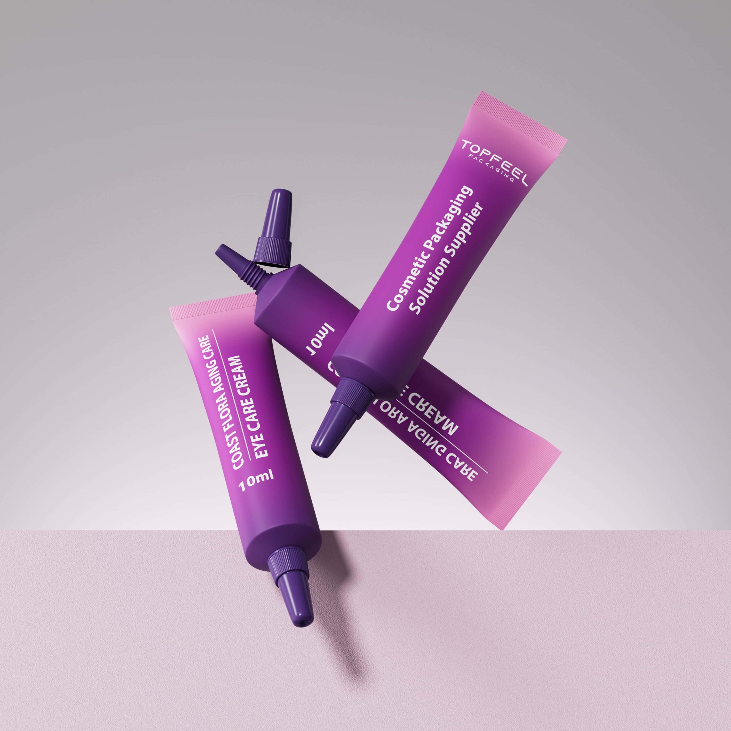
- ขวดแก้ว: ความรู้สึกหรูหราสำหรับวัสดุคุณภาพสูงเช่น ขวดเซรั่ม 15 มล. หรือ ขวดรองพื้นที่มีขนาด 30 มล..
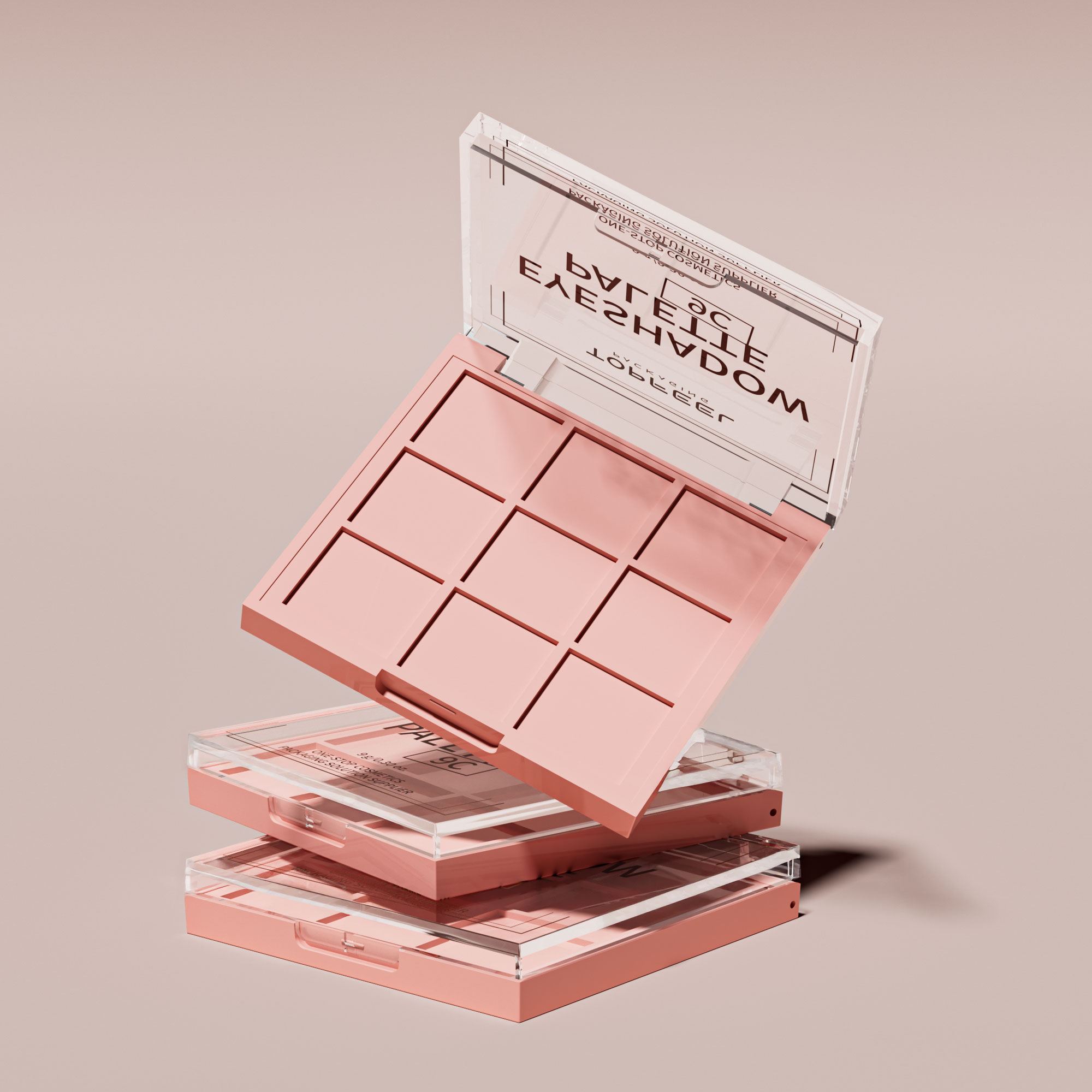
- รูปร่างที่เล่าเรื่อง: รูปร่างของภาชนะทรงกระบอกกระซิบความมีระดับ; ขวดสี่เหลี่ยม อำนาจการออกแบบโครงการ; พาเลตต์ทรงวงรีเพิ่มศิลปะให้กับอายแชโดว์.
ทำไมการจัดหาที่มีการรับรองจึงมีความสำคัญเมื่อเลือกใช้บรรจุภัณฑ์เครื่องสำอางที่ได้รับแรงบันดาลใจจากยุคเก่า?
△ การปฏิบัติตามมาตรฐาน ISO 9001 รับประกันว displine การผลิตที่คุณสามารถไว้วางใจได้
△ ข้อบังคับ REACH การปฏิบัติตามทำให้ความปลอดภัยทางเคมีโปร่งใสข้ามพรมแดน.
△ ปฏิบัติตาม RoHS วัสดุช่วยปกป้องผู้บริโภคทั่วโลกจากสารที่เป็นอันตรายในขณะที่คงความงามทางวัฒนธรรมผ่านการใช้โลหะอย่างระมัดระวัง (กลไกลท่อริมฝีปากจากอลูมิเนียมอัลลอยด์, ตัวอย่างเช่น).
เทคนิคการตกแต่งใดบ้างที่ทำให้ภาชนะแบบดั้งเดิมมีความน่าสนใจในรูปแบบใหม่?
— ฟอยล์ปั๊มร้อนสร้างชีวิตที่เปล่งประกายให้กับพื้นผิวเรียบหรือโค้ง เหมาะสำหรับการพ่นน้ำหอมทรงกระบอกที่ใช้ปั๊มน้ำพ่นแบบอะตอมไมเซอร์
— การพิมพ์ผ้าซิลค์สกรีนล็อคสีที่ตรงตาม Pantone ไว้ลึกภายในขวดเรซินอะคริลิกเพื่อให้การแสดงผลมีเอกลักษณ์ที่ชัดเจนตลอดหลายปีของการใช้งานแสดงสินค้า.
— ผิวเคลือบ UV ปกป้องการเคลือบสีดำด้านจากการซีดจาง และทำให้บรรจุภัณฑ์กล่องสี่เหลี่ยมรักษารูปลักษณ์ที่โดดเด่นภายใต้แสงในร้าน
— การออกแบบผิวสัมผัสที่มีการอัดลายพร้อมกับการนำฉลากที่กำหนดเองมาใช้มอบทั้งการสัมผัสและการจดจำในผลิตภัณฑ์ขนาดเล็ก.
จิตวิญญาณย้อนยุคกำลังมีอิทธิพลต่อกลยุทธ์การลงทุนของผู้ซื้อในจำนวนมากในวันนี้อย่างไร?
สาขาความคิดที่สั้น: ลักษณะนึกคิดที่มีความคิดถึงอดีตในตอนนี้ได้พบกับความต้องการด้านประสิทธิภาพ — PET รีไซเคิลที่เข้ากับวัสดุที่ทนทาน แปรงทามาสคาร่า ภายใต้เอฟเฟ็กต์สีเกรเดียนท์ — การสร้างสายผลิตภัณฑ์ที่ยังคงมงคลและใช้งานได้จริง
| เป้าหมายผู้ซื้อ | องค์ประกอบที่ตรงกัน | ข้อมูลที่กระตุ้นอารมณ์ |
|---|---|---|
| ความยั่งยืน | [แนวทางการจัดหาที่ยั่งยืน พลาสติกที่ได้รับการอนุมัติโดย FDA] | การดูแลควบคู่กับความรับผิดชอบ |
| ผลกระทบบนชั้นสินค้าระดับพรีเมียม | ขวดแก้ว & การตกแต่งด้วยอลูมิเนียมอัลลอยด์ | เสียงสะท้อนของเกียรติยศที่ไม่มีที่สิ้นสุด |
| การสร้างแบรนด์ที่โดดเด่น | ตัวเลือกการเคลือบสีที่กำหนดเอง การออกแบบพื้นผิวที่นูน | วัตถุรู้สึกเป็นของพวกเขาโดยเฉพาะ |
เอกสารอ้างอิง
บรรจุภัณฑ์ที่ชนะ – NIQ – https://nielseniq.com/global/en/insights/webinar/2026/webinar-packaging-design/]
[[Cosmetic Packaging Trends 2026 – Somewang –]] https://somewang.com/blog/cosmetic-packaging-trends/]
[การคาดการณ์บรรจุภัณฑ์ทั่วโลก: 2026 และต่อไป – Mintel –] https://www.mintel.com/insights/packaging/global-packaging-trends/]
[Mintel ประกาศแนวโน้มผู้บริโภคทั่วโลกสำหรับปี 2024 –] https://www.mintel.com/press-centre/mintel-announces-global-consumer-trends-for-2024/]
[เทรนด์ผู้บริโภคและบรรจุภัณฑ์ความงาม 2025 – กระดาษฟอง – https://www.bubblepaper.com/blog/beauty-consumer-and-packaging-trends-2025]
คู่มือสำหรับผู้ผลิตเครื่องสำอาง: ตรวจสอบความเข้าใจเกี่ยวกับข้อบังคับ REACH – https://xirancosmetics.com/makeup-manufacturers-ensure-understanding-of-reach-regulation/]
[ข้อกำหนด RoHS – สิ่งแวดล้อม – คณะกรรมาธิการยุโรป –] https://environment.ec.europa.eu/topics/waste-and-recycling/rohs-directive_en]
บริการ REACH สำหรับผลิตภัณฑ์เครื่องสำอางและการดูแลส่วนบุคคล – Intertek – https://www.intertek.com/assuris/chemicals/regulatory/reach-cosmetics-and-personal-care-products/]
คำถามที่พบบ่อยเกี่ยวกับการปฏิบัติตาม RoHS – คู่มือ RoHS – https://www.rohsguide.com/rohs-faq.htm]

