

Why is the Retro Packaging Trend Dominating Design in 2026?
January 26,2026
到2026年, retro packaging trend isn’t just playing dress-up—it’s stealing the show. Vintage 口紅管 bullets, frosted glass 粉餅盒 designs, and old-school aluminum tubes are flying off shelves like limited-edition vinyl records. Brands are cashing in on nostalgia because it hits where it hurts (and sells where it counts): emotion.
“Aesthetic familiarity builds trust faster than function,” says consumer behavior analyst Dr. Renee Haskins of NielsenIQ, citing a 22% higher purchase intent for products with vintage-inspired designs compared to their modern counterparts.
And sourcing managers? You’re not chasing trends—you’re calculating ROI in grams and gloss levels. Retro doesn’t just look sharp; it ships well, photographs better, and holds its own under REACH scrutiny.

The Surprising Rise of Retro Packaging in Modern Design
的 retro packaging trend is rewriting the rules of shelf appeal—where old-school charm meets next-gen branding.
Nostalgic Materials
- Eco-friendly cardboard boxes are making a comeback, not just because they’re biodegradable but because they remind people of simpler times.
- 品牌正積極投入 kraft paper, rough textures, and raw finishes—it’s all about that handmade vibe.
- Glass isn’t just glass anymore. Think amber glass, thick bases, and a weight that screams premium.
- Shoppers now associate 再生材料 with authenticity. If it feels reused, it feels real.
- Even the smell of certain packaging—like earthy tones from uncoated cardboard—triggers memory cues.
- More than 60% of consumers say 可持續選擇 influence their buying habits.
- Biodegradable doesn’t mean boring; many brands are using textured embossing on 紙板 for added flair.
- 玻璃瓶 now come in uniquely vintage hues and shapes to match nostalgic themes.
♻️ Sustainable nostalgia is no longer niche—it’s the new normal.
By mixing sustainability with throwback vibes, brands tap into emotional triggers while staying future-forward. That’s why 頂部包裝 champions these materials—they’re good for the planet and even better for brand storytelling.
獨特形狀
• Round is back—but not just any round. Think squat 圓柱形 jars that look like something your grandmother used to keep jam in. • Custom mold development allow brands to create signature silhouettes that scream “you’ve never seen this before.” • Ergonomics matter too—those curves aren’t just cute; they fit snugly in your hand or bag.
Grouped by function: – Visual Appeal: Retro-style bottle necks, fluted edges, curved shoulders – Functionality: Easy-to-grip forms, stackable bases, pour-friendly tops – Brand Identity: Signature silhouettes matched with vintage fonts
Consumers don’t just want something pretty—they want something practical that still gives them those warm fuzzy feelings from the past.
Vintage Colors
| Color Group | 情感效果 | Popular Pairings | 使用頻率 |
|---|---|---|---|
| 大地色系 | Grounded + Natural | Kraft paper + twine | 高 |
| 粉彩色彩 | Soft + Whimsical | Matte finishes + gold foil | 中型 |
| cURL Too many subrequests. | cURL Too many subrequests. | cURL Too many subrequests. | 高 |
| 金屬金 | cURL Too many subrequests. | cURL Too many subrequests. | 高 |
cURL Too many subrequests.
cURL Too many subrequests.
cURL Too many subrequests.
cURL Too many subrequests. cURL Too many subrequests.cURL Too many subrequests.
cURL Too many subrequests.
cURL Too many subrequests. 壓花 cURL Too many subrequests.
cURL Too many subrequests.
cURL Too many subrequests.

cURL Too many subrequests.
的 retro packaging trend cURL Too many subrequests.
cURL Too many subrequests.
- 永續材料 cURL Too many subrequests. retro packaging trend, offering that old-school charm without trashing the planet.
- Many companies are shifting to 回收內容, including post-consumer waste cardboard and 玻璃瓶 that bring vintage flair while cutting down on landfill overflow.
- An uptick in 環保設計 isn’t just about looks—minimalist graphics on kraft paper or tin evoke the past while reducing ink use.
- 崛起 可生物降解包裝 means those charmingly rustic boxes don’t sit in landfills for decades.
- 品牌正積極投入 道德採購, ensuring raw materials come from suppliers that treat workers fairly and minimize environmental harm.
- Tapping into vintage aesthetics helps brands stand out on cluttered shelves with hand-drawn fonts, muted colors, and nostalgic textures.
- This all feeds into the growing push toward a 循環經濟, where packaging lives multiple lives before returning to nature or industry.
認證標準
You can’t talk about responsible retro-inspired packaging without mentioning compliance. It’s not just about looking good—it’s about being safe and accountable.
• Products aligning with the retro vibe often undergo strict checks to meet REACH regulations, which limit harmful substances in materials.
• The classic look doesn’t mean outdated safety; adherence to the RoHS directive ensures electronics and components inside retro-styled packages remain free from toxic heavy metals.
• Trust is built through visible signs of quality—think seals showing full 監理合規性 stamped right onto labels.
• Modern consumers expect transparency; they want proof their favorite throwback brand follows top-tier 環境標準 set by global watchdogs.
• Behind every package is a trail of documentation—full-on material certification processes confirm what goes into each box meets eco-conscious expectations.
• These certifications also enforce strict rules around chemical usage through detailed lists of approved substances under global frameworks for chemical restrictions.
The result? Retro looks with modern peace of mind baked right in.
Decorative Elements
Retro isn’t subtle—it pops off shelves like your grandma’s soda bottle label used to. Here’s how:
1️⃣ Start with bold color palettes reminiscent of mid-century signage—these hues grab attention fast.
2️⃣ Add some shine using 燙印, which presses metallic foil onto logos or borders to create that luxe shimmer you remember from vintage chocolate tins.
3️⃣ Layer in a glossy finish via precise UV塗層, giving surfaces a slick feel while protecting printed designs from fading or scratching over time.
4️⃣ Combine both embellishments strategically—not overdone—to elevate your brand’s perceived value without overwhelming minimalistic layouts common in nostalgic styles.
Together, these details deliver more than just looks—they offer an immersive tactile experience that makes unboxing feel like opening a keepsake rather than just another product.
By weaving together authentic visuals with premium finishes, today’s brands are proving that the old-school way can still be the best way—with polish.
Why Retro Packaging Trend Is the Future of Branding
的 retro packaging trend cURL Too many subrequests.
cURL Too many subrequests.
cURL Too many subrequests.
- cURL Too many subrequests. 喜歡 cURL Too many subrequests. cURL Too many subrequests.
- cURL Too many subrequests. cURL Too many subrequests.
- cURL Too many subrequests.
- cURL Too many subrequests.
- cURL Too many subrequests.
- cURL Too many subrequests.
- cURL Too many subrequests.
這一轉變在於 cURL Too many subrequests. cURL Too many subrequests.
cURL Too many subrequests.
cURL Too many subrequests. cURL Too many subrequests. cURL Too many subrequests.
- Functional ease that beats flimsy alternatives—no awkward twisting here.
- A sensory experience that taps into memory and emotion.
- Durable inner components built for repeated use without jamming.
• Modern consumers want more than looks; they want tactile feedback too.
• Classic tube functionality offers both flair and reliability.
Incorporating mechanical charm into today’s beauty tools means bringing back vintage class without sacrificing performance—a win-win for brands chasing the retro design wave.
視覺識別
Color does more than catch your eye—it shapes perception. Check this out:
| Gradient Effect Type | Consumer Emotion | 感知價值 | Market Adoption (%) |
|---|---|---|---|
| Warm-to-cool blend | Calm & balanced | 優質 | 38% |
| Monochrome fade | 極簡主義 | 乾淨 | 26% |
| Neon gradient | Edgy & bold | 時尚 | 21% |
| Pastel transitions | Soft & nostalgic | Friendly | 15% |
These gradients aren’t just pretty—they’re strategic tools that elevate 視覺形象, boost shelf appeal, and signal brand personality at a glance.
So yeah, when you mix smart color psychology with retro cues, you get packaging that doesn’t just look good—it sells itself.
未來趨勢
“Retro is no longer niche—it’s mainstream,” noted Mintel in its Q2 2024 Packaging Innovation Briefing. And nothing says future-meets-past like metal-infused design.
Here’s where it gets interesting:
• 使用 鋁合金 adds durability without bulking things up. It feels luxe but stays light.
• Pairing this material with curved embossing or deco-style fonts nails that perfect balance between sleek and nostalgic.
• This combo also leans sustainable—aluminum is recyclable and increasingly favored by eco-conscious shoppers.
As consumer expectations evolve, materials matter more than ever. Brands like 頂部包裝 are already fusing traditional forms with forward-thinking materials to stay ahead in the ever-growing world of the retro packaging trend.

Can Retro Packaging Enhance Brand Recognition?
Retro packaging isn’t just about nostalgia—it’s a smart tool that can boost visibility and deepen consumer connections.
Comparative Effectiveness
- Retro design often uses tactile materials like tin or textured paper, which contrast sharply with the sleek minimalism of 現代設計, making products feel more personal.
- Consumers tend to associate retro design with authenticity and trust, while 現代設計 signals innovation and efficiency.
- 最近的 尼爾森IQ研究 cURL Too many subrequests.
cURL Too many subrequests.
cURL Too many subrequests. retro packaging trendcURL Too many subrequests.
cURL Too many subrequests.
cURL Too many subrequests.
cURL Too many subrequests. 潤唇膏管 cURL Too many subrequests.
cURL Too many subrequests.
cURL Too many subrequests.
cURL Too many subrequests. retro packaging trendcURL Too many subrequests.
cURL Too many subrequests.
cURL Too many subrequests.
- cURL Too many subrequests. 環保紙板 cURL Too many subrequests. 玻璃瓶.
- cURL Too many subrequests. cURL Too many subrequests.cURL Too many subrequests.
- A shimmering metallic gold finish hints at past glamour while aligning with modern taste.
→ The mix of memory and modern styling turns casual interest into purchase intent.
What are the best material and shape choices for large-scale makeup lines seeking vintage charm?
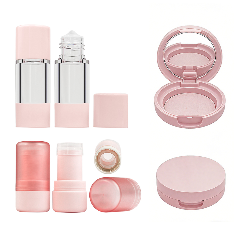
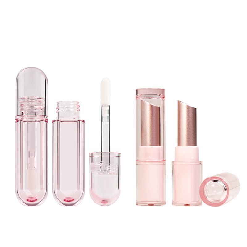
- PET plastic & Acrylic resin: Durable yet lightweight — ideal for travel-size items like a 5g lip balm container.
- Glass bottle: Luxurious feel for premium fills such as a 15ml serum bottle 或 30ml foundation bottle.
- Shapes that tell stories: Cylindrical container shapes whisper elegance; square bottle designs project authority; oval shaped palettes add artistry to eyeshadows.
Why is certified sourcing critical when adopting retro-inspired cosmetics packaging?
△ ISO 9001 compliance guarantees production discipline you can trust.
△ REACH法規 adherence keeps chemical safety transparent across borders.
△ RoHS compliant materials protect global consumers from harmful substances while preserving heritage aesthetics through careful metal use (aluminum alloy lipstick tube mechanisms, for instance).
Which decoration techniques give traditional containers an exciting new presence?
— Hot stamping foil breathes gilded life into flat surfaces or curves alike, perfect on cylindrical perfume sprays using an atomizer spray pump.
— Silk screen printing locks Pantone matched colors deep within acrylic resin jars for vivid identity retention over years of display use.
— UV coating finish defends matte black coatings against fading, ensuring rectangular box packaging retains its bold silhouette under store lighting.
— Embossed texture design plus custom label application delivers both touch and recognition in boutique runs.
How is the retro spirit shaping bulk buyers’ investment strategies today?
A short branch line of thought: Nostalgic looks now meet performance needs — recycled PET married to durable mascara brush applicators under gradient color effects — creating product lines that stay stylish yet practical.
| Buyer Aim | Matching Element | Emotional Hook |
|---|---|---|
| 永續性 | Sustainable sourcing practices + FDA approved plastic | Care paired with conscience |
| Premium shelf impact | 玻璃瓶 & aluminum alloy accents | Echoes of timeless prestige |
| Stand-out branding | Custom tinted options + embossed texture designs | cURL Too many subrequests. |
參考
cURL Too many subrequests. https://nielseniq.com/global/en/insights/webinar/2026/webinar-packaging-design/]
cURL Too many subrequests. https://somewang.com/blog/cosmetic-packaging-trends/]
cURL Too many subrequests. https://www.mintel.com/insights/packaging/global-packaging-trends/]
cURL Too many subrequests. https://www.mintel.com/press-centre/mintel-announces-global-consumer-trends-for-2024/]
cURL Too many subrequests. https://www.bubblepaper.com/blog/beauty-consumer-and-packaging-trends-2025]
cURL Too many subrequests. https://xirancosmetics.com/makeup-manufacturers-ensure-understanding-of-reach-regulation/]
cURL Too many subrequests. https://environment.ec.europa.eu/topics/waste-and-recycling/rohs-directive_en]
cURL Too many subrequests. https://www.intertek.com/assuris/chemicals/regulatory/reach-cosmetics-and-personal-care-products/]
cURL Too many subrequests. https://www.rohsguide.com/rohs-faq.htm]