How to Design Custom Rose Gold Makeup Packaging
Rose gold makeup packaging isn’t just pretty—it sells dreams. Think about it: one glimmer of that metallic blush tone and shoppers are already halfway convinced your product is worth every penny. But here’s the kicker—what looks luxe shouldn’t cost a fortune to make… or waste the planet in the process. Balancing glam, green, and good margins? That’s where things get real tricky, real fast.
Most brands fall into two camps: those who slap rose gold on anything shiny and call it a day—and those who actually know what they’re doing. You want to be in that second group.
Reading Notes in Rosé: A Luxe Look at Rose Gold Makeup Packaging
➔ Emotional Allure: Rose gold resonates with consumers through its warm, luxurious tone—balancing femininity and prestige.
➔ Design Strategy: Combining rose gold with elegant fonts, complementary colors, and subtle patterns elevates brand sophistication.
➔ Material Savvy: From glossy glam to matte chic, material finish transforms the packaging’s tactile experience and perceived value.
➔ Eco-Conscious Choices: Sustainable options like biodegradable materials or reusable designs help brands reduce environmental impact without compromising on style.
➔ Smart Budgeting: Brands can achieve a luxe look affordably by choosing cost-effective materials that don’t sacrifice quality for aesthetics.
➔ Seasonal Versatility: Rose gold adapts beautifully across seasonal campaigns—think shimmering holiday palettes or spring blush tones.
The Allure Of Rose Gold Makeup Packaging
Rose gold makeup packaging isn’t just pretty—it’s powerfully persuasive. Here’s how it wins over hearts, eyes, and wallets.
The Psychology of Color: Why Rose Gold Resonates
The emotional pull behind rose gold isn’t accidental—it’s backed by color psychology and consumer behavior.
- Its soft pink tone mixed with metallic warmth taps into feelings of comfort, passion, and indulgence.
- People associate it with romance and status—two things that sell like crazy in beauty aisles.
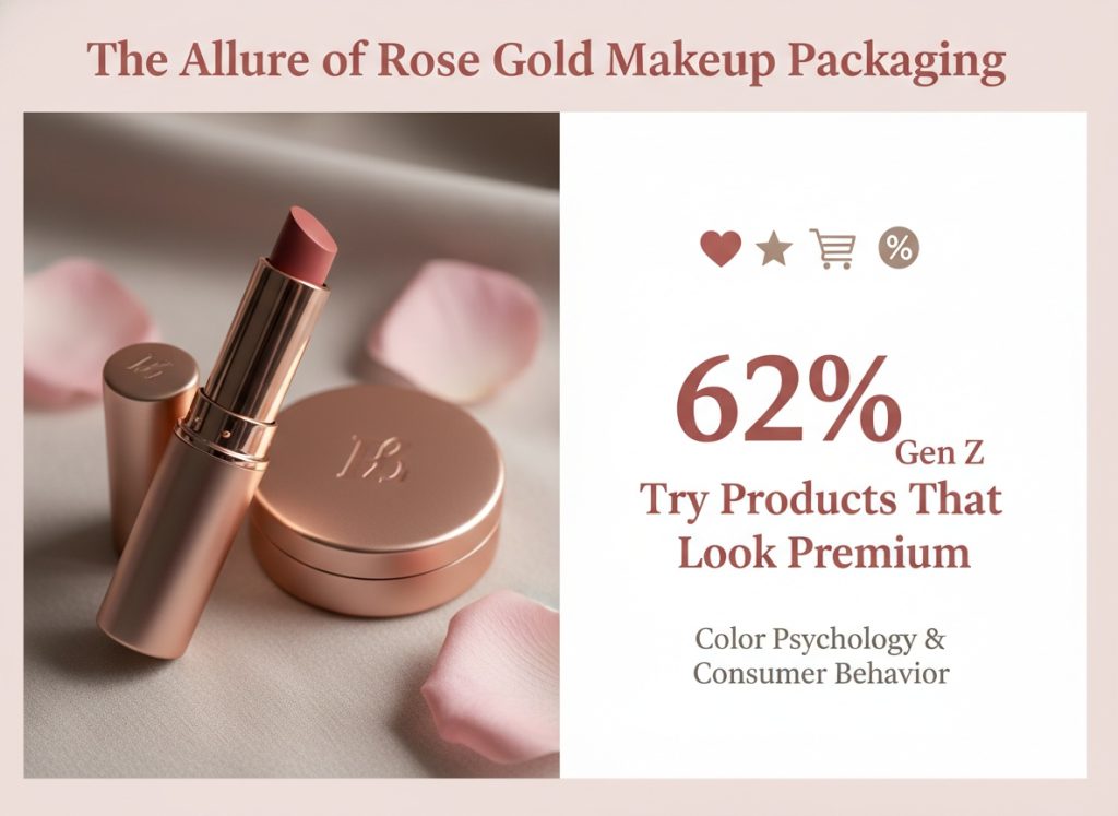
- According to a 2024 report from Mintel, over 62% of Gen Z consumers said they’re more likely to try a product if it “looks premium but feels personal.”
Now think about this:
- Pink alone? Too sweet.
- Gold alone? Sometimes too flashy.
- But together? It’s balanced—elegant yet inviting.
That’s why aesthetic appeal matters so much here. It’s not just about color—it’s about the vibe it gives off when someone grabs that lipstick tube or compact case off the shelf.
Captivating Designs: How Rose Gold Enhances Brand Appeal
When brands go for rose gold, they’re not just choosing a color—they’re crafting an identity that screams modern glam.
Grouped below are key design elements that boost brand appeal through rose gold:
🟠 Visual Aesthetics
- Reflective surfaces make packaging pop on shelves.
- Warm metallics pair well with both minimalist and ornate designs.
🟠 Consumer Attraction
- Limited-edition vibes without needing to say “limited edition.”
- Appeals across age groups—from teens to luxury-loving adults.
🟠 Packaging Design Strategy
- Works seamlessly with matte black, white, or nude tones.
- Often used for hero products in collections due to its standout nature.
🟠 Marketing Power
- Social media-friendly; rose gold packaging gets shared more often.
- Creates stronger unboxing experiences thanks to its photogenic shine.
It’s not just pretty; it performs on multiple levels—visually, emotionally, and strategically—for any brand looking to stand out without shouting too loud.
Luxury Feel: The Touch Factor in Rose Gold Packaging
What makes people call something “luxury”? It’s not always price—it can be the feel in your hand before you even use the product. That’s where the magic of tactile design kicks in with rose gold makeup items.
• Smooth finishes offer a cool-to-touch sensation that screams premium.
• Embossed logos or brushed metal textures enhance haptic feedback.
• Heavier components signal durability and quality—not cheap plastic vibes.
A quick swipe across the surface can trigger subconscious cues tied to high-end experiences—that’s smart use of sensory marketing right there. And when customers feel like they’re holding something special?
They treat the product like it’s worth more—even if it’s drugstore-priced.
So whether it’s lipstick tubes with weighted caps or compacts lined with subtle shimmer, every touchpoint builds up that sense of exclusivity tied closely to rose gold’s charm—and that’s why brands keep coming back to it.
Choosing The Right Materials For Custom Packaging
Picking the right packaging material isn’t just about looks—it’s about durability, cost, and your brand’s vibe.
The Pros and Cons of Different Packaging Materials
• Cardboard is lightweight and widely recyclable but can lack water resistance. Great for dry goods and simple shipping.
• Plastic offers strong protection but has environmental drawbacks unless it’s recycled plastic.
• Glass feels premium and preserves product integrity, though it adds weight and fragility to your shipment.
• Metal, especially aluminum, is sleek and durable but tends to be pricier than other options.
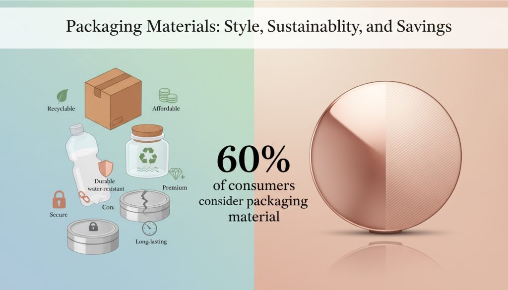
📊 According to Mintel’s Q2 Packaging Trends Report, over 60% of beauty consumers now consider a product’s packaging material before purchasing—especially when it comes to high-end items like rose gold makeup packaging.
Sustainable Options: Exploring Eco-Friendly Materials
Eco-conscious packaging isn’t just trendy—it’s fast becoming the norm:
- Recycled cardboard is a go-to for brands aiming for a rustic yet clean aesthetic.
- Biodegradable plastic breaks down faster under certain conditions, reducing landfill pressure.
- Compostable packaging, often made from cornstarch or bagasse, disappears naturally without leaving toxins behind.
- Plant-based options like plantable packaging, which contains seeds that grow once buried, are gaining traction among indie brands.
- Brands also lean into details like using soy-based or other eco-friendly inks, adding a green layer to their story.
- Sourcing from FSC-certified forests ensures truly sustainable sourcing, not just marketing fluff.
If you’re targeting fans of luxury eco-beauty lines—think those drawn to soft metallics like matte or glossy finishes on rose tones—these materials align with both values and aesthetics.
Material Finish Matters: Glossy vs. Matte in Rose Gold
Glossy finish? Flashy glam vibes all day long. Matte? Understated elegance that whispers luxury instead of shouting it:
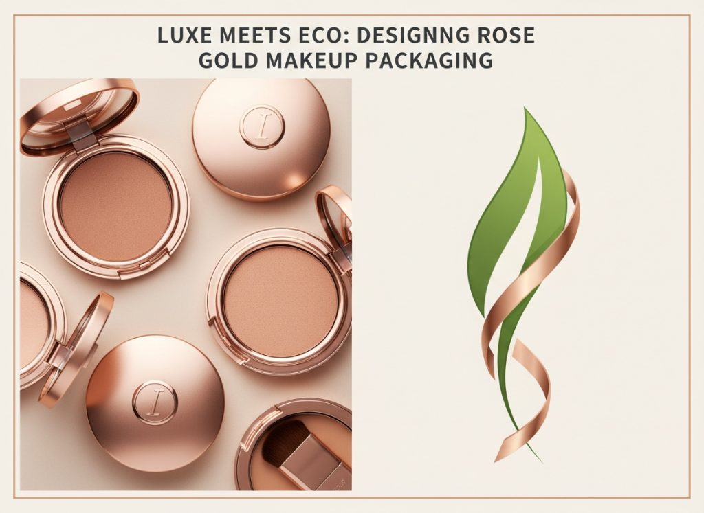
▪ A glossy finish on your rose gold box catches light beautifully—perfect for shelf appeal at first glance.
▪ A soft-touch matte surface brings sophistication while reducing fingerprints—a big plus for high-end skincare or cosmetics.
▪ Texture plays a role too: lamination enhances durability while elevating the tactile feel of either finish.
When designing your next piece of custom cosmetic packaging—or even something as specific as limited-edition blush kits—choosing between these two finishes can completely shift how customers perceive the quality inside the box.
Cost-Effective Solutions: Balancing Quality and Budget
Balancing style with spend? Totally doable if you play smart with materials:
- Go for bulk orders—many suppliers offer steep discounts when quantities hit certain thresholds.
- Opt for mid-range materials like coated paperboard instead of solid metal if you’re mimicking luxe looks affordably.
- Printing costs add up fast; limit color layers or choose digital over offset where possible.
- Factor shipping into your equation—lighter materials cut down freight charges significantly.
- Don’t overlook hidden costs like lamination or embossing; they might blow up budgets quietly if not tracked carefully during your initial cost analysis phase.
Sometimes skipping ultra-premium touches doesn’t mean sacrificing overall impact—especially if you’re working with clever design around elements like rose gold foil stamping on budget-friendly boxes that still feel elevated without breaking the bank.
3 Ways To Incorporate Sustainability In Your Packaging
Sustainable packaging isn’t a trend—it’s the new baseline for conscious brands.
Biodegradable Materials: A Green Approach to Packaging
♻️ Go all-in with these eco-smart swaps:
- Swap plastic wraps for plant-based films like PLA or cellulose, which are fully biodegradable, breaking down without leaving toxic residue.
- Choose molded pulp trays instead of foam inserts—these are not only compostable but also made from recycled paper, making them extra eco-friendly.
- Opt for cornstarch-based containers over petroleum plastics; they offer a truly green approach, especially when paired with water-based inks.
And if you’re working with luxe items like rose gold makeup packaging, these sustainable cosmetic packaging solutions can still be sleek and upscale—sustainability doesn’t mean sacrificing style.
Reusable Designs: Packaging That Lives Beyond Its Purpose
Packaging isn’t trash—it’s an opportunity to rethink design.
🌀 Consider this:
- Magnetic-lid boxes that double as storage cases? Yes, please.
- Glass jars with airtight seals that can be reused as travel containers or brush holders.
- Fabric pouches that feel high-end yet function long after the product’s gone.
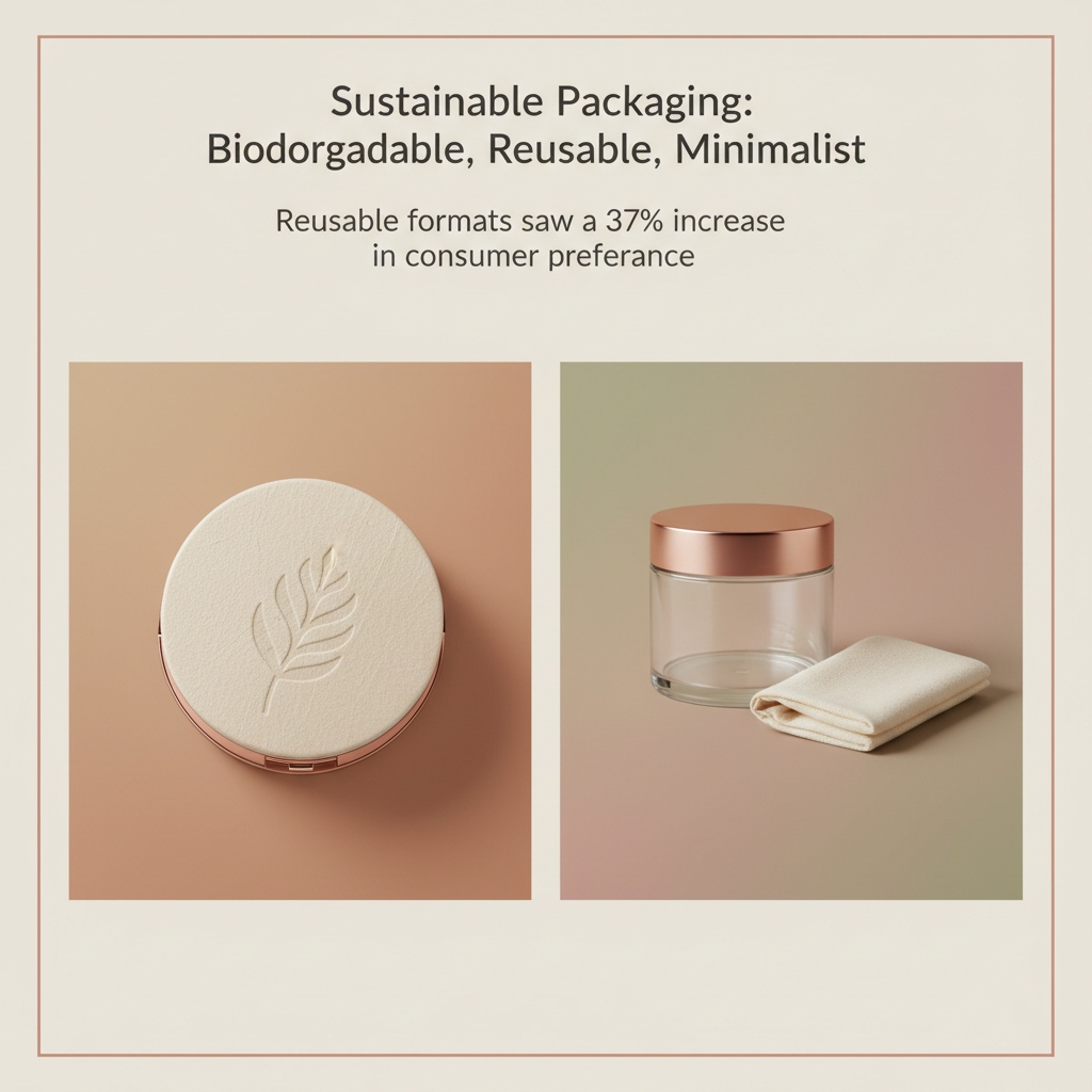
For beauty brands dabbling in rose gold makeup packaging, creating a reusable outer shell with durable hinges or mirrored interiors adds value and cuts waste. According to McKinsey’s 2024 Beauty Consumer Insights, “Reusable formats saw a 37% increase in consumer preference year-over-year,” especially among Gen Z shoppers demanding more than just pretty looks—they want purpose too.
Minimalist Packaging: Less is More in Eco-Friendly Choices
🧃 Small tweaks can lead to big impact:
• Shrink the box size—no more oversized cartons for tiny products. Less air = less shipping waste.
• Ditch unnecessary inserts; let your product speak for itself inside sleek, sturdy cartons made from recycled board.
• Limit finishes—go easy on foils and lamination so the package stays easily recyclable.
When minimalist meets chic—as seen often in rose gold makeup packaging lines—you get beautiful makeup packaging that feels premium without overdoing it on materials or cost.
Bonus Tip: Combine All Three Approaches
Here’s how it plays out step-by-step:
Step 1: Start by switching base materials to something naturally compostable, like bamboo pulp or sugarcane fiber trays. These align perfectly with sustainable goals while supporting luxury aesthetics found in rose gold makeup packaging.
Step 2: Layer on functionality by choosing jar designs or compact cases that serve a second life beyond their original use—a true nod to smart, durable, and multi-purpose thinking.
Step 3: Finally, strip back your visuals—keep logos minimal, typography clean, and colors subdued using soy-based inks on kraft paperboard for an ultra-modern yet environmentally sound finish.
This trio not only brings sustainability full circle but also builds stronger customer loyalty through thoughtful design choices rooted in real-world impact—not just good intentions.
Creating A Cohesive Look With Rose Gold Packaging
A unified design is everything when it comes to making your product stand out. Let’s shape a vibe that makes your rose gold makeup packaging unforgettable.
Color Pairing: Complementary Colors for Rose Gold
Pairing the right shades with rose gold can turn “meh” into “wow.” Here’s how you nail the vibe:
- Soft Neutrals: Think beige, ivory, and soft taupe — they let the metallic pop without competing.
- Muted Pastels: Dusty pinks, sage greens, and pale blues offer gentle contrast with high elegance.
- Deep Tones: Navy or forest green adds drama while keeping things luxe.
- Avoid overly saturated hues; they tend to clash with rose gold’s warm undertones.
These combos help build a cohesive color palette rooted in solid color theory, creating visual harmony that doesn’t scream for attention but still owns the shelf.
Font and Typography: Selecting Styles that Enhance Packaging
Typography can either elevate or ruin your whole aesthetic — don’t sleep on it.
- Choose serif fonts with delicate lines for a timeless look that complements the softness of rose gold.
- Sans-serif fonts work if you’re going modern — just keep them sleek and minimal.
- Avoid novelty fonts; they’ll clash hard with your luxe vibe.
- Use bold weights sparingly — maybe on headers or callouts — so you maintain balance in your visual hierarchy.
The goal is readability + style = packaging that looks as good as it feels.
Design Elements: How to Fuse Patterns with Rose Gold
Mixing patterns into your design? It’s all about finesse:
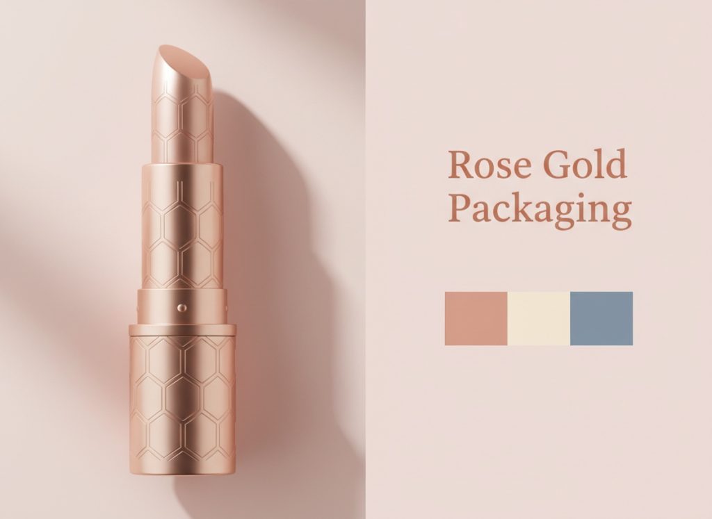
• Go subtle: Fine-line geometrics or faded florals pair well with metallic tones like rose gold.
• Keep texture in mind: Embossed patterns add dimension without needing extra color noise.
• Don’t overdo it: One focal pattern per surface keeps things chic instead of chaotic.
Patterns should enhance — not compete with — the natural glow of this popular finish, especially when working within tight packaging dimensions for compact items like lipstick tubes or palettes.
Seasonal Themes: Adapting Rose Gold for Different Collections
Seasonal refreshes keep things spicy without ditching brand identity:
Winter Collection – Pair warm metallics like rose gold with deep burgundy or frosted silver accents for a cozy luxe feel.
Spring – Lean into blush tones and mint greens; they echo nature’s rebirth and mesh beautifully with muted rose hues.
Summer – Coral pops and sandy beiges bring sun-drenched energy while letting rose gold shine softly underneath.
Autumn – Rust oranges and olive greens play up warmth, grounding the shimmer in earthy vibes.
That way, each season feels fresh but still totally “you.”
Using Color Theory Tables for Strategic Pairings
Color pairing isn’t guesswork when you’ve got data on your side:
| Base Tone | Complementary Hue | Emotional Effect | Best Use Case |
|---|---|---|---|
| Rose Gold | Sage Green | Calm & Balanced | Spring/Summer launches |
| Rose Gold | Charcoal Gray | Sleek & Modern | Unisex collections |
| Rose Gold | Dusty Blue | Soft & Romantic | Bridal/Limited Editions |
| Rose Gold | Ivory | Clean & Classic | Everyday essentials |
This table helps visualize how different combinations impact perception—essential when designing cohesive collections across product lines like blushes, compacts, and lip kits using consistent elements from your chosen color palette.
Layering Fonts Without Losing Elegance
Short tips stacked up quick:
– Header font? Try Didot or Playfair Display — both ooze class alongside metallic finishes like rose gold.
– Body text? Avenir Light nails readability without stealing spotlight from other design elements.
– Accent font? Script styles should be used sparingly—think logo marks or quotes only!
Keep font pairing balanced so nothing overshadows your hero finish—aka that gorgeous glow from your rose gold makeup packaging centerpiece.
The Role of Texture in Pattern Integration
Here’s how textures turn flat designs into tactile experiences:
Step 1 – Start simple: Choose one dominant pattern—like pinstripes or abstract waves—that complements rather than competes with shiny surfaces like foil-stamped rose gold labels.
Step 2 – Add depth using embossing techniques on matte backgrounds; this contrast enhances both touch and visual appeal.
Step 3 – Combine gloss varnish over select pattern areas so light bounces differently depending on angle—adds intrigue without cluttering space!
When done right, texture doesn’t just look good—it makes people want to pick up the product again…and again.
Matching Seasonal Trends With Brand Identity
Let’s break this down by collection type + trend alignment:
Holiday Kits • Metallic red accents + snowflake motifs = festive sparkle
• Matte black boxes lined in rose foil give off upscale winter vibes
Valentine’s Day • Blush pinks + heart-shaped cutouts = romantic energy
• Soft script typography layered over glossy rose panels
Back-to-School Sets • Minimalist layouts using gridlines + copper-toned foil stamping
• Neutral tones like sand beige make products feel versatile yet premium
By syncing seasonal themes with key elements of brand identity—like consistent use of rose gold, clean typography choices, or signature patterns—you create a sense of continuity even as Gen Z trends evolve throughout the year.
Combining Color + Typography + Pattern Seamlessly
Let these pieces work together instead of fighting each other:
– Use soft neutral backgrounds so bold fonts stay legible against reflective surfaces like metallic finishes found on most rose gold makeup packaging.
– Pick one focal point per side: If one panel features heavy pattern work, let another be text-forward instead of doubling down visually everywhere at once.
– Harmonize tone across all components—from box exterior down to inner tray inserts—to build trust through consistency across touchpoints.
It’s not just about looking pretty—it’s about telling a story every time someone opens their favorite beauty buy wrapped in smart design choices anchored by soft shimmer and strong branding cues.
FAQs about Rose Gold Makeup Packaging
What makes rose gold makeup packaging so attractive to shoppers? It’s not just a color—it’s an emotion. That warm pink-gold glow feels like elegance wrapped in comfort. People are drawn to it because it whispers luxury without shouting, and it carries a softness that feels personal. On the shelf, rose gold doesn’t beg for attention—it earns it.
How can I make my rose gold packaging feel as good as it looks? * Use soft-touch matte finishes for a velvety grip that lingers in memory.
- Metallic coatings add depth and shimmer—perfect for catching light (and eyes).
- Pair tactile textures with sturdy materials to create something people want to hold onto.
Are there sustainable options available if I’m ordering large quantities? Yes—and they’re getting better all the time:
- Recycled PET plastic balances durability with reduced waste impact.
- Molded pulp or kraft paperboard offers structure while staying biodegradable.
- Bamboo blends bring in natural charm and eco-conscious appeal.
These choices let you stay kind to the planet without compromising on style.
Which colors work best alongside rose gold in custom designs? Soft neutrals like cream or sand keep things elegant, while pastels—think blush pink or pale lavender—create harmony without overwhelming the metallic warmth of rose gold. If you’re feeling bold, deep navy or charcoal adds contrast that feels modern but still refined.
Can I balance price and quality when producing bulk orders of this type of packaging?Absolutely—but it’s more art than math. Instead of going full foil across every surface, consider selective accents: maybe just the logo shines while everything else stays matte and grounded. Choose mid-tier materials but elevate them through design decisions that feel intentional rather than cost-cutting.
Should I go glossy or matte with my rose gold finish components?Glossy screams glamour—it reflects light dramatically and turns heads fast—but too much shine can overwhelm delicate branding elements. Matte tones things down; they whisper instead of shout, perfect for brands leaning into subtlety over sparkle. The right choice depends on your product’s personality… is she bold at midnight or graceful at dawn?
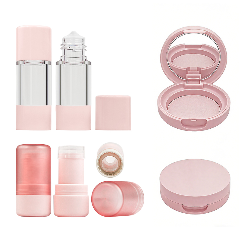
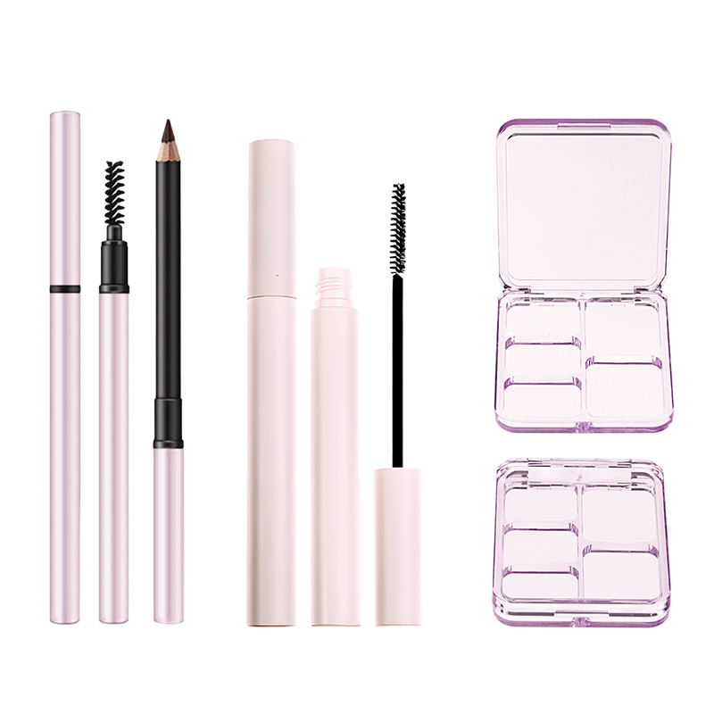
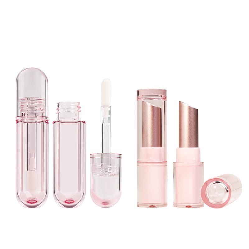
Whether you are looking for a stunning mascara tube, a chic lip gloss tube, an elegant powder container, or a versatile empty makeup palette, integrating rose gold accents can transform your collection into a must-have luxury experience.
References
- The Color Rose Gold – Adobe Express
- Mintel announces Global Beauty and Personal Care Trends for 2024 – Mintel
- How Sensory Research Impacts Marketing Strategies and Consumer Behavior – Compusense
- Sustainable Solutions: Transforming biodegradable packaging for cosmetics – Hongren
- 6 Benefits Of FSC Certified Packaging – BPKC
- The Difference Between Glossy, Satin, and Matte Labels – Blue Label Packaging Company
- Why Choose Molded Pulp Packaging? – EggTrayEquipment
- Winning in sustainable packaging in 2025: Bringing it all together – McKinsey
- What Colors Go With Rose Gold: Must-Know Color Matches – Atolea Jewelry
- Gen Z Beauty Shopping Trends: How This Generation is Redefining the Industry – Insights In Marketing

