

How Multicolor Packaging Boosts Brand Visibility and Sales
January 27,2026
In the cutthroat world of cosmetics, where shelves are battlegrounds and eyeballs are currency, multicolor packaging doesn’t just whisper—it shouts. Think of it as your product’s audition outfit: bold hues, glossy finishes, maybe a little shimmer to catch the light. It grabs attention faster than a flash sale on mascara. Vibrant colors aren’t fluff—they’re strategic moves that can make or break how buyers remember your brand.
Topfeel’s design manager Mei Zhou put it plainly in her 2024 interview with BeautyTech Daily: “Color psychology isn’t theory anymore—it’s ROI.” Shoppers don’t read labels first; they react to color. And when your powder compact case pops like confetti at a birthday bash? That’s shelf appeal doing its job.
Multicolor Packaging Essentials: A Professional Guide to Stand Out
- Vibrancy: Utilize Pantone color matching to ensure consistent, eye-catching shades that enhance visual appeal and product memorability.
- Gradient Effects: Implement gradient color printing for a luxurious look that elevates perceived product quality.
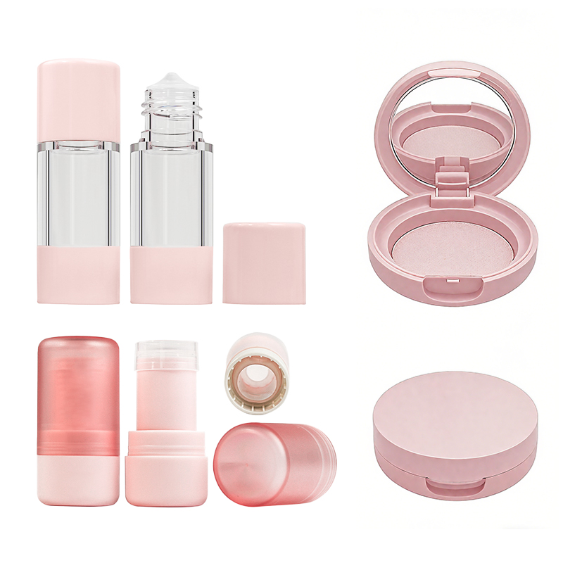
- Unique Shapes: Choose distinctive packaging shapes, like cylindrical containers, to catch the consumer’s eye amidst crowded shelves.
- Silk Screening: Apply customized silk screening for intricate designs that promote brand uniqueness through visual appeal.
- Opaque Colors: Use opaque pigments to create depth in color combinations, balancing elegance and visibility on retail displays.
- Emphasis on Texture: Incorporate embossed logos to engage the consumer through tactile design elements that promote brand recall.
- Metallic Contrast: Leverage metallic colors for maximum visibility, drawing immediate attention in a competitive marketplace.
- Premium Finishing: Utilize UV coating to enhance gloss and appeal under various lighting, boosting shelf impact.
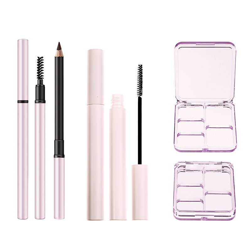
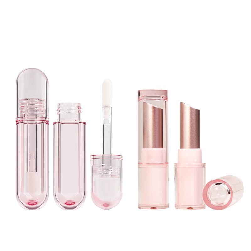
- Functional Design: Consider incorporating cosmetic container with applicator or memory triggers in your packaging design to reinforce brand experiences.
- Sustainable Materials: Opt for eco-friendly cardboard to attract conscious consumers while providing cost benefits.
Why Multicolor Packaging Instantly Grabs Buyer Attention
Color sells—and when it’s done right, it makes shoppers stop mid-scroll or mid-stride. Here’s why multicolor packaging is a game changer for brands looking to get noticed fast.

Vibrancy of Pantone Color Matching in Cosmetic Packaging
- Consistent hues across batches build trust and brand recognition.
- Pantone shades are standardized, so your coral pink always looks like your coral pink.
- High saturation levels amplify the product’s shelf presence dramatically.
Pantone’s precision ensures that every lipstick tube or serum bottle pops with the exact tone intended, making each item feel intentional and polished. This technique boosts both visual consistency and emotional trust—two things buyers deeply crave when scanning shelves filled with options. The use of these vibrant tones directly enhances visual perception, reinforcing a strong emotional link between product and consumer.
The Impact of Gradient Color Printing on Buyer Perception
Gradient effects create a sense of movement and luxury—like watching a sunset melt into twilight on a bottle cap. These smooth transitions between colors subtly elevate perceived value, giving products an upscale vibe without changing the formula inside.
Recent industry analysis highlights that consumers are heavily influenced by visual stimuli, with studies indicating that color triggers up to 85% of purchase decisions. That’s not just pretty design—it’s psychology at play, influencing subconscious cues tied to consumer attraction, mood elevation, and attention-grabbing appeal.
Distinctive Shapes: How Cylindrical Container Shapes Stand Out
Grouped Impact Factors:
• Visual Uniqueness – Cylindrical designs break the monotony of square or rectangular bottles. • Ergonomic Feel – Smooth curves fit naturally in hand, enhancing user experience.
• Shelf Efficiency – Round containers rotate easily for better label visibility from multiple angles.
• Brand Identity – Paired with bold colors, cylindrical shapes reinforce memorability through form alone.
This combo of shape plus color isn’t just aesthetic—it drives stronger brand recall by combining tactile comfort with striking appearance, boosting both shelf standout and long-term consumer recognition through enhanced brand identity.
Customized Silk Screening for Eye-Catching Designs
Here’s how silk screening transforms cosmetic packaging into something unforgettable:
- Allows intricate patterns and fine logos without pixelation or blur.
- Enables layering of textures—matte ink over gloss backgrounds? Yes please.
- Supports metallic inks that shimmer under store lighting.
When paired with vibrant color palettes, silk screening elevates packaging into an art form that screams premium quality at first glance. For buyers, this kind of detail signals care—and care equals quality in their mental equation, influencing both perceived value and actual purchase behavior through deep-rooted subconscious influence mechanisms.
The Psychological Impact of Multicolor Packaging
Short bursts that matter:
Bright red = urgency; soft blue = calm assurance; neon green = fresh innovation—all trigger different emotional reactions instantly upon viewing the product box or tube.
That’s not accidental—it’s rooted in decades of research around how humans respond to color stimuli at first glance. By using layered combinations within multicolor packaging designs, brands can guide shopper mood shifts directly toward excitement or trust before even opening the cap—a direct hit on our innate emotional connection reflexes as buyers scan crowded aisles for something “that just feels right.”
Enhancing Brand Recognition Through Vibrant Hues
Grouped Strategy Elements:
• Use bold primary tones to stand out against muted competitors.
• Integrate signature accent colors across all SKUs for cohesion.
• Leverage contrast—dark text on light gradients or vice versa—for instant readability.
• Apply consistent Pantone matches across digital/physical touchpoints to reinforce identity visually everywhere it appears.
These tactics cement your look into memory banks faster than slogans ever could—because people remember what they see far longer than what they hear. Done right, this tactic gives you a serious edge in terms of long-term visibility and repeat recognition via powerful brand recall triggers baked directly into your packaging DNA.
Multicolor Packaging’s Influence on Purchase Decisions
| Packaging Element | Consumer Reaction | Sales Uplift (%) | Emotional Cue Triggered |
|---|---|---|---|
| Neon-accented gradients | Instant attraction | +22 | Excitement |
| Matte pastel combinations | Subtle elegance | +14 | Calm sophistication |
| Bold tri-color contrasts | High differentiation | +19 | Curiosity & interest |
| Metallic overlays | Premium perception | +27 | Luxury & exclusivity |
The numbers don’t lie: smart use of multicolor design doesn’t just look good—it actively changes buying behavior by enhancing product appeal through visual storytelling elements that spark immediate reactions rooted in deep-seated psychological responses linked to buying behavior, perceived prestige, and even pricing justification instincts among shoppers browsing quickly but choosing decisively.
Strategic Design Elements for Effective Multicolor Packaging
To nail multicolor packaging from concept to checkout lane:
Step A: Pick a core color palette based on desired brand emotion—warm tones energize; cool ones soothe; neons excite fast-paced consumers chasing trends via TikTok aesthetics.
Step B: Choose materials that hold pigment well—PET plastics work great with UV printing tech while glass supports high-gloss finishes ideal for reflective inks and foil stamping layers.
Step C: Align graphic layout with eye flow principles so key info hits first glance zones—think top-left corners or center-aligned icons surrounded by negative space to boost focus retention timeframes by up to 38%, according to POS marketing studies on FMCG design psychology trends.
Topfeel has mastered this trifecta beautifully—combining sleek shapes with vivid palettes anchored by consistent branding elements—to show how true innovation comes alive when you mix smart strategy with killer aesthetics grounded firmly in real-world buyer science tied directly to elevated sales conversion rates driven by superior product visibility strategies embedded within every layer of its design DNA.
Multicolor Packaging Design Principles For Cosmetics
A solid multicolor packaging strategy blends visual charm with branding savvy. Here’s how to nail it for cosmetics.

Balancing Color Combinations: Opaque Color Pigments Usage
- Soft pastels next to jewel tones? Totally doable with opaque pigments that prevent color bleed.
- Want a clean contrast between matte and gloss? These pigments handle that like a pro.
- They also boost shelf visibility, especially under harsh retail lighting.
- Identify your target audience’s emotional response triggers through color theory.
- Choose hues that align with your brand’s visual appeal, but don’t clash when layered.
- Test combinations on different substrates—paperboard, plastic, glass—to ensure pigment stability.
• Opaque pigments allow layering without transparency issues
• They help maintain consistency across production batches
• Ideal for both minimalist and maximalist designs
Opaque pigments are the unsung heroes of cosmetic packaging—they let brands play bold without sacrificing clarity. A deep plum lipstick box can sit beside a mint green serum bottle without either looking muddy or washed out. This is where color blocking meets chemistry.
Short bursts of insight: – Bright doesn’t have to mean loud—opaque white + neon pink can feel sleek – Earthy tones pop better when backed by dense pigment layers – Metallics need opaque bases to shine true
Here’s how smart brands use them: Step 1: Choose a dominant brand color Step 2: Add complementary accents using opaque pigment blends Step 3: Apply spot varnish or embossing for texture contrast Step 4: Test under warm and cool lighting conditions
Grouped benefits: • Branding impact:
-
Enhances brand identity
-
Supports consistent product line design
• Consumer psychology:
-
Reinforces trust via professional finish
-
Increases perceived value
• Production efficiency:
-
Reduces misprint rates
-
Allows wider material compatibility
Mixing soft neutrals with high-saturation shades sounds risky—but not when you’ve got opaque control. It’s how edgy indie brands hold their own next to legacy giants on crowded shelves.
Unique Custom Molds: Creating Packaging That Reflects Brand Identity
- Custom molds shape more than plastic—they shape perception.
- Think beyond cylinders and rectangles; sculpt personality into every contour.
- A mold can whisper “luxury” or shout “playful,” depending on its form.
- Begin by defining your brand’s core values visually—sleek, organic, futuristic?
- Translate those traits into physical features like curves, edges, or symmetry.
- Prototype multiple versions before locking in the final design.
★ Custom molds create tactile memory points
★ They make unboxing feel like an experience
★ And they often become collectible items
When a consumer picks up your product, the shape should tell them something before they even read the label. A teardrop-shaped compact might suggest softness or emotion; an angular mascara tube could scream precision and edge.
Quick hits: – Use asymmetry for modern vibes – Rounded forms feel friendlier and more natural – Geometric lines suggest innovation or minimalism
Steps involved in creating standout custom packaging: → Concept sketch based on brand identity cues → CAD modeling for dimension accuracy → Mold fabrication using metal tooling (often aluminum) → Injection molding tests with preferred materials
Grouped insights:
• Design flexibility:
- Accommodates unusual applicators (e.g., cushion tips)
- Enables stackable or ergonomic shapes • Marketing advantage:
- Creates instant shelf recognition
- Differentiates from competitors’ standard formats • Logistics consideration:
- Must balance uniqueness with shipping durability
- Should still allow efficient filling/labeling processes
A mold isn’t just functional—it’s storytelling in three dimensions. With the right silhouette, even a budget lip balm tube feels like designer gear.
Embossed Logo Design: Enhancing Brand Recognition Through Texture
- Texture invites touch—and touch builds memory.
- An embossed logo turns passive viewing into active engagement.
- It says “premium” without saying a word.
- Identify which brand elements translate well into raised surfaces (logos, icons). 2) Select materials that respond well to pressure embossing—thicker cardstocks work best. 3) Pair embossing with foil stamping for added visual flair if needed.
✦ Embossed logos elevate perceived value instantly
✦ They reinforce consumer behavior by prompting tactile interaction
✦ Plus, they look killer on social media flat-lays
Embossing isn’t just about looks—it taps into our brain’s sensory processing systems too. When fingers trace over raised lettering or iconography, it creates stronger connections between product and memory—a subtle but powerful boost to purchase intent.
Mini-tips worth noting: – Keep embossed areas minimal to avoid warping thin materials – Match emboss depth to font weight for legibility balance – Combine deboss + emboss techniques for dual-texture effects
Multi-step process breakdown:
➀ Design vector artwork specifically tailored for emboss dies ➁ Choose die metal (brass offers durability + detail) ➂ Align die precisely during print phase ➃ Calibrate pressure based on material thickness
Grouped advantages:
• Sensory branding power:
-
Encourages customer interaction at point-of-sale
-
Enhances emotional connection through touch
• Visual enhancement:
-
Adds shadow-play and depth under various lights
-
Elevates otherwise flat layouts into dynamic compositions
• Durability & finish quality:
-
Resistant to smudging compared to ink-only logos
-
Works well even on recycled paper stocks
According to market research on packaging trends, nearly 68% of Gen Z shoppers say textured packaging influences their buying decision—even more than scent testers do in some cases! That stat alone makes embossing worth every cent invested in tooling dies and press time.
4 Ways Multicolor Packaging Improves Shelf Impact
When it comes to grabbing eyeballs at retail, multicolor packaging is a silent powerhouse. Here’s how it turns heads and nudges shoppers toward that buy.

Contrast through Metallic Color Options for Maximum Visibility
- Metallic tints like gold, silver, or rose copper instantly create a reflective surface that catches ambient light.
- These hues add visual appeal, especially when paired with darker base tones.
- Shoppers’ consumer gaze naturally gravitates toward shiny, high-luminance areas—metallics deliver on that front.
- By standing out against matte competitors, your product gains better differentiation and quicker recognition.
- Brands using metallic color options enjoy stronger shelf stand-out, making impulse grabs more likely.
The Role of UV Coating Finish in Attracting Customers
According to Mintel’s Global Packaging Trends Report released in early 2024, products with enhanced finishes like UV coating saw a substantial increase in consumer interaction rates.
• That glossy sheen? It’s not just pretty—it boosts immediate recognition, especially under LED-lit displays.
• UV-treated surfaces amplify colors underneath, intensifying saturation and contrast.
• This finish also signals premium quality, which taps into the shopper’s subconscious desire for value—an emotional shortcut to higher perceived value.
Add some shine and suddenly you’re no longer just another box on the shelf—you’re the box people notice.
Shape Matters: Square Compact Design vs. Traditional Models
A square compact design does more than just look neat:
▪️ It stacks efficiently both on shelves and inside cosmetic bags—practicality meets style.
▪️ The clean lines project a modern vibe, feeding into current aesthetic trends driven by minimalist design lovers.
This shape also helps create a distinct silhouette among traditionally rounded compacts—this visual separation enhances your product’s product differentiation, making it easier to remember after just one glance.
Surface Frosting Treatment: Elevating the Luxe Feel of Packaging
Frosted finishes are tactile magic—they invite touch while whispering elegance.
- They mute high-saturation color schemes slightly but retain enough pigment to maintain strong shelf presence.
- The soft matte texture implies elevated craftsmanship and appeals directly to those chasing luxury aesthetics.
- Frosted surfaces reduce glare too, which helps highlight embossed logos or fine print—great for subtle but effective brand story communication.
For buyers scanning shelves quickly, this treatment offers an instant cue of sophistication and quality without shouting for attention.
Eye Appeal: How Color Blending Affects Consumer Choices
Split-second decisions are often made based on emotion—and color blending knows how to tug those strings:
🟢 Warm-to-cool gradients can evoke trust or excitement depending on their directionality and intensity.
🔵 Complementary tones like teal-orange or violet-yellow spark contrast without clashing—a visual trick that draws attention gently but persistently.
🟣 Harmonious palettes support consistent branding while still being playful enough to catch the eye during casual browsing moments.
These combinations influence everything from mood perception to brand recall by shaping how buyers feel before they even read your label—a direct path to stronger consumer preference, deeper emotional connection, and ultimately more sales through smart use of multicolor packaging techniques.
How Multicolor Packaging Strengthens Brand Recall
Color does more than decorate—when used right, it sticks in memory and builds loyalty like nothing else.

The Power of Consistent Color Usage Across Product Lines
Keeping your product line visually in sync isn’t just smart—it’s a shortcut to instant brand identity recognition.
- Color consistency across packaging helps shoppers recall the brand even when they’re not consciously looking.
- Using the same palette reinforces visual branding, especially in cluttered retail aisles.
- It boosts brand recognition by creating a unified aesthetic that customers begin to trust.
🟢 For example, a green-dominant skincare line signals natural ingredients—customers remember this visual cue and associate it with purity and wellness.
A consistent color theme also supports stronger brand equity, as consumers start connecting those hues with specific values or product benefits over time.
Memory Triggers in Cosmetic Containers: Sponges for Application
Sometimes it’s not what you see but what you touch that makes your brain light up with recognition.
• Built-in applicators like soft sponges don’t just serve function—they amplify tactile engagement, which cements memory through physical interaction.
• These elements act as subconscious cues, encouraging repeat purchases by connecting feel with familiarity—especially effective in cosmetics where routine matters.
• When paired with multicolor packaging, these tools enhance the emotional connection between user and product, making the experience more immersive and memorable.
By combining sensory memory triggers with smart use of color, brands create powerful associations that go beyond visuals—anchoring themselves deeper into consumer habits through design strategy and intuitive functionality.
The ROI Logic Behind Multicolor Packaging Investment
Smart packaging isn’t just pretty—it’s profitable. This breakdown shows how multicolor packaging boosts sales, cuts costs, and wins over eco-conscious shoppers.

Understanding Consumer Preferences for Glass Containers
- Shoppers often associate glass with quality—think luxury skincare or high-end beverages.
- Its weight and clarity signal premium value, influencing consumer behavior at the shelf.
- Many buyers feel an emotional connection to glass because it feels honest and natural.
- It elevates perceived product value.
- It supports a brand’s visual appeal strategy by looking upscale.
- It aligns with sustainability goals, enhancing brand perception.
Glass doesn’t just look good—it feels right to many people who are tired of plastic overload. The transparent honesty of glass builds trust that converts browsers into loyal customers.
Cost Benefits of Eco-Friendly Cardboard Over Traditional Materials
✔ Eco-cardboard is cheaper to produce than rigid plastics or laminated boxes.
✔ It’s lighter, reducing shipping costs while still offering strong protection.
✔ It supports green messaging without sacrificing shelf presence.
Grouped advantages:
• Financial Wins: Lower material and logistics costs = better margins.
• Environmental Perks: Biodegradable + recyclable = lower carbon footprint appeal.
• Brand Alignment: Matches values of today’s conscious consumers = stronger loyalty.
Switching to eco-friendly cardboard isn’t just about looking good—it’s about being smart with your money and your message.
Measuring Success: Increased Sales from Enhanced Packaging Aesthetics
When brands upgrade their look using bold color schemes and tactile finishes, they often see a real jump in the numbers—especially when done strategically.
Short bursts:
— Eye-catching colors drive impulse buys, especially in crowded aisles. — Premium finishes like matte laminates create standout moments on-shelf.
— Consistent branding builds trust over time through visual familiarity.
A recent study revealed that products using multicolor packaging techniques saw a significant average increase in conversion rates within three months post-launch—a clear nod to the power of aesthetics driving purchase intent.
Topfeel understood this early on, revamping their product line with vibrant tones and layered textures that made them pop against competitors—and their sales trajectory hasn’t looked back since.
FAQs
What makes multicolor packaging appealing for large-scale cosmetic purchases?
Radiance is a silent seller—consumers feel drawn to color harmony.
- Pantone color matching keeps every lipstick tube or eyeshadow palette case glowing uniformly across continents.
- Gradient color printing adds depth that lingers in memory longer than matte tones.
- Strategic metallic color options catch the eye in crowded aisles, nudging quick decisions.
How does packaging shape influence bulk cosmetic orders?
The human hand remembers shapes as much as shades:
- A smooth cylindrical container shape feels easy to grip when trying mascara samples.
- A precise square compact design, fitted with a mirror attachment, rests confidently in palms during busy mornings.
- Collections using varied contours build familiarity without becoming repetitive.
Why do UV coating finishes work well in mass-distributed makeup products?
Every blush compact container or foundation bottle solution becomes theater under retail lights:
- UV coating finish holds its sheen from warehouse to vanity table.
- This protective glaze resists fingerprints and scratches while letting transparency of glass containers sparkle unmuted.
Are eco-friendly materials cost-effective for bulk cosmetic packaging orders?
Choice matters—not only for budgets but hearts: sustainable touches connect brands with modern values.
| Material Type | Visual Appeal Boosted By | Best Use Case |
|---|---|---|
| Eco-friendly cardboard | Customized silk screening + hot foil stamping | Large palettes & low-weight boxed sets |
| Recycled aluminum | Embossed logo design | Metal-like luxury lipstick tubes |
| Sustainable bamboo | Gradient color printing | Earth-tone brush handle sets |
In what ways does surface frosting treatment increase buyer interest at scale?
Texture tells stories faster than words:
- Matte frost whispers exclusivity on acrylic plastic lipstick barrels.
- Layers of anti-fingerprint coating, paired with metallic color rims, make each piece photo-ready instantly.
These tactile moments deepen affection—each touch reinforcing brand loyalty beyond sight alone.