

Effective Methods for Enhancing Your Empty Palette Design
October 10,2025
You ever picked up an empty palette that felt like it came free in a cereal box? Flimsy plastic, dull colors, cheap clasps—it’s like the packaging forgot it had a job to do. In a market overflowing with glam and glitter, a lackluster empty palette is a brand’s silent assassin. Buyers want packaging that whispers “luxury” before it even opens. And when it doesn’t? That’s money left sitting on the shelf, untouched.
Thing is, customers don’t just “buy makeup”—they buy the drama, the ritual, the mirror moment. If your palette doesn’t play the part, it’s curtains. Smart design, bold finishes, eco-friendly creds—these aren’t extras; they’re the ticket in.
Reading Notes for the Empty Palette That Sells Before It Opens
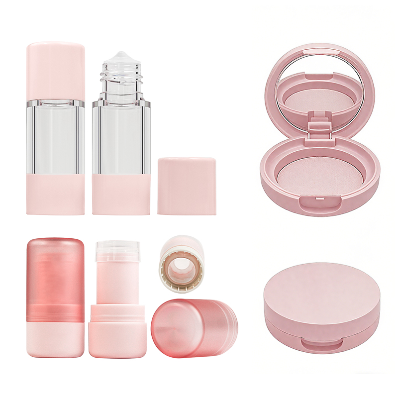
➔ Design Matters: Bland acrylic plastic compact cases weaken brand identity, making your product forgettable on crowded shelves.
➔ Finishes Speak Luxury: Skipping UV coating on aluminum shells downgrades perceived quality and shelf appeal.
➔ Closures Count: Cheap snap-on lids frustrate users and damage the overall experience—consider magnetic closures for a premium feel.
➔ Sustainability Sells: Without refillable systems or biodegradable materials, brands lose favor with eco-conscious consumers.
➔ Certifications Build Trust: Lack of ISO 9001 or RoHS certification can erode buyer confidence in safety and quality standards.
➔ Color Strategy Wins Eyes: Earth tones, pastels, bold contrasts—color schemes influence emotional connection and buying behavior.
➔ Manufacturing Precision Pays Off: Techniques like injection molding ensure consistency and durability in palette assembly.
Why Is Your Empty Palette Failing To Engage Customers?
There’s a good chance your customizable color case isn’t hitting the mark—and it’s not just about shade selection.

Bland Acrylic Plastic Compact Cases Undermine Brand Appeal
Flat, uninspired packaging can make even the best product feel like a drugstore afterthought. Here’s where it falls apart:
- Acrylic plastic feels generic—it’s overused and lacks texture or visual interest.
- Minimalist is one thing, but a truly bland design makes your brand forgettable at first glance.
- When every other brand is pushing bold shapes or luxe finishes, sticking with basic compact cases screams low effort.
- Without distinctive features, your cosmetic packaging gets lost on crowded shelves.
- Consumers associate tactile quality with value; smooth, glossy plastic rarely delivers that premium feel.
- A weak exterior undermines even high-quality formulas inside—poor palette design can sabotage the whole experience.
Skipping UV Coating on Aluminum Shells Reduces Perceived Quality
Let’s break down why skipping that extra layer leaves your product looking like a knockoff:
• No UV coating, no shine—your sleek metal turns dull fast under store lights.
• Scratches and smudges show up instantly on bare surfaces, killing shelf appeal before the customer even touches it.
• Adding this finish enhances both durability and luxury perception—it’s a small step with big impact.
Now add this twist:
- Consumers equate weight and sheen with premium quality—raw aluminum shells don’t deliver either without finishing touches.
- The absence of protective layers shortens product lifespan, which reflects poorly on your entire manufacturing process.
The bottom line? If you want people to treat it like treasure instead of trash, coat it right.
Cheap Snap-On Lids Diminish User Experience
You’d think lids are just lids—but when they’re flimsy or loose? Game over.
- Poorly designed snap-on lids often pop open in bags, leading to spills and stained makeup pouches.
- A tight seal matters—it’s part of what makes your palette feel well-engineered and worth keeping around.
- Bad lid mechanics frustrate users daily; over time that annoyance becomes resentment toward the brand itself.
- Inconsistent closure clicks scream cut corners during production—a red flag for anyone who cares about build quality in their tools.
- Functional flaws in something as basic as a lid reveal deeper issues in overall product design, turning off repeat buyers fast.
Absence of Refillable Systems Weakens Eco Credentials
Sustainability isn’t just buzz—it’s purchase motivation now more than ever.
In fact, according to Mintel’s Global Beauty & Personal Care Trends Report from Q2 2024, nearly 68% of Gen Z consumers actively seek out refillable beauty formats when shopping for new products. And yet many brands still ignore this shift.
By skipping out on offering refill-friendly options:
Your product adds to landfill guilt.
Your brand misses key talking points around waste reduction and reuse—which are major hooks for green-conscious shoppers today.
And worst of all? You lose long-term loyalty from customers who want sustainable routines without sacrificing style or performance.
When you don’t offer modern solutions like modular pans or recyclable inserts inside your cosmetic palette casing, you’re not just ignoring trends—you’re alienating an entire generation committed to better choices.
Lack of ISO 9001 Certification Erodes Buyer Confidence
Trust isn’t built through marketing—it starts at the factory floor.
• Without visible proof of standardized processes like an official ISO 9001 certification, customers start wondering what else might be missing behind the scenes.
• Buyers today aren’t just looking at colors—they’re reading labels for signs of reliability and safety protocols too.
Now consider these two real-world effects:
– Retailers may hesitate to stock uncertified goods due to liability concerns or perceived inconsistency in supply quality.
– Consumers increasingly equate formal certifications with professionalism; lack thereof hints at shortcuts in both production and testing phases.
So if you’re serious about building real buyer confidence—not just buzz—you need those internationally recognized stamps backing up every claim you make about quality control and manufacturing standards.
Five Color Schemes To Elevate Empty Palette Designs
Color can make or break a beauty compact’s vibe. These five schemes prove that even an “empty palette” can speak volumes before it’s filled.

Monochrome Minimalism in Recycled Paperboard Palettes
Keeping it clean never looked this sharp. A single hue across the board makes a statement—quiet, but bold.
• A monochrome look strips distractions and lets texture shine—especially when paired with matte or embossed finishes on recycled paperboard.
• Consumers drawn to minimalism often associate it with eco-savvy values, making this combo feel thoughtful and modern.
- Choose one tone—think charcoal grey, ivory cream, or soft sand—and apply it across lid, base, and interior trim.
- Use subtle ink embossing instead of foil to stay aligned with sustainable goals.
✦ Bonus: These palettes photograph beautifully for social media content thanks to their uniform tones and minimalist aesthetic.
Monochrome doesn’t mean boring—it means confident design choices that don’t scream for attention but still get noticed.
Pastel Harmony with Sustainable Bioplastic Compacts
Soft shades meet soft-touch materials in this dreamy pairing that feels like spring all year long.
Grouped Color Themes:
- Blush Pink + Sage Green: Romantic yet grounded
- Lavender + Sky Blue: Airy and youthful
- Peach + Mint: Sweet without being sugary
Grouped Material Benefits:
- Bioplastic Shells: Derived from renewable sources like sugarcane
- Matte Texture Finish: Adds tactility without gloss
- Low VOC Dyes: Keep emissions in check during production
Grouped Consumer Appeal:
- Appeals to Gen Z’s love for color stories
- Aligns with eco-conscious purchasing habits
- Perfect backdrop for soft glam beauty lines
These pastel combinations give your compact serious shelf appeal while signaling sustainability through both hue and material choice.
Bold Contrast on Acrylic Plastic Compact Cases
When your packaging needs to pop from six feet away, nothing beats a good contrast strategy built into durable acrylic shells.
Grouped Visual Strategies:
• Black-on-neon yellow for high-energy brands
• White-on-red for drama that doesn’t fade into the background
• Navy-on-lime green for futuristic vibes
Grouped Material Attributes:
• Glossy finish enhances color vibrancy
• Transparent overlays allow dual-tone layering effects
• UV-stable pigments prevent fading over time
Grouped Audience Impact:
• Attracts trend-driven buyers who want boldness in every detail
• Works well under retail lighting due to reflective surfaces
• Makes even an unused compact feel full of personality
This isn’t just about color—it’s about attitude baked into every surface of the packaging.
Metallic Accents Enhanced by Metallization Finishes
Luxury gets literal when metallic sheens layer over sleek packaging forms—and numbers back up their impact:
| Finish Type | Avg Cost Increase (%) | Perceived Luxury Score | Recyclability Rating |
|---|---|---|---|
| Silver Metallization | 18% | 8.9/10 | Medium |
| Gold Foil | 22% | 9.3/10 | Low |
| Rose Gold Coating | 20% | 9.0/10 | Medium |
| Chrome Mirror | 25% | 9.5/10 | Low |
Metallic accents catch light and eyes alike—but they also push costs higher depending on finish type and recyclability trade-offs.
For brands chasing prestige aesthetics, metallized touches deliver instant value perception—even if the palette is still waiting to be filled inside.
Earth Tone Simplicity Paired with Biodegradable Materials
Warm neutrals paired with earth-friendly textures create a grounded vibe consumers trust right away—and they’re not just pretty faces either.
✔ Think sandy beige shells made from wheat straw fiber blends; they’re biodegradable but still sturdy enough for daily use.
✔ Rich terracotta tones work beautifully against bamboo-based trays that add tactile charm.
✔ Olive green lids crafted from PLA bioplastics signal natural origins while staying lightweight.
✔ Uncoated kraft interiors reinforce the idea of raw authenticity without sacrificing elegance.
✔ Touches like laser etching instead of printed logos keep things refined yet low-impact.
✔ Add molded pulp inserts dyed in clay tones to complete the earthy story visually and materially.
This combo tells a quiet tale of sustainability—one rooted in nature but designed for modern vanity tables everywhere.
Product Demo: Empty Palette Assembly Scenario
Peek behind the scenes at how a pro-level makeup case comes together—every detail counts when crafting that sleek, magnetic-ready color tray.

Inspecting Recycled Paperboard and Glass Bottle Inserts
Visual Checkpoints:
-
Each sheet of recycled paperboard gets scanned for warping, delamination, or inconsistent fiber distribution.
-
All glass bottle inserts are inspected under polarized light to catch microfractures invisible to the naked eye.
Durability Testing:
-
Drop tests simulate warehouse handling.
-
Moisture exposure tests ensure structural integrity in humid conditions.
Sustainability Metrics:
-
Suppliers must provide post-consumer content certification.
-
Ink absorption rates are measured to maintain eco-print compatibility.
This inspection phase ensures every component feeding into an empty palette build meets both sustainability goals and high-end product expectations.
Forming Palette Bases via Precision Injection Molding
The process starts with heating specialized polymers, then injecting them into steel molds designed with micron-level tolerances. Here’s how it plays out:
• The mold closes with hydraulic precision, forming the foundation for the base unit.
• Once cooled, automated arms extract each piece and scan for burrs or shrinkage defects using high-speed cameras.
• Tool maintenance is constant—any deviation in surface polish affects how well later coatings adhere.
Now imagine stacking up hundreds of these molded shells per hour—all identical down to their snap-fit edges. That’s what makes this part crucial in shaping a consistent palette experience that feels premium straight out of the box.
Applying Silk Screening Branding and UV Coating
-
Branding Layer:
-
Custom logos are applied using high-resolution silk screening, which allows ultra-fine detail reproduction across curved surfaces.
-
Surface Protection:
-
A layer of clear UV coating locks in color vibrancy while resisting scratches from brushes or travel cases.
-
Aesthetic Touches:
-
Matte vs gloss finishes are selected based on seasonal product launches.
-
Color-matching systems ensure consistency between batches—even slight hue shifts get flagged before shipping.
By the time this stage wraps up, what was once a blank shell now carries identity—the palette shell is no longer empty; it’s branded, sealed, and ready for action.
Inserting Magnetic Closures and Snap-On Lids
You don’t notice good closures until they fail—so Topfeel made sure you never do:
• First off, rare-earth magnets are laser-positioned during assembly; this ensures uniform pull strength across all units.
• Next comes lid fitting: each lid clicks into place via pre-calibrated pressure points integrated into the hinge system.
• Final touch? Ergonomic testing by hand—if it doesn’t feel smooth or intuitive during open/close cycles, it goes back for rework.
These details might seem small but they’re what make an empty tray feel like a complete experience from day one—no wiggle, no wobble, just clean performance every time you pop it open.
Verifying GMPC Compliance and RoHS Certification Standards
There’s no shortcut here—it all has to be airtight:
1) Materials undergo chemical analysis to confirm absence of heavy metals per strict RoHS certification criteria.
2) Manufacturing lines follow documented hygiene protocols aligned with international GMPC compliance frameworks—think gloves-only zones, air filtration checks every shift.
3) Random batch sampling includes third-party audits where inspectors test everything from magnet adhesives to ink toxicity levels.
Only after passing all these checkpoints does production move forward—and that’s why customers trust what they’re holding isn’t just stylish but safe too.
FAQs
A compact might look sleek in a catalog, but if it feels flimsy or clunky in someone’s hand, the charm fades fast. Consumers notice when snap-on lids don’t close right or when plastic compacts feel hollow instead of solid. And when there’s no refillable option? That screams wasteful—especially to eco-conscious shoppers. A forgettable design won’t just be ignored; it’ll be remembered for all the wrong reasons.
- They open and shut like magic—no awkward fumbling or broken nails.
- The soft click gives a sense of quality that people associate with high-end products.
- Over time, magnets wear down less than plastic hinges do, keeping palettes looking new longer.
It’s not just about function—it’s about how that function makes someone feel: smooth, confident, satisfied.
Absolutely—and customers can tell the difference. Bioplastics molded into gentle curves and earth-toned shades send a message before anyone even opens the lid: this brand cares. Recycled paperboard doesn’t have to mean dull either; paired with embossed logos or matte finishes, it becomes something you want on display—not hidden away in a drawer.
The trick is balance—between texture and tone, between ethics and aesthetics.
Some labels aren’t just red tape—they’re trust signals:
- ISO 9001 means consistency across every batch.
- GMPC ensures hygiene standards during manufacturing—a must for anything touching skin.
- RoHS shows harmful substances are kept out of your packaging (and off your conscience).
For brands scaling up while staying true to their values, these marks speak louder than any marketing slogan ever could.