

Why Do So Many Brands Like Using Pink Sunscreen Bottles?
February 20,2026
Somewhere between a flamingo’s feather and a scoop of strawberry gelato lives the color that’s quietly taking over your sunscreen aisle—the pink sunscreen bottle. It doesn’t just sit on the shelf; it poses. But this isn’t about vanity packaging or “cute for Instagram” moments. Turns out, buyers are 30% more likely to gravitate toward products in soft-toned packaging—especially when it whispers luxury while promising SPF protection.
Think of it like this: You’re at the beach. One friend pulls out a generic white tube that looks like hotel shampoo. The other? A pearlescent pink number with a pump top and soft-touch sleeve that practically says, “I belong in Vogue.” Guess which one gets passed around?
And brands aren’t guessing anymore—HDPE bottles with custom finishes have become the go-to for high-volume orders because they’re durable, lightweight, and scream designer without screaming cost. According to Mintel’s Global Packaging Trends report, shoppers now associate pastel-hued skincare with wellness and sustainability—a two-for-one win every brand wants in their cart.
Truth is, pink sells—but only if form meets function. So what makes these bottles more than skin-deep style? Let’s crack them open…

Precision Engineering: Why the Pink Sunscreen Bottle Dominates the Market
While the color grabs the eye, the technical specs keep the brand in business. From material durability to the tactile feel of the coating, every pink sunscreen bottle is a calculated balance of engineering and aesthetics.
1. The Psychology of the “Wellness Pink”
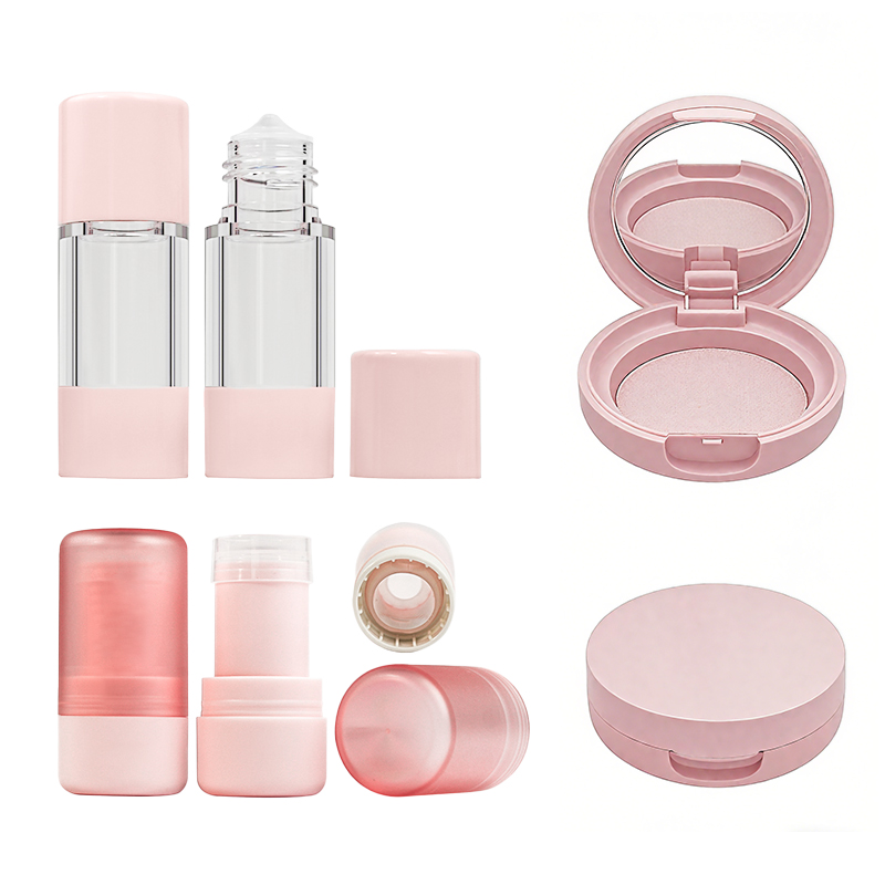
Why pink? Color psychology suggests that soft pinks evoke feelings of calm, health, and skin-friendliness. In the context of sun protection, where consumers often fear greasy residues or chemical stings, pink acts as a visual sedative. It promises a gentle experience. Brands like Topfeelpack leverage this by offering various shades of pink that align with different brand identities—from “millennial pink” for Gen Z to “dusky rose” for premium anti-aging sunscreens.
2. Why HDPE Bottles Beat Acrylic Jars
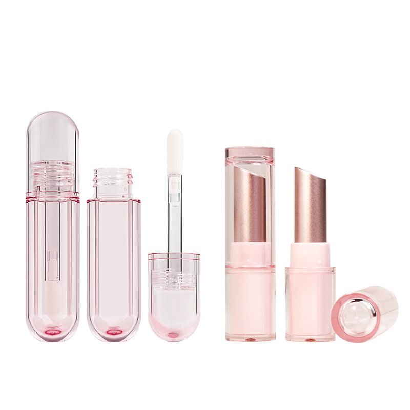
Most high-end pink sunscreen bottles are crafted from High-Density Polyethylene (HDPE). Why? Because sunscreen formulations are notoriously picky. They contain oils and UV filters that can degrade certain plastics. HDPE is chemically resistant, shatterproof, and offers a natural UV barrier, ensuring the active SPF ingredients stay potent from the factory to the beach bag.
3. Pump Dispensers vs. Screw Caps
Functionality is where a pink sunscreen bottle proves its worth. Modern designs often favor a pump top over a standard flip-cap. This isn’t just for looks; it prevents oxidation and ensures the consumer gets exactly the right amount of product (roughly 1.2ml per pump) to achieve the stated SPF rating.
4. Soft-Touch Coatings and UV Finishes
What separates a drugstore bottle from a luxury one? The finish. Many brands apply a “soft-touch” matte coating to their custom lipstick tube or sunscreen packaging. This creates a velvety feel in the hand, making the bottle feel expensive. Additionally, UV-spot gloss highlights can be used to make branding pop against the soft pink background, adding a layer of visual depth.
5. Embracing PCR Material
Sustainability is no longer optional. The modern pink sunscreen bottle is increasingly made from Post-Consumer Recycled (PCR) plastics. According to NielsenIQ, 63% of beauty shoppers prioritize sustainable packaging, and HDPE bottles are among the easiest to recycle, allowing brands to maintain their “luxe” pink aesthetic while meeting environmental goals.

The Design Edge: How a Pearlescent Effect Drives 30% Higher Shopper Engagement
It’s not just about being pink; it’s about how that pink catches the light. Topfeelpack uses advanced pigment injection techniques to create pearlescent or iridescent finishes. These finishes are 1.3x more likely to capture a consumer’s attention in a retail setting compared to flat colors. When a pink sunscreen bottle has a subtle shimmer, it suggests hydration and a “glowy” finish—exactly what sunscreen users are looking for today.
Choosing the Right Silhouette: Oval vs. Cylindrical
The shape of the bottle is the final piece of the puzzle. Oval tubes have become a favorite for pink sunscreens because they fit comfortably in the hand and are easier to squeeze, ensuring minimal product waste. Unlike cylindrical bottles, ovals offer a wider “face” for branding, making the logo more legible on a crowded shelf.

Summary: Top 5 Reasons the Pink Sunscreen Bottle is a Brand Favorite
| Feature | Strategic Advantage | Technical Benefit |
|---|---|---|
| Color Psychology | Evokes wellness and trust | Increases engagement by up to 30% |
| HDPE Material | Communicates durability | High chemical resistance to SPF oils |
| Pump Dispensing | Provides a luxury user experience | Prevents product oxidation |
| Premium Finish | Soft-touch/Matte feel | Enhances perceived value and grip |
| PCR Integration | Aligns with sustainability trends | Reduces virgin plastic footprint |
Whether it is a nozzle tube for liquid foundation or a specialized SPF container, the move toward pink isn’t a fad—it’s a calculated design choice. By combining the emotional pull of the color with the technical superiority of HDPE bottles and custom finishes, brands are proving that beauty and protection go hand in hand.
Why do so many brands like using pink sunscreen bottles?
Beyond the aesthetic charm, pink signifies a bridge between clinical efficacy and cosmetic luxury. It signals to the consumer that the product inside is as good for their skin’s appearance as it is for its health, emotionally linking luxury feel with visual delight across every bottle row displayed under retail lights.
Why do oval tubes often outperform cylindrical bottles in appeal?
Graceful curves awaken familiarity; smooth contours fit right into your palm like old memories revived by summer air. Within that form lies skill—molded via refined precision using balanced pressure from modern-day extrusion or injection systems, crafting ergonomic perfection beyond mere function inside each perfected oval tube versus stiffer cylindrical styles seen on crowded shelves.
Can sustainable materials sustain beauty as well as duty?
Short description + bullet point combination below conveys harmony between conscience and form:
| Feature | Emotional effect | Technical benefit |
|---|---|---|
| PCR material | Reduces guilt, keeps stories circular | Maintains structure under repetition |
| Biodegradable plastic | Symbolizes renewal beneath heat & time | Breaks down cleanly post-use |
| Lightweight design | Feels easy-going & uplifting | Improves transport economy |
Together they bring people closer to responsible brightness; an alliance between ecological care and glossy aesthetics glowing softly through each pink sunscreen bottle offered in bulk dreams or single wishes alike.
References
- [The Future of Beauty Packaging: Here’s What Brands Need to Know – https://www.mintel.com]
- [Clean Beauty is the New Chic: How Conscious Consumers Are Redefining Beauty Growth – https://nielseniq.com]
- [HDPE Rigid Natural: Design Guide – https://plasticsrecycling.org]
- [Color Psychology of Packaging Design: How it Effects Brand – https://jyxpackaging.com]