

How to Choose the Best Premium Jar for Your Cosmetic Line in 2026
January 20,2026
In a world where your moisturizer costs more than dinner and your serum has its own Instagram page, the jar it comes in better look the part. Choosing the right premium jar for your cosmetic line isn’t just about holding goo—it’s about sending a message: “This brand knows what it’s doing.” Material, shape, closures—each detail whispers (or screams) luxury to shoppers who size up packaging before they even touch the product inside.
Buying at scale? That’s a whole other ballgame. You’re not picking out five cute jars for an Etsy shop—you’re building shelf appeal across hundreds of stores or e-commerce channels. Efficiency meets aesthetics here, and if you don’t nail both… well, someone else will.
Premium Jar Insights for Optimal Cosmetic Packaging
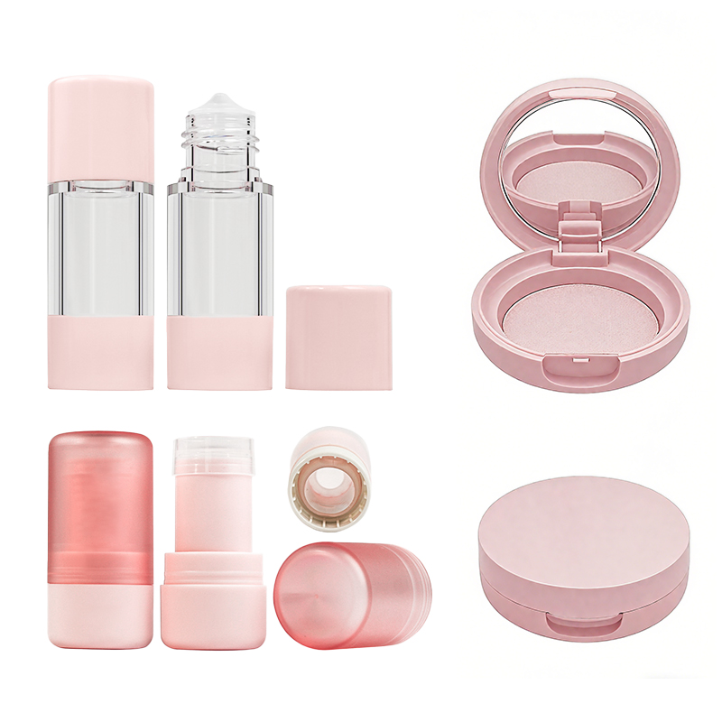
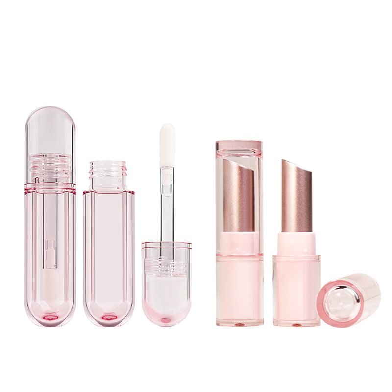
➔ Quality Materials: Glass bottles provide durability and luxury appeal, enhancing product preservation.
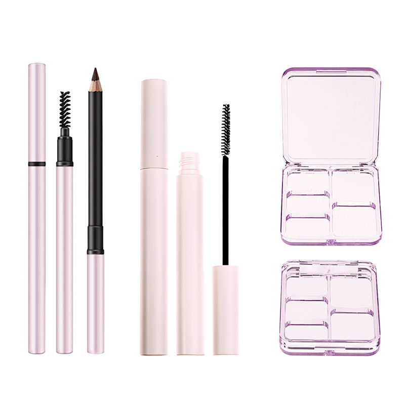
➔ Versatile Closures: Magnetic closures ensure security, while screw top lids offer convenience and versatility.
➔ Decorative Techniques: Hot stamping and silk screen printing add elegance and intricate designs, enhancing aesthetics.
➔ Sustainable Options: Eco-friendly paperboard is rising in popularity, offering a sustainable choice without sacrificing luxury.
➔ Ideal Sizes: Consider 50ml for travel or 100ml for full-sized luxury; smaller sizes like 5g samples encourage trials.
➔ Appealing Shapes: Round containers provide a classic look, square bottles offer modern appeal, while oval compacts stand out on shelves.
➔ Color Impact: Pantone matched colors and custom blends create lasting impressions, while pearlescent pigments enhance visual allure.
➔ Shape Perception: Rectangular cases convey modernity, influencing consumer perception and purchase decisions.
5 Key Features of Premium Jars for Cosmetic Packaging
From materials to closures, the best premium jars combine style with practicality. Here’s what really sets them apart.

Quality Materials: Why Glass Bottles Excel in Cosmetic Packaging
- Glass is king when it comes to high-end skincare and makeup packaging.
- It’s non-reactive, which keeps formulations stable and free from contamination.
- The clarity of glass showcases product color beautifully—great for branding.
- It resists heat and UV light, preserving active ingredients longer.
- Unlike plastic, it doesn’t leach chemicals into sensitive formulations.
- Its weight gives that luxury feel customers crave.
• Bonus? It’s endlessly recyclable—big win for eco-conscious brands.
A well-made glass container not only protects but elevates a product. In short, it’s the gold standard for both durability and luxury in cosmetic packaging.
Versatile Closures: The Importance of Magnetic Closures and Screw Top Lids
Magnetic closures bring sleek elegance; screw tops offer everyday ease. Together, they shape the experience.
Magnetic lids snap shut with satisfying precision—perfect for creams that need to stay airtight.
Screw tops are clutch when you want reliable sealing without fuss during travel or daily use.
Short bursts:
• Both options guard against leaks
• They help maintain shelf life by preventing air exposure
• Each closure type aligns with different user habits
Whether it’s a spa-grade balm or an on-the-go moisturizer, these closures protect product integrity while enhancing user interaction through intuitive design.
Decorative Techniques: Hot Stamping vs. Silk Screen Printing for Luxury Appeal
Hot stamping and silk screen printing aren’t just about looks—they’re about storytelling through design.
Grouped styles:
-
Hot stamping
- Uses metallic foils
- Adds reflective shine
- Ideal for highlighting logos or accents
-
Silk screen printing
- Offers crisp details
- Works well on curved surfaces like round jars
- Great for layering multiple colors
Each method brings something unique to the table:
✔️ Hot stamping screams opulence
✔️ Silk screen printing nails intricate branding
Used right, these finishes turn any premium jar into a visual magnet on retail shelves—and that’s half the battle won in beauty marketing.
Sustainable Options: The Rise of Eco-Friendly Paperboard in Premium Jars
Eco-friendly paperboard is stepping up as more than just packaging—it’s part of the brand story now.
- It reduces your carbon footprint without compromising visual appeal.
- Customers love knowing their favorite products come in biodegradable containers.
- When paired with refillable inserts, it becomes a long-term solution—not single-use waste.
This material might look soft but delivers serious benefits: – Lightweight yet sturdy enough for protection – Fully customizable with embossing or foil accents – Sourced ethically from renewable forests
As sustainability becomes non-negotiable in beauty packaging, expect more brands to shift toward paperboard-based designs that still hold their own among traditional glass or acrylic options in the world of luxe skincare jars.
Choosing the Right Size for Your Premium Jar
Finding the sweet spot in jar sizing is key to product appeal, cost-efficiency, and customer convenience—let’s break it down.

Selecting the Ideal Volume: 50ml Capacity vs. 100ml Volume
Picking between a 50ml or a 100ml standard volume isn’t just about how much product you can fit—it’s about how your customers live.
- A sleek 50ml jar is perfect for on-the-go users—think gym bags, weekend trips, or minimalist vanities.
- The 100ml capacity gives off that full-size glam vibe—ideal for long-term use or premium skincare rituals.
- Ask yourself: Is your product daily-use? Or a luxury treatment used sparingly?
Now toss in some math: if your cream requires only a pea-sized dab per use, even a smaller jar dimension could last weeks.
And don’t forget shelf space—retailers love compact designs that stack well without hogging space. So while bigger might feel better, smarter sizing often wins hearts—and carts.
Benefits of Smaller Sizes: 5g Sample Size for Customer Trials
Sample sizes aren’t just cute—they’re strategic tools that drive conversions and brand loyalty.
🟢 Trial without commitment: A tiny 5g container lets users test texture, scent, and skin compatibility before buying big.
🟢 Boosts brand trust: Offering samples signals confidence in your formula—it tells shoppers you’re not afraid to let them “try before they buy.”
🟢 Perfect event giveaways: These mini jars shine at pop-ups or influencer mailers—they’re pocket-sized ambassadors of your brand.
🟢 Supports eco-conscious sizing: Less waste means happier eco-conscious buyers who prefer minimal packaging.
🟢 Low-cost entry point: For high-end creams or balms, this size makes luxury accessible—even on a tight budget.
So when launching a new line under Topfeel’s banner, consider starting with these micro jars to warm up interest before rolling out full-size versions of your premium jar collection.
Balancing Purpose and Size: Choosing Between 15g Containers and 30g Sizes
You’ve got two strong contenders here—the nimble 15g size, or the balanced heft of a classic 30g container. Here’s how to choose:
Step 1 – Define usage frequency If it’s an eye cream used twice daily? Go with the lighter option; it travels better and reduces spoilage risk from prolonged exposure.
Step 2 – Factor in application amount Thicker textures like balms demand more per use; go bigger to avoid constant repurchasing complaints from customers.
Step 3 – Consider perceived value A sleek glass-look 30g balm container screams indulgence—it looks great on shelves and feels worth every penny spent.
Step 4 – Match with product longevity goals If you want users to finish within three months max? Keep it small; freshness matters more than volume when dealing with active ingredients or naturals.
Balancing between aesthetics, practicality, and how often someone dips into their favorite formula—that’s where smart sizing wins over flashy marketing every time.
The Impact of Premium Jar Shapes on Appeal
How a premium jar is shaped can make or break its shelf appeal. Let’s unpack how form influences function—and consumer love.

Round Containers vs. Square Bottles: Which Attracts More Consumers?
• Round containers scream familiarity. That soft, circular contour feels more natural in hand and signals comfort.
• Square bottles, though? They’re all about that bold, clean vibe—perfect for brands aiming to feel modern or innovative.
• Both shapes serve different crowd vibes—round jars lean into tradition, while square ones flirt with the future.
- Shoppers looking for trust and comfort often gravitate toward round options—they subconsciously read them as safe and reliable.
- On the flip side, square designs attract eyes that crave structure and clarity—think minimalists who love symmetry.
☑️ Aesthetic matters—but so does practicality. Square bottles are easier to stack and store; round jars win when it comes to smooth dispensing.
The shape isn’t just about looks—it’s a silent communicator of brand values. A round container might suggest gentle skincare or nourishing formulas, while a square bottle could hint at clinical-grade potency or high-tech innovation.
Short takes:
- Round = approachable
- Square = sharp and bold
- Both = strategic choices in brand storytelling
🌀 Shape influences both visual appeal and physical interaction, affecting how consumers perceive the product’s functionality, weight, and even its perceived quality when they pick it up off the shelf.
Grouped considerations:
- Visual Identity: Round = classic elegance / Square = modern edge
- Shelf Impact: Round blends in / Square stands out
- Consumer Feel: Round feels soft / Square feels solid
Each jar shape has its fanbase—and smart brands play into those preferences based on their audience’s emotional triggers and lifestyle cues.
Why Oval Compacts Stand Out in a Crowded Market
• Oval compacts don’t follow the rules—and that’s exactly why they work so well on cluttered shelves. They look fresh without trying too hard.
- The unexpected silhouette breaks monotony—a subtle but powerful cue for shoppers craving something new or unique.
- They also communicate movement and grace; there’s a fluidity to ovals that makes them feel more tactile and luxurious than rigid forms.
✳️ You’ll often find oval compacts used by niche or indie brands trying to carve out space among giants—it gives them instant differentiation without shouting through loud colors or fonts.
An oval compact doesn’t just hold product—it holds attention longer than traditional shapes do because it disrupts pattern recognition in our brains, triggering curiosity.
Quick bursts:
- Unexpected = memorable
- Unique shape = higher perceived value
- Curved edges = better grip + smoother opening experience
🧩 When held in hand, ovals offer improved grip due to their elongated curves—making them not only pretty but also practical for daily use.
Grouped benefits:
- Ergonomic Edge: Easier to hold + open with one hand
- Brand Alignment: Ideal for products positioned as exclusive or bespoke
- Shelf Strategy: Naturally draws eye movement due to asymmetric design flow
Oval compacts aren’t just visually striking—they’re built for real-world use too, making them an ideal choice when both form and function matter most in your next premium packaging move.
How Color and Shape Affect Your Premium Jar’s Marketability
Color and shape aren’t just for looks—they’re silent salespeople driving attention, emotion, and brand loyalty for every premium jar on the shelf.

The Power of Pantone Matched Colors: Creating a Lasting Impression
Pantone-matched colors make your brand perception stick like glue—here’s how they do it:
- Ensure color consistency across product lines, which builds trust.
- Support instant recognition even from afar.
- Elevate perceived value by aligning with luxury color palettes.
According to NielsenIQ’s late 2024 packaging insights study, “consistent color schemes improve consumer recall by up to 80%.” When your premium jar flaunts a precise hue—say, that signature coral or deep emerald—it not only screams identity but also whispers quality. It’s not just about looking good; it’s about being remembered.
Custom Color Blends for Unique Brand Identity
You want your premium jar to stand out? Custom shades are the secret sauce:
① They create emotional resonance—think calming lavenders or energetic oranges.
② They distinguish you from copycat competitors using stock hues.
③ They allow storytelling through color—like earthy tones for organic lines or bold neons for Gen Z-targeted products.
These blends go beyond aesthetics—they’re tools of color psychology, shaping how consumers feel before they even touch the product. A unique tint becomes your visual fingerprint.
Pearlescent Pigments: Enhancing Aesthetic Appeal
• Adds shimmer that catches light and attention instantly.
• Boosts the luxury factor with subtle iridescence.
• Makes shelf presence pop against matte competitors.
Pearlescent pigments transform an ordinary cosmetic container into a showstopper. Whether it’s a soft champagne glow or a full-on holographic sheen, this finish elevates your packaging aesthetics without screaming for attention—it glows with quiet confidence instead.
The Role of Shape: How Rectangular Cases Influence Perception
Rectangular jars don’t just look sleek—they work hard behind the scenes:
🟢 Communicate modernity and precision through geometric symmetry.
🟢 Stack efficiently on shelves, maximizing retail visibility and space usage.
🟢 Signal sophistication—rectangles imply order and elegance over round shapes’ softness.
Consumers associate sharp edges with high-end design because they feel more structured and confident. This simple shape shift can level up your brand’s entire vibe while subtly reinforcing its brand identity through form alone.
The Psychology of Color in Premium Cosmetic Packaging
Colors speak louder than words when it comes to cosmetics:
Red = passion & energy | Blue = calm & trust | Gold = opulence & prestige
Each shade triggers an automatic emotional response, tapping into subconscious desires or memories. That’s why luxury brands often lean into deep jewel tones—they scream exclusivity without saying a word. In short? Your premium jar isn’t just holding product—it’s projecting personality through pigment.
Ergonomics and Aesthetics: The Impact of Jar Shape on User Experience
Let’s break down why shape matters so much:
🔹 Ergonomic appeal – fits naturally into hands during use or display.
🔹 Tactile experience – smooth curves vs angular grip points affect handling.
🔹 Shelf presence – unique forms catch eyes faster than standard rounds.
🔹 Functional design – wide mouths ease scooping; tall necks reduce contamination risk.
These physical cues influence how people interact with—and remember—your product long after purchase, reinforcing both utility and style within every jar design decision tied to overall jar design strategy.
Integrating Color and Shape for Optimal Market Appeal
Color + shape = unmatched shelf power when done right:
Step 1: Choose hues aligned with current color trends but tailored to your audience’s emotional triggers.
Step 2: Pair them with distinctive forms that support function while enhancing tactile joy.
Step 3: Test combinations under real lighting conditions; what works digitally may flop physically.
Step 4: Align everything back to core branding strategy—from logo placement to lid texture—for seamless harmony across all touchpoints.
This synergy creates true visual harmony, setting apart any premium cosmetic container as both artful object and practical tool—a rare combo that wins hearts fast at point-of-sale displays across beauty counters worldwide.
Future Trends in Premium Cosmetic Jar Design (2026)
What will define tomorrow’s most coveted jars?
Group A — Materials:
• Bioplastics made from algae
• Post-consumer recycled glass
• Smart polymers that change opacity based on temperature
Group B — Shapes:
• Modular stackable bases
• Asymmetrical silhouettes
• Sculptural lids doubling as applicators
Group C — Finishes & Tech:
• NFC-enabled caps
• Matte-gloss hybrid textures
• UV-reactive coatings
By mid-2026, expect consumer expectations around sustainability + innovation to skyrocket—as confirmed by Mintel’s Beauty Packaging Futures report released Q2/2024—which means any successful future-facing premium jar must fuse eco-awareness with visual drama while keeping tactile satisfaction intact.
FAQs
What makes glass bottles stand out in premium jar packaging?
Glass Bottles give a sense of transparency and purity that people instantly trust.
① Strength preserves the delicate mix inside, from mascaras to foundation bases.
② Chemical resistance ensures formulas stay fresh through long haul transport.
③ Recyclability adds emotional assurance—the package doesn’t hurt the planet while it shines on vanity shelves.
How do Pantone Matched Colors change brand perception for compact cases or lipstick tubes?
Pantone precision helps each Lipstick Tube and Compact Case echo one brand tone—no accidental shade shifts between batches.
- Creates full harmony across product families using similar Metallic Finishes or Pearlescent Pigments.
- Looks consistent under retail lighting, adding calm confidence to every display line.
Why is hot stamping preferred over silk screen printing on aluminum shells or acrylic plastic lids?
A quick metallic flick glows when Hot Stamping meets Aluminum Shells; it whispers “exclusive.”
• Silk Screen Printing offers vivid flat beauty; yet Hot Stamping radiates luxury suitable for Oval Compacts and Cylindrical Tubes alike.
• In feel—slight raised texture catches fingertips; eye contact becomes instant attraction.
What charm does magnetic closure bring to premium jars compared with snap fit caps?
Like a quiet click between old friends, Magnetic Closures merge function with mood: secure yet soft in action.
1️⃣ Keeps creams stable inside 30g Size containers without spill fear during travel adventures.
2️⃣ Adds ritual pleasure missing from simple Flip Top Caps—a small theatrical pause before revealing content glory.
How do smaller sizes such as 5g sample containers connect emotionally with consumers?
Short description + Multi-column feel below captures their purpose:
| Volume | Emotional Cue | Application Example |
|---|---|---|
| 5g Sample Size | Curiosity & invitation to try | Test blends beside main Foundation Bottles |
| 15g Container | Travel convenience & flexibility | Makeup kit inclusion without bulk load |
They translate discovery into loyalty—mini treasures inviting skin’s future favorites.
Which decorative techniques push square bottle designs toward elegance beyond function alone?
Square Bottles act like little sculptures; applied art turns practicality poetic:
★ UV Coating magnifies surface gloss until mirrors appear within touch range.
★ Metallization weighs its presence softly—luxury visual gravity wrapped around clean edges of Eco-Friendly Paperboard labels too.
Together they create that rare equilibrium where design feels human, not machine-made perfection.
References
- Plastic vs Glass Jars for Cosmetic Packaging: Pros and Cons – ahpackaging.com
- How & Why Magnets are used for Packaging Closures – usmagnetix.com
- The Future of Beauty Packaging: Here’s What Brands Need to Know – mintel.com
- The Hidden Psychology Behind Curves in design – medium.com
- Color Consistency In Packaging – A Game Changer – bizongo.webflow.io
- The Psychology of Shapes in Design: What Circles, Squares & Triangles Really Say – agencyanalytics.com
- Mintel announces Global Beauty and Personal Care Trends for 2025 – mintel.com