

Cute Cosmetic Packaging: The Best Practices
September 30,2025
Cute cosmetic packaging isn’t just a pretty face—it’s the winged eyeliner of your product line: sharp, expressive, and impossible to ignore. In an age where shelf appeal can outweigh ingredients (hey, we’ve all judged a serum by its dropper), brands that don’t nail their look risk being left on read by Gen Z scrolls.
“Packaging is 60% of first purchase decisions in cosmetics,” notes Mei Zhang, senior packaging designer at Topfeel as of March 2024. “If it doesn’t spark joy or match the vibe—consumers simply skip.”
Thing is, making something adorable and scalable? That’s the real tightrope walk. You’re not just picking colors—you’re engineering consistency across fifty SKUs with materials that won’t melt under pressure (literally).
Key Points in the Art of Cute Cosmetic Packaging
➔ Types That Turn Heads: From round acrylic lipstick tubes with gradients to custom PET mascara containers, shape and finish define shelf appeal.
➔ Five-Step Creation Flow: Begin with product lineup and volume selection (5 ml–100 ml), then move through materials, shapes, colors, and decoration methods.
➔ Color & Shape Cohesion: Use Pantone palettes, metallics, and consistent forms—round or square—to visually unite your brand identity.
➔ Logo Placement Strategy: Ensure logos are visible yet elegant on tubes, compacts, and bottles without overwhelming the design.
➔ Standardization = Brand Harmony: Keep materials like glass or acrylic uniform across SKUs while aligning closures (pumps/droppers) and finishes (UV coating/hot stamping).
Types Of Cute Cosmetic Packaging
From sleek aluminum to quirky PET designs, these packaging types bring a playful twist to your beauty shelf.

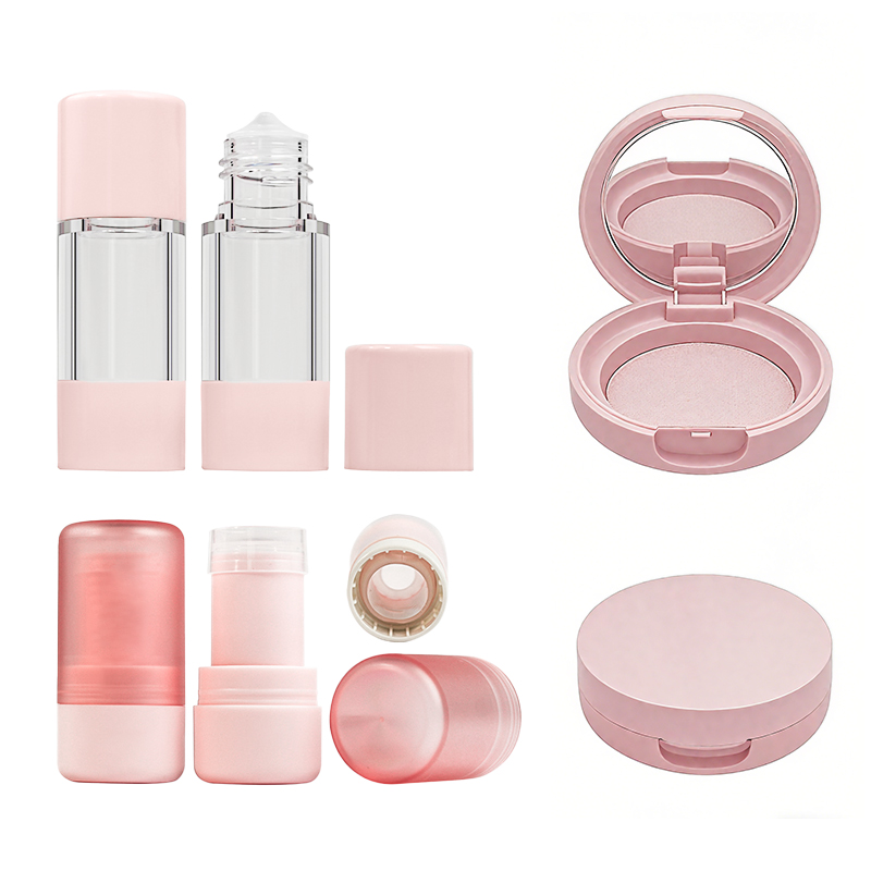
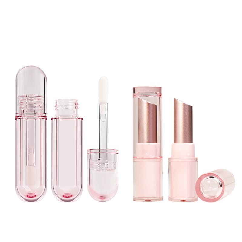
Round Acrylic Lipstick Tubes with Gradient Finish
• Acrylic makes these tubes sturdy but still lightweight enough for everyday use.
• The gradient finish? It’s not just pretty—it gives off that soft, dreamy vibe people love on their vanity.
• Perfect for brands aiming to blend elegance with fun.
- These tubes often come in soft pinks and lavenders—ideal for pastel color palettes.
- They’re great for limited runs or limited edition designs, thanks to their customizable surface.
✧ Their rounded shape makes them comfy to hold and easy to toss into a purse without sharp edges.
The combo of clear acrylic and smooth gradient layers turns an ordinary lipstick into something gift-worthy—no wrapping needed.
Short bursts of shimmer, tactile smoothness, and compact size make them a favorite among collectors and casual users alike.
Square Glass Foundation Bottles in Metallic Tones
- Sharp edges = stability on your dresser (no more tipping over).
- The metallic tones scream premium without being too flashy.
• Pairing glass with brushed gold or rose-tone caps adds that luxe feel while staying grounded in practicality.
• These bottles often feature miniature applicators inside the cap—a nod to both convenience and cuteness.
“According to Mintel’s 2024 Beauty Packaging Insights, consumer preference is shifting toward materials that balance eco-consciousness with visual appeal.” This explains why square glass formats are trending hard right now—they’re recyclable yet undeniably chic.
They work especially well when paired with kawaii-style fonts, making even clinical-looking formulas feel charmingly personal.
Oval Compact Cases: Aluminum with Metallization
- Lightweight but tough—aluminum doesn’t crack like plastic under pressure.
- With metallization? You get that mirror-like shine that catches eyes instantly.
- The oval shape feels fresh compared to tired round compacts dominating the market.
These cases are often finished off with embossed logos or etched patterns, making each one feel like a tiny piece of art. Many feature heart-shaped compacts inside as a surprise touch—bonus points for delight!
Inside, you’ll usually find dual compartments: one for powder, another for sponge storage. That built-in function keeps things neat while maintaining style cred on social feeds.
It’s not just about looking good—it’s about feeling special every time you open it up before work or a night out.
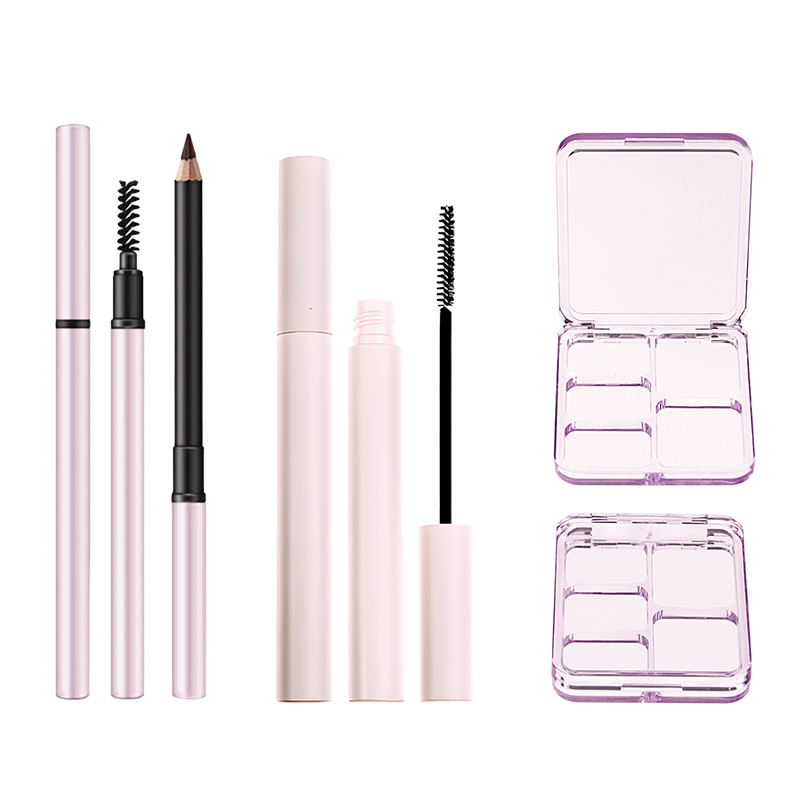
Custom-Shaped PET Mascara Containers with UV Coating
Step-by-step breakdown:
1️⃣ Start by choosing your custom mold—think stars, moons, even little animals (yes, animal-shaped containers are huge right now).
2️⃣ Apply UV coating post-mold; it locks in color vibrancy and protects from fading under sunlight exposure.
3️⃣ Add branding using screen printing or hot stamping—keeps it cute but professional looking.
These containers are especially popular during seasonal drops when brands collaborate with artists or IPs featuring beloved characters (character collaborations, anyone?). The UV layer also gives them that slick gloss finish which pairs well with glitter finishes around the cap area.
Whether you’re going bold or whimsical, these mascara tubes give serious personality—and they stand out big time on crowded shelves at Ulta or Sephora.
Five Steps To Create Cute Cosmetic Packaging

Nailing the look of your product is half the battle—here’s how to bring that playful, stylish vibe into every detail.
Define your cosmetic lineup and volume range (5 ml–100 ml)
• Lip glosses? Think small—around 5–10 ml for portability.
• Creams and lotions usually fall between 30–50 ml for daily use convenience.
• Serums often sit pretty at around 15–30 ml, perfect for dropper bottles or pumps.
Getting a grip on your entire product family early helps you avoid mismatched packaging later on. A consistent volume strategy also simplifies production runs and keeps your cute lineup looking polished from shelf to social feed.
Select materials and closures: Glass, Plastic & Screw Caps
You want something that looks good but also works hard behind the scenes.
Glass gives off a luxe feel—it’s heavier, sustainable, and ideal for skincare oils or serums that need stability over time. Plastic brings durability without the weight; it’s great for travel-friendly items like mists or balms.
According to Mintel’s Beauty Packaging Report Q1 2024, “Over 67% of Gen Z buyers prefer recyclable plastics with tactile finishes over traditional gloss.” That means pairing a matte PET bottle with a metallic pump could hit both aesthetic and eco marks.
For closures? Screw caps are solid all-rounders—clean look, easy use—but don’t overlook droppers or flip-tops if you’re aiming for something more tactile or fun.
Shape options – round, square, oval to custom forms
Grouped by vibe:
• Round: Classic and approachable; ideal for body creams or bath products with soft branding tones.
• Square: Sleek and modern; works well with minimalist labels on toners or setting sprays.
• Oval: Feminine yet ergonomic; a go-to shape for hand creams or lip tints.
• Custom forms: Want to stand out? Think heart-shaped jars or star-tipped tubes—just make sure they still fit standard retail shelving specs.
Choosing the right shape isn’t just about looks—it affects storage space, label layout, even how users interact with each product daily.
Color treatments with Pantone, gradient and metallic finishes
Color can make or break that first-glance impression—and when you’re going after that soft-focus charm associated with playful packaging styles, it’s everything.
Gradient transitions give depth—a blush-to-peach fade can evoke warmth while still feeling chic. Metallic touches add glam without being loud; think rose gold foil around the rim of a lid instead of an all-over chrome effect. And using precise Pantone shades ensures consistency across batches—even under different lighting conditions at retail displays.
From pastel lilacs to dreamy corals, color isn’t just decoration—it becomes part of your brand voice as much as any logo ever could.
Decorate using hot stamping, silk screening & UV coatings
Quick hits on what makes each option shine:
Hot stamping: Adds shine through metallic foils—great for logos or accent borders on glass containers.
Silk screening: Best for bold colors printed directly onto surfaces like plastic tubes.
UV coatings: Offers gloss or matte textures while protecting against scratches—a must-have if you’re going label-free.
Mixing techniques can elevate even simple designs into something premium-feeling without blowing up costs. Want texture? Combine silk screen art with raised UV lines along edges—that way your packaging feels as good as it looks when picked up off the shelf.
And yes—Topfeel has nailed this combo before on their mini balm jars with pearly white bases and gold-stamped lids…a total crowd favorite among boutique retailers chasing standout display appeal.
Adorable Cosmetic Brand Identity

Creating an irresistible aesthetic starts with consistency. From color schemes to container shapes, every detail matters when shaping a brand that screams charm and style.
Crafting a Cohesive Color Palette: Pantone, Gradient & Metallic Hues
- Soft pastels like blush pink and mint green set a playful tone.
- Use bold metallics—rose gold or chrome—for premium appeal.
- Gradients help transition between seasonal shades without jarring contrast.
- Select 2–3 base tones using official Pantone codes.
- Layer complementary hues across product lines to create visual rhythm.
- Apply consistent color logic across all touchpoints—packaging, web design, and marketing materials.
☑️ Avoid using more than five core colors; too many can dilute brand memory.
A well-balanced palette isn’t just pretty—it builds recognition fast. According to a 2024 Nielsen Visual Impact Study, products with consistent color branding saw 33% higher recall among Gen Z consumers within three seconds of exposure.
Logo placement on lipstick tubes, compact cases & dropper bottles
• On lipstick tubes: place logos vertically along the cap for easy thumb-level visibility during application.
• Compact cases benefit from centered embossing—choose either matte foil stamps or UV gloss overlays depending on your chosen material texture.
• For dropper bottles, use silk-screened logos aligned just below the neck curve—keeps things readable even when tilted during use.
Avoid hiding your identity in obscure corners; that’s branding sabotage! The logo should always complement the overall packaging design, not compete with it.
Aligning container shapes – round, square & custom designs
Grouped by usage type:
Lip Products
- Round tubes = classic and familiar
- Square tubes = modern edge but trickier for storage
Face Compacts
- Circular = soft and approachable
- Square = sleek but less ergonomic
Serums & Oils
- Custom teardrop bottles suggest luxury
- Standard cylinders streamline production costs
Mixing too many silhouettes? That’s where brands lose cohesion fast. Stick to two dominant forms max per category to maintain visual fluency across your lineup—and yes, this includes matching lids!
Standardizing decoration and materials for cohesive branding
Start by choosing your primary materials:
| Material Type | Texture Feel | Cost Efficiency | Sustainability Score |
|---|---|---|---|
| PET Plastic | Smooth/glossy | High | Medium |
| Glass | Premium/heavy | Medium | High |
| Acrylic | Sleek/modern | Low | Low |
| Aluminum | Cool/tactile luxe | Medium | High |
Then move into decoration styles:
- Foil stamping for elegance
- Soft-touch matte finishes for grip + vibe
- UV spot gloss to highlight logos or slogans subtly
✨ Pro tip: Keep decorations aligned with your overarching brand story, not just trend-hopping aesthetics.
As Bain & Company noted in their 2024 Beauty Branding Report, “Material coherence across product lines increases perceived value by up to 27%, especially in ‘cute’ packaging categories aimed at younger demographics.”
Branding Inconsistency? Standardize Cosmetic Packaging Across Products
Keep your packaging game tight. A scattered look might kill your vibe—and your sales. Let’s unify those bottles, caps, and colors.

Choose uniform materials from acrylic to glass for brand coherence
- Acrylic and PETG offer durability at low cost—great for budget-friendly lines.
- Glass gives a premium feel that elevates perception instantly. Ideal for serums or oils.
Topfeel uses a hybrid approach: acrylic for outer shells, glass inserts for core formulas—balancing luxe with practicality.
→ Why it matters:
• Uniform materials support stronger brand recognition.
• They also simplify your supply chain management, cutting production headaches.
Establish a consistent color system with Pantone guidelines
- Pick two anchor shades that reflect your brand’s tone—think mood over trend.
- Use Pantone codes to lock them down across vendors and product ranges.
- Add one accent color per line to support product differentiation, but keep it subtle.
A recent NielsenIQ report shows brands using consistent color palettes see up to a 33% boost in shelf visibility—a quiet win for your overall marketing strategy.
Standardize closure types across SKUs – pumps, droppers & screw caps
Grouped by function:
-
Pumps:
• Great for lotions, creams, and SPF products.
• Offers hygienic dispensing and portion control.
• Best paired with rigid containers like PET or airless acrylic. -
Droppers:
• Ideal for oils, serums, and watery essences.
• Adds perceived value through precision application.
• Works best with thick-walled glass bottles. -
Screw Caps:
• Budget-friendly choice for masks or balm jars.
• Easy to produce at scale; supports lower-cost items.
• Compatible with both plastic and recyclable aluminum jars.
Sticking to these standard closures keeps user experience smooth while reinforcing visual unity—a key part of building lasting consumer perception.
Harmonize decoration methods: UV coating, hot stamping & labeling
Short bursts of clarity:
• UV coating creates high-gloss drama—perfect on dark tones or matte backgrounds.
• Hot stamping adds metallic flair without going full glitter bomb; think gold logos on pastel jars.
• Labels should follow one grid system—even if the font or icon shifts slightly per SKU.
According to Packaging World’s Q2 data from April 2024, brands using harmonized decoration saw an average of +18% improvement in perceived quality scores during consumer testing panels.
| Decoration Type | Cost Index (/unit) | Shelf Impact Score | Sustainability Rating |
|---|---|---|---|
| UV Coating | $0.12 | High | Low |
| Hot Stamping | $0.09 | Medium | Medium |
| Labeling | $0.05 | Variable | High |
Topfeel nails this balance by combining foil-stamped logos with soft-touch labels—proof you don’t have to sacrifice aesthetics for consistency across your cute cosmetic packaging lineup.
FAQs
It’s not just about looking good—it’s about being remembered. The right packaging tells a story before the product is even opened. A soft pastel lipstick tube, a shimmering compact with rounded edges—these are more than containers; they’re characters in your brand’s world.
- Shapes like slim tubes or oval jars create visual consistency
- Soft gradients and metallic finishes evoke emotion at first glance
- Materials such as acrylic or frosted glass feel luxurious to the touch
Each piece should whisper the same message: “This belongs here.”
Yes—and it’s where creativity meets engineering. A curved PET bottle shaped like a teardrop can still hold its wand perfectly straight inside. Add UV coating for durability and shine, and you’ve got something that turns heads while staying practical on every swipe.
Designing these pieces isn’t guesswork—it’s an art of balance between charm and performance.
Think of closures as punctuation marks in your collection—they finish each sentence with clarity. When caps, pumps, or droppers follow a rhythm across foundations, serums, and creams:
- Customers feel familiarity from one product to another
- Shelves look cohesive instead of chaotic
- Functionality becomes second nature—no surprises when opening
That quiet harmony builds trust over time.
Logo placement is choreography—you want it seen but never forced. On lipstick tubes, near the cap edge keeps it visible even when closed. For compacts or dropper bottles:
- Centered logos draw focus naturally during use
- Mid-body placement avoids clashing with labels or instructions
The goal isn’t just recognition—it’s creating moments where someone smiles because they spotted your mark exactly where it felt right to be seen.