

Lipstick Packaging Color Tips: Make Your Brand Stand Out on Shelves
July 30,2025
In today’s busy beauty world, picking the right color for lipstick packaging isn’t just about looks. It’s a strategic method for enhancing brand recognition, capturing attention, and driving consumer purchases. With tons of products on shelves and online, smart color choices and good design help you shine. This article explains how the right packaging colors can lift your lipstick game and connect with buyers.

The Strategic Role of Color in Lipstick Packaging
Why Packaging Color Influences Consumer Behavior
Color hits people first. It gives clues about a product’s vibe, quality, and cost before they even pick it up. In the beauty industry, emotional responses heavily influence purchasing decisions. That’s why packaging color matters so much. Bold red conveys confidence and power, while light pastels suggest delicacy and simplicity.
Emotional Triggers and First Impressions Through Color
Colors evoke specific emotions, a principle rooted in color psychology. Red evokes powerful emotions such as passion and excitement. Blue feels steady and safe. These vibes hit fast, shaping opinions in seconds. Gold or black packaging immediately signals exclusivity and premium quality. White or beige tones feel pure and clean.
Gold is often used in cosmetic packaging to symbolize luxury and exclusivity. Lots of brands go for gold lipstick tubes for that reason.
The Shelf Impact: Standing Out in a Crowded Market
In retail environments, packaging must immediately capture attention to stand out. Your product’s up against dozens of others. Bright mixes or standout colors grab eyes from across the aisle. Plus, sticking to the same colors helps folks spot your brand fast in a packed display.
Applying Color Psychology to Lipstick Packaging
Understanding Emotional Associations with Common Colors
-
Red, Pink, and Coral: Passion, Femininity, and Energy
These colors often tie to the lipstick inside. Red means strength and desire. Pink feels gentle and girly. Coral’s fresh and young.
-
Black, White, and Grey: Sophistication and Simplicity
Black, white, and grey keep things sleek. Black’s classy. White’s crisp. Grey plays nicely with other shades.
-
Gold and Silver: Luxury and Prestige
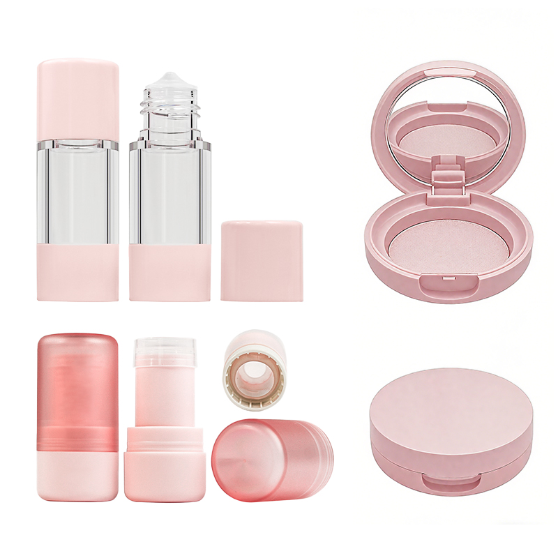
Gold exudes a sense of opulence and prestige. Silver’s cool and modern. Both work great for pricey cosmetic lines. Take the *Topfeelpack MA-15 Empty Lipstick Tube Makeup Containers for Luxury Lipstick*—it’s a gold lipstick tube and got a cool shape that’s artsy and grabs attention fast.

-
Green and Blue: Calmness, Naturalness, and Trust
Green often represents eco-friendliness or natural ingredients, making it ideal for organic products. Blue builds trust, good for lipsticks with extra care benefits.
Choosing Colors That Reflect Product Mood or Use
Packaging color should align with the product’s characteristics and intended use. A moisturizing balm might go with cool blues to show hydration. A tough matte lipstick? Matte black fits its staying power.
Aligning Packaging Colors with Target Demographics
Cultural Preferences in Global Beauty Markets
-
Preferences in Asian vs. Western Markets
In places like Japan or Korea, Soft hues such as peach or lavender are popular in markets favoring subtle, youthful aesthetics. They love that light, young look. Western folks lean toward big colors like deep red or shiny metallics—bold suits their style.
-
How Regional Skin Tones Influence Color Perception
Skin tone shifts how colors pop. A shade that’s bright on pale skin might fade on darker tones. Brands have to keep that in mind for different areas.
-
Age Groups and Their Color Affinities
Teens and young adults dig wild colors—think hot pinks or sparkly finishes. Older buyers like classic picks like rich reds or gold-trimmed blacks. Those feel timeless.
Reflecting Brand Identity Through Consistent Color Use
-
Translating Brand Values into Visual Design Elements
Colors tell your brand’s story. Green might show you care about the planet. Silver could mean cutting-edge ideas. Mixed colors might say you’re for everyone. Every pick counts. *Topfeelpack* focuses on top-notch packaging tailored to what customers want.
-
Building Recognition Through Repetition of Key Colors
Using the same colors over and over sticks in people’s heads. Think Tiffany & Co.’s famous blue—everyone knows it. Steady colors across your lipstick range make your brand easy to recall.
-
Creating a Signature Look with Custom Palettes
Custom colors let you stand out. Topfeelpack gives tons of options, including unique shades. That’s a big plus in a tough market.

Using Unique Color Combinations for Market Differentiation
-
Balancing Contrast and Harmony for Visual Interest
Mix bold contrasts to catch eyes and soft matches to keep it smooth. Matte black with shiny gold, for example, looks dramatic but not over the top.
-
Avoiding Overused Industry Colors to Stay Original
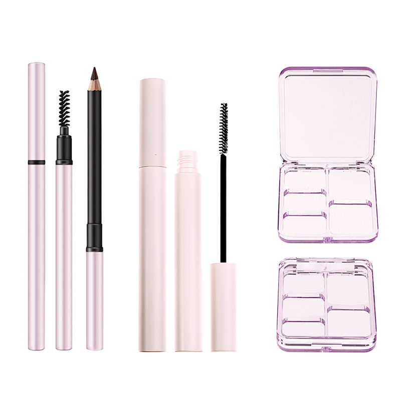
Pink is a ubiquitous color in the beauty industry, though it can sometimes be overused. But odd combos like teal and copper? They break from the pack.
-
Enhancing Brand Memorability with Unexpected Pairings
Surprise color mixes grab attention and can turn iconic if you keep using them in ads.
Testing Packaging Colors for Consumer Resonance
Conducting A/B Testing on Color Variants
Try out colors online with A/B tests. See which one pulls more clicks before you make a bunch.
Gathering Feedback from Focus Groups or Surveys
Ask your target crowd what they think. Their input shows if the colors fit your brand’s vibe.
Using Retail Data to Refine Future Designs
Check sales numbers by product. That tells you which colors people actually buy over time.
Staying Current with Market Trends in Packaging Design
Monitoring Seasonal and Annual Trend Reports
Colors change fast in beauty because of fashion. Keeping an eye out keeps you in the game.
Incorporating Pantone’s Color of the Year Strategically
Pantone picks a color every year, and it sets trends. Use it smartly in special editions to get noticed.
Adapting to Shifts in Consumer Lifestyle Preferences
People care more about health and green living now. Earthy colors like clay brown or deep green might click better than loud neons these days.
Innovating While Maintaining Brand Integrity
Freshen up designs each season, sure. But don’t mess with your brand’s core, like its fonts or layout.
Choosing Materials That Enhance Your Chosen Colors
How Material Texture Affects Perceived Color Quality
The stuff you use changes how colors show up in light.
-
Matte vs. Glossy Finishes on Lipstick Tubes
Matte finishes absorb light, giving a refined, understated appearance. Glossy finishes reflect light, creating a bold, eye-catching effect. Each suits different brands. Private Label – Topfeelpack offers *custom OEM options*, like picking colors and matte or glossy finishes.
-
Transparent vs. Opaque Components for Visual Impact
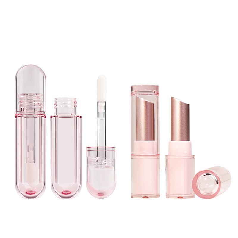
Clear tubes let the lipstick shade peek out—handy and simple. Solid tubes let you go fancy with tricks like embossing or foil.
-
Ensuring Durability Without Compromising Aesthetics
Tough stuff like PP (polypropylene) lasts forever and takes any color you want. It’s recyclable, light, and built to stick around.
Conclusion
Lipstick packaging color serves as a visual dialogue between your brand and consumers. It blends psychology, culture, trends, materials, and fresh ideas. Get these right from start to finish, and your brand doesn’t just look good—it bonds with people.
FAQs
- Grabs attention fastSparks feelings tied to the product
- Hints at quality (like gold for luxury)
- Makes it pop on busy shelves
Yep:
- Asian markets love soft peach or lavender
- Western ones go for red, black, or gold
- Skin tones shift how colors stand out
For sure! Suppliers let you:
- Pick PP, ABS, or AS based on toughness
- Go matte or glossy for the look you want
- Add stamping, silkscreen, or labels