

Why Chameleon Packaging is the Secret to Effective Branding
February 09,2026
In a world where beauty shelves scream for attention and TikTok trends change faster than your mascara dries, chameleon packaging isn’t just smart—it’s survival. This isn’t about slapping on shiny foil and calling it luxe. We’re talking color-shifting, light-catching finishes that flirt with the eye and whisper to shoppers, “Pick me.” And they do.
Big players in cosmetics know: the right packaging for cosmetics doesn’t just protect product—it sells it before the cap’s even twisted off. A 2024 report by McKinsey showed that brands using sensory-driven visual design saw a 27% lift in consumer recall after two seconds of exposure. That’s not design fluff—that’s market magic.
When Topfeel’s senior designer Mei Chen called chameleon finishes “a shortcut into the shopper’s emotional brain,” she wasn’t exaggerating. These aren’t labels—they’re feelings in disguise. Let’s talk about why your next brand refresh might start at the surface—and go way deeper than skin care ever has.
Chameleon Packaging: Transforming Your Brand Identity

Smart packaging isn’t just about looking good—it’s about speaking volumes before a word is read. Here’s how chameleon packaging reshapes brand storytelling.
The Magic of Transformative Packaging Design
Transformative design isn’t just a gimmick—it’s a layered experience that evolves with every glance and touch.
1. Visual Movement Through Finish Layers
- Metallic overlays: Reflect light differently depending on angle, creating real-time visual evolution.
- Transparent gradients: Let the product peek through, adding a sense of mystery and depth.
2. Interactive Engagement Triggers
- Thermo-reactive inks: Change color with temperature shifts, encouraging consumer interaction.
- Dynamic texturing: Surfaces that morph under light or touch increase the unboxing experience.
3. Emotional Storytelling
- These elements don’t just decorate—they tell a story. A shifting tone might suggest freshness, innovation, or even nostalgia.
- Brands using this form of adaptive aesthetics often see higher shelf retention and stronger emotional ties.
By blending these layers, brands create packaging that doesn’t sit still—it lives in motion, sparking curiosity and building lasting impressions through sheer sensory play.
Leveraging Color Shifts for Brand Recognition
Color isn’t static—it’s psychological fuel for memory. When done right, shifting hues can lock your brand into someone’s mind like their favorite song chorus.
- Brands using iridescent finishes often tap into subconscious cues tied to luxury and modernity.
- Satin gradients subtly shift under lighting to trigger emotional warmth—perfect for wellness or beauty sectors.
- Using deliberate chromatic variation, you can guide perception without saying a word.
According to NielsenIQ’s 2024 Packaging Trends Report, “Packages with dynamic color transitions were 28% more likely to be recalled after one week compared to static-color designs”.
That kind of recall? It’s gold dust in retail aisles jammed with visual noise. With each shift in hue, you’re not just showing off—you’re embedding your identity deeper into buyer memory through strategic use of color psychology, bold palette choices, and thoughtful gradient effects.
How Material Choices Impact Your Brand’s Message
What your product comes wrapped in says more than most logos ever could. Materials speak—and customers are listening closely now more than ever.
A. Luxury & Premium Feel
-
Glass: Heavy in hand and cool to the touch—screams high-end.
-
Brushed aluminum: Sleek lines with an industrial edge signal tech-forward thinking.
- Both deliver unmistakable cues through their unique tactile experience.
B. Sustainability Signals
-
Bamboo or sugarcane fiber: Instantly recognizable as eco-conscious choices.
- They align perfectly with Gen Z values around environmental responsibility.
- Their natural textures also add bonus points for sensory appeal, especially when paired with matte finishes.
C. Minimalism & Modernity
-
Think molded pulp trays inside smooth monochrome boxes—clean lines meet earthy tones.
- This combo reflects restraint and clarity—a nod toward minimalist design trends gaining traction post-pandemic.
From substrate to finish, every layer adds meaning. Smart brands treat material selection as part of their voice—not an afterthought but a key player in how they show up on shelves using smartly chosen materials that echo their values loud and clear through innovative forms of material innovation, texture contrast, and sustainable intent woven right into the package itself.
5 Reasons Chameleon Packaging Boosts Consumer Engagement
Chameleon packaging turns the ordinary into eye candy and keeps shoppers curious long after the first glance.
Dynamic Color Shifts: Keeping Consumers Hooked
Color that morphs with light or touch isn’t just a gimmick—it’s a hook. Color-changing inks, like thermochromic and photochromic coatings, shift with temperature or UV exposure, giving packaging a living, breathing quality.
- A shampoo bottle that changes hue as water hits it? That’s not just cool—it’s memorable.
- These effects increase visual appeal, triggering an emotional wow moment.
- The novelty factor drives social sharing and boosts online engagement.
By tapping into multisensory design, this type of packaging makes each interaction feel fresh—literally keeping consumers hooked.
Sustainability as a Key Engagement Driver: The Role of Recyclable and Biodegradable Materials
Eco is no longer optional—it’s expected. Brands using recyclable materials, biodegradable packaging, or even fully compostable solutions are winning trust fast.
“Over 72% of Gen Z consumers say they’re more likely to buy from brands that use sustainable packaging,” according to NielsenIQ’s April 2024 report on sustainable consumer behavior.
It’s not just about ticking the green box either. Sustainable practices reflect real alignment with modern consumer values, making customers feel good about their purchase—and loyal to the brand behind it.
Interactive Features: How Packaging Plays with Consumer Expectations
Interactive elements surprise people in ways static boxes never could:
- Scan-and-play tech like QR codes or simple AR filters turn packages into mini experiences.
- Textured surfaces add tactile fun—think raised logos or gritty grip zones.
- Hidden layers via peel-offs create mystery, encouraging deeper exploration.
- Some brands even gamify unboxing through collect-and-scan rewards systems.
This kind of participation builds emotional investment while elevating perceived product value—all through clever physical design.
Emotional Connections: The Psychological Impact of Matte vs. Glossy Finishes
The finish on your package speaks volumes before a word is read. A smooth, reflective surface—the classic glossy finish—signals premium quality and high energy; it’s flashy and confident.
In contrast, a muted matte lip gloss tube oem gives off calm vibes and minimalist elegance. It whispers instead of shouts but still turns heads on shelves packed with visual noise.
Both finishes affect how people feel when they touch them—this is called haptic feedback—and those feelings stick around long after checkout, subtly influencing brand perception through texture alone.
The Power of Customization: Personalizing the Consumer Experience
Personalized design doesn’t just look good—it makes people feel seen:
- Use variable data printing to swap names, cities, or colors per customer batch.
- Try limited-run designs for local events using techniques like silk screening and foil stamping.
- Offer user-generated label options for full-on co-creation vibes.
People crave uniqueness now more than ever—and when a brand delivers through truly personal touches in its custom lipstick tube game, buyers don’t just remember it—they post about it too. That kind of connection builds real loyalty over time across every layer of your chameleon-inspired packaging system.
Chameleon Packaging for Cosmetics: A Perfect Match

Smart brands know that packaging isn’t just a shell—it’s the first impression. Let’s break down how chameleon packaging can elevate both look and function.
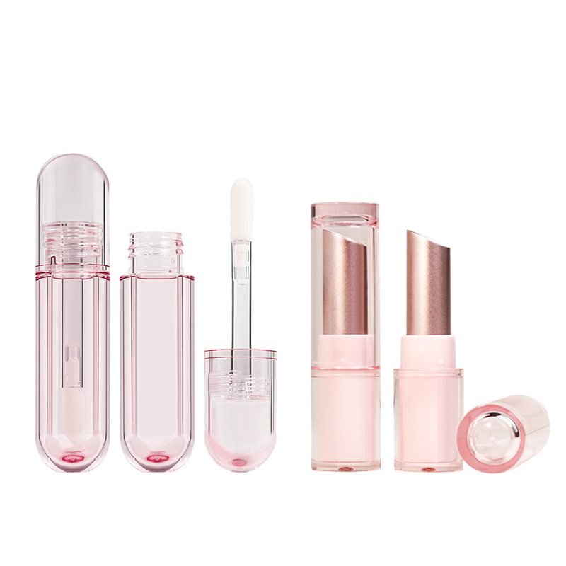
Aesthetics and Functionality: Choosing the Right Packaging for Cosmetics
- Form factor matters—slim tubes are great for portability, while wide-mouth jars offer better access.
- Material selection like glass or PET affects durability and luxury feel.
- Don’t skimp on dispensing mechanisms; pumps reduce waste and mess.
- Brands need to balance visual appeal with practical use.
- A good design protects product integrity while enhancing user interaction.
- Clear lids or windows increase visibility without compromising protection.
✱ Compact designs should align with how the product is used daily.
Long gone are the days when pretty was enough—now, packaging must work hard too. Consumers expect more than just looks; they want smart, functional containers that reflect a brand’s quality and intention.
Smooth curves, ergonomic shapes, and tactile finishes all influence how people perceive your product before even opening it.
→ Start by identifying your target customer’s habits → Match those needs with appropriate container shapes → Then test usability in real-world scenarios → Finally, refine based on feedback to optimize the user experience
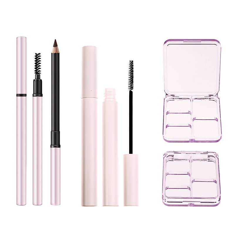
The Role of Silk Screening and Hot Stamping in Cosmetic Branding
• These decoration techniques add character through texture and shine.
• Hot stamping creates striking metallic effects, especially for logos or accents.
- Use silk screening for detailed patterns or layered color effects.
- Metallic foil can highlight key text elements like product names or ingredients.
» Combined techniques help reinforce a strong brand identity on shelves.
A clean font printed via hot stamping on matte black says premium without shouting it—and that matters in crowded retail spaces.
Bold graphics applied through these methods don’t just look good—they feel good too, thanks to added tactile elements that create sensory engagement during use.
→ Choose base material → Test ink adhesion with silk screening → Apply foil layers where necessary → Finish with coatings to protect your graphic application
Why Clear, Transparent Packaging Works Wonders for Beauty Brands

• Transparency builds trust—what you see is what you get.
• It enhances shelf appeal by showcasing product color and texture directly through the package’s body.
- Acrylic compacts allow full view of pressed powders inside.
- Glass bottles show off serums’ clarity—boosting perceived purity.
- PET containers offer lightweight options without sacrificing clarity.
¤ Customers want proof of quality at a glance—and clear packaging delivers that instant validation through visible product integrity.
“According to Mintel’s 2024 Global Beauty Report, 72% of skincare buyers say they’re more likely to trust products housed in transparent containers”.
Short bursts of visibility:
- Boosts impulse purchases
- Supports ingredient-conscious shoppers
- Elevates perceived freshness
→ Select high-transparency materials like acrylic or glass → Ensure compatibility with formula (no discoloration) → Add minimal labeling so clarity takes center stage
Sustainability in Beauty Packaging: PCR and Refillable Options
• Using post-consumer resin (PCR) reduces virgin plastic usage by up to 60%.
• Refill systems cut long-term waste—and customers love them for it!
- PCR-based tubes keep carbon footprints low without sacrificing design.
- Refillable compacts support repeat sales while promoting reusability.
- Eco-friendly materials like bamboo caps add an earthy aesthetic touch.
♻️ Today’s beauty lovers demand action—not just promises—on sustainability goals through real efforts in reducing environmental impact.
Multiple mini-solutions:
- Switch to recycled content
- Offer refill pouches instead of full-size replacements
- Design parts for disassembly so users can recycle components easily
→ Audit current packaging footprint → Source verified PCR suppliers → Create user-friendly refill instructions → Educate consumers at point-of-sale
Topfeel has already embraced this shift toward sustainable innovation by integrating refillable components into several best-selling lines—making eco-smart choices easy and stylish for its audience using adaptive forms of modern chameleon packaging design strategies across categories like loose powder jar and lipstick tubes alike.
How to Choose the Right Chameleon Packaging for Your Brand

Picking the right chameleon packaging can make or break how your product connects with real people. Let’s break down what really matters.
Packaging Material Selection: Glass, Acrylic, or Bamboo?
Choosing between glass, acrylic, and bamboo isn’t just about looks—it’s about brand identity and how your audience feels when they hold your product.
- Glass brings a premium feel and high-end aesthetic appeal.
- Acrylic shines in terms of durability and crystal-clear visibility.
- Bamboo screams eco-love with its renewable sourcing and natural vibe.
Each material has different material properties that affect everything from shelf life to recyclability. If you’re aiming for sustainability points, bamboo is a win due to its lower-impact manufacturing process. But if you’re targeting luxury skincare lovers? Glass pump bottle might be the better bet.
Topfeel often blends these materials in clever ways—like pairing bamboo lids with acrylic jars—to match both function and feeling.
Analyzing Your Target Market’s Preferences in Packaging Types
Understanding what your crowd actually wants is half the battle. It’s not just about pretty jars—it’s about syncing with their habits, values, and lifestyle.
- Younger buyers lean toward minimalist palettes that feel modern yet fun.
- Eco-conscious consumers prefer refillable formats or biodegradable packaging.
- Busy professionals love droppers or pumps that offer quick access without mess.
According to Mintel’s 2024 Global Beauty Report, “Over 60% of Gen Z consumers say packaging plays a key role in their purchasing decisions—especially when it aligns with their values”.
So if your chameleon packaging doesn’t speak their language—be it through convenience, vibe, or sustainability—you’re missing out on major traction.
Closure Mechanisms that Enhance Consumer Experience
The way a product opens affects more than just practicality—it shapes perception and satisfaction too.
• Snap-on lids add speed but may lack strong seal integrity, risking leaks during transit.
• Pump dispensers are gold for lotions—clean use plus solid tactile feedback.
• Dropper caps deliver elegance along with precise control; perfect for serums where every drop counts.
Smart closures also serve as subtle security features, offering both tamper evidence and reusability—a combo today’s shoppers totally expect from quality chameleon-style packaging. Topfeel invests heavily in intuitive closure systems that don’t just work—they impress from first touch to last use.
Chameleon Packaging’s Role in Enhancing Product Perception
How a product looks and feels on the outside can shape everything we think about what’s inside. That’s where chameleon packaging shines.

Glossy vs. Satin Finishes: Elevating Product Perception
Gloss or satin? It’s more than just a vibe—it’s a signal.
A. Appearance cues that drive perception
- Glossy finishes reflect light, making products look sleek and high-tech.
- In contrast, satin textures absorb light subtly, adding a sense of calm sophistication.
B. Tactile impact on consumer trust
- Smooth gloss suggests modernity and precision.
- Soft satin implies warmth and intimacy—consumers often associate it with higher-end goods thanks to its velvety feel.
C. Material choice affects perceived quality
Surface consistency matters—when paired with premium plastics or glass, both finish types enhance the overall material aesthetics, reinforcing the idea of superior craftsmanship.
Chameleon packaging uses these finishes interchangeably based on target demographics and product category alignment.
The Importance of Functional Packaging Components: Actuators, Collars, and Inserts
It’s not just about how it looks—how it works matters too.
A. Structural reliability through design
- Well-engineered dispensing mechanisms, like actuators, ensure consistent flow control.
- Reinforced collars maintain neck stability under pressure.
B. User experience drives retention
- Easy-to-use components reduce frustration during application.
- Secure inserts prevent leakage or contamination—key for preserving product efficacy over time.
C. Brand credibility through functionality
 When every element—from pump to insert—is thoughtfully designed, consumers equate that attention to detail with brand trustworthiness.

 High-performing parts support long-term
 packaging integrity, keeping customers coming back for more.
Chameleon packaging nails this by aligning function with form without compromise.
How Color & Design Influence Buying Decisions
Color doesn’t whisper—it shouts from the shelf when done right.
• Bold tones like scarlet or cobalt create urgency through emotional triggers tied to color psychology.
• Metallic accents add flash that signals luxury without saying a word.
• Clean layouts guide the eye using smart visual hierarchy—think logo placement above call-to-action text blocks for maximum impact.
“In a recent NielsenIQ study from early 2024, over 70% of consumers admitted they’ve chosen one product over another solely due to packaging design”.
Design isn’t decoration—it’s persuasion in disguise. Chameleon packaging makes sure every stroke counts toward boosting brand recognition and driving purchase intent at first glance.
The Impact of Packaging Size on Product Positioning: Compact vs. Bottle
Size talks—and buyers listen closely whether they realize it or not.
A. Compact formats suggest exclusivity
-
Often adopted for prestige cosmetics or travel kits.
- Their small footprint enhances portability, appealing to urban shoppers on-the-go.
- They also imply scarcity—a tiny jar hints at something potent or luxurious inside.
B. Bottles broadcast daily utility
-
Tall silhouettes dominate shelves with their strong shelf presence, ideal for shampoos or lotions meant for routine use.
- Their volume signals value-for-money—a practical choice for budget-conscious buyers.
- Larger bottles also improve visibility in crowded aisles by maximizing vertical space within retail displays.
By adjusting size strategically across SKUs, chameleon-style packaging adapts effortlessly between mass-market appeal and boutique charm—all while optimizing storage efficiency behind the scenes.
FAQs about Chameleon Packaging
What makes chameleon packaging stand out in the beauty world?
- Glass bottles and acrylic jars glow under light, shifting between matte calm and metallic drama.
- Bamboo compacts or paperboard palettes whisper sustainability while catching eyes with iridescent tones.
- Pumps, droppers, and screw caps add a tactile rhythm—each click or press part of the sensory stage.
How can material choices amplify a brand’s personality?
- Aluminum bottles project strength for bold skincare lines; transparent acrylic flaunts every swirl of tinted cream.
- Bamboo jars suggest mindfulness; plastic tubes with satin finishes feel approachable yet refined.
- Matching closures—flip-top caps for ease, dropper caps for precision—complete the story your hands already expect to tell when opening them.
Which decoration methods create an unforgettable first touch?
★ Silk screening forms delicate patterns you trace without thinking; hot stamping flashes gold like a secret revealed in motion.
★ Frosted glass offers intimacy through softened edges; offset printing makes full-color drama sing across every angle of a palette lid or jar collar insert.
References
- Packaging: The underrated performance and value driver – McKinsey
- Winning in sustainable packaging in 2025: Bringing it all together – McKinsey
- Top 10 NIQ insights of 2024 – NielsenIQ
- Gen Z in the Omnichannel Era: Rethinking Consumer Behavior for Sustainable Business Success – NielsenIQ
- The Future of Beauty Packaging – Mintel
- Beauty and Personal Care Industry Insights – Mintel
- Decoding Mintel’s 2024 Trends – Global Cosmetic Industry
- Packaging Colour Psychology – How It Affects Your Success – GWP Group
- Color Theory and the Cultural Psychology of Beauty Packaging – Cultural Daily