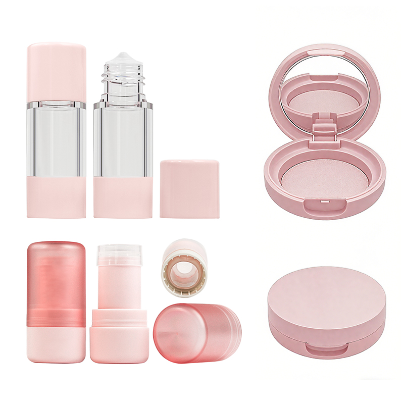
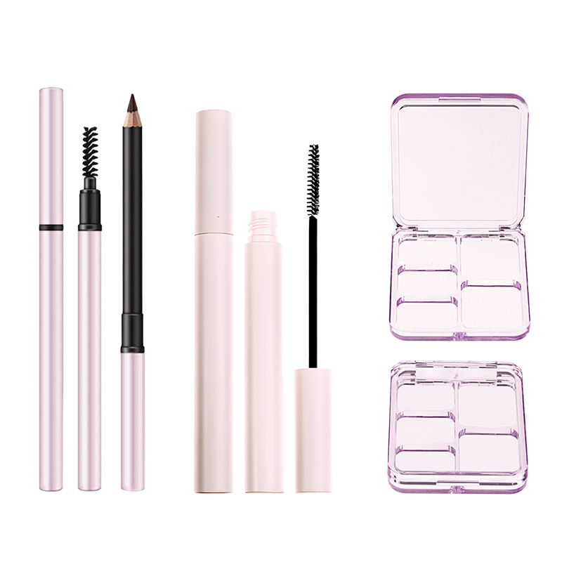
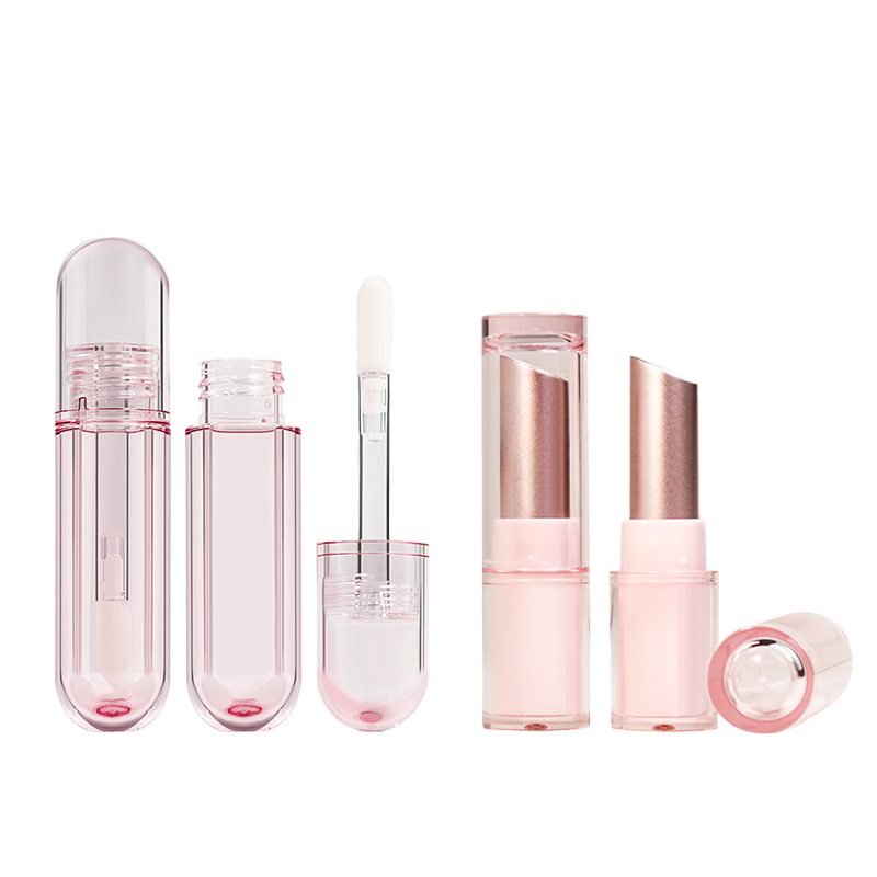
Beautiful Cosmetic Packaging: Effective Strategies Unveiled
Beautiful cosmetic packaging isn’t just eye candy—it’s your brand’s handshake, smile, and elevator pitch all rolled into one. Picture this: you’re standing in a store aisle and boom—your eyes lock on a bottle so sleek it practically flirts with you. That moment? That’s design doing the heavy lifting before the product even touches skin.
Truth is, most beauty brands are in a knock-down drag-out battle for attention—and packaging might just be the secret weapon nobody talks about loud enough.
“Packaging isn’t dressing up the product—it is the product,” says Claire Xu, Senior Designer at Topfeel (2024). “It’s what tells your customer: ‘This belongs on your shelf.’”
So here comes the playbook. From smart materials that feel luxe but don’t trash the planet to shape psychology that makes customers instinctively reach out—we’re breaking down how to package pretty with purpose.
Reading Notes for Beautiful Cosmetic Packaging: From Shelf Appeal to Sustainable Chic
➔ Color and Emotion: The right hues aren’t just pretty—they evoke emotion, boost recognition, and influence purchasing decisions from first glance.
➔ Shape Psychology: Cylindrical and square containers aren’t just structural choices; they shape how consumers perceive brand personality and functionality.
➔ Tactile Impressions: Embossing, metallized finishes, and texture treatments like UV coating elevate perceived value through touch alone.
➔ Material Matters Most: Glass feels premium but acrylic offers durability—each material choice reflects your brand’s sustainability stance or luxury goals.
➔ Decorative Techniques That Speak Volumes: Hot stamping and screen printing turn packaging into art—and marketing storytelling tools in one elegant sweep.
➔ Functionality Sells Too: Pump dispensers, sponge applicators, sifters—they’re not glamorous but absolutely essential for user satisfaction and retention.
➔ Transparency vs. Mystery: Opaque materials suggest sophistication or protection; clear ones build trust by showing product quality upfront.
➔ Sustainable Beauty Wins Loyalty: Bamboo casings, eco paperboard wraps, scratch-resistant coatings—green doesn’t mean boring when done beautifully.
➔ Consistency is Key in Color Strategy: Pantone matching across product lines builds visual cohesion that customers associate with reliability.
➔ Unboxing as Brand Theatre: A well-designed unboxing experience—with custom labels and luxe touches—is a silent salesperson creating lasting memory.
The Art Of Beautiful Cosmetic Packaging
Designing beautiful cosmetic packaging isn’t just about slapping on a pretty label. It’s about emotion, texture, and shape—all working together to make products irresistible.
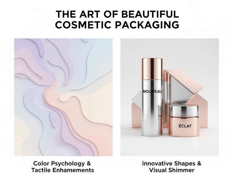
Aesthetic Appeal: The Role of Color in Packaging Design
- Color psychology drives emotion—warm tones like coral or peach can feel uplifting, while cooler hues like lavender calm the senses.
- A curated color palette ensures consistency across product lines and strengthens brand identity.
- Strategic use of contrast creates a clear visual hierarchy, guiding the eye from logo to product name to key benefits.
- Trending shades—like muted earth tones or iridescent pastels—are popping off shelves thanks to evolving consumer perception.
- When used right, color doesn’t just decorate—it tells your brand’s story without saying a word.
Innovative Shapes: Exploring Cylindrical and Square Containers
• Cylindrical tubes are easy to grip, making them ideal when ergonomics matter more than shelf presence.
• Square jars? They’re space-savers with a modern edge—great for stacking and standing out in crowded aisles.
• Some brands mix both shapes within the same line to build visual contrast while keeping design cohesion intact.
Shorter containers also shift how customers perceive volume—even if two jars hold the same amount, one might “feel” more luxurious simply because of its shape.
Texture and Feel: Embossing and Metallized Finish Techniques
Grouped by sensory type:
Tactile Enhancements
- Raised logos using embossing give packaging that subtle “touch me” vibe.
- Soft-touch coatings add comfort during use and suggest premium value.
Visual Shimmer
- A high-gloss metallized finish reflects light beautifully under store lighting.
- Brushed metallic textures create depth without overwhelming minimal designs.
Material Matters
- Choosing the right base material supports surface treatments like foil stamping or UV coating—essential tools in crafting truly premium packaging that screams luxury even before it’s opened.
Texture Meets Color Meets Shape
When you blend texture with color and unique form factors, magic happens:
• A soft matte bottle in sage green with embossed gold accents? That’s earthy elegance at its finest.
• Or think bold—a shiny black square container with sharp corners and a silver logo pressed into its lid; it oozes confidence from every angle.
These combinations turn everyday cosmetics into art pieces people want on their vanities—not tucked away in drawers.
The best part? This kind of thoughtful design keeps evolving alongside trends in material selection, consumer behavior, and packaging tech—all fueling the future of truly beautiful cosmetic packaging experiences.
5 Key Elements Of Effective Cosmetic Packaging
Creating beautiful cosmetic packaging isn’t just about looks—it’s a balance of function, feel, and flair. Here’s what makes packaging both practical and irresistible.
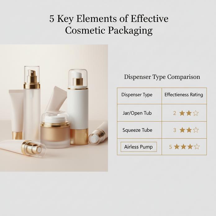
Material Matters: Choosing Between Glass and Acrylic Plastic
- Glass gives off that luxe, premium vibe—great for serums or high-end skincare.
- Acrylic plastic, on the other hand, is lighter, less breakable, and still looks sleek.
- Want to go eco? Glass is more recyclable, but acrylic wins on transport efficiency.
✔️ Sustainability tip: Refillable acrylic containers are gaining traction fast.
💡 Topfeel recommends hybrid designs—glass body with an acrylic cap—for a balance of durability and elegance in your cosmetic packaging lineup.
Decorative Enhancements: Hot Stamping and Screen Printing
- Hot stamping adds that shiny metallic pop—perfect for logos or accents.
- Screen printing delivers crisp text and bold colors that won’t rub off easily.
- Combine both for layered branding with texture and depth.
🌀 Think of it like makeup for your product’s outfit—it’s all about standing out on shelves packed with other bottles vying for attention.
To make truly beautiful cosmetic packaging, every detail counts—from the font thickness to foil color choice.
Functional Components: The Importance of Pump Dispensers
• Pump dispensers aren’t just convenient—they’re key to keeping formulas clean by limiting air exposure.
• Less mess = better user reviews = fewer returns = happier bottom line.
• They also allow precise dosage control so users don’t overuse expensive products.
When you’re designing your next batch of skincare or foundation bottles, don’t skimp on the pump—it’s not just hardware; it’s part of the experience.
| Dispenser Type | Airless Protection | Dosage Control | User Preference Rating |
|---|---|---|---|
| Standard Pump | Low | Medium | ★★★☆☆ |
| Airless Pump | High | High | ★★★★★ |
| Dropper Cap | None | Low | ★★☆☆☆ |
Topfeel integrates high-efficiency pumps into their latest lines to enhance usability while preserving product integrity—an essential factor in crafting truly beautiful cosmetic packaging solutions.
Applicator Options: The Value of Quality Cosmetic Sponge Applicators
Soft-touch sponges can totally change how people feel about your product:
– A dense sponge ensures smooth application without soaking up too much product.
– Antibacterial materials reduce skin irritation risks.
– Ergonomic shapes offer better grip during use.
In short bursts:
- Precision? ✔️
- Hygiene? ✔️
- Comfort? ✔️
From BB creams to concealers, quality cosmetic sponge applicators elevate not only application but perceived value too—key when aiming for standout yet functional design in today’s crowded beauty market.
How Beautiful Cosmetic Packaging Influences Purchase Decisions?
A product’s outer shell can make or break its first impression. Let’s unpack how design and material choices sway buying behavior.
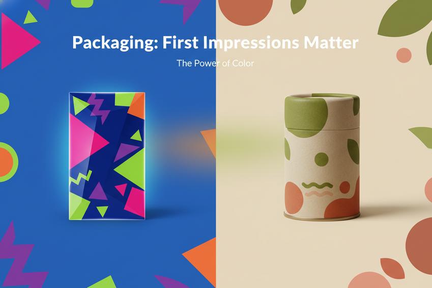
First Impressions Matter: The Impact of Color and Shape
The magic starts before the lid even opens—color, shape, and overall vibe hook people instantly.
- Bright, saturated color palettes tend to scream energy, while softer tones whisper luxury.
- Rounded shapes feel more approachable; sharp edges suggest precision or boldness.
- A harmonious packaging design builds instant recognition—consistency is key for a strong brand image.
Now picture this: You’re walking past a shelf, and your eye snags on a clean, minimalist bottle with soft curves and earthy tones. That reaction? It’s not random—it’s the brain responding to carefully chosen visual triggers.
Short bursts of color psychology:
• Red = urgency or passion
• Blue = trust, calmness
• Gold = premium appeal
When you combine these with smart structural choices like ergonomic grips or sleek silhouettes, you’re not just selling skincare—you’re selling an experience. And that experience begins with the packaging’s aesthetic pull.
In fact, many shoppers don’t even realize how much they judge based on looks until later. What feels like gut instinct is often deep-rooted in visual cues tied to identity and aspiration.
Psychology of Packaging: Opaque vs. Transparent Materials
Why does seeing the product inside matter? Or not seeing it at all?
🟢 Transparent packaging:
- Boosts consumer confidence by offering full product visibility
- Suggests honesty—“nothing to hide” equals higher consumer trust
- Often used when textures or colors are part of the appeal
🔴 Opaque packaging:
- Signals luxury or exclusivity
- Protects formulas from light degradation
- Adds mystery—what’s inside might be special
Grouped by impact:
➡️ Trust & Quality Perception
• Transparency helps shoppers verify contents visually
• Opaqueness implies careful curation and protection
➡️ Brand Strategy
• Clear bottles suit natural or organic lines
• Matte black tubes scream high-end sophistication
➡️ Functional Considerations
• Some ingredients degrade under light—opaque wins here
• Thick creams may look unappealing if exposed—better hidden
Topfeel nails this balance by choosing materials that showcase their formulas when needed but protect integrity where it matters most. This dual approach reinforces both authenticity and care—a combo modern consumers crave when assessing any kind of “beautiful cosmetic packaging.”
Ultimately, whether you’re drawn to something see-through or sealed tight depends on what you’re looking for—reliability you can see…or elegance you can feel.
Sustainable Practices For Beautiful Cosmetic Packaging
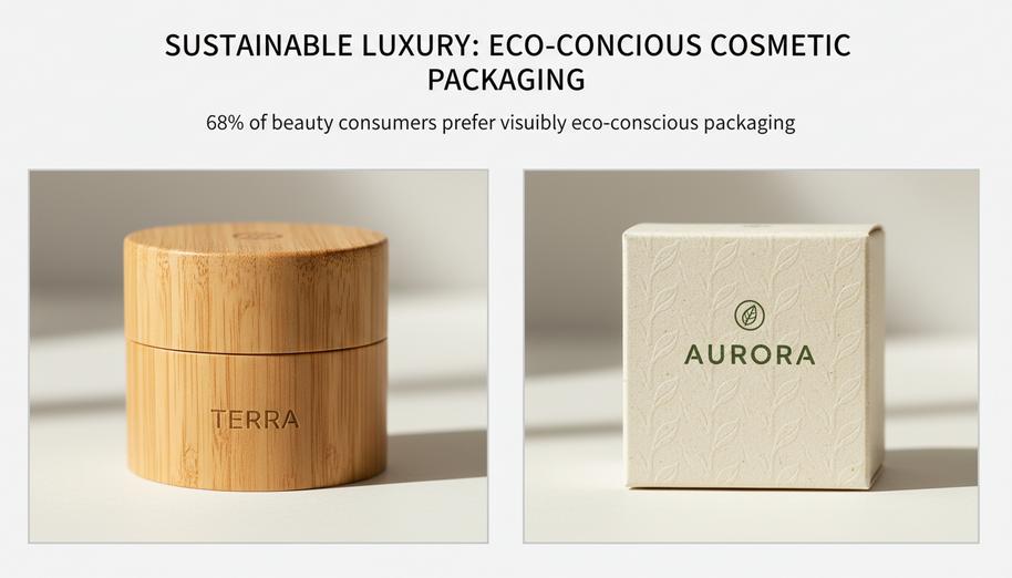
Eco-conscious design isn’t just a trend—it’s the new standard for creating truly beautiful cosmetic packaging that respects both style and sustainability.
Eco-Friendly Materials: The Rise of Sustainable Bamboo Casing
Using sustainable bamboo in cosmetic packaging isn’t just about being green—it’s about giving your products a down-to-earth luxury feel.
- Biodegradable charm: Unlike plastic, bamboo casing breaks down naturally without leaving toxic waste.
- Renewable resource: Bamboo grows super fast—some species shoot up over 3 feet a day—making it an ideal choice for eco-smart brands.
- Visual texture: The natural grain patterns of bamboo elevate the look of any product, adding warmth and authenticity to otherwise sterile packaging.
- Low energy processing: Manufacturing with bamboo uses significantly less energy than aluminum or plastics, reducing carbon footprints.
- Consumer appeal: Today’s shoppers are drawn to materials that look good and do good—bamboo checks both boxes.
When it comes to crafting truly beautiful cosmetic packaging, few materials balance aesthetics and ethics like this humble grass turned powerhouse.
Green Decorations: Using Eco-Friendly Paperboard in Packaging
Designers looking for sustainable sparkle are turning to eco-friendly paperboard as their go-to medium—and it’s not hard to see why.
• It’s lightweight but strong, making it ideal for outer wraps and decorative sleeves around jars or tubes.
• With finishes like embossed textures or soy-based inks, you can make even minimalist designs pop without hurting the planet.
• Brands using recycled paperboard reduce landfill waste while still delivering on premium presentation.
According to a recent NielsenIQ survey from early 2024, over 68% of beauty consumers now prefer products with visibly eco-conscious packaging—even if they cost more. That gives brands using smart decoration strategies with sustainable materials a real edge when competing on shelves crowded with synthetic options.
Treatments for Longevity: UV Coating and Scratch Resistance
Protective finishes don’t just keep your product looking fly—they help maintain that “new” feel long after purchase.
- UV coating advantages
- Shields against sun damage that fades colors
- Adds subtle gloss without overpowering natural designs
- Extends shelf visibility by keeping labels crisp
- Scratch resistance perks
- Keeps surfaces smooth despite frequent handling
- Reduces visible wear during shipping or display
- Protects detailed prints and logos from scuffs
These kinds of finishing touches are critical when aiming for durable yet beautiful cosmetic packaging. Whether you’re working with glass jars or cardboard palettes, applying the right protective layer ensures your sustainable choices stay stunning through every stage—from warehouse to vanity top.
Building Customer Loyalty With Beautiful Cosmetic Packaging
A killer first impression matters. Let’s unpack how smart packaging keeps customers coming back for more.
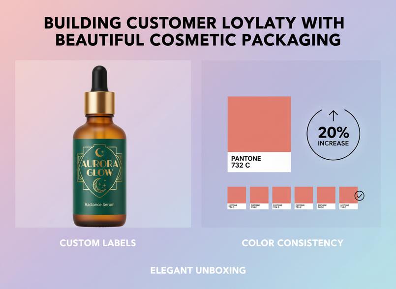
Custom Labels: Enhancing Brand Recognition Through Design
• A splash of personality: Custom labels turn standard containers into brand ambassadors.
• Eye-candy appeal: Unique fonts, textures, and finishes boost visual impact.
• Consistency counts: Repeat exposure to the same label design reinforces memory recall.
You want your product to feel like a friend—familiar, stylish, and trustworthy. That’s where well-designed labels come into play. By using bold typography and clean layouts, you create instant recognition. Think of it like a signature look; even from a distance on a crowded shelf, your product stands out because the label screams “you.” Whether it’s foil stamping or matte lamination, these details add to the tactile experience too.
Grouped Benefits:
- Custom Labels signal professionalism and polish.
- They enhance overall shelf presence through bold graphic Design.
- Help build emotional ties via familiar branding elements.
- Improve consumer trust by reinforcing consistent messaging.
The Power of Consistency: Pantone Matched Color Strategies
“According to NielsenIQ’s Beauty Consumer Report published Q2 of this year, brands with consistent color schemes reported up to a 28% increase in unprompted brand recall.”
Color isn’t just decoration—it’s identity. When brands commit to exact hues using Pantone matching systems, they’re locking down their visual DNA. This builds long-term memory links between consumers and the product line. A soft blush pink or deep emerald green becomes unmistakably yours over time.
Short Descriptive Segments:
— Pantone ensures that every print run looks identical across batches.
— Visual harmony across platforms—from Instagram posts to packaging—is easier with color control.
— Consumers subconsciously associate color consistency with quality and attention to detail.
Grouped Strategy Highlights:
- Locks down your core shade palette via precise Color Matching.
- Reinforces trust through uniformity across touchpoints.
- Makes it easier for consumers to spot you instantly on shelves.
- Supports long-term brand equity by anchoring visual identity around specific tones.
Packaging as Experience: Creating Elegant Unboxing Moments
Unboxing isn’t just functional—it’s emotional now more than ever.
Think about it: when someone opens your product for the first time, what do they feel? Surprise? Delight? Awe? That moment is golden—and totally within your control if you get the details right.
Multi-item Grouped Details:
• Luxurious tissue paper adds texture and sound—the crinkle effect is real sensory magic.
• Magnetic closures or ribbon ties offer tactile satisfaction beyond basic flaps or tabs.
• Scented inserts subtly elevate the entire vibe without screaming for attention.
More than just looking good on Instagram reels, elegant packaging supports perceived value. It tells customers they made the right choice—even before they try what’s inside.
Benefits Breakdown:
- Enhances perceived luxury via thoughtful physical design (Elegant Design, ribbons, embossing).
- Sparks joy during unpacking—a key part of modern customer delight strategies (Customer Delight).
- Builds deeper emotional bonds that drive repeat purchases (Unboxing Experience, emotional touchpoints).
Even if you’re not selling high-end serums or prestige makeup lines, creating an upscale moment can shift how people talk about—and remember—your brand tied closely with your beautifully designed cosmetic packaging solutions.
References
[1] Cosmetic Packaging Colors: What Works and What to Avoid – BrillPack
[2] How Packaging Colors Influence Cosmetic Purchasing Decisions? – Print247
[3] The Environmental and Aesthetic Benefits of Bamboo Packaging in Beauty Products – APG Packaging
[4] Sustainable Beauty Packaging: Industry Trends & Opportunities – Meyers
[5] 2024 Beauty, Health & Wellness Innovation Report – NielsenIQ
[6] Packaging Colour Psychology – How It Affects Your Success – GWP Group
FAQs
The moment someone picks up a product, the packaging speaks before anything else. Shape and color stir emotion—soft curves feel approachable, bold hues suggest confidence. A transparent bottle might whisper honesty, while opaque materials hint at mystery or luxury. The right design doesn’t just hold a formula; it tells a story that buyers want to be part of.
Absolutely—and sometimes they’re even more charming because of their imperfections.
Recycled paperboard offers an earthy texture that feels genuine in hand.
Bamboo cases bring warmth and individuality with each grain pattern.
Glass jars made from post-consumer material reflect light differently—less polished, but deeply human.
These choices don’t sacrifice beauty—they shift the definition toward something more thoughtful and tactile.
It depends on how you want your brand to feel in someone’s palm:
- Glass is cool, weighty—a signal of elegance—but fragile under pressure.
- Acrylic is lighter, clearer than most plastics, resilient through shipping chaos.
- If sustainability matters most to your audience, glass may win hearts; if convenience rules the day, acrylic keeps things simple without looking cheap.
Balance what looks good with what lives well in real life.
Texture lingers where sight fades—it’s often what people remember when they close the box lid. Raised embossing catches fingertips like Braille telling stories of care. Matte finishes calm reflections so eyes can rest on details; glossy UV coatings dazzle under store lights but also protect against smudges that would dull excitement later on.
When someone runs their fingers over a package and pauses… that’s connection—that’s loyalty being born right there in silence

