

Why Iridescent Packaging is Essential
January 30,2026
In a world where beauty shelves look like a copy-paste job, iridescent packaging isn’t just eye candy—it’s your product’s neon sign in a blackout. Think of it as the red carpet dress at a grocery store gala: bold, showy, unforgettable. If you’re banking on beige and hoping for buzz… honey, that’s not how star power works.
“Iridescence triggers 40% more shelf engagement than matte finishes,” says Mintel’s Global Packaging Trends Report—proof that sparkle speaks louder than words.
You’re not just selling serums or lip gloss; you’re selling desire in a bottle. And when that bottle shifts color with every tilt and touch? That’s magic people remember—and buy again.
The Role of Iridescent Packaging in Brand Identity
A little shimmer goes a long way—iridescent packaging does more than just catch the eye; it shapes how we feel about a brand.

How Holographic Printing Defines Brand Aesthetics
- Holography isn’t just flashy—it’s strategic. When done right, it builds strong visual memory.
- Brands use advanced printing techniques to create light-shifting illusions that demand attention on shelves.
- That flicker and shift? It’s not random. It’s engineered for maximum visual appeal, reinforcing your brand’s vibe.
- A bold holographic printing sheen makes products instantly recognizable.
- Subtle shifts in light communicate innovation and forward-thinking design.
- Consumers associate holograms with tech-savvy, premium experiences.
✦ For example, beauty brands often pair holographic finishes with minimalist typography to balance flash with sophistication.
The dynamic nature of these optical effects enhances the overall product story—whether it’s skincare or tech accessories, the packaging becomes part of the experience.
Short bursts of shine do wonders: – Grabs attention in cluttered retail spaces – Signals modernity and confidence – Makes unboxing feel like opening treasure
By integrating holography, brands like Topfeel build emotional connections through layered design, reinforcing their unique brand image while standing out in saturated markets.
The Impact of Color Selection: From Pearl White to Champagne Shimmer
• Soft hues like pearl white evoke cleanliness and trust—perfect for skincare or wellness lines.
• Warmer tones such as champagne shimmer lean into indulgence and celebration, ideal for luxury gifting sets.
• Each tone subtly tweaks consumer mood without saying a word.
- Choosing specific shades within the spectrum of iridescent colors can completely change perception—from clinical to romantic or youthful to regal. 2) Studies show that 68% of shoppers make purchasing decisions based on color alone—this makes your palette more than just pretty; it’s persuasive.
✧ “Color psychology plays a critical role in packaging success,” notes Mintel’s 2024 Consumer Packaging Report, highlighting how tone affects trust levels across demographics.
Multiple shade strategies: – Use cooler iridescence (like blue-pink shifts) for calmness and clarity – Opt for warmer transitions (gold-peach blends) to signal richness
Whether you’re going bold or subtle, playing with color inside your iridescent shell fine-tunes how people read your product at first glance—and that impression sticks hard.
Iridescent Coatings: A Symbol of Luxury and Quality
Luxury isn’t always loud—but it should always feel intentional. That’s where high-end iridescent coatings come into play.
• These finishes instantly elevate perceived value by adding depth and texture to even minimalist designs.
• When paired with structured fonts or clean layouts, they whisper exclusivity rather than shout opulence.
Grouped perks:
- Adds tactile dimension that feels premium on contact
- Reflects light differently at every angle, creating movement
- Signals investment in detail—a shortcut to perceived quality
Brands using these finishes often report higher engagement rates online due to share-worthy aesthetics—because let’s face it, people love posting shiny things.
Premiumization through finish is real:
“Consumers equate reflective surfaces with higher price points,” says Euromonitor’s Global Packaging Trends 2024 report—a reminder that surface matters as much as substance when building perceived brand value.
So if you’re aiming for prestige without overcomplicating design language, an iridescent coating is your secret weapon—it hints at craftsmanship while keeping things sleek and modern across all touchpoints of your brand identity.
Why You Should Choose Iridescent Packaging Today
Amp up your product’s shelf presence with smart, stylish, and sustainable iridescent packaging choices that blend beauty with brains.

The Benefits of Acrylic Plastic in Iridescent Designs
- Durability meets style: Acrylic plastic holds its shape and resists cracking, making it ideal for reusable or long-lasting packages.
- Crystal-clear transparency shows off those shimmering color shifts in iridescent designs, catching the light—and attention—at every angle.
- Design flexibility means brands can mold it into just about any shape or finish they want, from glossy to matte or layered textures.
This combo of strength and sparkle makes acrylic a front-runner in premium visual branding.
Aluminum Containers: Combining Sustainability with Eye-Catching Appeal
✔️ Lightweight yet sturdy — aluminum containers offer protection without the bulk.
✔️ They’re endlessly recyclable, scoring major points on the sustainability scale.
✔️ That sleek metallic surface? A perfect canvas for an iridescent finish, giving your product a futuristic vibe.
When you pair eco-consciousness with visual punch like this, you’re not just packaging—you’re making a statement.
The Rise of Biodegradable Plastics in Iridescent Packaging
Bioplastics are getting smarter—and shinier. Here’s why they’re blowing up:
• They break down faster than traditional plastics, easing their environmental impact.
• Many now support high-end finishes like shimmer and gloss to suit modern iridescent packaging needs.
• Brands adopting these materials are aligning with growing demand from eco-conscious consumers, especially Gen Z buyers who favor ethical design.
With innovation driving new blends and finishes, biodegradable plastics options no longer mean boring.
Magnetic Closures: Enhancing Functionality and Visual Impact
Step-by-step breakdown of why magnetic closures rock:
- Start with the tactile experience — that satisfying snap when you close the lid? That’s all about improved user experience.
- Add security — these closures don’t pop open easily during transit, offering a more reliable seal than standard lids.
- Layer in style — magnetic designs allow seamless integration into luxury box designs featuring bold colors or subtle iridescent accents.
The final result is a package that feels as good as it looks—practical yet polished with elevated design appeal thanks to built-in functionality and sleek aesthetics.
3 Reasons Why Iridescent Packaging Stands Out

From metallic tones to tactile finishes, iridescent packaging goes beyond looks—it’s a full sensory experience that hooks beauty lovers instantly.
The Allure of Rose Gold in Cosmetic Packaging
There’s something about rose gold that screams timeless glam. It’s not just a color—it’s an attitude.
- ✨ Shoppers gravitate toward the soft warmth of metallic hues like rose gold because they evoke elegance without being over-the-top.
- 💄 In beauty aisles, products wrapped in gold mascara tube tones stand out as more premium, even if the price tag doesn’t say so.
- 🌟 Brands use it to signal both trendiness and trustworthiness—a rare combo.
A few quick hits:
• It flatters most skin tones, making it visually relatable.
• The subtle shine pairs well with both matte and glossy finishes.
• It’s often associated with femininity and luxury, which aligns perfectly with cosmetic branding.
It’s no wonder rose gold has become the go-to for limited editions and influencer collabs—it tells a story before you even open the lid.
Soft-Touch Finishes: Adding a Sensory Element
Touch matters way more than you’d think—especially when you’re picking up a product for the first time. That’s where soft-touch finishes change the game.
Grouped by experience:
- Tactile Experience • A silky, almost suede-like feel • Increased grip and comfort
- Consumer Perception • Feels more luxurious = perceived higher value • Encourages longer interaction time on shelves
- Branding Impact • Differentiates from traditional slick plastic or cardboard • Aligns with modern minimalist aesthetics
| Finish Type | Texture Rating (/10) | Cost Impact (%) | Shelf Appeal Score |
|---|---|---|---|
| Glossy Laminate | 5 | +5 | Medium |
| Matte Varnish | 7 | +8 | High |
| Soft-Touch Coating | 9 | +12 | Very High |
| UV Spot Coating | 6 | +6 | Medium |
Brands aiming for tactile engagement are increasingly mixing soft-touch finishes with other embellishments like foil stamping or die-cuts—because texture sells almost as much as color does in today’s crowded market.
How Embossed Patterns Elevate Product Presentation
When your fingers trace raised designs on packaging, you’re not just touching texture—you’re feeling brand identity come alive.
Here’s how it all plays out:
• Step one: Brands choose embossed patterns to add depth—literally—to their visual design while reinforcing logos or motifs.
• Step two: These raised elements create contrast against smooth surfaces, catching light differently and drawing attention fast.
• Step three: As customers interact with these textures, there’s an instant sense of craftsmanship and care baked into their perception of quality.
Embossing amplifies both visual drama and haptic satisfaction. Combined with other effects used in iridescent packaging, it transforms ordinary boxes into collectible keepsakes that consumers don’t want to throw away—even after the product is gone.
How Iridescent Packaging Enhances Customer Experience
A splash of shimmer and a clever design twist can turn everyday products into irresistible shelf candy.

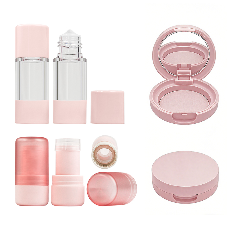
Round Containers vs. Cylindrical Bottles: The Best Shapes for Visual Engagement
• Round containers project warmth and familiarity—think soft, approachable vibes that make people want to pick them up without overthinking it.
• Cylindrical bottles, on the flip side, scream modern minimalism with their clean lines and vertical stance, giving off a more premium feel.
• When paired with iridescent packaging, each shape tells a different story under shifting light—round ones emphasize depth while cylindrical ones highlight sleek reflectivity.
• According to Mintel’s 2024 Packaging Insight Report, “Consumers are 38% more likely to associate round shapes with comfort and trustworthiness, especially when combined with tactile or reflective finishes.”
• For brands aiming to pop on crowded shelves, the combo of smart product design, strategic container shapes, and shimmering hues from iridescent packaging is a total win-win.
• Ultimately, your choice between round or cylindrical should hinge on what emotion you’re trying to spark—playful curiosity or polished sophistication?
Enhancing User Interaction: The Role of Pump Dispensers
- Pump tops aren’t just about convenience—they’re low-key brilliant at elevating everyday routines.
- A well-designed pump dispenser makes product access smoother while keeping things mess-free.
- Combine that with slick iridescent packaging, and suddenly even soap feels like luxury skincare.
- Customers love how these dispensers marry style with function; no twisting caps or squeezing tubes needed.
- On top of that, the visual rhythm created by pumps atop sleek bottles adds symmetry—a subtle touch that enhances overall packaging aesthetics.
- From hand creams to serums, the right dispensing mechanism ensures every drop feels intentional.
- Add ergonomic design into the mix? Now you’ve got an experience that’s as satisfying as it is stylish.
- Whether it’s ease-of-use or elevated elegance you’re chasing, pump dispensers bring serious value to both form and function within modern beauty packaging systems.
The Science of Iridescent Packaging Durability
Durability matters, especially when you’re working with flashy, high-impact looks like iridescent packaging. Let’s break down what keeps it looking good and holding strong.

PET Plastic: Balancing Durability and Aesthetic Appeal
- PET plastic is a go-to for material strength, offering impact resistance without sacrificing clarity.
- It supports intricate visual design, making it a favorite for shimmering finishes like iridescent packaging.
- This polymer handles both heat and pressure well—great for shipping or shelf life.
- Brands love its lightweight nature; consumers love its sleek look.
- It’s recyclable too, adding a sustainability bonus to its list of wins.
- When layered with metallic foils or holographic films, PET holds up better than many alternatives.
- Its flexibility allows for embossed textures that enhance the reflective quality without cracking.
The Role of Eco-Friendly Inks in Product Longevity
• You want your design to pop—but not peel. That’s where eco-friendly inks shine.
- These inks are made from plant-based resins or soy derivatives, which bond better with flexible surfaces like PET.
- They resist fading under UV exposure—a key factor in preserving product longevity on store shelves.
• According to Smithers’ Packaging Print Forecast 2024, pigment-stable inks now account for over 60% of premium cosmetic labels due to their fade resistance and minimal environmental impact.
Eco-conscious doesn’t mean dull anymore. Today’s water-based ink tech lets you print vibrant gradients that complement the multi-tone shimmer of segmented iridescent packaging designs—without bleeding or smudging over time.
Comparing the Durability of Glass Bottles with Aluminum Containers
Not all containers are created equal when it comes to keeping your product safe—and stylish. Here’s how two popular choices stack up:
| Material Type | Impact Resistance | Weight Efficiency | Recyclability |
|---|---|---|---|
| Glass bottles | Low | Poor | High |
| Aluminum containers | High | Excellent | Very High |
| Coating Compatibility | Moderate | Very High | Moderate |
| Shelf Life Contribution | Strong aesthetic preservation | Strong physical protection | Balanced |
While glass gives off a luxurious vibe perfect for luxury lines using rich tones beneath translucent layers, aluminum offers unmatched toughness—ideal when your bold, reflective finish needs to survive real-world handling. Both have their place depending on whether you’re prioritizing look or logistics in your next round of iridescent packaging development.
How to Choose the Right Iridescent Packaging
Finding packaging that pops on shelves and works like a charm isn’t just about color. It’s about shape, closure, and how it fits into sustainable lifestyles.
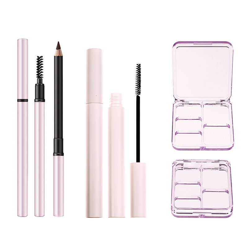
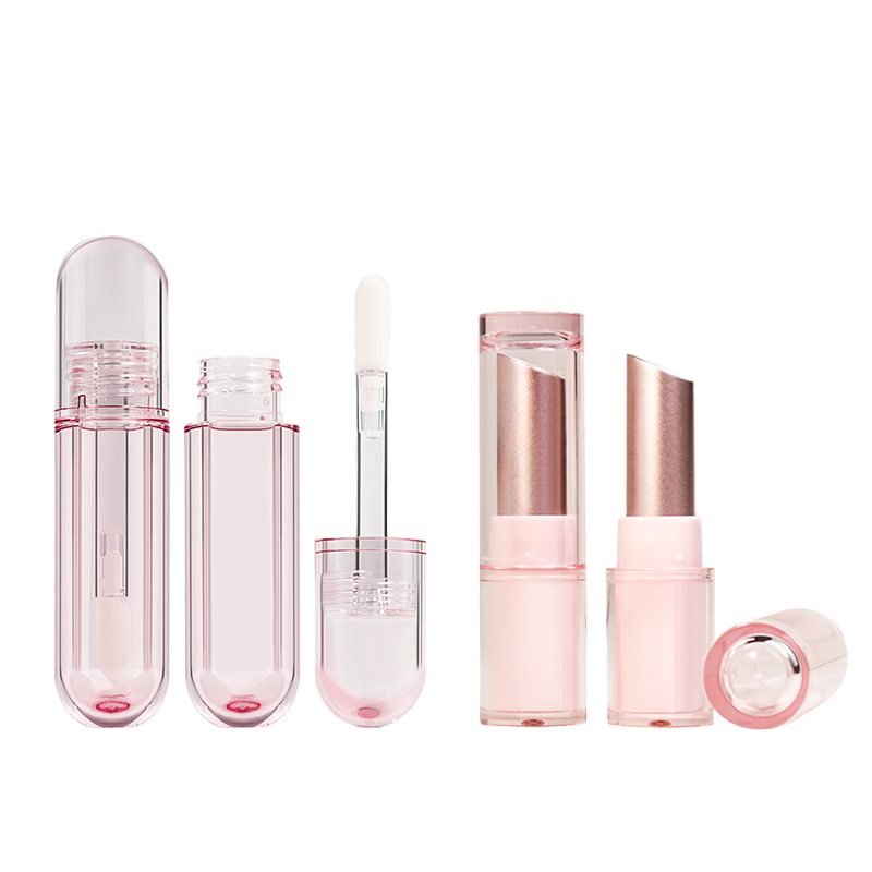
Key Factors in Selecting Shapes: Oval Tubes and Rectangular Palettes

Choosing the right form for your product isn’t just about looks—it’s about performance. Here’s what makes certain shapes stand out:
- Oval tubes are easy to grip, making them ideal for lotions, creams, and balms. Their ergonomic design fits well in hand and bag.
- If you’re after maximum layout space for branding or ingredient info, go with rectangular palettes—they offer great flat real estate.
- For products like eyeshadows or blushes, the structured lines of rectangular palettes help organize multiple shades efficiently.
- Shelf presence matters too—packaging shapes that stack neatly or stand upright attract more attention in retail environments.
- The form should reflect the product form, enhancing both function and visual appeal. A creamy product? Tube it. Powder-based? Palette all day.
Choosing the Right Closure Type for Various Cosmetic Products
Getting the closure right can make or break how people use your product every day. Here’s a mix of key tips:
- For thick creams or balms that need extra protection from air exposure, go with screw caps—they lock tight and feel secure.
- If you’re working with liquid serums or foundations, a good bet is an airless pump, which prevents oxidation while delivering precision.
- Want quick access for shower products? A sturdy flip-top cap is your friend—fast open-close action keeps things mess-free.
- For luxury oils or concentrated formulas, nothing beats a glass dropper—it adds elegance while controlling dosage.
💡 Bonus tip: Always test your closures with different viscosity levels before finalizing production—it avoids spills and customer complaints later on.
Tips for Incorporating Refillable Packaging in Iridescent Designs
Refillable formats aren’t just eco-trendy—they’re smart business now. And yes, they can still shine bright.
Designers often think reusable equals boring—but not when paired with shimmering finishes or modular parts that snap cleanly into place. Start by selecting materials compatible with both refilling mechanisms and reflective coatings; PETG and aluminum hybrids work well here.
According to Euromonitor International’s Q1 2024 report on beauty packaging trends, “consumers are increasingly seeking refillable options that don’t compromise on aesthetics.” That means you’ve got room to innovate—think magnetic inserts inside mirrored cases or refillable cartridges wrapped in dazzling shells.
The trick is making sustainability feel premium without losing the soul of your brand—or the sparkle of your iridescent vibe.
FAQs
What makes iridescent packaging irresistible for cosmetic brands?
It’s the play of light and texture that draws attention long before shoppers read the label.
- Holographic printing & Metallic foiling create shifting reflections on cylindrical bottles and rectangular palettes.
- Shades like Rose gold, Pearl white, and Champagne shimmer speak luxury in an instant.
3️⃣ Even small items—like lipstick tubes or blush compacts—gain a perceived value boost through a gentle iridescent coating and soft glint from every angle.
How does acrylic plastic enhance large-scale iridescent designs?
Acrylic’s clarity brings out every layer of color with lasting shine.
• Deep tone pairing: Lavender purple + Ocean blue = smooth gradient glow.
• Works beautifully for bulk runs where consistency matters most, especially on oval tubes or foundation bottles.
✦ The result is crisp transparency that feels both playful and premium at once.
Why do color choices carry emotional weight in design success?
Color sets the emotional tempo before touch ever happens:
1️⃣ Pearl white mirrors grace—perfect for skincare purity lines;
2️⃣ Ocean blue whispers freshness into summer launches;
3️⃣ Rose gold captures modern elegance for metallic-lid perfumes.
→ Each hue influences buying instincts faster than words can persuade, giving packaging more voice than advertising itself.
Which sustainable materials fit iridescent ambitions without losing appeal?
A short theory of balance—a sparkle today, but mindful tomorrow:
| Sustainability Type | Material Partner | Surface Finish |
|---|---|---|
| Recycled materials | PET plastic | Soft-touch finish |
| Biodegradable plastics | Paperboard packaging | Holographic printing |
| Refillable packaging | Aluminum containers | Iridescent coating |
Eco-friendly inks tie them together so luminous shades stay kind to Earth while keeping visual power intact.
How do closures contribute to beauty as much as function?
Every click or twist becomes part of the sensorial story.
- Magnetic closures: satisfy with one elegant snap on square compacts; no obstruction to shimmer reflection.
- Pump dispensers: make foundation use effortless while showcasing pearly glow through transparent bodies.
◇ A closing remark—a closure should secure more than product; it seals brand memory in glittering permanence.
References
- [Mintel Global Packaging Trends – https://www.mintel.com/global-packaging-trends/]
- [Smithers Packaging Market Reports – https://www.smithers.com/services/market-reports/packaging]