

Custom Cosmetic Packaging: Best Decoration Techniques
December 02,2025
You ever stand in the beauty aisle, holding a lip gloss and thinking, “Dang… this is cute”? That’s not an accident. Brands pouring big bucks into custom cosmetic packaging know that before your product even touches skin—it’s gotta flirt with the eyes. Because truth is, packaging doesn’t just hold your formula—it holds your story.
“Decoration sells the dream,” says Mei Lin, senior designer at Topfeel Packaging (2024 Global Beauty Components Report). And she’s right—metallic foils whisper luxury; embossed logos demand a second touch; UV-coated jars glimmer like candy on a Sephora shelf.
So if you’re scaling up production or launching that next hero SKU, don’t sleep on surface treatments. These small details? They’re silent salespeople—and they speak fluent glam.
Key Points in Shine: A Quickfire Summary on Custom Cosmetic Packaging
→ Visual Impact Wins: Surface treatments like UV coating, hot stamping, and metallic finishes boost shelf appeal and communicate luxury.
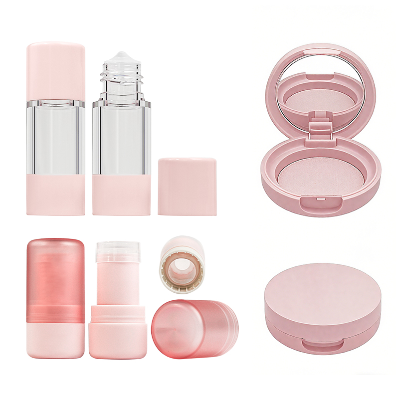
→ Shape Sells Style: Custom bottle silhouettes and compact case forms create a memorable brand identity that draws consumer attention.
→ Color Consistency Counts: Utilizing the Pantone Matching System ensures your packaging color stays true across every production run—vital for brand recognition.
→ Texture Talks: Finishes like matte, glossy, and soft touch affect tactile experience and influence perceived product value.
→ Eco Meets Elegance: Materials such as recyclable PET jars and paperboard offer sustainability without compromising visual flair or print quality.
3 Innovative Techniques For Custom Cosmetic Packaging Design

Quick visual appeal, sustainable choices, and clever shapes are rewriting the rules of custom cosmetic packaging. Let’s break down three smart design moves changing the game.
Transformative Aesthetics: Utilizing UV Coating for Eye-Catching Designs
• UV coating gives packaging that glossy pop—like lip gloss for your box.
• It adds a layer of protection against scratches, smudges, and shelf wear.
• Think high-end look without the high-end cost.
- Brands use spot UV to highlight logos or product names.
- Full-surface UV creates an all-over shine that screams luxury.
- Matte + UV contrast? Now that’s drama on a carton.
✦ Bonus? It extends shelf life by reducing moisture damage.
A recent study by Smithers Pira found that over 62% of consumers associate glossy finishes with premium quality—a small touch with big impact when designing cosmetic packaging.
The Power of Shapes: How Custom Designs Enhance Product Appeal
Rounded edges, hexagonal tubes, or pyramid-style jars—yeah, they’re not just for fun. These custom designs shift how people feel about your brand.
- Unique forms like curved cartons or fold-out boxes draw attention instantly
- Structural creativity builds stronger emotional connections
- Functional shapes improve usability while reinforcing brand identity
Grouped Benefits:
• Boosts shelf differentiation
• Enhances tactile experience
• Supports storytelling through form
According to Packhelp Insights Q2/2024, “Shoppers are more likely to pick up products with unexpected shapes—especially in crowded beauty aisles.” That’s why shape isn’t just form—it’s function dressed up as flair.
Eco-Friendly Materials: Combining Paperboard with Attractive Graphics
This is where green meets gorgeous. Paperboard, when paired with bold prints and smart design, becomes more than recyclable—it becomes irresistible.
Step-by-step:
Step 1: Choose FSC-certified or post-consumer recycled paperboard
Step 2: Apply soy-based inks for vibrant yet eco-conscious color
Step 3: Use minimal coatings so recyclability stays intact
Short bursts:
- Lightweight but sturdy = lower shipping costs
- Flat surface = perfect canvas for detailed graphics
- Consumers love knowing their beauty buys aren’t trashing the planet
| Material Type | Recyclability (%) | Print Compatibility | Cost Efficiency |
|---|---|---|---|
| Kraft Paperboard | 95 | Medium | High |
| SBS Paperboard | 90 | High | Moderate |
| Recycled Chipboard | 85 | Low | High |
Eco doesn’t mean boring anymore—not when you’ve got killer attractive graphics on top-tier sustainable packaging like this.
How Custom Packaging Influences Consumer Buying Decisions
Custom cosmetic packaging isn’t just about looking pretty—it’s a game changer in how people feel, decide, and trust brands at first glance.

The Impact of Color: Using Pantone Matching System for Brand Recognition
- Color psychology isn’t fluff—it’s science. A consistent hue across your product line builds instant familiarity.
- The Pantone Matching System helps brands nail that exact shade every single time—whether it’s lipstick boxes or lotion tubes.
- For cosmetics, color consistency equals consumer confidence. People spot what they know and gravitate toward it fast.
A recent NielsenIQ report from early 2024 found that over 59% of beauty buyers are more likely to recall a brand with consistent packaging colors across shelves and digital ads.
Topfeel uses precise Pantone shades to create a sharp visual identity that stands out even in crowded store aisles or endless scrolls online.
First Impressions Matter: The Role of Glossy vs. Matte Finishes
• Matte finishes scream minimalism and sophistication—think clean, modern skincare lines targeting Gen Z.
• Glossy textures? They catch light—and attention—making them perfect for glam-focused products like highlighters or lip glosses.
• Texture directly impacts perceived quality; consumers often associate glossy finishes with luxury and richness, while matte finishes feel premium yet understated.
That first swipe of the eye across the shelf? It’s not reading labels—it’s reacting to texture and shine on the box or bottle.
Labeling Strategies: Conveying Brand Story Through Effective Design
Short bursts say more than long paragraphs:
Brand Storytelling – A well-designed label tells your origin story without needing a back cover essay.
Visual Hierarchy – Smart placement of fonts, icons, and color guides the eye naturally toward key info like ingredients or benefits.
Emotional Triggers – Use illustrations, taglines, or typography styles that evoke mood—calmness, excitement, trust.
Today’s shoppers want authenticity in their beauty buys. Labels are no longer just functional—they’re emotional cues wrapped around your product.
Custom Shapes: How Unique Bottles Attract More Customers
Grouped by impact:
Attention-Grabbing Appeal * Unusual curves or asymmetrical silhouettes make products pop off shelves filled with standard cylinders and rectangles.
Functional Differentiation * Ergonomic designs enhance usability—like pump bottles shaped to fit snugly in hand during skincare routines.
Social Media Magnetism * Unique cosmetic containers, especially those shaped like fruit, crystals, or abstract art pieces, get shared more often on TikTok and Instagram.
Custom cosmetic packaging design doesn’t stop at color—it extends into shape as a storytelling tool that drives curiosity and trial among new customers.
5 Latest Trends In Custom Cosmetic Packaging Decoration
From foil glam to tactile textures, today’s custom cosmetic packaging is all about form meeting function with flair.

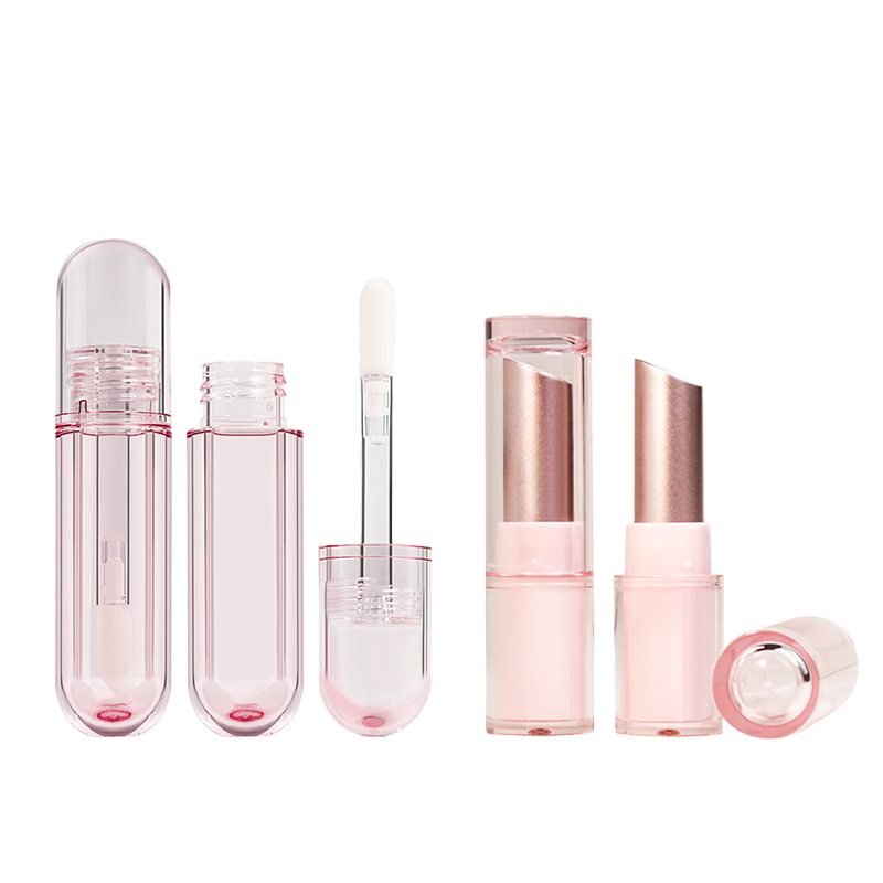
Hot Stamping: Adding Luxury to Lipstick Tube Packaging
• Brands are turning up the heat—literally—with hot stamping, a method that uses foil and pressure to give lipstick tubes a luxe sheen.
• Not just about aesthetics, this technique also boosts shelf appeal and brand recognition.
• Think of it as the cherry on top for premium lines—metallic golds, silvers, or even holographic accents elevate even minimalist designs.
Metallic Finishes: Today’s Must-Have for Foundation Bottles
- The rise of reflective surfaces has made metallic finishes a go-to for foundation bottle decoration.
- These finishes create a high-end vibe that consumers now expect from mid-tier and luxury brands alike.
- When paired with frosted glass or matte pumps, metallic details offer contrast that screams sophistication.
| Finish Type | Consumer Appeal Rating | Cost Impact (%) | Common Use Cases |
|---|---|---|---|
| Gold Foil | 9.5/10 | +12% | Premium foundations |
| Chrome Overlay | 8/10 | +8% | Mid-range skincare lines |
| Rose Gold Tint | 9/10 | +10% | Youth-focused cosmetics |
| Brushed Metal | 7/10 | +5% | Gender-neutral packaging |
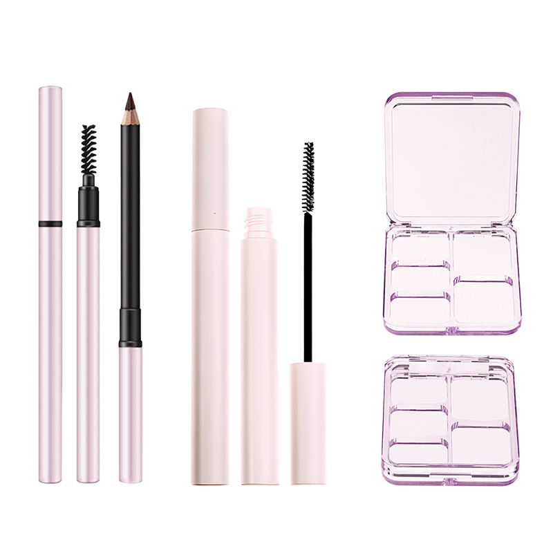
Screen Printing: An Emerging Favorite for Eyeliner Pens
Short bursts of detail make all the difference:
• With screen printing, eyeliner pens now carry intricate branding without smudging or fading over time.
• This method allows bold colors and crisp typography to shine—even on small cylindrical surfaces like pen barrels.
Precision meets practicality here; it’s clear why screen printing is becoming a staple across slim-profile beauty tools.
Textured Surfaces: Enhancing User Experience for Compact Cases
You know those moments when you fumble through your bag looking for your compact? That’s where texture saves the day.
Grippy ridges or soft-touch coatings on compact cases don’t just look cool—they help users identify products by feel alone. Plus, textured materials can reflect brand personality while reducing accidental drops during use.
Whether it’s embossed logos or rubberized coatings, adding dimension through surface design makes compact cases more functional and stylish at once.
Sustainability in Packaging: The Rise of Recyclable PET Jars
Multi-layered shift happening right now:
• Eco-conscious consumers are demanding transparency—and brands are responding with recyclable options like recyclable PET jars.
• These containers balance durability with environmental responsibility.
• Lightweight yet strong enough for creams and scrubs, they’re easy to dispose of responsibly.
• Many manufacturers now use post-consumer resin blends to further reduce waste.
• As sustainability becomes non-negotiable, these jars signal both innovation and accountability within custom cosmetic packaging design.
In fact, Topfeel recently integrated recycled PET into its skincare line jars—just one example of how far the industry has come toward circular design thinking.
Custom Cosmetic Packaging: The Role Of Branding

Custom cosmetic packaging isn’t just about good looks—it’s your brand’s first handshake with the customer. Let’s talk about how packaging becomes identity.
Consistency is Key: Aligning Your Brand’s Message with Packaging Design
- A mismatch between your visual design and your tone confuses consumers fast.
- If you’re eco-conscious, but use glossy plastic? That screams contradiction.
- Minimalist skincare brands should avoid overly ornate boxes—they send mixed signals.
- Align color schemes with emotional triggers—calming blues for wellness, bold reds for glamor.
- Typography matters—sleek sans-serifs hint at modernity, while hand-drawn fonts feel more indie or artisanal.
- Don’t forget materials—paperboard often feels more natural than rigid plastics, reinforcing organic brand messages.
✦ Even small details like embossing or matte finishes can reinforce premium positioning.
A consistent brand message across all touchpoints—including packaging design—builds trust faster than any ad campaign ever could.
• Fonts, colors, textures—all these elements scream who you are before the customer even opens the box.
• The packaging should whisper your brand values, not shout them out randomly.
• Think about how your visuals speak to your target audience—is it Gen Z skincare lovers or luxury fragrance buyers?
Steps that help nail consistency:
Step 1 – Define core values and tone before designing anything.
Step 2 – Audit competitor designs to identify gaps or overdone tropes.
Step 3 – Create mockups and test them with real users from your audience base.
Grouping by sensory cues:
Color Palette:
-
Warm neutrals = comfort & sustainability
-
Monochrome = sophistication
Typography Style:
-
Serif = tradition
-
Sans-serif = innovation
Material Finish:
-
Matte = subtle elegance
-
Glossy = high-energy pop
If the look doesn’t match the feel of what’s inside, people notice—and they remember.
The Influence of Component Choice: Caps and Pumps in Brand Identity
Caps and pumps may seem like afterthoughts—but they’re loaded with meaning when it comes to shaping perception around custom cosmetic packaging.
• A sleek airless pump suggests high-tech skincare innovation.
• A bamboo cap implies eco-awareness without saying a word.
• Heavy metal closures communicate luxury through tactile weight alone.
Grouped Impact Areas:
Functionality
Airless pumps extend shelf life for sensitive formulas
Lockable caps add travel-friendliness for on-the-go users
User Experience
Ergonomic pumps enhance daily usability without frustration
Precision droppers offer control for serums or oils
Aesthetic Appeal
Frosted glass paired with matte black caps gives off minimalist chic vibes
Gold-accented pumps channel old-school glamour
Scientific Table – Functional Performance Ratings by Component Type:
| Component Type | Ease of Use (1–5) | Product Protection (1–5) | Sustainability Score (1–5) |
|---|---|---|---|
| Screw Cap | 3 | 2 | 4 |
| Pump Dispenser | 5 | 4 | 3 |
| Dropper | 4 | 3 | 4 |
| Magnetic Closure | 2 | 2 | 2 |
Your choice of components reflects both form and function—and it speaks volumes about your brand identity, even before customers twist open the lid.
In short, don’t underestimate how much a cap says about you—it might be whispering elegance…or screaming cheapness.
FAQs
What makes custom cosmetic packaging catch a buyer’s eye on the shelf?
It’s all in the details. A lipstick tube with a metallic sheen, or a foundation bottle shaped like no other—these aren’t just containers; they’re silent salespeople. When your product sits among dozens of others, it needs to whisper (or shout) something different. That could be:
- A unique silhouette that stops someone mid-scroll or mid-shop
- Hot-stamped logos that glint under store lights
- Consistent Pantone shades across products so your brand stays instantly recognizable
These touches don’t just look good—they make people feel something before they even touch the product.
Why do some brands obsess over UV coating for large orders?
Because when you ship thousands of units into stores and warehouses, every scratch, smudge, and dull surface is an enemy to your image. UV coating isn’t just shiny—it protects that shine from fading fast. It keeps colors bold and surfaces sleek through handling and display chaos alike.
How does paperboard reflect a brand’s personality while staying eco-friendly?
Paperboard walks the line between sustainability and style beautifully:
- It’s recyclable—so it speaks directly to conscious consumers without saying a word.
- The material takes ink well, allowing vivid designs without heavy plastics involved.
- Lightweight yet strong enough to cradle creams or powders safely during transit.
For indie brands especially, this choice says “I care,” both about aesthetics and impact.
Can consistent color really shape how people remember my brand?
Absolutely—and not just any color will do. Using Pantone Matching System (PMS) lets you lock in exact hues across lip gloss tubes, mascara wands—even outer cartons. Once customers associate that coral pink or deep plum with you alone… you’ve got more than packaging—you’ve got presence.
Do small design choices like pumps or caps matter at scale? Really?
Yes—and here’s why: these aren’t afterthoughts; they’re part of how users interact with your product daily.A smooth-gliding pump can say “luxury” louder than words ever could.An aluminum cap might hint at eco-conscious values.Even weight matters—a heavier compact feels premium in-hand compared to plastic-light alternatives.In bulk production runs where repetition meets perception head-on, those small choices echo loudly across shelves worldwide.
References
Pantone Color Psychology – How Color Meanings Affect Your Brand
Global Packaging Industry Market Reports – Smithers
How Packaging Influences Consumer Behaviour – Packhelp
What The FSC Labels Mean – Forest Stewardship Council
Why the Pantone Matching System Still Rules Color Design in 2025 – Custom Designs Boxes
2024 Beauty, Health & Wellness Innovation Report – NielsenIQ