

Easy Ways to Enhance Your Cosmetic Powder Packaging Appearance
January 19,2026
When it comes to cosmetic powder packaging, you’re not just picking a container—you’re crafting the first impression of your entire brand. That little compact is your red carpet moment on a crowded shelf, and if it’s dull or forgettable? Customers scroll right past with their eyes.
One Topfeel senior product designer put it bluntly in an April 2024 interview: “If your packaging doesn’t speak up fast—someone else’s will.” And that’s the truth. In today’s market, where aesthetics influence 72% of beauty purchase decisions (Woola, 2024), bland packaging isn’t just boring—it’s bad business.
So how do you make sure yours sings from the shelf without blowing up production costs? Stick around—we’ve got some tricks that are as flashy as they are functional.
Understanding Cosmetic Powder Packaging Aesthetics
Packaging does more than hold powder—it tells your brand’s story before the lid even pops open.

The Role of Material in Creating First Impressions
- Sustainable Cosmetic Packaging like bamboo or recycled paperboard instantly signals eco-conscious values.
- Premium plastics give off a sleek, modern vibe that aligns with high-performance formulations.
- Glass adds weight and transparency—literally and figuratively—to your product’s perceived value.
- Metallic finishes, especially brushed aluminum, scream sophistication and durability.
Choosing the right surface isn’t just about looks—it affects how users feel about your cosmetic powder packaging from the first touch.
Color Psychology: Choosing the Right Packaging Hues
① Soft pinks evoke calm and femininity—ideal for natural beauty lines.
② Deep blacks and navy blues exude elegance, often used for prestige powders.
③ Earth tones connect emotionally with sustainability-focused shoppers.
According to Mintel’s Q2 Beauty & Personal Care report (2024), over 68% of Gen Z consumers say color directly influences their perception of product quality.
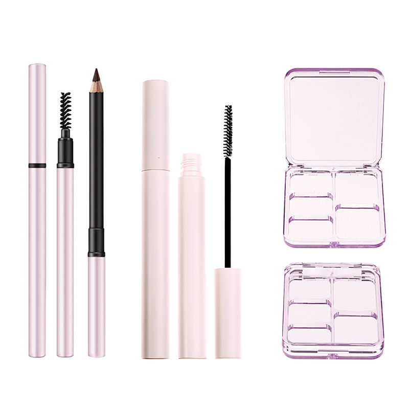
How Closure Types Impact User Experience
✱ Flip-top lids are fast, fuss-free, and great for on-the-go touch-ups.
✱ Screw tops offer security but may frustrate users in a rush.
✱ empty magnetic palette? Pure joy—smooth action plus premium feel.
The closure mechanism isn’t just functional—it shapes how people interact with your cosmetic powder packaging every single day.
Designing for Luxury: Aesthetic Features that Matter
Luxury is in the details—and those details better shine:
- Embossing gives logos tactile richness that begs to be touched.
- Spot UV accents catch light beautifully on matte backgrounds.
- Soft-touch finish creates an irresistible velvety grip.
- Add-on features like gold-toned hinges or mirrored interiors level up shelf appeal.
When aiming upscale, don’t skimp on these sensory cues—they’re what make customers fall in love at first glance.
Material Selection for Visual Impact
A visual feast starts with smart material pairings:
🟢 Combine glass options with metallic caps to blend clarity and glamor.
🟤 Use textured paperboard textures to add artisanal charm to refillable jars.
⚪ Integrate smooth premium plastics when you want sleekness without fragility risks.
It’s not just what it’s made of—it’s how each material plays off another that turns basic into beautiful in cosmetic powder packaging design.
Finishing Techniques for Elevated Aesthetics
| Finishing Technique | Texture Feel | Visual Effect | Ideal For |
|---|---|---|---|
| Matte lamination | Smooth & velvety | Subdued luxury | Minimalist brands |
| Hot foil stamping | Slightly raised | Metallic shimmer | High-end limited editions |
| Debossing | Indented | Understated chic | Heritage-inspired designs |
| Metallic inks | Smooth | Luminous sheen | Futuristic collections |
Every finishing detail reinforces brand identity—from whisper-soft touches to eye-catching gleams across the compact’s surface.
Design Elements and Branding Integration
Short bursts that shape brand memory:
Your logo’s position matters; centered logos feel balanced, while corner placement feels edgy.
A bold yet consistent color palette helps customers recognize you instantly—even across new launches.
Fonts aren’t just letters—they’re mood-setters; serif says tradition, sans-serif says modernity.
Each element—from typography to structural form—should sync up visually so your cosmetic powder packaging always speaks fluently in your brand voice.
Why Topfeel Nails Packaging Aesthetics Every Time
Here’s why Topfeel Makeup gets it right:
🔹 They use layered materials like bamboo over glass jars—not just pretty but planet-friendly too.
🔹 Their compacts feature magnetic closures paired with embossed metallic logos—a combo that feels luxe every time you open it.
🔹 They understand emotional branding—tying visual hierarchy into storytelling through clever use of graphic patterns and ergonomic features.
With every jar or compact they produce, Topfeel proves aesthetic impact isn’t accidental—it’s engineered from concept to closure in every piece of cosmetic powder packaging they create.
Practical Tips to Elevate Your Cosmetic Powder Packaging Today
Smart tweaks can make your cosmetic powder packaging pop. From visual tricks to eco upgrades, here’s how to stay sharp and on-brand.

3 Must-Know Decoration Techniques for Stunning Packaging
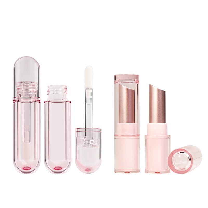
- Hot stamping: This flashy finish uses heat and pressure to apply metallic foil—ideal for logos or borders.
- custom cosmetic packaging: Full-color designs can be printed directly onto the surface, offering endless creativity.
- Embossing or debossing: Add texture by raising or recessing parts of your design—it screams premium.
Grouped with these techniques, using a bold color scheme, standout font choices, and increased logo prominence can take your look from average to amazing. These visual cues help your product stand out on shelves packed with similar cosmetic powder containers.
Quick Guide: Decorative Options for Every Material Type
Step-by-step, here’s how different materials open up unique styling options:
- Cardboard? Try embossing paired with textured paper.
- Acrylic? Go sleek with UV spot coating plus a clear window.
- Plastic? Slap on high-res labels and go wild with print effects like holographic shine.
Then layer on extras like custom-shaped labels, matte finishes, or even subtle pattern overlays. These tweaks aren’t just eye candy—they help communicate brand values through tactile storytelling.
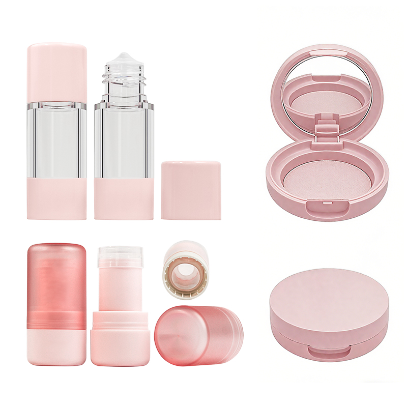
Mirror Included: Enhancing Functionality While Boosting Appeal
Step into the consumer’s shoes:
Step One – Open the compact mid-rush hour on a train; no mirror? Frustrating.
Step Two – Flip open one that includes an integrated mirror—instant win.
Step Three – Bonus points if it’s got an ergonomic hinge that holds position while applying touch-ups.
Adding this kind of smart feature isn’t just about looks—it adds real-world utility that customers appreciate without thinking twice. A neatly placed mirror inside your powder compact case turns packaging into a daily-use tool.
Customizable Dimensions: Tailoring Packaging to Your Market
Shorter jars work well for travel kits; taller pans suit professional kits better. Here are three use-case styles:
• Travel-size compacts — Slimmed-down cases that slip into tiny purses
• Luxury editions — Wider formats with magnetic closures and velvet trays
• Everyday basics — Mid-sized pans with stackable shapes for easy storage
By mixing up dimensions based on target users, you keep things relevant—and practical—for every buyer type browsing cosmetic powder products today.
Selecting Sustainable Materials: Eco-Friendly Options for Modern Brands
More brands are ditching plastic-heavy designs for greener alternatives—and there’s data backing it up. According to Mintel’s Global Beauty & Personal Care Report (2024), “73% of Gen Z consumers say they prefer beauty products packaged sustainably.”
That means switching over to materials like:
- Recycled aluminum compacts topped off with soft-touch finishes
- FSC-certified cardboard boxes featuring minimalist graphics
- Naturally antibacterial bamboo casings paired with laser-cut logos
These swaps don’t just reduce waste—they also boost brand credibility among eco-conscious shoppers hunting down Sustainable Cosmetic Packaging without compromise.
Case Studies: Effective Cosmetic Powder Packaging Examples

A quick dive into how real brands are nailing their cosmetic powder packaging—from luxe compacts to indie-friendly sifters.
Compact Containers: Success Stories from Luxury Brands
- Refillable systems aren’t just a sustainability play—they’re a status symbol now. Think Dior and Chanel, where elegance meets environmental awareness.
- Magnetic closure adds that satisfying snap that screams premium.
- The use of metal and glass components elevates the tactile experience, giving users that luxe-in-hand feel.
- Brands are leaning into custom molds, creating signature shapes that stand out on shelves and in selfies.
- A subtle matte finish or soft metallic sheen? That’s not just design—it’s brand identity molded into form.
Luxury players know that when it comes to powder compact, you’re not just selling makeup—you’re selling a moment of indulgence.
Loose Powder Pots vs. Pressed Powder Pans: A Look at Popularity
- Pressed powder pans dominate high-end lines due to their portability and mess-free application.
- loose powder jar, however, offer a higher-end ritual-like experience for those who enjoy brush-based application at home.
- Both formats allow for innovation with materials—many brands now use soft-touch, recyclable plastics or even hybrid designs with built-in sifters.
• Pressed pans often include an integrated mirror, while loose pots rely on generous volume and minimalism to appeal to skincare-forward consumers.
Loose or pressed? It really depends on the vibe your brand wants to give off—and how your audience uses their product daily.
Sifter Jars: Market Trends Among Indie Beauty Companies
Grouped trends from indie beauty brands using sifter jars:
🟢 Functional Design
- Built-in sifter controls product flow
- Lightweight jars improve shipping efficiency
- Optional twist-lock mechanisms add tamper-evident security
🔵 Material Innovation
- Use of biodegradable materials like PLA blends is growing fast
- Some opt for clear PET with a frosted look for modern appeal
- Refillable options using modular inserts are gaining traction
🟣 Brand Identity Play
- Minimalist labels with bold typography connect well with Gen Z buyers
- Soft pastel color palettes dominate this format’s aesthetic
- Many incorporate quirky storytelling through label copy or QR-linked videos
Indie brands aren’t playing small—they’re getting crafty with every detail of their cosmetic powder packaging choices, especially when it comes to sifter jars.
FAQs
1. What materials create the best impression in wholesale compact orders?
A short description + bullet point structure — durable yet expressive choices that form emotional connections with buyers.
- Durable plastic: reliable and cost-conscious for standard compact size ranges.
- Recycled aluminum: sleek, premium appeal for luxury cosmetics brands seeking refinement.
- Sustainable bamboo: natural texture drawing eco-conscious hearts closer to your story.
- Acrylic casing: bright clarity allowing UV coating or embossed logo decoration that stands out across retail shelves.
2. How does color selection influence packaging success at scale?
Short descriptive branch line — color speaks before words can form; it sets mood and brand essence instantly.
Soft pastels warm mass market retailers who chase pleasant familiarity, while deep jewel tones define exclusive energy for private label manufacturers targeting higher clientele within travel-friendly sizes or large capacity containers.
3. Which closure types win trust among professional makeup artists buying bulk?
List-style bullet structure blending care and practicality:
1️⃣ Magnetic closures: smooth open-close rhythm during backstage rushes.
2️⃣ Screw-top lids: tight confidence keeping powder intact through constant movement.
3️⃣ Twist-lock systems: artful mix of function and design pleasing both grip and gaze in refillable compacts.
4. What decoration techniques truly magnetize high-value clients?
Symbol-style grouped statement echoing tactile beauty ✦ ✧ ✩
✦ Hot stamping on eco-friendly cardboard—a timeless signature touching prestige enthusiasts’ souls;
✧ Embossed logos combined with UV coating—radiant contrast admired by indie beauty companies aiming for visual depth;
✩ Custom printing paired with gentle label application—personalized attention seen as luxury beyond material itself.
5. How do sifter jars contrast against pressed powder pans when shipped in quantity?
Multi-column table format framing real-world flexibility:
| Aspect | Sifter Jars | Pressed Powder Pans |
|---|---|---|
| Best For | Loose formulas needing control via sifter insert | Compact portability sealed by hinged closures |
| Typical Material | Durable plastic or recycled aluminum | Acrylic casing or sustainable bamboo cover |
| Preferred Market | Indie beauty companies appealing to playful consumers | Professional makeup artists demanding neat kits |
Both styles support refillable designs enhanced through fine custom printing options that turn simple packaging into storytelling pieces.
6. Why do mirrors inside refillable compacts lift perceived value so sharply?
Natural combination of structures 1–7, poetic yet practical — a human gesture within every glance.
Mirror included is not mere reflection—it’s reassurance:
- Adds convenience during daily routines under any light condition.
- Amplifies aesthetic pleasure beside applicator sponge and tamper-evident seal details.
Summary whisper: A mirror transforms a container into an experience—one small detail crafting loyalty where price never could.
Looking to elevate your brand with custom packaging that captivates? Contact Topfeel Makeup today to discuss your vision with our expert design team.