

How to Choose the Best Cosmetic Packaging Design for Your Product
January 21,2026
Here’s a truth bomb: in the beauty biz, your product’s got less than 8 seconds to charm someone from the shelf—or their screen. That means your cosmetic packaging design isn’t just wrapping; it’s the wingman, hype squad, and first impression all rolled into one. We’re talking glass that whispers luxury, caps that click like a promise kept, and colors that flirt with memory.
For bulk buyers or brand builders gearing up for a big run—one wrong choice can mean warehouse purgatory. “A poorly matched closure system alone can tank user satisfaction by over 40%,” notes Topfeel’s Senior Packaging Engineer Lian Zhou in their Q2 2024 report. So yeah…this guide is your compass before you sign off on thousands of units (and cross your fingers).
Quick Insights for Effective Cosmetic Packaging Design
➔ Material Impact: The choice between glass, recycled PET, or sustainable cosmetic packaging significantly influences brand perception, evoking luxury or eco-friendliness.
➔ Color Psychology: Utilizing Pantone matched colors and gradients can create emotional connections, reinforcing brand identity through visual appeal.
➔ Shape Recognition: Unique geometric forms and familiar cylindrical containers enhance brand recognition, making it easier for consumers to remember products.
➔ Closure Functionality: Essential closure types like pump dispensers and flip tops ensure product integrity and boost user satisfaction.
➔ Decorative Techniques: Artistic elements such as embossing and screen printing elevate the overall packaging appeal and attract customers.
The Importance of Cosmetic Packaging Design in Brand Identity
Packaging isn’t just a shell—it’s the face of your brand. Great cosmetic packaging design speaks louder than ads ever could.

How Material Type Influences Brand Perception
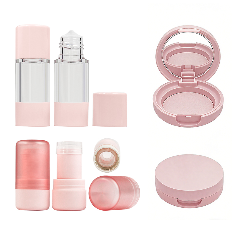
- Glass feels premium—think perfumes and serums that scream luxury on a vanity shelf.
- Plastic, especially recycled PET, tells a story of eco-awareness and affordability, perfect for younger, conscious buyers.
- Metal tins offer durability and nostalgia, often used for balms or travel kits where ruggedness meets charm.
Each material’s texture and weight shape how we see the product before even opening it—material isn’t just function; it’s messaging.
The Role of Color in Establishing Brand Identity
Pop shades or soft hues? It’s not random—it’s strategy.
• Bright colors like coral or lime often attract Gen Z eyes, giving off bold energy.
• Muted tones such as beige or dusty rose suggest elegance and calm, ideal for spa-inspired lines.
• Consistency across products builds trust—your audience should recognize your line from across the aisle.
The psychology behind color, especially when tied into a cohesive brand palette, helps forge emotional ties that stick longer than catchy slogans ever will.
Packaging Shapes That Enhance Brand Recognition
• Cylindrical jars are timeless—they fit comfortably in hand and stand out on shelves without screaming for attention.
• Triangular tubes or asymmetrical bottles catch the eye fast, becoming instantly iconic if done right.
• Ergonomic curves aren’t just about comfort—they subtly signal innovation and care about user experience.
A unique shape can become shorthand for your brand identity, like Apple’s silhouette does for tech—recognition through form is real power.
Material vs Shape vs Color: A Comparative Influence on Perception
| Element | Influence on Luxury Perception | Eco-Friendliness Signal | Memorability Score |
|---|---|---|---|
| Glass | High | Medium | High |
| Recycled Plastic | Low | High | Medium |
| Metal | Medium | Medium | Low |
| Bold Colors | Medium | Low | High |
| Pastel Colors | High | Medium | Medium |
| Unique Shapes | High | Low | Very High |
Combining these elements strategically multiplies their impact—think sleek black glass bottles with minimalist fonts: instant high-end vibes. Or use soft matte plastic with pastel gradients to craft an approachable yet modern aesthetic that resonates deeply with your target crowd. Smart choices around material, color, and shape make your cosmetic packaging design unforgettable—even before anyone tries what’s inside.
By blending tactile appeal with visual storytelling, brands like Topfeel have shown how smart packaging design becomes part of the product experience itself—not just its container but its voice too.
6 Key Elements of Effective Cosmetic Packaging Design
A killer cosmetic packaging design isn’t just about looking pretty—it’s a mix of smart choices, solid materials, and creative flair that keeps products safe and customers hooked.

Durable Material Types: Ensuring Quality and Protection
Choosing the right material for your packaging can make or break your product’s shelf life—and your brand reputation.
- Glass jars offer a premium feel but need extra care during shipping.
- Plastic options like PET and HDPE are lightweight, flexible, and cost-effective.
- Tougher stuff like aluminum holds up better under pressure—literally.
- High-end brands often go for acrylic, thanks to its crystal-clear look and scratch resistance.
- Eco-conscious shoppers? They’re eyeing anything labeled as recyclable, even if it costs a little more.
Each type brings something different to the table. So when you’re picking materials for cosmetic packaging design, think beyond looks—think durability, weight, sustainability, and how it feels in someone’s hand.
Utilizing Custom Label Application for Brand Visibility
Labels aren’t just stickers—they’re silent salespeople working overtime on every shelf.
- Use custom printing to align with your brand vibe—bold fonts or delicate scripts? Your call.
- Add tactile appeal with raised textures through techniques like foil stamping or embossed finishes.
- Choose between wrap-around labels or sleek transparent overlays depending on container shape.
- For full coverage on oddly shaped bottles, go with shrink sleeves—they hug every curve perfectly.
- Big plus: Direct-to-bottle printing eliminates peeling issues while keeping things clean and modern-looking.
It’s all about standing out without shouting too loud. Smart label design can turn heads—and turn browsers into buyers when done right in any cosmetic packaging design setup.
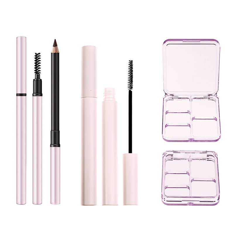
Essential Closure Types to Maintain Product Integrity
Closures might seem minor until something leaks—or worse, spoils.
• Flip-top caps are quick to open but stay shut tight when tossed into a bag.
• Airless pumps? Game-changer for serums—they protect formulas from air exposure entirely.
• Screw caps remain reliable classics but now come with tamper-evident rings for added safety.
• Spray nozzles work best for mists but need proper locking mechanisms to avoid accidental spritzes.
• Magnetic lids add an upscale touch while ensuring secure closure without threads.
The key here is matching the closure style with what’s inside—because nobody wants their moisturizer drying out before they even use it.
Artistic Decoration Types That Elevate Design Appeal
This is where things get fun—and fancy.
You’ve got options like silk screening, which lays down crisp graphics directly onto containers without labels at all. Then there’s the shine factor: nothing screams luxury louder than some well-done hot stamping or full-on metallization, especially in golds or chromes that catch the light just right.
Want texture? Try subtle touches like embossing logos onto glass jars or going opposite with recessed patterns using debossing techniques instead. A final coat of high-gloss or soft-touch matte via specialty finishes like UV coating gives your product that “just right” tactile feel customers can’t stop touching.
When done right, artistic decoration doesn’t just beautify—it builds identity into every inch of your cosmetic packaging design journey.
Trends Shaping the Future of Cosmetic Packaging Design

From eco-conscious materials to wild custom shapes, today’s cosmetic packaging design is anything but boring.
The Rise of Eco-Friendly Packaging Material Types
- Biodegradable tubes made from corn starch are showing up on more beauty shelves.
- Brands are swapping virgin plastic for PCR blends that look sleek and reduce landfill pressure.
- Refillable palettes and bottles are now a thing—less waste, more style.
- 85% of Gen Z shoppers say they prefer products with green packaging.
- Many indie brands now launch exclusively with compostable wrappers and cartons.
- Major retailers have started offering incentives for returning empty, refillable containers.
✱ Some companies even use mushroom-based foam as an alternative to plastic fillers—yes, mushrooms!
Eco doesn’t mean dull anymore. Today’s sustainable options come in vibrant colors, luxe finishes, and smart closures that scream premium while staying planet-friendly. And don’t forget: recyclable doesn’t just mean cardboard; it includes sleek aluminum and glass too.
Short bursts:
- More brands are flaunting their carbon footprint stats right on the label.
- Even mascara tubes now come in fully recyclable, water-based ink designs.
- Compost-ready jars? Yep, those exist—and people love them.
Steps to keep it clean:
→ Start with a lifecycle analysis of your current packaging
→ Switch over high-volume items to sustainable alternatives
→ Communicate your green shift clearly on-pack
Grouped types of eco-materials:
• Paperboard & kraft paper – lightweight yet strong
• Glass – infinitely recyclable and classy
• Aluminum – sleek and endlessly usable
• Bioplastics – made from sugarcane or cornstarch
Mixing methods: Some brands go hybrid—like pairing a bamboo cap with a PET bottle—to balance cost with impact reduction. That’s where Topfeel really shines by offering modular formats that let you mix-and-match sustainable parts without compromising design.
Unique Shape Trends: From Standard to Custom Molded Forms
- Think beyond round jars—today’s lip balms come in star-shaped tins or tiny pyramids.
- Ergonomic curves make bottles easier to grip and way cooler on the shelf.
- Asymmetry is hot right now; nothing says “niche luxury” like an off-center lid.
- Custom lipstick bullets shaped like hearts or flames? Totally trending.
- Oval compacts fit better in clutches than bulky squares—function meets flair!
- Shoppers remember unusual silhouettes far longer than standard ones, boosting brand recall big time.
⚙️ Want standout appeal? Go for molded forms that align with your product vibe—sleek cylinders for serums, chunky cubes for creams.
Custom shapes aren’t just about aesthetics—they also affect how consumers interact with your product daily. A twisty bottle might feel more intuitive than a flip-top cap if done right.
Quick hits:
- Dropper bottles shaped like teardrops evoke softness and hydration themes
- Fragrance packaging often mimics sculpture now
- Kids’ lines go all out with animal-shaped dispensers
Grouped innovation by shape type:
• Ergonomic – fits naturally in hand (think curved lotion pumps)
• Asymmetrical – visually striking without being chaotic
• Bespoke molds – designed from scratch per brand DNA
Natural blend of ideas: A bold shape grabs attention fast—but pairing it with tactile finishes like soft-touch matte elevates the whole experience further. That’s why many upscale skincare lines combine both custom form and texture in one cohesive package strategy across their entire line-up of cosmetic packaging design elements.
Innovative Decoration Techniques: UV Coating and Embossing
| Technique | Visual Impact | Tactile Effect | Ideal For |
|---|---|---|---|
| UV Coating | High-gloss shine | Smooth & slick | Lip gloss tubes |
| Embossing | Raised detailing | Textured feel | Logo areas |
| Hot Stamping | Metallic accents | Slightly raised | Luxury branding zones |
| Screen Printing | Bold solid colors | Flat finish | Minimalist aesthetics |
UV coating isn’t just for show—it protects labels from smudging while adding serious glam factor under store lights. Combine it with subtle debossing around logos for contrast that feels expensive without going overboard.
Bullet-fast insights:
• Matte + gloss layering adds depth you can see AND feel
• Gold foil hot stamping = instant prestige vibes
• Clear screen print over frosted glass = understated elegance
Multi-layered techniques work best when tied into overall brand identity—not every bottle needs glitter bomb effects! Instead, choose what enhances the message behind your cosmetic product line’s story through its packaging design language.
Grouped decoration types:
• Tactile finishes – embossing, debossing, soft-touch matte coatings
• Visual highlights – metallization, holographic foils, UV spot effects
• Identity markers – etched logos or signature patterns
Natural wrap-up combo: A little shimmer here, some texture there—it all adds up when done tastefully. These techniques help elevate even simple shapes into works of art within the world of cosmetic packaging design today.
Maximizing Shelf Impact with Unique Cosmetic Packaging

A killer first impression on the shelf can make or break a product—let’s unpack how packaging design grabs eyes and wallets.
The Impact of Volume Type on Shelf Presence
• Bigger isn’t always better, but it sure gets noticed. A bold volume like 200ml screams value from across the aisle.
• Meanwhile, compact sizes like 50ml whisper exclusivity and portability—perfect for on-the-go skincare lovers.
• Matching your product dimensions to consumer intent makes the whole thing click: travel-friendly serums? Go small. Family-size body wash? Go big.
Smart use of capacity doesn’t just fill space—it creates visual dominance and signals brand positioning without saying a word.
Eye-catching Colors: Utilizing Pantone Matched and Gradient Effects
- Start with brand DNA—what hues reflect your vibe?
- Lock in exact tones using Pantone color matching to keep things consistent.
- Layer on gradient effects that shift subtly under light, adding depth and motion.
- Use contrast wisely—a sharp pop can pull eyes instantly from bland competitors.
- Don’t forget finish! Matte vs gloss changes how your colors hit under store lighting.
When done right, these color tricks don’t just look good—they build instant recognition in the crowded world of cosmetic packaging design.
The Influence of Unique Closure Types on Customer Choice
✦ A flip-top cap offers speed; users love the one-hand open-close action when they’re mid-routine.
✦ Pump dispensers bring hygiene and control—especially loved by skincare enthusiasts who hate waste.
✦ Twist-lock nozzles feel premium while keeping leaks at bay during travel or gym runs.
Each type of closure adds something different—from tactile satisfaction to elevated functionality—all feeding into that final purchase decision.
Engaging Shapes: How Geometric Forms Capture Attention
Square bottles? They stand tall and proud, refusing to roll off shelves or fade into sameness. Cylindrical tubes? Smooth, ergonomic, familiar—but often forgettable unless paired with rich textures or metallic finishes.
Hexagonal jars bring unexpected angles that spark curiosity, making consumers pause—and that pause often leads to purchase.
Unusual geometric forms, especially when tied into thoughtful branding through consistent patterns or symmetry, make products visually magnetic in any retail lineup.
Summary Table of Packaging Features & Their Shelf Benefits
| Feature Type | Visual Benefit | Functional Advantage | Consumer Perception |
|---|---|---|---|
| Large Volume Bottle | High shelf visibility | More product per dollar | Value-driven |
| Pantone-Matched Color | Brand consistency | Easy brand recall | Professional & polished |
| Flip-top Closure | Quick access | One-handed use | Convenient & casual |
| Square Shape | Stands out geometrically | Stackable & stable | Bold & modern |
Topfeel’s latest line nails all four elements—from precise Pantone gradients to clever square bottles with twist closures—showing how smart tweaks in cosmetic packaging design can drive serious shelf appeal and customer love alike.
Choosing Colors for Your Cosmetic Packaging Design
Color isn’t just visual—it’s emotional. Smart color choices in your cosmetic packaging design can speak volumes before a product is even opened.

Emotional Response: The Psychology of Color Selection
Understanding how color affects perception is key when building a strong brand message through cosmetic packaging design.
• Warm tones like red and orange can stir excitement, urgency, or even hunger—great for bold lipsticks or trendy skincare lines.
• Cool hues such as blue and green tend to soothe and calm, perfect for spa-inspired or sensitive-skin products.
• Neutrals like beige and gray signal minimalism or luxury depending on their pairing.
- Know your audience—Gen Z gravitates toward pastels and neons; Millennials lean into muted earth tones.
- Match the emotion to the function—Is it energizing serum? Go bright. A calming night cream? Think soft blues.
→ Want consistency across product lines? Build a palette around one dominant tone that reflects your brand’s personality.
Color theory isn’t fluff—it’s foundational psychology that influences consumer behavior, mood, and even shelf-stopping power in retail aisles.
Topfeel nails this by syncing each product line with carefully chosen colors that reflect both function and feeling—a masterclass in emotional branding through color.
Balancing Solid Color Palettes with Gradient Effects
Solid shades are dependable—but gradients bring life to cosmetic packaging design when used right.
Solid Colors
- Offer consistency across SKUs
- Reinforce brand recall instantly
- Work well for minimalist aesthetics
Gradients
- Add dimension without cluttering the layout
- Let you blend multiple moods into one surface—think sunrise pink fading into golden yellow on summer-themed items
- Create movement, drawing eyes naturally across the package
Design Tips:
• Use gradients sparingly so they don’t overshadow typography or logos.
• Blend two analogous hues for harmony; try blue-to-teal or coral-to-peach transitions.
The balance between flat tones and gradient overlays gives you room to play while maintaining visual clarity—a must when designing standout yet cohesive packaging visuals.
Accessorizing with Metallic Colors for Enhanced Appeal
Metallics aren’t just bling—they’re strategy wrapped in shimmer.
Gold accents scream luxury, especially on high-end serums or prestige palettes. Silver feels futuristic, ideal for tech-driven skincare solutions like LED masks or peptide-infused creams. Rose gold? Still trending hard among younger consumers looking for something both classy and playful.
Glossy foil stamping on logos elevates perceived value instantly—even if it’s just a $12 lip gloss inside.
Matte metallic finishes offer sophistication without glare, making them great for photography-heavy eCommerce listings where reflection ruins shots.
And don’t forget inner detailing—metallic liners inside boxes create a premium unboxing experience that customers remember long after purchase.
In cosmetic packaging design, these shimmering touches aren’t overkill—they’re what makes your product feel worth every penny at first glance.
FAQs
How does cosmetic packaging design shape a brand’s personality?
Shapes, textures, and tones speak quietly yet powerfully:
- Glass bottles whisper grace; acrylic plastic shouts modern versatility.
- Pantone matched colors hold the identity close; gradient color effects bring intrigue.
- A tall line of cylindrical containers, or a row of daring custom molded shapes, leaves an enduring mark.
Which closure types work best for high-demand beauty products?
Think about daily rhythm — open, dispense, close again:
- Pump dispenser systems keep product pure and touch-free.
- Magnetic lid closures add a tactile luxury that customers remember at every use.
- For casual convenience, nothing beats quick-flick flip top caps.
What sustainable choices win lasting loyalty from eco-conscious buyers?
Short description + bullet list structure: Nature meets design in satisfying ways:
- Use biodegradable materials, bringing authenticity to your ethos.
- Offer refillable packaging options, creating intimate repeat rituals for users.
- Integrate subtle charm with beautiful yet practical designs in harmony with reduced waste ideals.
Can metallic tones elevate visual appeal on crowded shelves?
In dim aisles and bright counters alike, shimmer calls attention instantly—pairing shine with detail can feel irresistible:
| Decoration Type | Effect Achieved |
|---|---|
| Hot stamping logos | Lux sparkle under movement |
| Embossed patterns | Raised elegance the hand admires |
| UV coating finishes | Gloss depth that tempts touch |
Adding hints through lids or accents turns functional into covetable.
How do different volumes influence buying decisions across markets?
From first try to family favourite:
★ 15ml sample sizes – invite curiosity without commitment.
★ 50ml standard bottles – promise balance between price and daily need.
★ 200ml family sizes – resonate with those who share generously at home.
Volume isn’t just capacity—it’s how you choreograph intimacy or abundance.
Why is distinctive shape essential in mass production lines?
Distinctive silhouettes stir recognition instantly:
• Sharp-edged confidence from square shaped bottles
• Flowing ease via curves of an oval compact
A retail shelf becomes theater—each form its own character waiting to catch the passerby’s eye before they even read your name.
References
Quick—You Have Eight Seconds! – d-bridge.rolanddg.com
The Impact of Packaging on Cosmetic Consumer Behavior – containerandpackaging.com
Top Trends in Cosmetic Packaging for 2025 – techcenter.apcpackaging.com