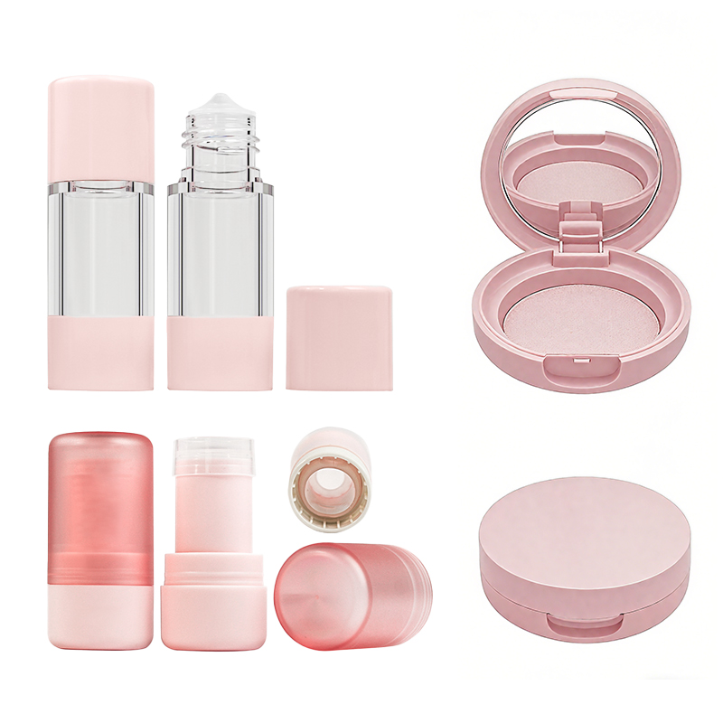
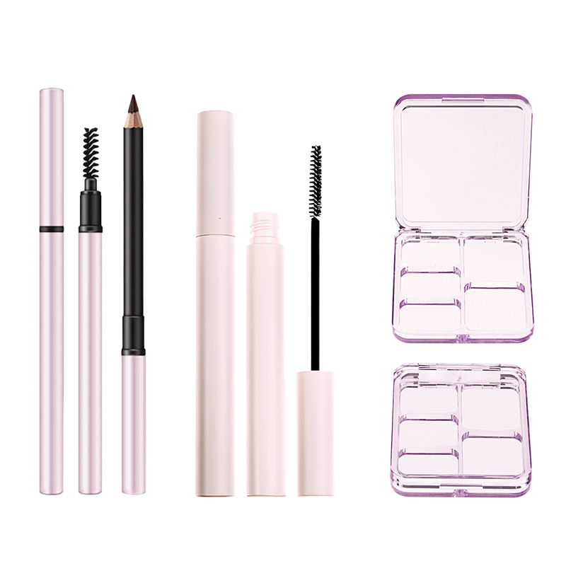
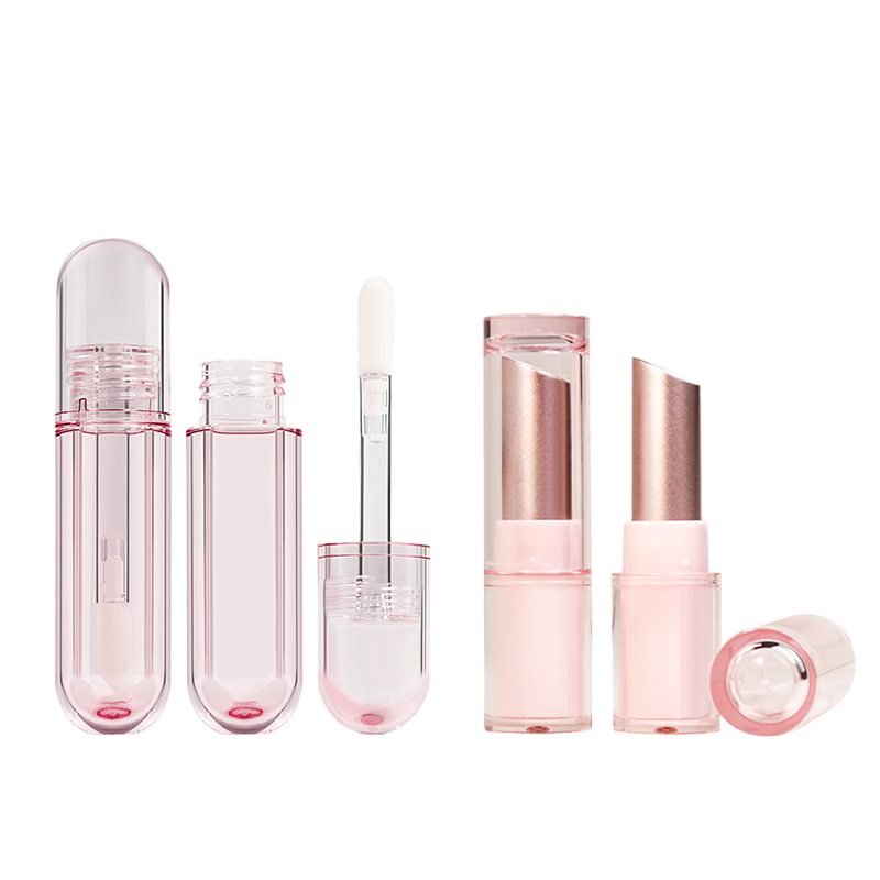
What are some important considerations for color in your cosmetic packaging design?
When designing packaging for cosmetics, color isn’t just about making things look pretty—it is a strategic tool.
According to McKinsey & Company, nearly 85% of consumers say color is the main reason they buy one product over another. That means picking the perfect hue could be more powerful than any influencer shout-out or marketing campaign.
When determining your color strategy, you must balance aesthetics with utility. Soft matte nudes might whisper “clean beauty,” but do they stand out? Amber tones look moody, but their real job is fighting UV damage to keep formulas fresh.
If you are packaging at scale, you need to consider how color talks before customers even pop the cap.

Key Points: The Secret Language of Color Selection
→ Consider Consumer Psychology: Nearly 85% of consumers say color is the main reason they choose one product over another—making your hue a silent but powerful sales pitch.
→ Consider Shelf Impact: Bright, vivid custom cosmetic packaging on bottles and spray nozzles fine-mist help products stand out among competitors during peak shopping seasons.
→ Consider Sustainability Signaling: Earthy tones on aluminum tubes lightweight tap into eco-conscious trends, signaling natural ingredients and sustainable choices to buyers.
→ Consider Brand Positioning: Sleek white opaque bottles or black sleek designs offer a clean, high-end appeal that resonates with modern cosmetic shoppers.
→ Consider Product Protection: Custom colored plastics must do more than look good—they need to enhance UV protection for formulas inside clear transparent containers.
Top Five Considerations For Custom Colored Plastics
Custom custom color matching of cosmetic packaging aren’t just about looks—when designing packaging, you must weigh practical perks against aesthetic goals, especially regarding high-volume production and product protection.
1. Production Efficiency and Cost
When designing for mass production, color choice impacts your bottom line.
• Bulk manufacturing of HDPE containers becomes more efficient with pre-colored resin, cutting down on post-production tinting steps.
• Customization at the resin level means fewer delays and faster fulfillment—shorter lead time, lower overhead.
• When you’re producing thousands of units like a sunscreen bottle, even small savings per unit stack up fast.
You get both cost savings and consistent quality without sacrificing design flexibility.
2. Brand Identity and Recognition
Your color choice must serve as a consistent brand anchor.
- Vivid hues make your product pop in a sea of sameness—think neon green or matte black for that extra edge.
- A consistent color palette across packaging builds long-term consumer trust and visual recall.
- For example, PET bottles in signature tones can become instantly recognizable on store shelves, reinforcing branding opportunities.
Color becomes your silent ambassador—it speaks before your logo does.

3. Visibility and Differentiation
You must consider how the container interacts with the product inside.
■ Transparent containers with custom tints offer dual benefits: they highlight the product while filtering excess light exposure.
■ A tinted sunscreen bottle not only looks sleek but subtly hints at its premium formulation inside.
Shoppers notice color before reading labels—this is where aesthetic appeal meets function.
4. Environmental Impact and Perception
Sustainability is no longer optional; your makeup packaging color choices should reflect this.
Grouped by Impact:
– Material Reality:
• Bio-based resins paired with natural pigments reduce carbon footprint.
• Compostable options now come in soft earth tones that align with eco-conscious branding.
– Consumer Perception:
• Buyers are drawn to sustainability cues—greens, browns, and muted blues signal responsibility.
• According to NielsenIQ’s 2024 Sustainability Report, “Products with visible eco-friendly packaging saw a 21% lift in purchase intent.”
– Brand Value:
• Using recycled content in colored plastics boosts CSR credentials.
• Eco-themed colors strengthen emotional connection between brand and buyer.
This isn’t just greenwashing—it’s smart design meeting real-world expectations.
5. Functional Protection (UV Resistance)
Perhaps the most technical consideration: Does the color actually protect the formula? A custom-colored plastic container doesn’t just look good—it can also shield contents from harmful rays.
Here’s how different colors stack up:
| Color Pigment | UV Blocking Efficiency (%) | Common Use Case | Material Compatibility |
|---|---|---|---|
| Amber | 85 | Pharmaceuticals & oils | PET |
| Cobalt Blue | 60 | Cosmetic serums | Glass & PET |
| Opaque White | 95 | Sunscreen formulations | HDPE |
| Smoky Grey | 70 | Nutritional supplements | PP |
These choices enhance uv resistance, extend shelf life, and elevate overall material performance—ensure your color choice provides the armor your formula deserves.

How Does Color Influence Consumer Choices?
Color isn’t just a visual—it’s a decision-maker hiding in plain sight. When designing, you must unpack how color shapes trust, emotion, and buying behavior.
Emotional Connection: The Psychology of Color
Colors tap into our feelings faster than words ever could. That’s why smart packaging design uses shades that speak directly to the heart.
- Warm tones like coral or peach often stir joy and comfort—ideal for daily skincare lines.
- Cool hues such as lavender or mint trigger calmness, making them perfect for night creams or serums.
- Earthy neutrals connect with eco-conscious buyers looking for sustainable cosmetic packaging.
Now blend that with color psychology, and you’ve got branding magic. A tinted amber bottle doesn’t just look chic—it whispers “natural” and “pure.”
Visual Impact: Standing Out on Shelves
In crowded retail spaces, custom colors are your best wingman. Your design must grab attention before consumers even read the label.
Grouped by impact:
Bold & Bright
- Fluorescent oranges or electric blues scream energy—great for youth-focused skincare.
- Neon greens signal freshness, often used in exfoliants or detox masks.
Matte & Minimalist
- Soft matte beige or dusty rose feels premium and refined—popular for high-end foundations.
- Charcoal black gives off an edgy vibe that appeals to trend-savvy shoppers.
Transparent & Tinted
- Clear bottles show off product texture while tinted glass adds mystery and luxury.
- A frosted finish elevates elegance without going overboard.
Trust and Safety: Product Perception
Color isn’t just about looks—it builds trust before someone even twists open the cap.
Let’s break it down naturally:
-
White = Clean + Safe
That’s why white opaque containers dominate medical-grade skincare lines. Consumers associate white with sterility and transparency.
-
Blue = Clinical + Reliable
Used often in acne treatments or SPF creams because it feels trustworthy without being too cold emotionally.
-
Green = Natural + Gentle
Perfect for organic moisturizers or plant-based serums; green tells users it’s kind to skin—and planet-friendly too.
For items like a sunscreen bottle, a light blue tint instantly signals sun protection while maintaining a soothing aesthetic.

Market Trends: What Colors Are Driving Behavior Now?
To design effectively, you must stay ahead of the curve. According to Mintel’s 2024 Global Beauty Report, “Color remains one of the top three packaging elements influencing first-time cosmetic purchases.”
Here are five key takeaways shaping current buyer behavior:
- Black is back – Matte black bottles surged 28% YOY due to their modern, gender-neutral appeal.
- Pastel palettes – Soft lilacs, blush pinks, and sage greens continue dominating Gen Z-targeted brands.
- Sunset tones – Shades inspired by golden hour lighting—like burnt orange and terracotta—are trending hard among indie lines.
- Dual-color combos – Products like two-tone sunscreen bottles, pairing metallic caps with muted bodies, saw increased engagement online.
- Cultural relevance – In Southeast Asia, red-tinted containers symbolize vitality; brands adapting colors regionally see better shelf conversion rates.
FAQs about Packaging Color Considerations
How do bottle colors affect what people buy?
Color isn’t just decoration—it’s persuasion. A vibrant orange spray nozzle can whisper “fun in the sun,” while a soft beige tube suggests natural, calming ingredients. These subtle cues stir emotions before the product is even touched. In summer aisles packed with choices, color becomes your silent salesperson.
Why are opaque colors often preferred for skincare products?
- White bottles feel clean and honest—like something you’d trust on sensitive skin.
- Black packaging gives off a sleek, premium vibe that appeals to minimalists.
- Crucially: Opaque materials help shield formulas from sunlight, keeping them stable longer.
Which design elements make packaging stand out on crowded shelves?
A flat label won’t cut it anymore. What grabs attention is texture you can feel or shine that catches light:
- Shrink sleeves wrap around every curve of the bottle for full visual impact.
- Metallic hot stamping adds glints of gold or silver where eyes naturally land.
- Embossed patterns invite fingers to linger—a small moment that builds connection.
Are there eco-friendly color options available?
Yes—and they’re gaining ground fast. Brands are choosing bio-based plastics and recyclable PET not only because customers demand sustainability but because these materials now offer durability without compromise.
What shapes work best for travel-size bottles?
When you’re tossing something into a beach bag, shape matters alongside color:
- Oval designs nestle easily in your palm.
- Flexible tubes let users squeeze out every last drop.
- 50ml formats hit airline limits perfectly.
References
[Why Color Matters – ColorCOM]
[NielsenIQ’s 2024 Sustainability Report – NielsenIQ]
[The Psychology of Color in Marketing – HelpScout]
[2024 Global Beauty and Personal Care Trends – Mintel]


